On Sale: GamesAssetsToolsTabletopComics
Indie game storeFree gamesFun gamesHorror games
Game developmentAssetsComics
SalesBundles
Jobs
TagsGame Engines

benefactum-games

60
Posts
13
Followers
9
Following
A member registered May 12, 2025 · View creator page →

Creator of

Recent community posts

I have not, but it sounds interesting. I didn't have much hope that "statues with people inside them" would be a wholly original idea, but I am happy that it was at least the only occurrence of that concept in the Jam. 

Thanks for the feedback on the bugs. There was one other comment that I went overboard with the palette and variation between panels, so I've been looking for things to cut, but you're the first to have given me a specific suggestion on that front. 

Basically the deal there is I was concerned about not having left myself enough room for any illustrations, and although I am an artist, I'm not a sci-fi/fantasy artist, nor a portraitist. So I was looking for ways to integrating simple illustrations into the design. If they're distracting as a watermark, what I'll probably try to do is condense that panel slightly to leave some space at the bottom or in between sections and have a line of them crawling across.

(1 edit)

Thanks for the detailed feedback! I really appreciate the granular notes about typos and such. You're right, I had waffled about Daphne's name and evidently forgot which version I'd settled on when writing that point on the timeline.

Likewise, good catches on the Observation/Viewing Platform. Those are the kinds of things that will be really helpful in finishing this up for publication. And I'll make the staff icon opaque for the Staff Area in Act III... the idea is that most go that way while some hide in the Kitchen, and you may or may not actually encounter them depending on what the Convicts are doing. But it's true that by default there should be some there to I'll make it a solid icon.

I'm planning on removing the timestamps from the timeline anyway. It seems to be more limiting and confusing than helpful. Instead it will just be a list of things that happen in each act, with some flexibility in the ordering and spacing.

Regarding the theme, my thinking is that it's there both literally and figuratively. Literally, there are people (and a Mulcher) under the surface of the statues. Figuratively, Camilla's beauty is only skin deep and she is in fact a monster under the surface. But I can see how the statues thing might seem too indirect if you were thinking of larger surfaces, like water or the planet's surface.

I agree that it's not the easiest thing to run for novices. My thinking there is that the setup is designed to be slotted in between other scenarios, so it's not going to be anyone's first time playing. It can still be a handful, though, as there are a lot of moving parts.

(2 edits)

Okay, I apologize. I'm not insisting on anything, I just thought based on your response that I hadn't been clear enough.

I can delete my replies if you'd like, or all the feedback. I did say up front on the Discord that I'd be happy to remove any feedback that people take exception to.

There are some rough edges here and the plot is fairly standard Mothership fare, but I really appreciate all the thought you put into making this module Warden-friendly. 

Things that you did well:

  • Breaking up the information into digestible blocks, detailing the planet, the crew, the ship, the monster, etc. separately instead of in one big wall of text.
  • Providing a clear three-act structure plus intro and suggestions for the aftermath, instead of focusing on just the action and leaving the rest for the Warden to figure out.
  • Providing a decent amount of peripheral detail through very short sentences, rather than spending a lot of words on just the most important things.
  • Highlighting the things you want the Warden to pay extra attention to.

The design and layout isn't too bad. It's not super slick, but for the most part it's functional. My main complaint about that is that there are too many transitions between light-on-dark and dark-on-light text, which is visually kind of overwhelming. It's okay to use reversed type for headers or maybe one box per page that you want to call attention to. But having a 50/50 mix scattered all over the page just makes it hard to know what to look at because you're eyes are being pulled all over the place.

When looking at the freighter map, I didn't immediately see where the location key was. If you're not going to put them on the same panel, try to do something to visually connect them, like make sure their tops are aligned, or have a box or line that stretches across the fold and connects them.

I don't know if I'll run this because there are so many other options within the niche of "respond to distress call, fight monsters, run away," but it's one that I might think of if I find myself in a situation where some people want to play Mothership right now and I have nothing prepared, because you've done all the things you need to do to make a module ready to go without any extra prep needed by the Warden.

Straightforward and literal interpretation of the theme, but it obviously works. I like the plot hook of an asteroid on a collision course turning out to be inhabited. Oops. It's maybe not as strong on horror vibes as most Mothership stuff, but that's okay.

The story probably works better with the explosives than the engines, although then it might leave the players wondering why they have to land on it and can't just shoot it with a missile.

The visual design is spare but functional. The maps are a bit confusing in that they both use numbering and then the location descriptions are all on the same page together. I might use letters for one and numbers for the other. 

There's a significant usability issue in having the interior map (the more elaborate of the two) on the opposite side of the sheet from the location descriptions. That's going to be a lot of flipping. You could fix that by putting the interior location descriptions on the left panel of the spread instead of the right... then with the cover open but the flap closed, you'd have the interior map and interior descriptions next to each other.

Plotwise, I can see this being a lot of fun once the players are in contact with the cult and entering the asteroid. I like that they have options to just fight through the scenario and blow everything up, or try to persuade the cult to help find a non-destructive way to divert the asteroid and get a "good" ending. 

However, I see one problem there in that it's not obvious why the players would go inside. Some players might just shoot the first group of cultists, finish setting up their explosives, and take off, without ever learning anything more. You're kinda counting on the players to "play along" and show some curiousity (or ethics) for the sake of the plot.  But that can make them feel railroaded if they think their characters would take the shortcut, but know that it would mean not really having an adventure.

I would suggest altering the plot slightly to force a trip inside. If you're going with explosives, maybe the mission-givers can tell the asteroid is hollow. They don't have enough explosives to blow it up from the outside, but planting some inside should work. But first they'll need to install a radio repeater on the surface so the detonation signal can reach the charges. Something like that maybe?

This is a good one overall, probably in my top ten, although there's one thing that seems missing to me that I'd have to brainstorm a solution to if I was going to run it. I'll get to that in a moment.

It looks very nice. The cover art in particular is great, and the map and character portraits are both pretty good. I like the use of colour. Only complaint layout-wise is that there are a few places the text is right up against something... type needs to breathe, as my typography teacher used to say. Easy to fix though, just add some internal margin to your text boxes and external margin to the text wrap on your character portraits.

Like with a number of the other modules, I found myself wishing there was a single-paragraph Warden's summary on the flap before we get to the timeline and stuff. Reading everything else becomes easier once you know there's a bioweapon, a scientist who was experimenting on people, and a woman who rebelled and caused the tower to become flooded and the bioweapon to get loose.

(I've had some pushback on that feedback from a couple of people, so let me add a disclaimer and say this may just be because I'm a news editor and spend my days telling people to get to the point immediately, not to bury the lede. I feel that applies to modules too, but opinions seem to vary.)

Minor omission from the map: I guess that 42 and 43 are not flooded? I found myself wondering how Ophelia was alive and playing the piano underwater, but then noticed that there's a slight blue tint to everything except those areas. I would add that to the map key and maybe make the tint a little darker to be more obvious.

My bigger complaint about the structure of the story is that there seems like a lot of exploration without any threat other than taking too long and running out of oxygen, followed by a climax that might be over very quickly. I don't necessarily mind a lot of build-up, but the Homogen only shows up once all the doors are open and the characters have what they need, at which point I don't see anything that would stop the players from swimming straight up the elevator shaft to get away, which doesn't seem like a satisfying end. Unless they get cornered and have no choice but to fight, which also isn't ideal.

So, to run this I would have to come up with a way to force a more complex endgame, ideally one that would reward the players for having poked around and laid some groundwork during the relatively stress-free exploration phase of the scenario, rather than just speedrunning everything. A chase sequence that involves the elevator shaft somehow getting sealed might work, so e.g. if they've cut through the ships in the docking bay they have a better chance of making it.

Not so much below their pay grade as just not the right type of skill set when you'd want a lawyer or a social worker or something. Maybe, space allowing, you could make it work with a humorous anecdote about what happened the last time someone tried to serve the guy these papers. A high-speed chase that left five people dead or something. He got off the hook because he's a well-connected corporate doctor, but they want to make sure he gets served and no one else dies this time. It would also give the players a reason to barge in when he doesn't come to the waiting room right away.

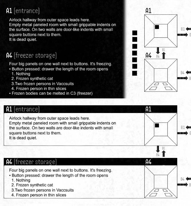
This is very quick-and-dirty and raises some other minor design issues that you'd have to fix (I had to cut a line from the A4 text to make the boxes the same size, for instance). But just to show you what I mean about connecting rather than dividing. It's not just the change of color in your version, you've actually got those little squares that visually tell the viewer "these things don't go together" when in fact they do.

All feedback is of course to be taken or left as people see fit, because it's your project. 

The reason I am very caught up on ordering of information is that I'm a news editor by profession, and news is of course all about ordering of information so people get the most clarity as quickly as possible even if they're only skimming. You're right that most of these issues won't hurt usability in the long run, but I'm big on reducing friction the first time someone looks at something.

Personally, I think it's possible to "have your cake and eat it too" when it comes to this stuff. It's entirely possible for a module to be easy to read sequentially and also to use at game time. For instance, with the interior spread I'm not saying don't put the descriptions next to the room images. I'm saying change the background so it looks like all one spread not three separate panels. The problem is the visual division between the descriptions and the images, which makes the descriptions seem like they're in a weird order until you realize they're next to the corresponding images. If they were visually connected to the images instead of separated from them, then it would be obvious at a glance that they go together.

Props for doing a mechanical add-on entry rather than a module, and making it fit the theme. I like the "layers" approach to simulating hacking. It'd be cool to use this when hacking an AI brain (or even a human one using some neural technology) and do some kind of Inception thing where you're also experiencing layers of consciousness as you go deeper.

I was confused by a lot of the mechanical explanation at first because you took a long time before getting to the central points which is that:

  1. The nodes are numbers on a die.
  2. The hacker is trying to change their number to match the secret target number, while getting clues about whether they're higher or lower.

If you said that up front and then got into the nitty-gritty, it would make life a lot easier for the reader. A visual representation of the game showing dice on a number line would also go a long way. I feel like a lot of entries in this jam make the mistake of trying to tell everything in full detail from beginning to end instead of starting with the big picture and then doing the detail.

I think the main thing that's missing for me is a way to just fail your hack attempt. You've got Hunter Worms, but they're optional. Aside from those, it seems like the only risk is on the way back out. There needs to be something like a time limit after which you have to start making Panic checks or fail the hack. Otherwise it's just sitting there rolling dice until you get in.

Visually, the biggest issue here is the small variations in type size, width, line spacing, etc. The general rule in graphic design is that if things are the same, they have to be exactly the same, and if they're different, they have to be different enough that it's clearly on purpose. Things that are just a little off are in the uncanny valley.

One example is the text in quotation marks at the top left of the interior spread. You've used a compressed version of the font there, but it's otherwise the same size, weight and color as the surrounding text, which makes it look wrong. If you need to use compressed text there for space saving reasons, make it bolder than the surrounding text and a different colour. Then it will be obviously "different on purpose" and not look like some of the regular text got squished by mistake.

(1 edit)

I'm glad someone did something with nonlinear spaces, although I feel like the theme is weakly implemented. I guess you're entering through the surfaces of the cube, and the pocket dimension is "beneath the surface" of conventional spacetime or something, but if it wasn't an entry in this jam I'm not sure the words "beneath the surface" would come to mind.

The level of polish is decent for the most part. Everything looks nice and is readable. The main issue is information ordering. There are a few examples of that:

  • Like a few other entries you seem to be expecting that people will read the middle front panel first after the cover, but I'm not sure that's how I'd read an accordion fold pamphlet, and it's definitely not how you'd read a roll fold. I'd swap the left and centre panels there.
  • Assuming the middle panel is the first thing I read after the cover, I'm getting the Cube's stats before I've even got the scenario summary. I feel like most complex modules should start with a quick overview so the reader knows how the parts fit together before you start giving them the details.
  • The division of the map spread into dark and light areas creates a visual break between the map and the area descriptions, which then causes the order of the descriptions not to make sense. I realized after a moment that every description is next to the corresponding cube... however, in the visual language of design, the separation of the spread into three columns with different background colours means those things aren't actually "next to" each other anymore. If you split the layout into three columns that way, then the sequence of the descriptions should just be A1, A2, A3, A4, B1, B2, etc. from top to bottom in the left column then in the right. Or, if you want to put them next to the locations, then don't split up the background.

Usability is good overall, but what I feel is missing is some indication of what the cubes' motivations are (or who made them and what their motivations are). The setup feels like the Tesseract wants to force people to board, yet the cubes are presented as if they're defending it from intruders. So does it want them there or not? If it wants them to enter so it can kill or capture them, why? 

There are other games (e.g. D&D) where there's an expectation that monsters might just "be there" because they're there, and attack you because they're monsters. But I think Mothership encourages players to think in terms of "What does this thing want? Why is it doing this to us?" and as a player I would be let down if there was no answer to that.

Overall, I think the environment is cool, you've got just enough detail in the rooms, etc. I could see myself running this, and would look forward to players' reactions when they realize that something's weird with the layout. However, I'd want to build it into a bigger scenario where I would add that missing "why" component through the events before and after.

(1 edit)

This is one that's fine for what it is, but just not my personal cup of tea. I don't mind a vampire story, but if it's in a sci-fi setting, I'd like to see sci-fi twists on the standard tropes. Either the vampire or its enemies using technology in a way you wouldn't see in a classic vampire story, or a science fiction explanation for how someone becomes a vampire, etc. As it is, it feels a bit like you wanted to make an adventure for a different game entirely, but there just happened to be a Mothership Jam going.

The cover art and colour scheme are nice. The vampire is well-characterized. The interior map seems less polished than the rest... I think the gradients on the city, in particular, are what make it feel that way. I'd do away with those.

I like that you weren't afraid to be minimalist, but I think we're a little short of environmental detail in a way that makes things difficult for the Warden. The players will expect more location granularity than "you're in the city" or "you're in the cave," so I'd like to see minimaps for each location. Not necessary with much text to describe the sub-locations, but just a layout with e.g. "Lair," "Pool," "Bone Pit" indicated or whatever. It'd be much easier for the Warden to flesh out the detail from there than improvise the navigational choices on the fly.

Thematically, the vampire's powers are good, but I worry about a couple of them mechanically. Appetite of Terror seems like a lot of bookkeeping for the Warden without much upside in terms of gameplay complexity... tracking stat increases every time the players take stress just for a small % chance of affecting the outcome of her rolls. 

More importantly, Bewitchment is going to be unfun for players if they only get a single roll to resist and, on failure, are completely out of the game for a day. Which, for a one-shot, probably means the rest of the scenario. In terms of player agency, it's equivalent to an insta-kill. I'd include rules for how and when a "strong-willed person" (i.e. a player character) can try to break out of the spell, or else allow them to retain control of their character while doing the vampire's bidding, allowing the chance for "malicious compliance" (i.e. doing literally what she asked but not how she expected them to do it).

Great, highly original idea that doesn't quite live up to its potential due to layout and information prioritization issues.

Giant cosmic horror living in a the gas giant below? Great. Memory tendrils and stolen minds? Awesome. Sandbox setting with a lot of secondary stuff going on, love it.

So, what's not as great?

  • The map doesn't do anything useful because it doesn't show any connections between places.
  • The location descriptions aren't numbered, which makes it even less likely the map will be useful.
  • NPC descriptions are mixed in with the locations where they'll most likely be encountered, instead of given their own section.
  • Random skills table isn't needed. Presumably if you're paying to learn something you know what you're going to be learning. Just give a list along with the prices, it'll take up less room.
  • The scenario doesn't seem to be set up for a climax. Once we figure out what's going on and deduce where Barbara is, can we not just... go get her, with the only risk being a nightmare on the way? I think there needs to be a half-panel spent suggesting ways the rescue can play out/be complicated, from sabotage by Sal Marino to conflict with the Dream Eater itself.

This is one of the funniest ones to read, and also looks really great. Full marks and then some for polish. The only critical thing I can say there is that it needs some proofreading. (E.g. It's hunger -> Its hunger,  dopemine -> dopamine, targetting -> targeting). But the fact that I'm pointing out typos and spelling mistakes for this one and none of the others just says there's nothing else to pick at.

Weirdly, this is the second one back-to-back that got an actual laugh-out-loud from me on the cover. The chipper blurb followed by "WE'RE ALL LIKELY FUCKED" as a customer review is perfect tone-setting and genuinely caught me off guard in its delivery, which of course is the key to most successful humour.

The illustrations are super charming and the layout work is up there among the better entries.

I really like the approach of putting super-brief descriptors for each location on the first line followed by the more detailed description of the contents. It's both helpful for the Warden's own visualization and should keep the flow going at the table as it allows you to instantly give the players their first impression of the location while you read and refresh your memory of the details. I will probably steal that idea for a module at some point.

Weakest point is probably theme. Not that it's a bad theme, it's just that the connection to the jam is both obvious and shallowly implemented. "Something aquatic" is probably the first thing that sprang to many people's minds, and you're not playing with the actual water surface much (transitions from above/below water, things emerging out of the water, plunging into the deep, etc.) like some of the other aquatic ones. Outside of the context of the jam it's not an issue at all, but there are some other entries that really embraced the theme and wove it into the whole story. 

Usability is almost perfect... it'd certainly be easy to run the adventure once it's going, and everything's super easy to follow and set up for Warden convenience. What's a bit weak is maybe setup, denouement, and secondary plot arcs. Just respond to a distress call, show up and.... I guess kill the horror and steal the treasure chest? I think the biggest omission is NPC motivations and how much they know/care about what's going on . It seems like they're all just hanging out acting like everything's normal in a kinda surreal way. I notice the horror also ignores the scouts... does that mean it's the players' imagination? Who sent the distress call? I guess this is another one of those "we want the Warden and players to come up with those answers" things, but it does make it harder to run and prevents me from giving full marks for Usability.

I think this is the only one with the "MS Word aesthetic" (for lack of a better term) that's getting four stars for Polish from me, and it's largely because you got an immediate laugh with the opening diagram. I also like the way you embraced that aesthetic with the tickboxes, etc. and just made it look like a doctor's office form, since that particular brand of un-design is indeed typical in that context. I'm almost tempted to give you five stars, but that might be a little unfair to the few people who actually did manage to have pro-level writing, cartography and illustration/design in the same entry. You're getting five for Favorability, though.

But anyway, good work on that, it's a great example of how you can play to your strengths and work around the gaps in your skill set with a little thought and creativity. You also stayed away from trying to get too fancy and making the module hard to read in the process. It's all very functional, even the map.

I'm not sure this is at the top of my list for modules to try running, for reasons I'll get to in a second. However, it was one of my favorites just to read. The worms-worms-worms diagram was perfect in both setting the tone and conveying what the whole thing is going to be about... another thing others could take note of. There are lot of technically "better" pieces of cover art that don't communicate nearly as much as that does, and communication's really the thing.

And yeah, that same tendency to be simultaneously funny and clear was seen throughout the rest of the module. You've got a gift for that, and it helps that "grimly humorous without being silly, and while still being horrifying" is my personal sweet spot for Mothership. I think I would enjoy roleplaying the Skin Suits as a Warden.

The only thing that might stop me from running it is that I'm not sure about the setup unless it's a one-on-one one-shot with a PC designed to suit the scenario. Delivering the divorce papers doesn't feel like something a diverse crew of Mothershippy characters would be sent to do. And yet, the story does need them to start off twiddling their thumbs in the waiting room while things gradually get weirder and more disturbing until they feel the need to go investigate.

I might try running it for my son on our camping trip this summer, now that I think about it.

It'll be funny when the players are experimenting with the mirrors and one of them moves one and accidentally vaporizes a friend in the mirror-verse by moving them "out of frame."

I like the way you've presented this as an in-world pamphlet, but I think it could lean more heavily into overt, unintentionally-hilarious propaganda. There are notes of satire here and there but I think there are missed opportunities to simultaneously tell the corporation's (transparently bullshit) of things while heavily implying what's actually going on ("Although we generously extended paid leave for amputations to 48 hours, protests continued, with cowardly terrorists throwing themselves beneath the treads of crawlers to delay essential caviar deliveries for the management gala." That's maybe too much, but you get my meaning.)

I also like that although you present an example scenario, it's not made clear which side the characters are likely to be on.

Obviously, this isn't totally usable off the shelf, as the scenario is more of a single scene, and perhaps more illustrative than prescriptive. But it seems like a useful supplement to weave into a homebrew adventure.

I see that others have bemoaned the lack of Mothershippian "horror" elements, which is true but doesn't bother me because, again, it's not a complete adventure, but material to be woven into one. I think using an insurgency as the backdrop to a more standard monster story would create something more than the sum of its parts. E.g. maybe the twist for a group that's inclined to side with the insurgents is that the shipment they're intercepting turns out not to be space caviar this time, but the MacGuffin the corp needed to stop the threat. Oops. Now what?

(2 edits)

Aha, that makes sense. I figured it was something to do with the radiation. So the mirror world only exists where it could be seen through the mirror from the real world? That's a concept that could be developed further in some cool ways. It would mean, for instance, that a pillar or other large object might cast a sort of "shadow" of impassable "un-space" behind it, if there's no angle from which you could see behind it in the mirror. There could be puzzles involving shifting a large movable piece of machinery or cart in the real world to place the un-space such that it removes a particular hazard from existence in the mirror world.

Or maybe the un-space isn't impassible but anything that enters it fades out of existence. If you stick your hand in, it disappears, but you can pull it back out and it's there again, but if anything entirely enters the region of un-space, it's gone forever, or gets booted back to the real world or something.

Okay, in that case you've probably achieved what you set out to achieve, it's just not my cuppa tea, which is fine.

I will say that although confusing the players and having mysteries with no prescribed answer seems to be a standard part of Mothership design, I would recommend against confusing the Warden. Stuff like that can leave one wondering whether the designer had something in mind that they just forgot to mention and you're not seeing it, or whether it's an intentional open question. You could have a little panel about that somewhere. E.g. "WHAT'S UP WITH THE SQUIRRELS? Are they real, or part of the game? Are they just regular city squirrels that seem more significant because of the game's themes, or are they masterminding the whole thing in some way? Take cues from the players and let their guesses guide you, fleshing out the story as you go."

Trippy! The connection to the jam's theme seems tenuous and a lot of the elements feel like they'd be more at home in a high fantasy/sci-fantasy kind of game like D&D or the old Gamma World. However, it's very creative, I'll give you that.

There's a lot here that I feel needs at least some explanation. Are things like the crystal angels real, or are the part of the game? Why are there actual squirrels everywhere but no bears? 

What's actually happening when someone dies in the simulation and "respawns"? I could see e.g. blacking out for a period of time and then regaining consciousness, but why does dying in the game move you somewhere different in the real world?

The design isn't too bad. The two colours you've picked clash a bit... one easy trick is just to pick two that are opposite each other on the colour wheel. So that blue you've got can go with something more orange. Or that purplish-red can go with teal. I would also try to avoid having all caps for text longer than a single sentence, as it's harder and slower to read; the variable heights of lower case letters help people recognize words by shape, whereas all caps you pretty much have to read letter by letter.

Overall, a whole planet full of people gradually succumbing to virtual reality addiction and losing touch with their real environment is good fodder for Mothership. The treatment is just a bit too silly and insufficiently thought-out for my taste. However, it looks easy enough to run for someone who does find it up their alley.

Okay, so I like making space itself a villain, but way in which you've implemented that leaves me with questions. Specifically, whether this is a basically organic creature that just lives in space and uses camouflage, or whether it's some sort of metaphysical embodiment of space itself, like a "vacuum elemental." 

You seem to be trying to have it both ways, because you said it was a patch of space that became sentient, but then describe its attacks in a corporeal way. Specifically, "crushing mass" sounds like the opposite of space, since "space" is specifically the absence of matter.

By the same token, I want to know more about how it interacts with oxygen and how the oxygen is harmful to it, because that's something that would need to be described to the players. Oxygen can in fact be a deadly gas to organic things, and was an atmospheric poison to life on Earth at one stage of evolution, before most things came to depend on it instead. On the other hand, if it's more of a "living vacuum," then presumably it can't help but suck up the oxygen but becomes "less of a vacuum" in the process... maybe sucking up air and other things makes it smaller until it can "regenerate the vacuum".

The map and location descriptions are fine, the monster is cool despite needing to be more fleshed out, but the whole thing left me feeling a bit flat. It took a while to realize what it is, but I feel like this is almost more like a single, elaborate encounter than a full module. There's no complexity to the plot, no "transgression" (to use the TOMBS model) that provoked the monster's violence, nothing to explore, no real mystery to solve other than that the monster can possess people, no variability in the possible outcomes other than defeating it, dying, or running away. You just kinda show up on a mission, fight a monster, and go home (or not). 

So if you were going to do more work on this, those are the avenues I'd suggest... flesh out the exact nature of the monster a bit more, and put it into a more interesting context with more moving parts.

(2 edits)

Very solid submission. It might not quite make my top five of the jam but it's definitely in the top ten.

I think this would only get four stars for Theme if not for the visual treatment, but I gave you a bump to the full five because I love that you went full on cute water park with the design and stuck with it even as you're describing little kids exploding in showers of blood. That, to me, emphasizes without directly saying to the Warden that they've got to play up the wholesomeness of everything in the early stages, before the gore starts, which is where it really becomes "beneath the surface."

There's potential for some great surreal dark humor here as the grizzled space marines, empty-eyed androids and neurotic scientists feel completely out of place at first in this happy, cutesy environment, before going "oh okay that's more our vibe" as the chest-bursting aliens show up.

I also think this is really easy to run as a one-shot. I feel like with my groups and my style of Wardening, most one-shots actually require two sessions to get through. But this feels easily doable in a single session, and you've made it simple to just pick up and go.

I've complained about the too-casual tone of writing in some other modules, but this is an illustration of how to make it work. It's thoughtfully casual, not off-the-cuff. Where you're using shorthand and glossing over things, I can tell you're thinking about the end reader, not just writing for your own benefit. It's easy to follow your train of thought because you're not skipping over anything that can't easily be inferred, and keeping all the information in a logical order. The informal tone also serves a specific purpose here in that it matches the visual presentation.

If I have to criticize something, the layout is a little sloppy here and there. It looks okay at a glance, but for those attuned to such things, you can tell it was a little rushed. I'd explore some other options for the body font, for instance. And the there are inconsistencies in terms of things like spacing between the headers and the text underneath them. Tuning up those kinds of things are what would take this from "very good jam entry" to "professional finished product."

The cover art is gorgeous, but I think the adventure itself is trying to do too much for this sort of format, especially with an off-the-cuff writing style. I'm not sure it's possible to convey everything you want to convey here clearly in the space available, but if it is possible, it would require extremely tight writing and the use of graphic design tricks to save space. 

I guess the mechanics are clear enough that someone could, with a bit of effort, figure out how to run this as you intend it. But the problem for me is that compressing every location to a single one-sentence feature and a single stat check makes for uninteresting gameplay. It feels less like a storytelling game and more like one of those 80s-era American-style board games that boils down to just rolling dice for hours and seeing what happens.

If I was going to run this, I would ignore the stat checks you suggest and instead ad-lib each encounter, giving the players more choice in the situation and allowing more variation in the possible outcomes instead of just rolling dice and moving on.

However, there's no real reason to have three separate dungeons here. I think the result would have been much better if you had used the space available to flesh out a single dungeon with more detailed locations and complex challenges that can be approached in multiple ways.

I don't know how well it fits the theme. You've added secret motivations and the "Dyson sphere" angle, but they feel tacked on. (Bit of pedantry... it might be hollow on the inside but something moon-sized can't be a Dyson sphere, since that specifically means a huge sphere built around a star.)

Anyway, there are some individually cool details in this and my objections stem in part from a personal dislike for the "dice-chucking" approach to roleplaying. But I do think even as a dice-chucking depthcrawl this would do better if you reined in the breadth of the scenario in order to treat the remaining part in greater detail.

Awesome. Definitely give me a post-session report if you do run it. I don't know if you saw, but I did a recap of my playtest session on the Mothership Discord if you want to either compare notes after, or see how mine went to help prepare for yours. I found you probably have to mess with the timeline a little for the sake of pacing and having things happen when the players are most likely to notice something weird going on, but overall it worked really well.

(1 edit)

Interesting concept, although it's one that I feel is stretching the jam's theme a bit. Yeah, not everything is as it seems at first glance, but that's true of a lot of horror, so if this fits almost anything does. 

It's usable enough, I think, although it demands some ad-libbing by the Warden. I see two significant weaknesses on that front.

Firstly, you've established that the characters have had their memories wiped, so presumably the players don't know anything about their backgrounds. At the same time, you're asking the Warden to have the Horror evolve to fit the characters' specific fears. How do we know what those fears are if we don't know the characters' backgrounds? I think there needs to be some sort of flashback mechanic where the Warden invites the players to fill in their backstory gradually and evolve the Horror in tandem with that.

Secondly, I don't really see a likely way for the players to get out of this. I know Mothership is meant to be hard, but usually there's some way to move laterally when the challenge isn't beatable head-on. Here, once they're loose in the studio, you've established that the ONLY way out is through a checkpoint with bulletproof doors, and the only control for that is in a security room with potentially as many as ten high-statted security guards with armor and assault rifles AND automated turrets, while the best weapon the heroes could potentially have come across is a pistol with a 50% chance of firing one bullet or none at all. 

The best I can come up with is trying to take Shane hostage but realistically I don't see security letting them out in that scenario, it'd just create a prolonged standoff. (EDIT: Or I guess they could make explosives in the lab or something. But that assumes there's a chemist in the group, which won't necessarily be the case.)

(1 edit)

Holy wall of text, Batman. One of the criticisms of my submission was that I'd tried to pack a zine into a trifold, and you've got at least twice the amount of content that I do. I can tell that there are some extremely cool ideas here, but it's too much to absorb in this format, even for a guy who likes information density as much as I do.

I like the idea of clipping a paperclip to the physical product as a tracker, though I feel like there's enough need to flip back and forth to get all the information on this one that you'd end up knocking it inadvertently. It'd be super cool in like a zine if there was a flap inside the back cover to fold out for that.

Anyway, judging by the text at the bottom, it seems like you're mostly doing this to promote a larger commercial product, so it makes sense that there's a lot here. Maybe when you saw the theme,  you saw an opportunity to use some of the rules you were working on, but then you had to include all those rules in addition to the scenario and didn't anticipate quite how much text that would require.

I feel like to run this would require copying out all the info myself into a more usable format, and I'm not about to do that. However, I'm very curious to see the actual product.

Really strong submission, without much in the way of weak points. The art's nice, the layout is both functional and aesthetically pleasing. Maaaaaybe I'd like it to have an accent colour, not everything in the greeny-blue spectrum? But I'm stretching for things to pick at there.

You're taking on a very complex topic for a trifold. I think you did a good job of it but it's one that maybe wants to be a zine, as that would leave more room for e.g. lists of stuff found at each location, more fleshed out NPCs, etc.

Still picking at nits for the sake of having constructive criticism: the guy getting meowed at by his cat seems a bit twee for a horror story. The guy working to pay the bills to save his wife who is already dead in real life is more the kind of vibe I'd expect.

It isn't clear why the reactor can't be reached in the Mirror World.

Anyway, as you can see, my criticisms are pretty minor. I'm not done reviewing everything yet but this is another one that'll probably make my Top 5.

There are a few in this jam (including my own, although I don't think I'll go this route) that I think could be used as a free download to tease a larger zine-type module. This is maybe the best example of that because of the way it sits somewhere in between being just a setting and being a scenario. People could read the pamphlet and then decide whether they want to just build their own scenario around the cataclysm you've laid out for them, or buy the full thing where you've got say a three-Scenario arc of which the cataclysm is just the final one.

Love it. One of maybe three so far I'd have a hard time picking between if we had to decide on our favorite.

The graphic design is very good. Maybe I don't super-duper love the colour scheme and maybe the NPC table is taking things a bit far in terms of tiny font size, but whatever. Minor nitpicks. It's clean, it's functional, the ordering of information makes sense, I had no trouble following the story and knowing where to refer back to when checking things. 

Likewise, the writing is clear and to the point, and lets the material shine on its own terms without pretense. Just the way this news editor likes things.

Not even a criticism, more an observation: this kinda falls somewhere in between a setting and module. I like that you gave the Warden freedom to decide what the setup is, while also making suggestions. The only downside to that is that there isn't a built-in reason for the players to stay long on the lower levels and risk getting swallowed up. Obviously at the tail end of things you get caught between a literal rock and a hard (radiation) place, but in the middle stages there might be a slow period unless the Warden comes up with a reason to get the players to go back down for something.

For that reason, if I run this, I'll probably do at least two scenarios in the same setting and let the players get used to SUMU-7A in its normal state before it starts trying to swallow them whole. That way I can let the plot naturally give them a reason to stay near the bottom as long as they can, or try to go back to rescue someone, or whatever.

So, lots of creativity on display here... sentient pearl? The ship's cute dolphin turns out to be the evil mastermind? I'm here for all that. It's maybe a little lighthearted for Mothership, but I don't mind a bit of genre-bending. Similarly, the graphical treatment of the sub is really nice for what it is, but would look out of place in a lineup of other 3P Mothership products.

I think there are some weird decisions that were made in terms of how much space and attention to spend on things.

  1. The entire plot and all the threats are compressed into a single panel on the back page, while there's tons of available room elsewhere.
  2. The title gets an entire panel to itself and isn't really interesting enough in design to warrant that.
  3. The NPC descriptions are minimal and don't nearly use all the space available for them. If you don't want to write more about them, just make the pictures smaller and you'll have half a panel left for something else.
  4. The sub map is really nice and looks like it got more love than anything else in the module, but there isn't even a box-and-line map of the external environment you're navigating through.
  5. The sentient pearl is a cool idea but we're never told anything about it except that it's a pearl that's sentient. Does it grow inside a giant oyster like a normal pearl? Is the oyster a threat? If it's not made by an oyster, where does it come from? If it's sentient, how does it communicate and what does it want?

The style of writing, particularly the plot description is way too casual and stream-of-consciousness for my liking. It feels like you were just explaining the adventure to a friend out loud and got someone to transcribe your words verbatim. The written format gives you time to structure your thoughts more clearly than you would when speaking... don't waste that chance!

Anyway, it's a fun idea, but usability is low. I can see a good session coming out of this, but you're asking the Warden to do a lot of the heavy lifting because you focused on art and just kind of sketched the idea of a story around it.

Very good entry. The strongest point here is usability. I just read it once and have no doubt in my mind that I could run it as a one shot this instant without a hitch.

This is also a great illustration of how to do a dungeon crawl in a game like Mothership, if that's what you want. It's a game that IMO lends itself more to sandbox style scenarios, but a dungeon crawl works well when escape is the goal, rather than the sort of "fetch quest" that's more typical of D&D type games.

I like that the environment is about as nonlinear as you could make it on such a small scale, while still having a clear start and end point.

The graphic design is decent and does a good job of making everything easy to read and follow, which is the most important thing. If you want to improve it, I'd suggest incorporating bits of the environment into the background and the shape of the text boxes, etc. So like, gears and drills and pistons and rust and slag, etc. rather than the generic "glitchy digital" treatment you've given it (which I would guess was largely for time reasons, as what I'm proposing would obviously take longer).

Along the same lines, the only thing I felt was missing from the content was more characterization of the machine. To get the horror vibes going in a man-vs.-environment story like this, the environment really needs to be a character. You did a little bit of that with the "AI Broadcast" random event, but I'd want to see more of that, with some stuff tied to locations. I would want to see more revealed about what exactly went wrong with the AI and what its motivations are... the setup sounds like a glitch in terms of just "caught in a loop, not knowing when to stop," but then the AI broadcast seems much more malevolent than that. If it's not just obsessively pursuing consumption for its own sake and is actually malevolent towards humans, why is that? It's something that should be explored.

(2 edits)

Great art, great theme... almost-perfect execution that just needs a little more thought in order to be fully Warden-friendly.

Firstly, superb idea to use a factory farm as a setting, taking real-world horror and a source of actual distress and anxiety and turning it into a sci-fi horror scenario. There'd be more room to expand on the implied-mistreatment aspects in a zine format but you did what you could in the space without sacrificing other things.

The most confusing thing I encountered is that you use a lot of letters that I didn't see explained anywhere. After some thought, I decided that it must be G = General staff, E = Executive, and S = Security, and the indicators by locked areas tells you which type of NPC could let you in. However, that really needs to be explained somewhere, ideally in an eye-catching text box, as it's crucial to understanding the rest of the text. (EDIT: After reading other comments, I see that there is in fact such a box, it's just not very eye-catching and buried away on the right side of the spread, inexplicably as part of the Orbital Transfer Station section. Best solution might be to design three icons instead and explain them immediately on the flap, as they're used throughout the module.)

What I felt was missing from the content was more information about the nature of the barricades and how to handle the stampedes. Also what the surrounding area is like if the players decide to venture out and take the fight to the cattle in some way. That would be easier to explore in a zine format but maybe you don't need all four D10 tables and could sacrifice one for a little text block about the environs and how the stampedes play out.

Some aspects of the graphic design aren't quite up to the standards of the illustrations... the text is wall-like and uniform, often crowded up against other elements. The perspective of the animal pens on the map isn't quite right (the layers are staggered towards us when I assume they're meant to be stacked vertically), etc.

Anyway, this is one that would make my shortlist for Best in Show, and that I'll probably try running at some point. Great work.

Good double-layered use of the theme. Decent writing and aesthetics, although the typography could be improved.

Most of the components of a good adventure are here. I think the calm room, Android manager and sedatives are the strongest point of the whole thing. I'm a big fan of "quiet horror" and I think you've really nailed that. It's a great change of pace in a game where most scenarios involve giant alien monsters tearing limbs off people. And the "metallic scream" provides a good jump scare in the midst of all that eerie calm.

The main thing I think is missing is a default timeline of events. The scenario is very sandboxy, which suits my preferences, but there are relatively few cues to the Warden for how to drive the story forward. I would prefer to see a sequence of events that the players can try to disrupt, instead of the table of random events for each day in the mine, most of which don't really relate to the central threat or serve to advance the plot in any way.

I really like the concept of the horror here. The lo-fi, DIY aesthetic of the pamphlet mostly works, with some minor exceptions. The environment is decently detailed and there are enough NPCs to keep things interesting in between the action sequences.

The biggest weakness is organization and ordering of information. Everything seems to have just been put wherever it will fit without much thought given to what order the would-be Warden is going to read things in. It's not clear whether this is meant to be roll fold or Z-fold, but either way it doesn't really work.

I assumed roll fold, so after the front cover I went to the left panel/inner flap and immediately encountered... Zoicha's cassette? Who's Zoicha? What's this lake she's talking about?

The most important information seems to be in the TOMBS section at the bottom of the middle panel, which is the last thing someone would see for a roll fold. 

Okay, they're drilling wells, and suddenly there's tongues coming out of the lake. That's what I needed to know first,and less cryptically/poetically than you're presenting it. I appreciate that you're trying to be artsy/moody at times but it takes really refined writing to execute that without becoming confusing, so I would default to writing in a more direct and straightforward style for the important sections. (Side note: this is the second time I've seen someone explicitly include their TOMBS structure in a module, but I don't think that's the intent of the tool. It's a way to think about things as you're designing your scenario, not a recommendation for how to present the story to someone else.)

It would go a long way to replace the TOMBS section with the standard "What the players know" followed by "What the players don't know" sections, and put that on whatever panel you expect people to see first after the cover.

The interior spread is better but there are still usability issues. The outpost map uses symbols from the Shipbreakers' Toolkit without a key explaining them. I wouldn't assume the reader is familiar with any material other than the PSG, unless you're going to say "This module requires [XYZ] to play."

The index card with the encounter table is the one bit of "DIY aesthetic" I don't like, as the other things are all potentially "in-world" materials, whereas a D100 roll table isn't something you'd find lying around the base in-game. So having that presented that way is jarring and spoils the aesthetic. I think it could also be made more clear that this is for use during stages 4-6 on the timeline, not locations 4-6. Presenting it beside the location key made me think locations, so this is another example of needing to think about how you organize the information, keeping things that go together physically together in the pamphlet.

Anyway, having now thought through everything and re-read several times, I think I have enough of a handle on the scenario to run it, and it's pretty cool. But it was a lot of work to get to that point, so I would try to focus on making life easy for the Warden on your next attempt.

I like the idea of an adventure with a real-time component. It's something I've toyed with at various times, e.g. by restricting players' ability to discuss plans unless they want to call a meeting, in which case game time advances by the amount of time they spend talking. So I like the fact that you were willing to try to do that.

However, I feel like the module doesn't really know what it wants to be. Are we mining or are we doing a dungeon crawl? From the exterior of the pamphlet, I figured we'd be drilling on the asteroid surface and then eventually accidentally breaking through into the ziggurat and freeing an evil. But then with the inside spread it seems like we're just left outside the doors and we go in and... randomly start drilling ancient temple artifacts in the hopes that loot spills out?

It's very video gamey, and also feels like maybe there was some too-many-cooks happening with this four-person team.

As far as the mining mechanic goes, you spent an entire panel on it and I still don't feel confident I know how it's supposed to work. My best guess: you need four people to do it right, each with one of the four pieces of equipment. For each that's missing, you take 30 seconds longer and have some possible mishaps. You can drill... anywhere and anything? And then roll on the table unless the map tells you there's something specific in the thing you're drilling?

I'm not sure what the "two hands" bit is all about. Are the players supposed to be physically pretending to drill while doing this? Or is that just in game, to say that they can't do anything else except talk during those 2+ minutes?

I feel like there's also a lot of dungeon there to get through in just 2 hours before the Big Bad shows up and ruins everything. No group I've played with would speed through that many rooms in that time, especially with game-mandated drilling pauses.

I don't know. I want to like this because real-time drill-and-get-out feels fun. And there are some cool things here, like the deafening echo amphitheatre. But it's all kind of a mess and I can't see how to tie it together into an experience that would make sense to the players and lend itself to speed-running.

This is, of course, utterly gorgeous, and what text there is, is well-written (minus one typo I see at the bottom of the center panel: "They you aren't alone down there." — presumably meant to write "That"). 

There's not much to criticize, because there's not much here beyond the basic concept and a kick-ass map. If I have to complain about something, the idea of gasses penetrating due to "Hull Crystalization" strains credibility even within a sci-fi scenario in that at those pressures, any sort of structural failure of the hull seems like it would result in catastrophic implosion. I can't imagine "springing a leak" being a thing at Diamond Crushing Depth.

The only category I can't give great marks for is usability. Will I admire this again? Yes. Use the map for something? Maybe. Grab it when someone wants to play Mothership and I haven't prepped anything? Definitely not.

I know it's rules agnostic, but coming up with stats is (for me) the easiest part of adventure prep and Mothership is story-first anyway, so I don't mind the absence of mechanics. However, aside from the map (which is amazing, in case I haven't stressed that enough), there's really just more of a concept here than a scenario. And concepts are easy to come up with. If I'm using a module rather than rolling my own, it's because I don't have time to flesh out an environment, create a timeline of events, plan possible encounters, name NPCs and figure out their quirks, etc.

As a piece of inspiring art, this is awesome. But it's frustratingly awesome in that it makes me wish there was enough there that I could run it without being asked to basically ad-lib the entire adventure aside from the premise.

I like seeing something that isn't a module in here. That said, I'm not sure it fits the jam's theme at all. Maybe it's just something you were working on anyway and decided to participate, which is fine, but it means I can't give a good rating for Theme even though I like the idea.

I would include early on a one-sentence literal description of what a Generation Ship is, perhaps instead of or just before "a sci-fi tradition representing the indomitable human spirit." I think that most people are familiar with the basic idea of them but might not know that's the term for it. 

The first few tables are fine, but I'm not sure I like the lengthy narrative procedure for detailing the ship's entire history. I guess it works as a solo game for people who really love just chucking some dice and I see that some other commenters are into that, so it's probably just a personal preference thing.

Personally, I would rather just roll once for the ship's current status, then one or more times to see the current crisis and/or past issues it has overcome, etc. That would then leave some space to generate details about its layout and technological capacities, which IMO is more important than the full history if we're planning on running an adventure on board.

I think the example on the back panel is much too long. It would probably be better to show just a few "steps" on the journey, after which the reader gets the basic idea. I doubt many people are going to follow step by step through that entire wall of text, and it's redundant after the first few. If you cut it down by 50% or more, you could use the rest of the back panel for something else, e.g. maybe four little schematics showing how the modules might be arranged for basic Generation Ship archetypes, for Wardens who need some help getting started on their maps.

Small wording note: I'd replace "disabled" with "damaged" because if Life Support or Agriculture were actually disabled, everyone would just be dead, and your intent seems to be that "disabled" modules are just not working at 100% anymore.

Anyway, aside from the thematic non sequitur, my only big criticism is a matter of preference. In terms of accomplishing what you set out to accomplish, it seems like a functional set of rules.

Okay, yeah, if you haven't read or played ABH it's just an unfortunate decision on your part, but the monsters in that are literally called "Carcinids," so when I saw your title I was hoping that it would either be building off that in some way or taking the crab angle in a different direction than "giant crab monster."

Agreed. Trying to pack as much as I could in was kinda my goal from the outset, as a personal challenge. But by the same token you're absolutely correct that as a product, the same story would work better in a longer format.

The question is whether I should do that and leave the jam version as a free PDF to support a more fleshed out zine, or just do lighter revisions on the trifold and move on to a zine as my next project, maybe something intersecting with this a bit. Still mulling that over.

(1 edit)

I like the hand-drawn art and think the basic premise is very creative. The design is pretty basic, but it's easy to follow the story and find the information, which is the most important thing. Running the adventure as you intend it would be pretty straightforward.

However, I wouldn't run the adventure as you intend it, because it's extremely railroaded.

Specifically, I would never run an adventure that includes specifications about what the Warden should make the players do. Here, the plot only advances if the players make a bet on the ghost racer. That's a fatal flaw in adventure design (especially if they're then immediately punished for doing the thing you forced them to do, as in this case). If the players are required to take certain actions, you're not running a game for them, you're just telling them a story and making them roll dice. 

And that's not fun.

I would recommend going back to the drawing board with this one and think about how to make this scenario work regardless of what the players choose to do. A timeline is a popular tool with many module designers, so that there's a default way things play out and then the players can mess with that. 

Here, you could have some other group betting on the ghost racer... maybe some of those xenogoth kids pool their money and bet on it. So then if the players are among the ones betting, that plot arc moves forward, but if they don't bet, or bet on the other racer, things go in a different direction. Maybe the mobsters hire them to bully the xenogoths, or sabotage the race... and then the players have to decide who to side with. Give the players options, don't just lay out a single story they have to follow.