

Play pamphlet
In The Craters of the Moon | Mothership 1E Pamphlet Scenario's itch.io pageResults
| Criteria | Rank | Score* | Raw Score |
| Theme - How well does it match the Jam's Theme? | #7 | 4.123 | 4.250 |
| Polish - How is the overall look/vibes/writing & design? | #21 | 3.517 | 3.625 |
| Overall | #23 | 3.365 | 3.469 |
| Favorability - how much do you personally like the submission? | #28 | 3.153 | 3.250 |
| Usability - How "pick up & play" is this for a Warden? | #32 | 2.668 | 2.750 |
Ranked from 16 ratings. Score is adjusted from raw score by the median number of ratings per game in the jam.
Judge feedback
Judge feedback is anonymous.
- The aesthetics and tone of this submission really work for me. I think the layout/flow of the trifold could be improved. I don't have much to critique outside of that.
Leave a comment
Log in with itch.io to leave a comment.
Comments
This is a very thematic and eye-catching module with a lot of interesting ideas. I love the maps and the design and layout of all your art assets. As others have said, I think the text could benefit from some re-arranging for clarity - the content is great, it could just be easier to wrap your brain around. I like the inclusion of the TOMBS details; however, they take up a lot of space - you could communicate all that and more in a paragraph or two that incorporates that information narratively or on a timeline. In other words: show, don't tell. Let the reader gather that info as they piece together the scenario from reading your room descriptions and callouts. Overall a well-polished and tense module. Great work!
I appreciate having that reinforced. I think after the Jam concludes, I will revisit the way information is laid out in the pamphlet.
In future, I will reserve the TOMBS for my creature design documents, since it doesn't seem to add much for the space it occupies in the context of a scenario.
Thank you so much for taking the time to review it!
Simple and really effective use of the Jam Theme - I really really love the horror, and i can absolutely imagine running the optional PC Zygoform rules as a kind of PvP twist halfway through! The layout is also absolutely gorgeous, if a little hard to parse here and there. Great job!
I really like the concept of the horror here. The lo-fi, DIY aesthetic of the pamphlet mostly works, with some minor exceptions. The environment is decently detailed and there are enough NPCs to keep things interesting in between the action sequences.
The biggest weakness is organization and ordering of information. Everything seems to have just been put wherever it will fit without much thought given to what order the would-be Warden is going to read things in. It's not clear whether this is meant to be roll fold or Z-fold, but either way it doesn't really work.
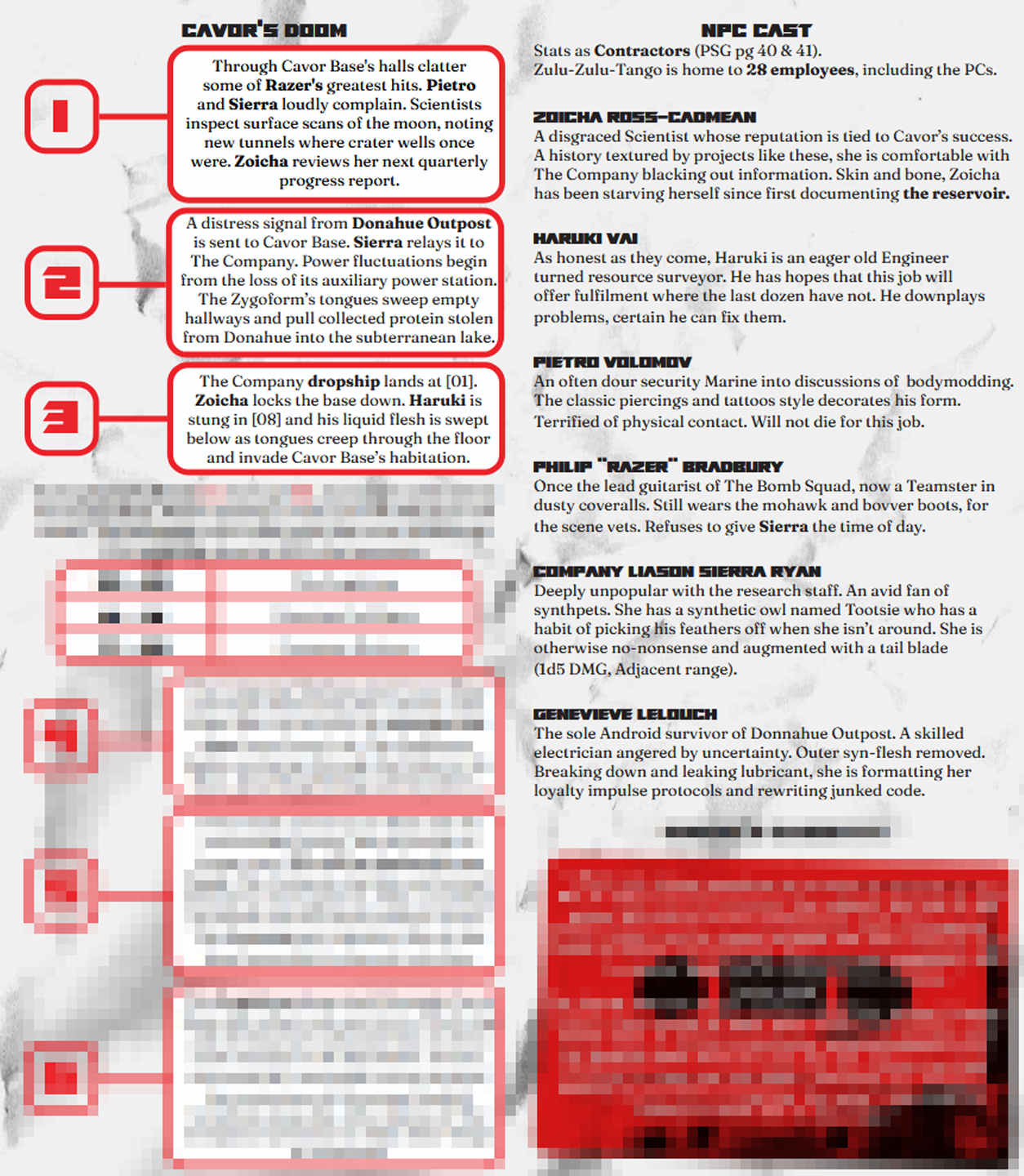
I assumed roll fold, so after the front cover I went to the left panel/inner flap and immediately encountered... Zoicha's cassette? Who's Zoicha? What's this lake she's talking about?
The most important information seems to be in the TOMBS section at the bottom of the middle panel, which is the last thing someone would see for a roll fold.
Okay, they're drilling wells, and suddenly there's tongues coming out of the lake. That's what I needed to know first,and less cryptically/poetically than you're presenting it. I appreciate that you're trying to be artsy/moody at times but it takes really refined writing to execute that without becoming confusing, so I would default to writing in a more direct and straightforward style for the important sections. (Side note: this is the second time I've seen someone explicitly include their TOMBS structure in a module, but I don't think that's the intent of the tool. It's a way to think about things as you're designing your scenario, not a recommendation for how to present the story to someone else.)
It would go a long way to replace the TOMBS section with the standard "What the players know" followed by "What the players don't know" sections, and put that on whatever panel you expect people to see first after the cover.
The interior spread is better but there are still usability issues. The outpost map uses symbols from the Shipbreakers' Toolkit without a key explaining them. I wouldn't assume the reader is familiar with any material other than the PSG, unless you're going to say "This module requires [XYZ] to play."
The index card with the encounter table is the one bit of "DIY aesthetic" I don't like, as the other things are all potentially "in-world" materials, whereas a D100 roll table isn't something you'd find lying around the base in-game. So having that presented that way is jarring and spoils the aesthetic. I think it could also be made more clear that this is for use during stages 4-6 on the timeline, not locations 4-6. Presenting it beside the location key made me think locations, so this is another example of needing to think about how you organize the information, keeping things that go together physically together in the pamphlet.
Anyway, having now thought through everything and re-read several times, I think I have enough of a handle on the scenario to run it, and it's pretty cool. But it was a lot of work to get to that point, so I would try to focus on making life easy for the Warden on your next attempt.
This was really thorough. I appreciate you taking the time to deconstruct my layout for the project.
This was really cool to read. Biggest points for overall look and vibes and generally just being wildly imaginative. I thought it might be taking a lot from Iron Lung but really it's its own thing. I have two major suggestions: firstly, it could use a bit of proofreading for minor spelling/grammar issues, as well as some fixes to readability (low contrast font/background at times), line spacing, etc. Secondly, it would benefit greatly from a short paragraph condensing the main idea at the beginning of the pamphlet. A lot of things are referenced before they're actually spelled out which makes the reader have to do a bit of mental legwork as they try to understand the adventure. Really cool though, great maps especially!
I like this module! Great flavour. I love the moonbase-meets-system-shock-2 vibe, and fitting a full planet surface point-crawl onto this little space is impressive. I especially love the "scattered papers" aesthetic to pack all the maps into the inside, it's scrapbooky and imaginative!
Two things I feel could punch this one up for usability and polish!
All in all, fantastic effort. Lake of stomach bile is going to haunt my nightmares!
Hey, this was incredibly cool to go through! Here are my thoughts and feedback:
+ Great Vibe and layout!
+ Evocative and concise descriptions for most of the events and warden-facing content
+ very plug and play!
- The room descriptions are a bit wordy; some trimming or reformatting could help wardens while running it.
- The encounter table is slightly hard to read
- unclear on the aim of the players beyond survival, it is no problem if the main horror cannot be stopped, but at the moment, it is a bit vague.
Hey CrayLives, I just got a word from TKG letting me know they haven’t received a submission for 3rd party licensing approval. Make sure you send your module as well as your contract in to 3pp@tuesdayknightgames.com
Thanks!
Hey there CrayLives, Please change the price of your submission from “pay what you want” to Free for the duration of the Jam. Thanks!
Oops, sorry about that. Will do!
Hey CrayLives,
my apologies, I have made a small rule change in favor of allowing submissions to be open for Donations, the edited rule reads as:
During the Jam you may list your game as Free or open to Donations. Someone pointed out to me that so long as submitters and judges download from the submissions tab instead of the individual pages, it will always download like its free. the original intent of this rule was to keep people from feeling inclined to donate simply to be a part of the Judging process. My apologies to those who were affected by this rule.
I hope this helps!