

Play trifold adventure
Paradise Park's itch.io pageResults
| Criteria | Rank | Score* | Raw Score |
| Favorability - how much do you personally like the submission? | #4 | 4.000 | 4.000 |
| Polish - How is the overall look/vibes/writing & design? | #5 | 4.222 | 4.222 |
| Usability - How "pick up & play" is this for a Warden? | #5 | 3.944 | 3.944 |
| Overall | #5 | 3.944 | 3.944 |
| Theme - How well does it match the Jam's Theme? | #24 | 3.611 | 3.611 |
Ranked from 18 ratings. Score is adjusted from raw score by the median number of ratings per game in the jam.
Leave a comment
Log in with itch.io to leave a comment.
Comments
hiya, looking thru ones i've already reviewed and noticed i must have forgotten to put my notes on this one! here's a super compressed version of those notes from memory--
paradise park had some of the best laughs for me throughout, dark as heck but uproarious. even a couple of days later i'm still thinking about the makeshift fort. i remember having questions about hinch and the "win" (survive?) state, but i forget what they were.
one of my faves i've read! lmk if you want more detailed notes, i know i saved them somewhere on my pc or phone. (i will be amalgamating them all once i am done reviewing)
Hey thanks! Glad you enjoyed it! And absolutely, any extra feedback you wrote down would be great
found em! apologies in advance for them being pretty scattered/disorganized!
now THAT is how you write a page 1. i'm primed, i have an idea of what is gonna happen, but now i NEED to know how it plays out. one of the best intros i have seen so far
(reading what happens next) oh this is FILTHY work. hahahaha well done.
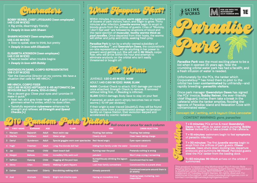
i like the stat blocks for the worms, very good way to represent some nasty leechy guys
i know room is always at a premium on these things, but id love to know more about petrice!
good lord. the makeshift fort. the sliding worm. these little details are SO GOOD. the mist, too?! you're relentless :D
cool to leave it open-ended, but what do you see as a win- (or, i guess more accurately, survive-) state for this adventure? clip hinch and take his ride? also how do you see including the love triangle into the nightmare?
awesome submission. you use the word "chaos" in here a few times and you are right to. delightfully depraved. absolute madness. great work!
Ahh thanks for the kind words! The only way off the orbital realistically is to swipe Hinch's ship or else survive until a theoretical rescue. My playtest players made it all the way to the service dock only to find their tanker had been stolen by panicked guests, and had to make their way back to the guest dock.
Very solid submission. It might not quite make my top five of the jam but it's definitely in the top ten.
I think this would only get four stars for Theme if not for the visual treatment, but I gave you a bump to the full five because I love that you went full on cute water park with the design and stuck with it even as you're describing little kids exploding in showers of blood. That, to me, emphasizes without directly saying to the Warden that they've got to play up the wholesomeness of everything in the early stages, before the gore starts, which is where it really becomes "beneath the surface."
There's potential for some great surreal dark humor here as the grizzled space marines, empty-eyed androids and neurotic scientists feel completely out of place at first in this happy, cutesy environment, before going "oh okay that's more our vibe" as the chest-bursting aliens show up.
I also think this is really easy to run as a one-shot. I feel like with my groups and my style of Wardening, most one-shots actually require two sessions to get through. But this feels easily doable in a single session, and you've made it simple to just pick up and go.
I've complained about the too-casual tone of writing in some other modules, but this is an illustration of how to make it work. It's thoughtfully casual, not off-the-cuff. Where you're using shorthand and glossing over things, I can tell you're thinking about the end reader, not just writing for your own benefit. It's easy to follow your train of thought because you're not skipping over anything that can't easily be inferred, and keeping all the information in a logical order. The informal tone also serves a specific purpose here in that it matches the visual presentation.
If I have to criticize something, the layout is a little sloppy here and there. It looks okay at a glance, but for those attuned to such things, you can tell it was a little rushed. I'd explore some other options for the body font, for instance. And the there are inconsistencies in terms of things like spacing between the headers and the text underneath them. Tuning up those kinds of things are what would take this from "very good jam entry" to "professional finished product."
Truly a fantastic submission! I have only a few nitpicks but otherwise I basically loved everything.
the nitpicks:
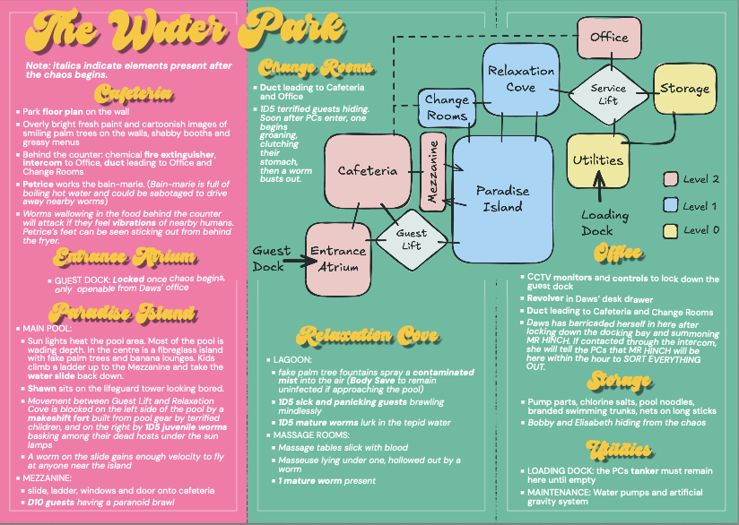
This is such an excellent module it deserves a full “Map” (I put map in quotes because I think it should be like one of those Disney Maps where its less a representation of the space and more artistically illustrated images of each location in rough proximity to each other.)
there are a few places on the map as is that aren’t described, if they are there more for vibes I would replace them with Icons on the map (like the Lifts and the Mezzanine could both be icons super easily)
I think you need a little more of a hook to keep the players here. as you have it now they are waiting essentially next to the Exit until things go down. I would change this to something like Daws needs them to finish up paperwork in the office as the tanks fill, then as the PCs are “Done” with the job and leaving the office things start breaking bad they see it in the relaxation cove and have a full view of the pandemonium in Paradise Island. This still lets Daws barricade herself in the room, puts the PCs in the middle of the action and forces them to engage even if their plan is just to head directly back to their ship and fly off… it also gives Hinch time to arrive.
Again sorry for only including things I think need fixing, its only because I liked everything so much that I’d just be writing a massive essay that all amounts to “this is great, I love this, I love the love triangle, I love the guest, I love the vibes… I WILL be running it for my PCs, and I WILL be supporting you once you do a post Jam version!”
Thanks for making something so cool to be a part of this Jam!
Thanks for the kind words and tips! It's been great to get lots of advice on improvements from everyone along with the nice comments -- I'll definitely have to make a redux version and incorporate everyone's suggestions.
Also, I'd love to hear about people's experiences running it! Love how differently an adventure can go every time it's run.
This feels like a perfect distillation of the horror of visiting a giant, corporate waterpark! There’s some intense dark humour in here and I feel like playing this as some kind of “evil dead meets that hitman from Fargo” vibe would be incredibly fun.
You've got a great visual treatment, I love mixing up the 6-panel format with the D10 Random Park Visitors table (also just love that kind of table for adventure like this with lots of bystanders). It has charming header treatments that are gaudy without being unreadable or ugly, a tough balance to strike! It reminds me of a visitor’s pamphlet in some ways.
On the critical side, I feel hierarchy of information is kind of borked, with headers and bold and italics being used kind of inconsistently. The idea of having pre and post disaster text is excellent but it needs to be differentiated with more than italics. I also feel that the statlines/traits for NPCs and monsters are listed without much visual treatment and feel harder to read than they should be.
None of these detract from the punchy, mean, darkly comedic core of this module though, and it's got a lot to recommend it! Well done!
An incredibly fun read & I love the aesthetic.
I am a sucker for random tables and I feel like I could roll up some interesting patrons ( A clearly drunk child covered in blood hogging all the pool toys!) Looks like it would be fun to spring on the players while on vacation leave. The NPC's seem fun and flavourful. Is Mr. Hinch intended to be an adversary when he arrives or would he try to get the players to help him. Could be interesting if his objective was to just kill everyone at the park and coverup the disaster.
This is a very fun nightmare in space-Butlins! Some great stuff, I've put my constructive criticism below!
+ Great idea, really grisly and fun!
+ Short, snappy and concise, but full of flavour.
- The standard font is a little tricky to read/low-contrast on the turquoise backgrounds. It is okay on bolded text, but maybe a weightier font or a darker text colour like that used for the logos and tagline would be kinder on the eyes.
- Some areas are shown on the map (mezzanine and the lifts) but don't have discrete entries, this makes a little confusing to parse, not a major thing but it did stick out to me.
- The font for the headers works great for the title, but for the room headings it is a little harder to read.
As a fan of horror comedies I loved this thing. The only reason I'm not running this asap is that I want the players to be to ones asking for a vacation.
I love how concise and on point every part is. The premise on the front and back could be enough to run something fun, the random visitor table contains so many great gags, and I could see a few hours of fun traversing that map. All around great module.
The one thing I'd like if you ever come back to this is maybe a different way to diferentiate pre/post work events, I can barely distinguish when it's italics, and a print friendly version (unless you're aiming to sell your own prints, obviously)