
Play game
Daikon Sphere's itch.io pageResults
| Criteria | Rank | Score* | Raw Score |
| Theme - How well does it match the Jam's Theme? | #22 | 3.789 | 3.789 |
| Usability - How "pick up & play" is this for a Warden? | #31 | 2.684 | 2.684 |
| Overall | #33 | 2.961 | 2.961 |
| Favorability - how much do you personally like the submission? | #35 | 2.842 | 2.842 |
| Polish - How is the overall look/vibes/writing & design? | #36 | 2.526 | 2.526 |
Ranked from 19 ratings. Score is adjusted from raw score by the median number of ratings per game in the jam.
Leave a comment
Log in with itch.io to leave a comment.
Comments
hiya, here are some stray notes i took while reading this one!
i remember early on seeing the name of the module and going "oh neat, daikons" and it was a few hours later i was sitting in bed and did a big "ohhhhhh" when the name clicked. very good!
god the agtech carpet bombing is so delightfully evil, i love it
i like the way it ramps up -- the night events table has some genuinely scary stuff in there to mess w players. and where time is relevant to the sites feels great too. unrelated but "they can't all fit inside the rover" sure hits like a bag of bricks huh. lot loaded into that sentence
death mountain is faaantastic. the terrain destruction. the shark fin. good stuff.
also the art in the project page is so great, lazy lil guy. throw him in the trifold too! :D really enjoyed reading this one!
Thanks for reading
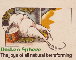
I actually had the lazy dude in there, but the picture has a bit of the original background color and I just didn't have time to properly clean it. Out of all the sacrifices to meet the dead line I feel it's the lesser one, but it's such a fun image that I had to at least use it as cover art.
I agree with the sentiment that this could use a little work on the layout front. Personally, a point-crawl map to connect the different sites would have helped a lot. I am not certain what tasks the PCs are meant to do on the planet, aside from 'QA testing' . I wish there was more info on the families in the bunker. Who are they, what are they like, what about their presence here could be made more dramatic?
The image of the Death Mountain is terrifying, I love it!
Cool trifold! Some comments in no particular order:
Overall, really cool concept, love the cheerfulness of the job brochure vibe, would love to see it slightly expanded for a multi-session run (and more random images of radishes).
I'm glad you liked the time aspect, the original idea was a take on depth crawls. I'm a bit worried you found the location font harder to read because I was thinking of making that the main one to save space and add stuff. I'll have to put the time to learn the delicate art of readablity.
Some of what you brought up is high in my to do list for the proper 1.0 version, I feel sorry for making people go though my rushed ESL mess. Now that we're almost done and no one will read this I feel okay exposing that I worried that if I fixed stuff I'd have to run it again through TKN and then not meet the deadline. No clue why I though it worked that way.
I have a couple more vintage radish pictures, including one where root vegetables are being dropped like bombs in a WW2 metaphor about productivity winning the war or something. I might find a way to use it, maybe I won't so I had to share that air dropping cover crops is apparently something people think about. Vintage art is always fascinating.
That sounds like the perfect image! 😆 Yeah we're all running each other through somewhat rushed messes -- don't stress on that.
I quite enjoy the mechanic of uncovering new information about a location every day you spend there! It makes for a great tie-in to the jam theme, in addition to the tie-ins made by the radishes and the presence of the Death Mountain. It's not just lip service, it's mechanical!
Unfortunately, the visual execution here doesn't hit the mark for me. There are too many different fonts used, making it hard to parse information effectively. I feel many Wardens will also struggle to give their PCs things to do, since Rover handles drilling/sample collection itself and most encounters boil down to "attacked by a monster." Making Rover less autonomous and giving PCs each a job during sample collection could make for more role-play and encounter opportunities.
That said, I think the Death Mountain is a great threat to build up to (Mothership Godzilla!), and the choice to remain at a location to uncover the full story vs. move on and conserve resources is a really effective one. With some more iteration and visual pass for consistency I can see this being a very strong module!
I really enjoyed the creative concept and play on words in the title.
A bit confused by some elements; mostly the 7 people in the Bunker not being able to fit in the 12 person Rover - there might not be over 5 PC crew alive by this point!). These NPCs are likely to be a significant source of drama/conflict, could be fleshed out more (especially if they attempt to take the rover by force!)
That's a huge catch! The Rover stats were the last thing I added and I never got to checking them, I'm also pretty sure it won't last long enough but I never did the math.
I was going for a moral dilemma, still solvable with creativity like dismantling the interior or tying a plant as a cart or riding on top. The survivors being an opposing force didn't come to me but that's also a potential angle if the players show no care for them.
Totally something to fix for the post-jam version.
Great work! I really enjoyed reading this. I've put some constructive criticism below:
+ I really appreciate the readability; the font size is good, and the text itself is clear and legible.
+ I overall like the layout and presentation of the text; it works nicely for me.
+ The idea is awesome, the cover page immediately sells me on the weirdness of the concept, and the name itself is great!
- The ordering of the pages feels a bit strange if it were printed and folded as the format implies, don't be afraid to lean into the restrictions/nature of the medium a bit more.
- There are several spelling and/or grammar mistakes, and the way the players/party is referred to is a little inconsisten., I think it just needs another pass or two for editing.
- It is a bit unclear as to why the rover needs to be housed before leaving on the rocket.
- Timeline is a bit misleading, as the extraction times are included with the travel times on the site description, it took me a few reads to figure out why I was confused by it.
- I assume the radishes become the white wyrms, but the text itself doesn't say outright., I think a small sentence or clarification would be easy to add in.
Amazing idea, suffering from a lack of polish on several fronts.
I love the idea of something wholesome gone wrong, and I'm pretty sure I've never seen radishes as the main antagonist in a story. Daikon Sphere is a great name. Full marks for Theme.
The typography is a bit messy, particularly on the interior spread, and there are grammatical issues with the text. The most distracting of those is switching back and forth between referring to the players in the second person, and the third person. Taken together, it makes the module a bit hard to follow.
I feel like there's an ordering issue for the panels on page one. The centre panel, which is the back of the pamphlet, has the info I would expect to find on the inner flap (left panel), and vice versa.
The locations are individually good, but I don't love that the players are forced to encounter them in a fixed sequence. As a player, after leaving each location, I'd expect to have some choice in where to go next.
Anyway, I think there's a super cool story here that deserves more design love. It's hard to fit a whole planet into a trifold, so maybe this is one where you'd want to treat the jam version as a prototype and go back to do a whole zine-format treatment of the same idea.
Thanks for the feedback. I wanted to give it a pass over and polish/rebuild it, so both technical issues and vibe checks are super helpful.
Locations are fixed because there are no indicators of what they'll find, so if it's random I though it could have an arc. Going from things that aren't a rush when they feel like they have time, things that are suspiciusly helpful and might be an investment of time when it's going bad, and the moral quandry when they're all out of time... but maybe it's more fun to have visual indicators?
IMO it's important to find a balance between controlling the order in which players discover stuff and giving them some choices that at least feel meaningful. You might perhaps give the sites descriptions like "A river delta," or "Rocky foothills" perhaps with some hints about what's there or why those sites were chosen ("suspiciously linear rock formations" or "a small but fresh-looking crater"). If you put the third one closest to the extraction point, they'll probably go there last and maybe it doesn't matter what order they do the first in. And then the bunker could become visible when they climb the foothills, giving them an optional side trek.
There's also the sneaky option of making certain important things discoverable at any location or guaranteed to be at the first one they go to. You don't want to overdo that as eventually the players will figure out that their choices are an illusion, but it works well if used sparingly for plot-essential things.
I felt I was extremely low on setting descriptions, adding the descriptions into other places like location names is a good one, I'm gonna use that. I consideredmaking it more of a point crawl than a depth crawl, and the end result is probably a weird middle point; I'll try to take all the input to fix it once voting is over so thanks for taking the time.