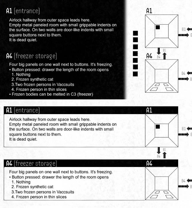
This is very quick-and-dirty and raises some other minor design issues that you'd have to fix (I had to cut a line from the A4 text to make the boxes the same size, for instance). But just to show you what I mean about connecting rather than dividing. It's not just the change of color in your version, you've actually got those little squares that visually tell the viewer "these things don't go together" when in fact they do.