

Play Adventure
Bone Farm's itch.io pageResults
| Criteria | Rank | Score* | Raw Score |
| Polish - How is the overall look/vibes/writing & design? | #6 | 4.184 | 4.313 |
| Favorability - how much do you personally like the submission? | #6 | 3.941 | 4.063 |
| Usability - How "pick up & play" is this for a Warden? | #8 | 3.699 | 3.813 |
| Overall | #10 | 3.790 | 3.906 |
| Theme - How well does it match the Jam's Theme? | #29 | 3.335 | 3.438 |
Ranked from 16 ratings. Score is adjusted from raw score by the median number of ratings per game in the jam.
Leave a comment
Log in with itch.io to leave a comment.
Comments
Bovine health and safety space terror! This setting is chef’s kiss. It’s such a cool idea. I would love to run this, the information and the timeline and the detail means you could run it as a really hard sci-fi version of Mothership. I think it would maybe need more set-up and preparation for the Warden than most of the submissions, but it would be worth it. I enjoy stressing the difficulties of the environment, really leaning in to the survivalist aspects and the ratcheting tension. This is a very unique and original way of setting up a story like that. Nice!
Great art, great theme... almost-perfect execution that just needs a little more thought in order to be fully Warden-friendly.
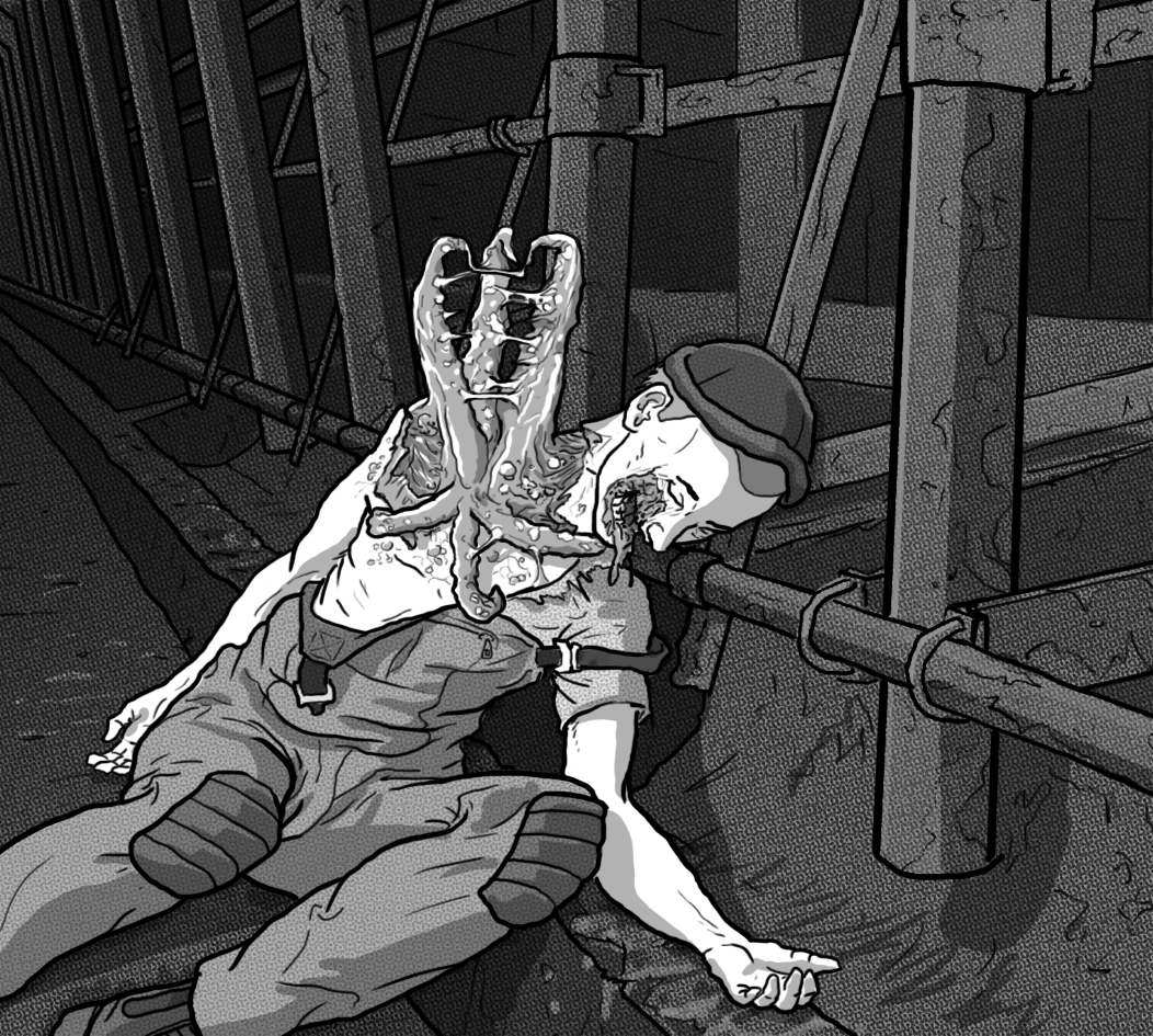
Firstly, superb idea to use a factory farm as a setting, taking real-world horror and a source of actual distress and anxiety and turning it into a sci-fi horror scenario. There'd be more room to expand on the implied-mistreatment aspects in a zine format but you did what you could in the space without sacrificing other things.
The most confusing thing I encountered is that you use a lot of letters that I didn't see explained anywhere. After some thought, I decided that it must be G = General staff, E = Executive, and S = Security, and the indicators by locked areas tells you which type of NPC could let you in. However, that really needs to be explained somewhere, ideally in an eye-catching text box, as it's crucial to understanding the rest of the text. (EDIT: After reading other comments, I see that there is in fact such a box, it's just not very eye-catching and buried away on the right side of the spread, inexplicably as part of the Orbital Transfer Station section. Best solution might be to design three icons instead and explain them immediately on the flap, as they're used throughout the module.)
What I felt was missing from the content was more information about the nature of the barricades and how to handle the stampedes. Also what the surrounding area is like if the players decide to venture out and take the fight to the cattle in some way. That would be easier to explore in a zine format but maybe you don't need all four D10 tables and could sacrifice one for a little text block about the environs and how the stampedes play out.
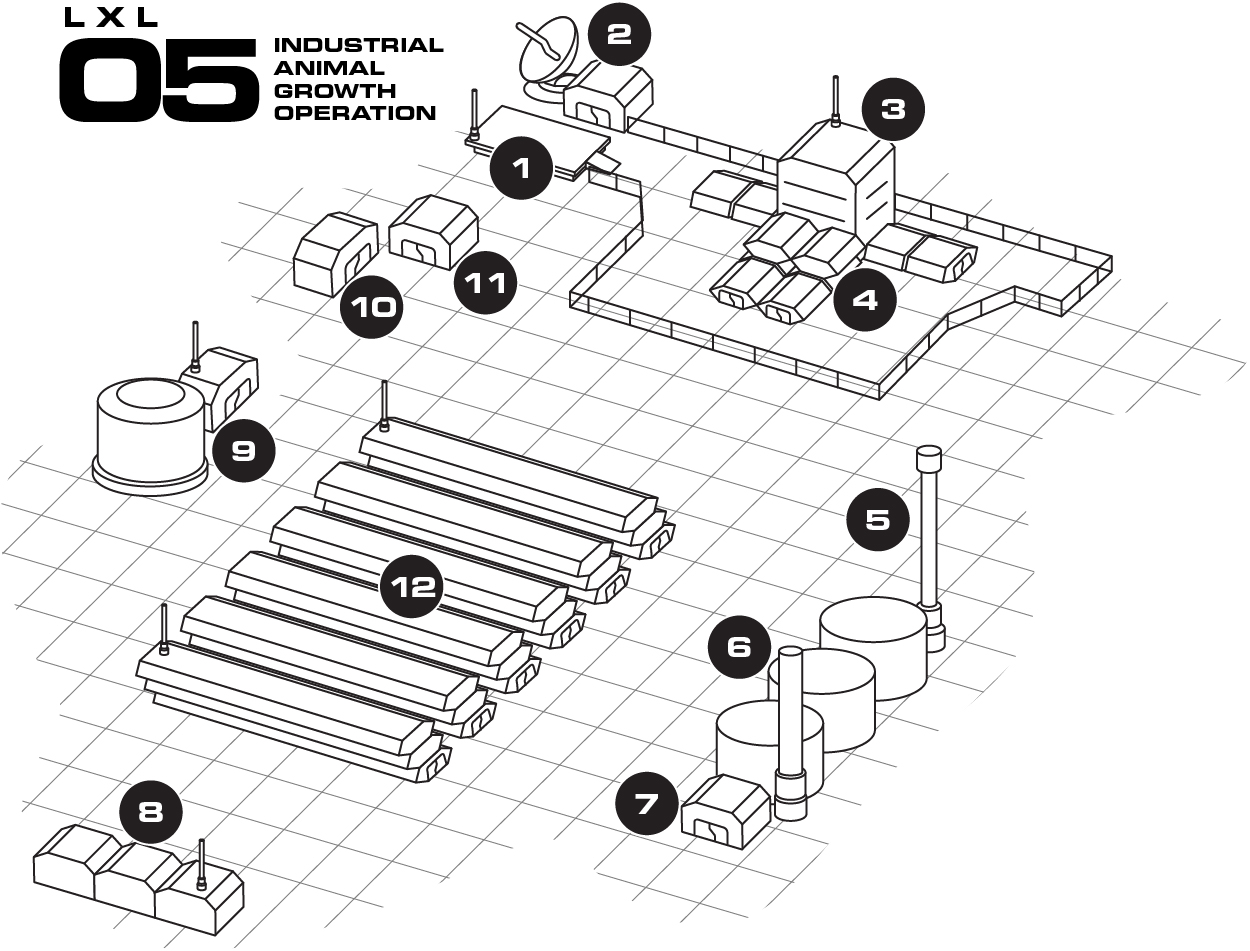
Some aspects of the graphic design aren't quite up to the standards of the illustrations... the text is wall-like and uniform, often crowded up against other elements. The perspective of the animal pens on the map isn't quite right (the layers are staggered towards us when I assume they're meant to be stacked vertically), etc.
Anyway, this is one that would make my shortlist for Best in Show, and that I'll probably try running at some point. Great work.
Thanks for taking the time and read and review! Appreciate the feedback!
Very clean look, very cool and eerie adventure setting! Nothing says cosmic/corporate horror like industrial farm full of mutated livestock! The small text is readable thanks to clear layout, and I really value that balance in a trifold. Great style and atmosphere. And I’d be remiss not to mention the ambient tracks you bundled in! That’s a really entertaining level of immersion. I put some tracks on throughout my review and I might be using them for my own games down the line.
On the critical side, I feel the Underground Connections are confusing as listed, could be represented visually on the map in some other way. I also wonder if it might be better for information on the inside panels to be presented in a different order - for example, “The Colony” section gives a high-level description of the farm operation, the origins of its name, etc. This is info that could be given to Wardens right away.
Great work!
Appreciate the kind words and suggestions for improvement, many thanks!
the map design is incredible and gives a great picture of where the adventure unfolds. While reading the key for the map I was confused by the abbreviations such as (E) and (G) and found the answer near the end of the trifold. Personally, it might make for less confusion if the description about the key cards comes before or attached to the map key. The art, aesthetics, and layout are all pristine with my only critique is I don’t like when blocks of text or how one of the tables spill over to another side of the trifold. I’m not sure if there is a way to finagle it so it’s all together. Reading this I really saw the vision that was put into it and I was already thinking of what I would do if I was to run it. I would like if there was some art of the mega cattle as both a normal or a demented would be add lots of vibes. Overall, I think you did an incredible job and you provided so much fun ideas I feel as if I could take the trifold and with minimum effort be able to run this adventure. Keep up the great work and I would love to see future projects!
Glad you enjoyed it and I appreciate your constructive criticism. Thanks so much for the feedback!
I can really see this module
Cheers LDD, thanks for taking the time to give it a look!