Play game
Social Anxiety's itch.io pageResults
| Criteria | Rank | Score* | Raw Score |
| Creative use of art assets | #316 | 3.019 | 3.019 |
| Overall | #358 | 2.872 | 2.872 |
| Overall polish | #368 | 2.731 | 2.731 |
| Engagement | #385 | 2.865 | 2.865 |
Ranked from 52 ratings. Score is adjusted from raw score by the median number of ratings per game in the jam.
Leave a comment
Log in with itch.io to leave a comment.


Comments
I tried multiple things on the start screen, expected to click on the buttons.
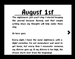
I like the combination of the pages and the gameplay!
Some nitpicking:
Hey! The concept for this game is really cool. I'm a big fan of games that explore mental health issues, so I love what you're going for.
It's definitely anxiety inducing. xD What really sells it is the music, which is an awesome touch.
I found the platforming to be a bit difficult. The player moves pretty quickly and jumps pretty low, so making them move slower and jump higher may help.
Overall, nice work. Congrats on your first Godot game! I would love to see more. :)
Interesting little platformer with an intriguing story. Some of the tiles were a little but unintuitive but once I figured it out it wasn't so bad.
An overall good game. The most monochromatic style was a good choice. Nice sfx, you made it yourself? Needs some visual feedback tho(for instance in the checkpoints).
Good style, fun diary. Had ghost collisions and would seemingly randomly lose. A good entry :)
Thematically strong game, the gameplay and feel of the game really work well together! Good job
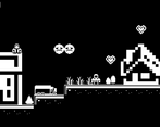
The alternative path over the roofs is funny. Though, I think the checkpoints need some work. I would have the flags be the checkpoints. I often got distressed right after respawning, since I got spawned very close to somone.
Nice little game. I would love to have some more polish like player animation or particle effects but I really enjoy the mood of the game!
Nice little game. I would love to have some more polish like player animation or particle effects but I really enjoy the mood of the game!
The story and idea behind the game is really great and the game mechanics supports them really well. I really liked how the story was told. There is no design category but the score there would be very high.
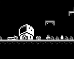
The worst part were the controls and that made me a bit anxious since I run into people many times without too much control. The collision box of some platforms was not clear (like trees or houses) and I found myself jumping without knowing if I would land on the people or on top of the houses.
Great job.
love the use of alternate paths for avoiding people. Interesting game.
The lengths this person will go to to avoid others in the nightmares is amazing. Jumping on buildings, cars, etc. It was a fun. Good job!
I really like that this game has a story. It definitely adds player motivation, rather than just being a platformer. I can tell you put thought into that! Nice choice for music, too.
I didn't notice my distress decreasing when I paused at the white flags, but I'm not sure.(I actually saw it happen on the second level, so maybe I missed it on the first?) Also, you might look at some ways to make the movement smoother (like with acceleration/deceleration), as currently it feels a little snappy--if you understand what I mean.Awesome job! I'll have to give your game jam a watch! I am hoping to make one for my own, but I have a LOT of footage to go through.
Love the concept! Others have mentioned that the gameplay was difficult and I agree but I am a fan of the game
While I enjoyed this game’s atmosphere and commentary, the most important part of the gameplay: the platforming, isn’t executed very well. It doesn’t feel right to not be able to jump up when you’re under a building because there is no way to tell what’s a platform and what’s not. It should allow one-way collision so that being on top doesn’t fall through, but being at the bottom, you should be able to jump over. There is no coyote-time, controls are floaty, respawn time is too long, hitboxes of enemies are too large, and when you get hit you get repositioned to the same plane as the enemy with no invulnerability which means you can essentially get one-shotted. With that said, this game has some potential, keep it up.
Quite an engaging story and the atmosphere was crafted beautifully. Quite hard for me to get through gameplay wise.
Can't point to why I had trouble with movement but jumping with something other than up would have been nice. Also got knocked back into inescapable positions a few times.
But overall a great game. Just some minor things that need tweaking. Keep up the good work
Always love a small game with a compelling story! Sure, the gameplay is a little rough around the edges, but definitely isn't bad considering you did start using Godot only a few weeks ago! Also you have a devlog and that is awesome!
This game was awesome. Probably my favorite so far.
My one major complaint is the knockback whenever you come into contact with a person. I'd get sent back immediately into a different person, making me distressed again without getting a chance to do anything.
loved the story and the gameplay , very good game !
This is exactly what I do when I'm in public. One critique is to expand just a tad past the monochrome and use color to indicate what's background and what's a foreground platform.