Indie game storeFree gamesFun gamesHorror games
Game developmentAssetsComics
SalesBundles
Jobs
TagsGame Engines

Mobility! The accessible precision platformer - OUT NOW!

A topic by Auroriax (Tom H.) created Feb 25, 2016 Views: 8,530 Replies: 47
Viewing posts 1 to 42
(2 edits) (+1)


I love precision platformers, but they've always been really difficult. Mobility is my attempt to make the genre more accessible, with different difficulty settings, accessibility options, and a browser version. (Die-hard fans, though, can also ignore all that and just play everything on the highest difficulty. Your choice!)

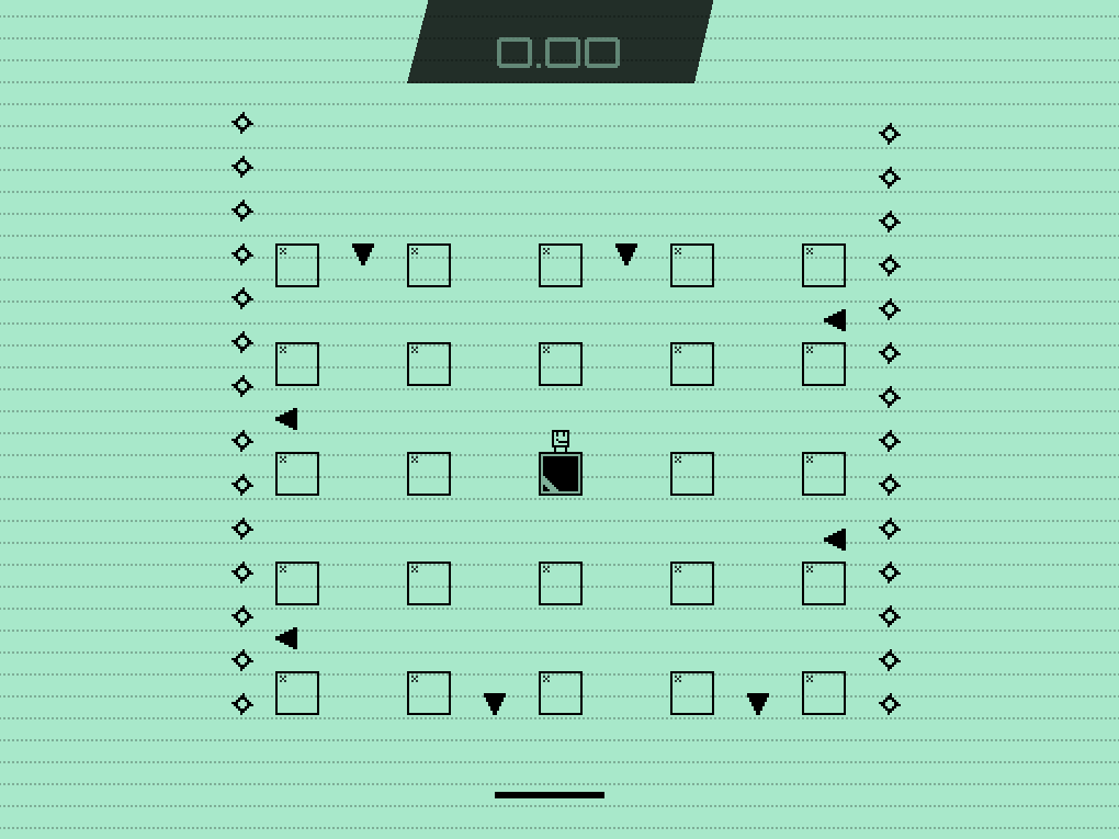
In Mobility, every platform is a switch you activate upon contact. The goal in each level is to activate all platforms, making each level a little puzzle, especially when you're attempting to score a new record. In the story, these rooms are engine rooms on spaceships that you (a repairman in training) has to fix.

I made this game over two years, in my free time during my game design study. While I am not charging for this game, if you enjoy it consider voting with your wallet to support me with making more games in the future. Mobility! was released on the 17th of February, 2018. You can play it here.


What follows below is the original first post of this thread, put online on the 25th of February, 2016.

Mobility! combines the super tight controls of Super Meat Boy with the extensive moveset of the 3D Mario games. The goal is to touch every platform on the level once by either landing or walking on it, or sliding down from its side.

https://gyazo.com/1051b451d0ac20ff2191d3b1c36cf7e2

The game aims to provide a fun experience to new players of the genre by it's inclusion of multiple difficulties and checkpoints, and tries to satisfy the profs with a solid competitive experience with replays, leaderboards (WIP) and secret super difficult levels (WIP). The levels will be accessible via a mini hub which doubles as a training ground and will hide some secrets of its own. This GIF shows a level that flows very well, but I'm also planning levels that require more routing to achieve the best time.

Updates on this 'log will mostly focus on game design, with an occasional extra topic every now or then. I'm trying to update it every week or so. Mobility! is developed using Game Maker Studio, by Tom 'Auroriax' H. (@AmazingcookieNL) and a very large amount of apple juice.

(+2)

https://gyazo.com/1db76aa92a49d907c8d807a03d6e1398

Been working on a new level which uses the plasma conveyors (mid-air conveyor belts!) heavily. I'm quite happy with the result!

My brother has also joined my team to design levels. He's also a hobbyist game designer and helped me out in the past building levels. I was using Bitbucket + Sourcetree already to sync the project between PC and laptop, and it was surprisingly easy to add him to the project and set up things for him. (Kudos to the Bitbucket team!) Here's his work so far:

https://gyazo.com/7d0a861d99db0907ba483a0a96dcbde3

Tons of bugfixing today. Moving platforms are always difficult to get entirely glitchless in a platforming game. And if you get hit with a spike, if you hit a block while the level transition was playing, the blocks you would hit would still get colored in.

Have I told you about our reset level button? In most time trial focused games, you have two keys to quickly reset the level. One is restarting from the last checkpoint, and one is for restarting the entire level and the timer. Personally, I often mix these up. If I'm used to quickly running levels, for which I often do a full reset if I make even the slightest mistake, when running a harder level I often press level reset instead of checkpoint reset, which prompts me to restart the level with no undo.

So in Mobility I came to the solution that pressing [R] resets to the checkpoint, and holding [R] for ~0.3 seconds resets the level. This works quite well, actually, and solves the problem for the most part.

Okay, bonus short story!

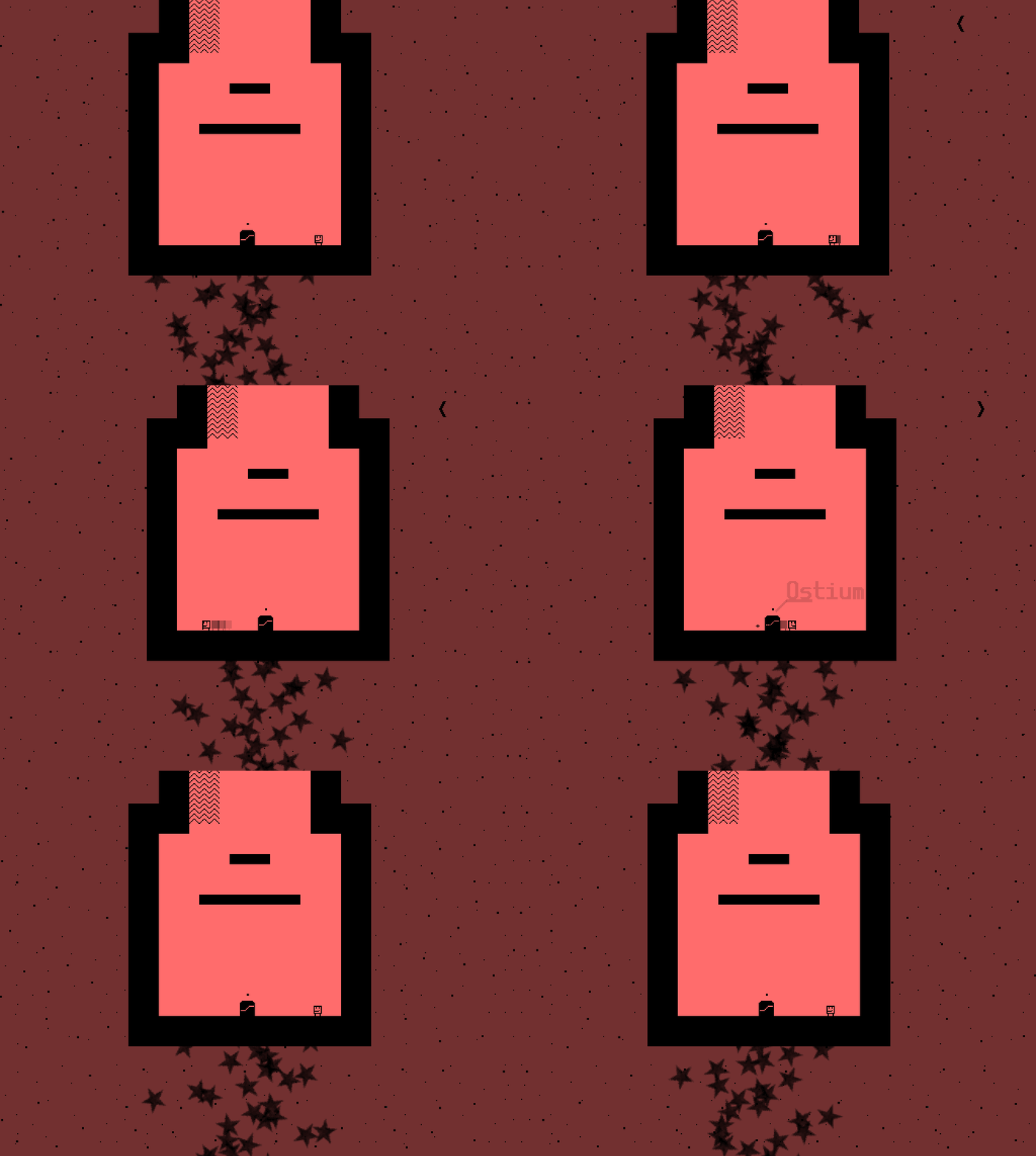
Unidrax (see last post, he's building some levels for Mobility! currently) saw the names I had given the levels so far (Vertigo, Xenon, Gold), and that inspired him to translate random words into Latin and use those as level names. This already generated some awesome names like Ostium ('door') and Magna ('big'). He comes with crazy ideas like this all the time but it's the most genius when it actually works out.

Short post! Today I implemented a new timer. (I had to write a script to draw parallelograms, but it was worth it!)

https://gyazo.com/c87f05fa45101080b96f542940bfca4b

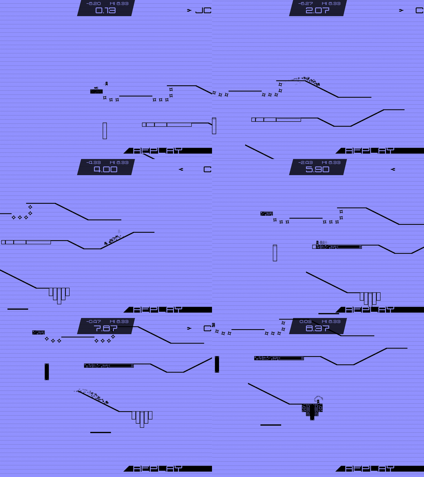
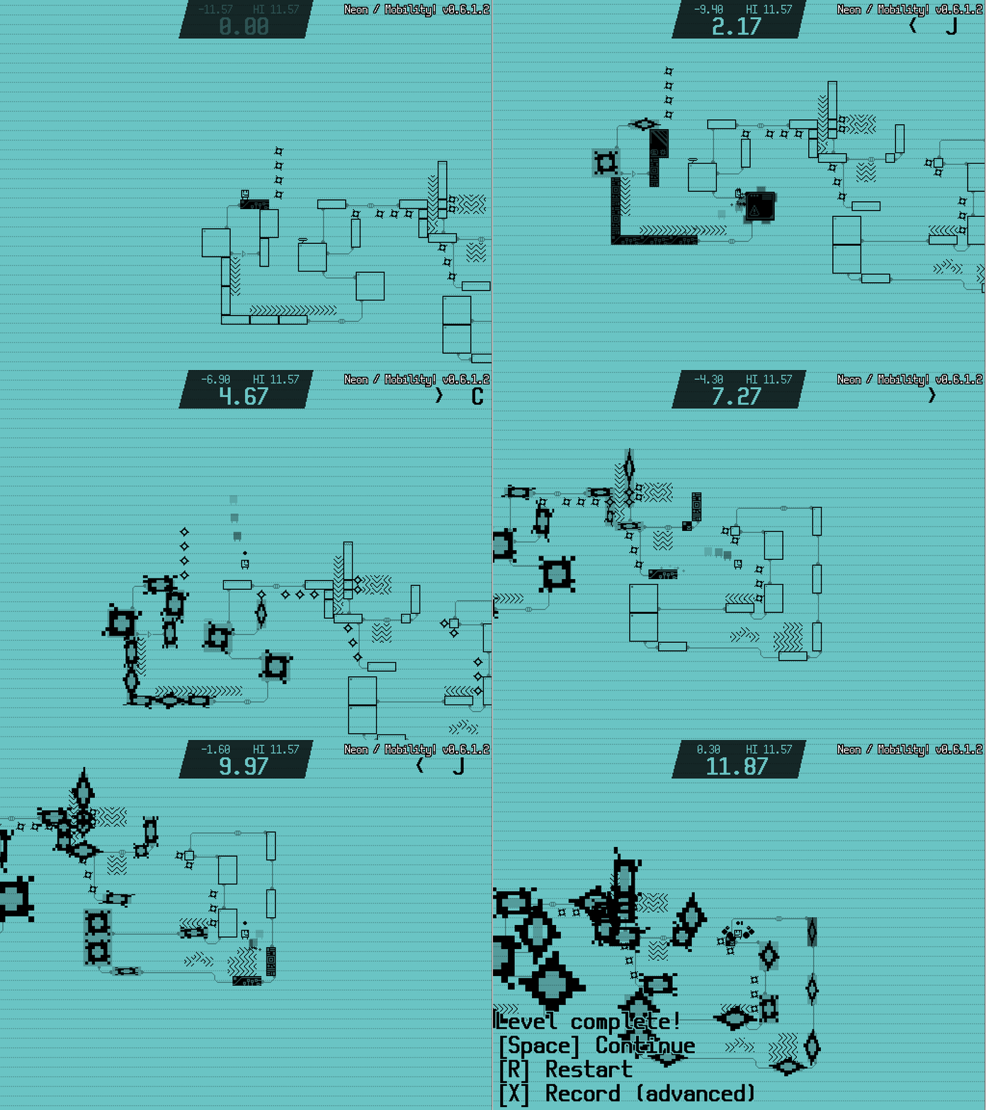
As you can see, the current time is the most important bit of information. Above that is info that relates to the highscore. Right is the highscore, and left from that is your current time relative to the highscore. So if you beat your highscore, you can immediately see how much your record has improved. (The font I'm using is Beamo, by the way.)

And if you beat your current best time, your now-previous highscore gets crossed through!

https://gyazo.com/f6962c7d7c5604b42d7ebf25435d7313

(+1)

In AAA parcour games, the player is often led in the right direction by level design and colors. You don't have that luxury in a 2D hobbyist game, but what I'm attempting comes close. See this screenshot:

https://gyazo.com/7eb4307b75ce05021544b7b31a436145

It feels a bit messy. Unless you're used to how the game works, you have trouble deciding where to go. Which is why I introduced cables. Here's the same screenshot with cables attached to the blocks:

https://gyazo.com/b10d504cc06d63fdca7a091d83048bd6

Now, the level flow is much clearer overall. You can see where you are intended to go next, and the cables lead you past all blocks on the stage.

The winning condition of the game is touching all blocks in the level. If the goal was placed on the leftmost platform in the above screenshot, the player could've simply backflipped past the spikes left from the start position, using an unintended shorter path. (In speedrunning jargon this is called skipping.) So if competive races where done on these levels, it would be about traversing the intended path the fastest, instead of trying to do a frame-perfect (speedrunning term for near perfect timing required) trick to skip half of the course, the very winning condition closes that possibility. It might still be possible from time to time, but all major skips are closed this way.

But with this ruleset, an entirely different type of level becomes possible. One where planing a route ahead will be necessary to get the quickest time. Compare this screenshot to the ones on top:

https://gyazo.com/6d173968b83dece66e01d7d8662e8c60

This level is more open, and also contains some moving threats (the floating spikes will actually start to move as soon as the level starts). So you'll need to plan a route ahead of time to get the fastest time on these kinda stages. This level also plays incredibly different on all three difficulties, more so than the parcour-type levels.

To finish, here's another GIF from a level Unidrax made:

https://gyazo.com/ec03f714e5db3c0815a80a7dd95c9960

I'm going to put the GIFs on top of my posts from now on to grab your attention:

https://gyazo.com/5b3e10f799b0fbd6db64a43457b7dacb

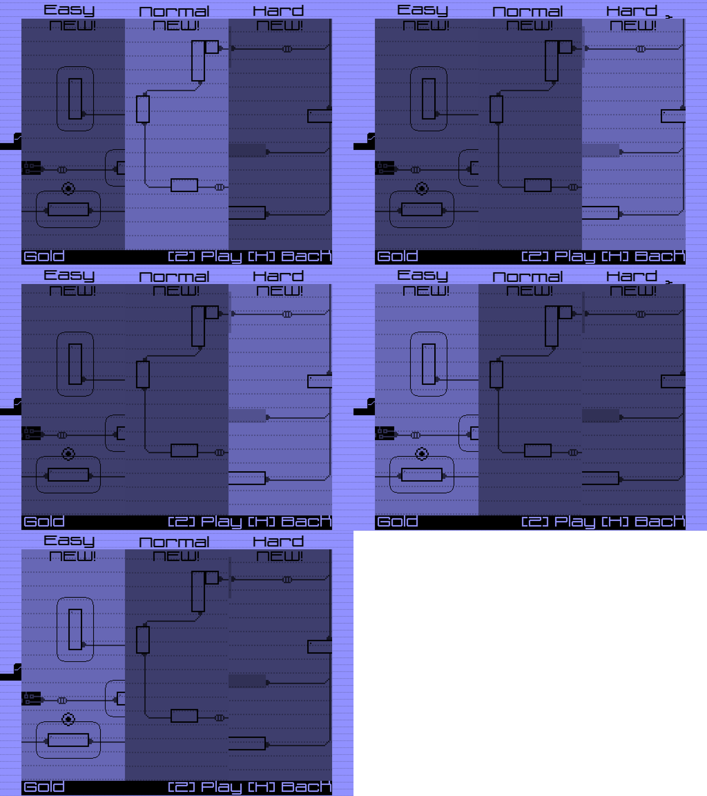
Bugfixing and implementing pause functionality today! Apart from that, I updated some interfaces. Here's the new difficulty selection:

https://gyazo.com/ba94beea27f3bcabf19a00bf927c1f58

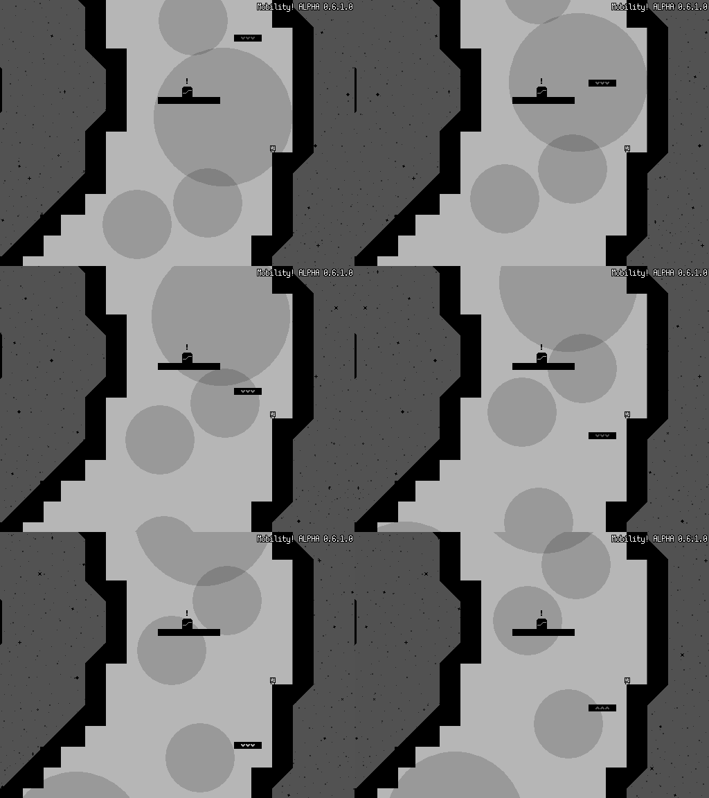
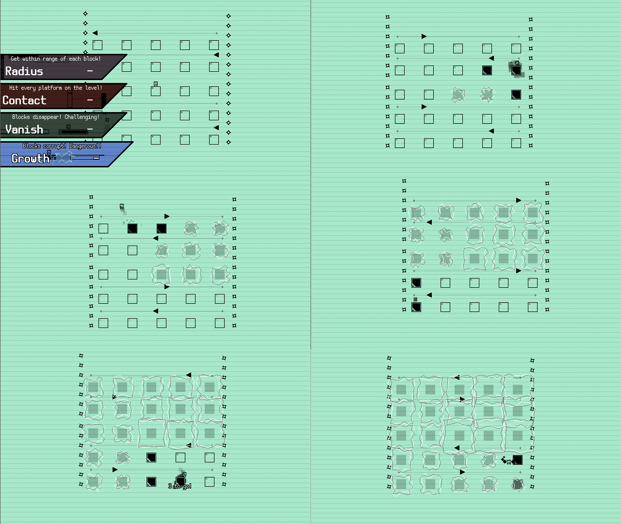
I should talk a bit about the differences between difficulties. The goal of each level is to touch all blocks on it, as fast as you can. Normal difficulty is the difficulty the game has been designed around, where you can walk or slide from the block's sides to activate it (but not from below, like you would do in Mario games). The easy difficulty puts a radius around each block, which you must enter to activate. That radius grows each failed attempt, so less experienced players can never be get stuck on a level.

On the hard difficulty, blocks disappear soon after being activated. While you can rest on the block you've just activated (the block will not disappear as long as you're still standing on it), it generally means you have to haste. In addition to that, all checkpoints are disabled, and while each level is about 20 seconds long, it still means you'll have a tough time.

The difficulty selection appears before you enter a stage, so difficulty can be selected on a case-by-case basis. While you mightn't know yet which difficulty you want before you enter, you can change it by simply exiting the level. It's much better than a game where you are asked to set the difficulty before you know how difficult the game actually is, and can't change the difficulty later on if you change your mind later. These multiple difficulties are also intended to make the game more accessable for everyone.

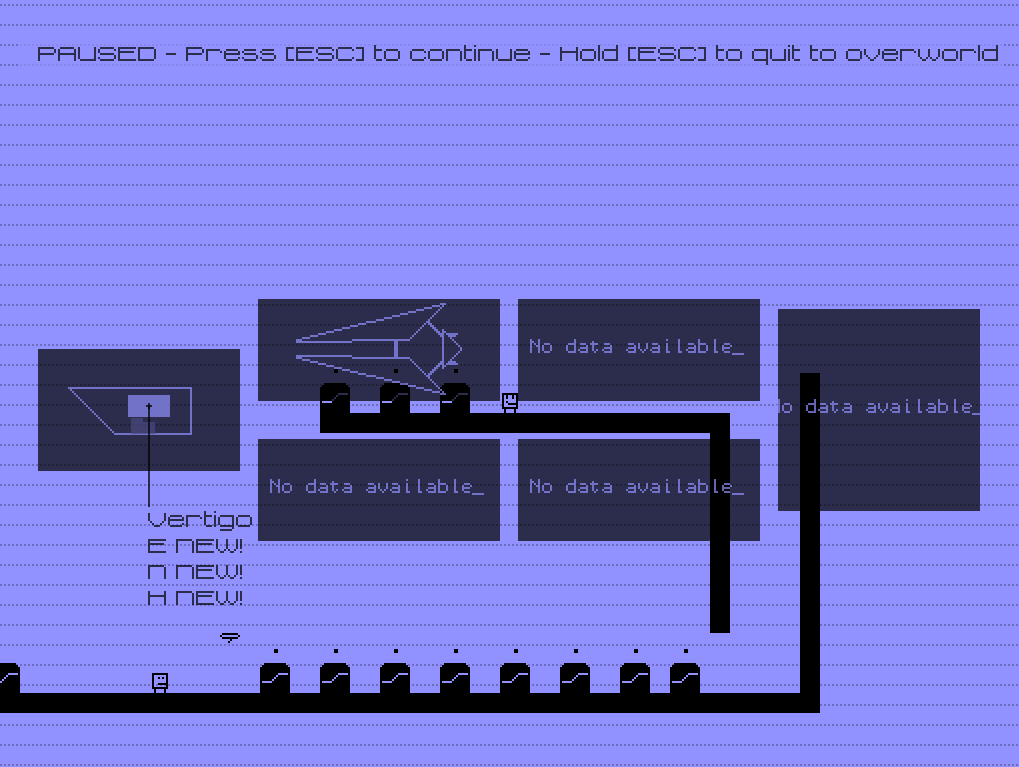
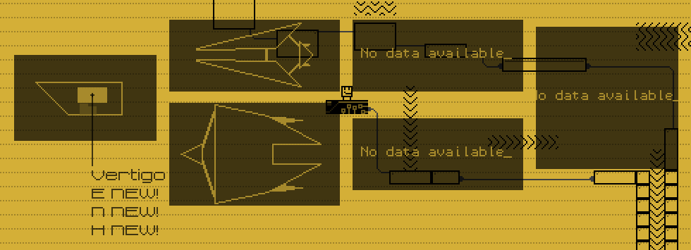
Some good progress since last time. Today we decided on some story and overworld criteria. The player character is training to become a spaceship repairer. As such, the overworld consists of multiple spaceships, which you can travel towards per teleporter once it's unlocked.

As such, I've been working on a way to create a map of the world that operates as automatically as possible. See here:

https://gyazo.com/08eedb3f09507cdb7fb3301543a68811

The room the player currently is in, has a brighter color than the rest. On the map you can also place notes that indicate you can access a certain level there, and it'll fetch that level's name and highscores. The second ships' design was done by Unidrax, which sent me this ship design which I then redid in the game's single-color style.

https://gyazo.com/20e515594deedf7cf23e4fe9ee01e117

And finally, we have a walking animation. [MP4]

https://gyazo.com/c96e2c593982fcd19efc3fb83f669ed8

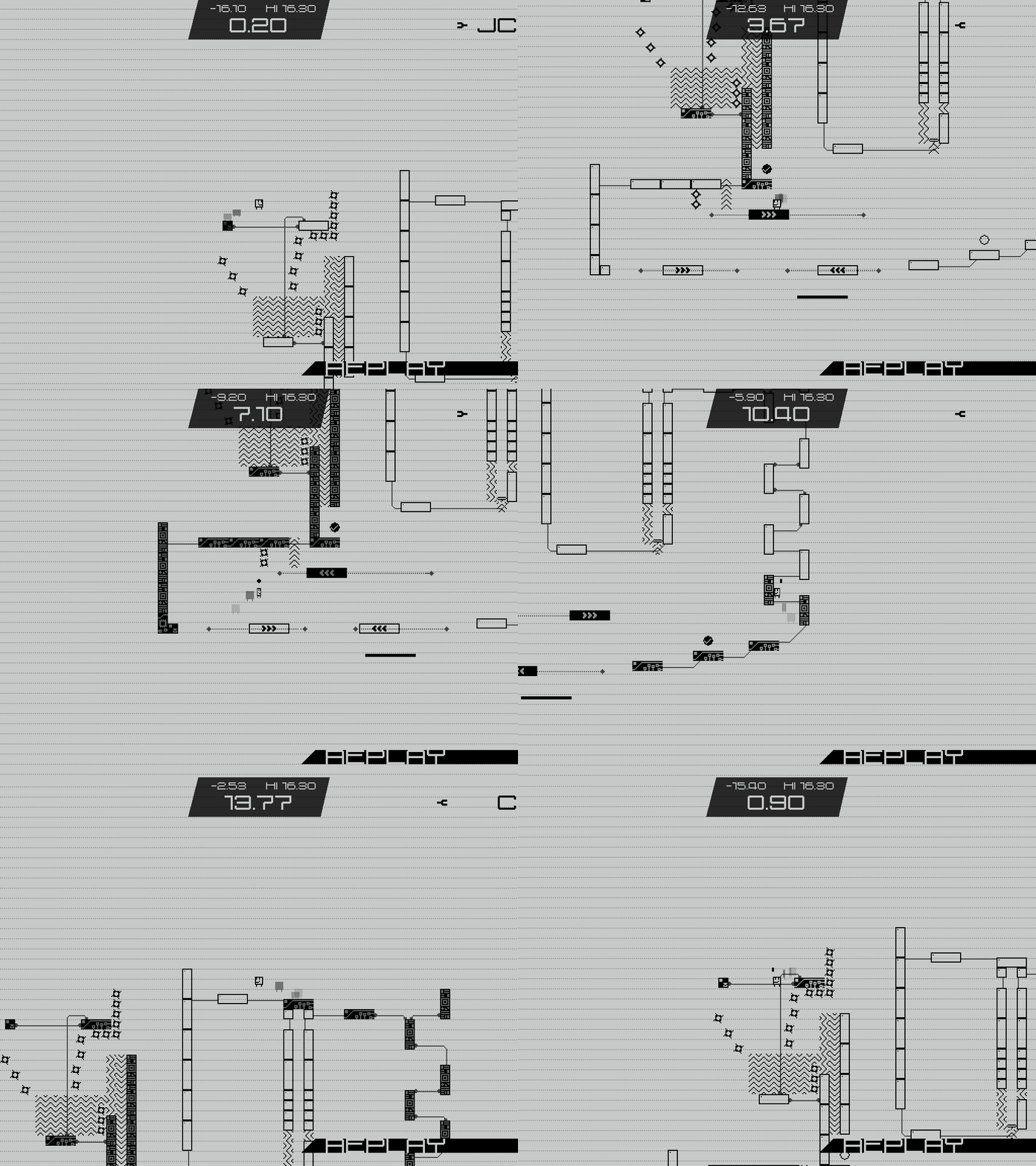
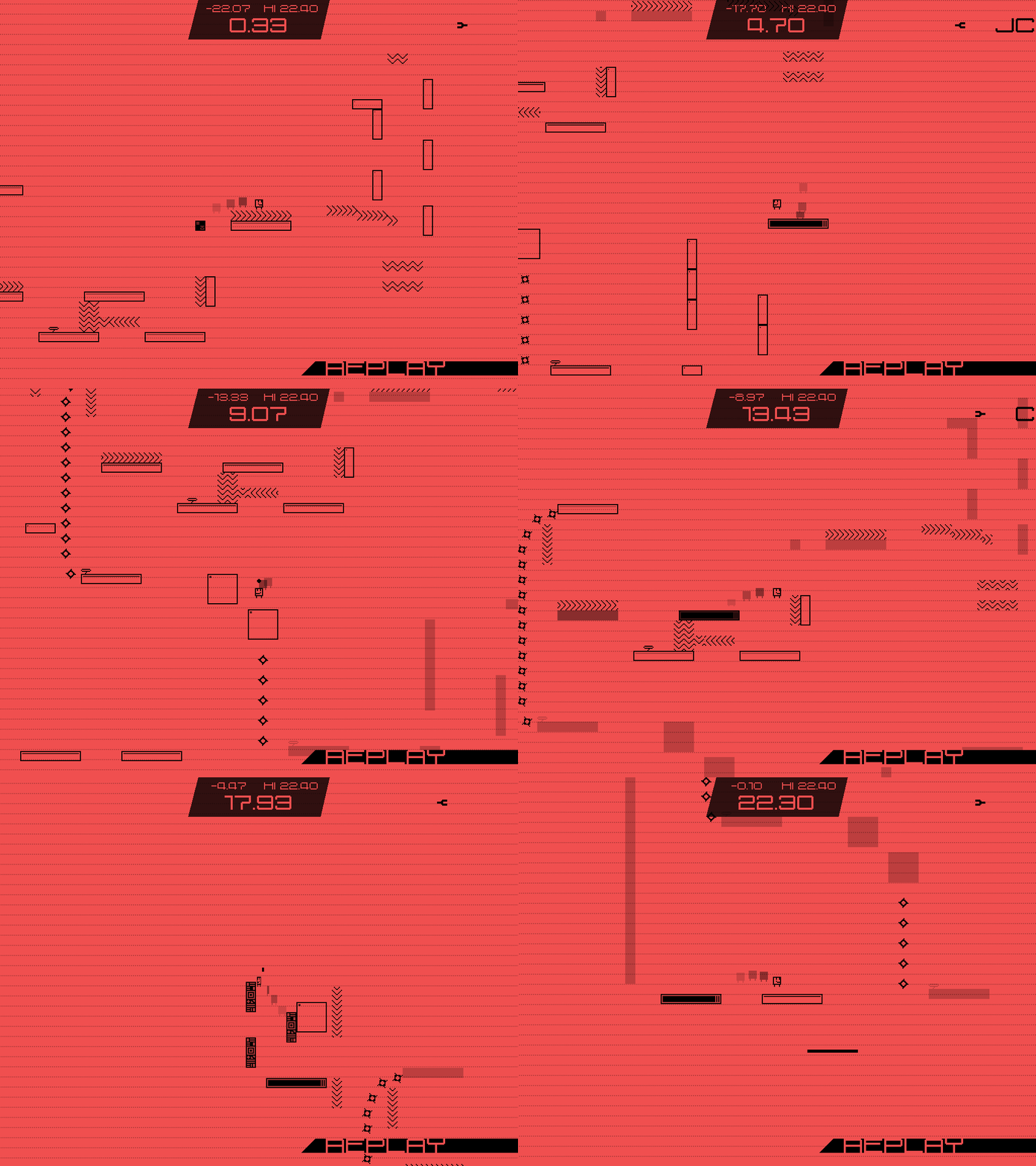
Yesterday I worked on a way to store a replay as a saveable file. The goal is to use the GameJolt API to upload these replays with the scores to the leaderboards. As such, I am especially watchful for ways to reduce the file size of these replays to make uploading them as smooth as possible.

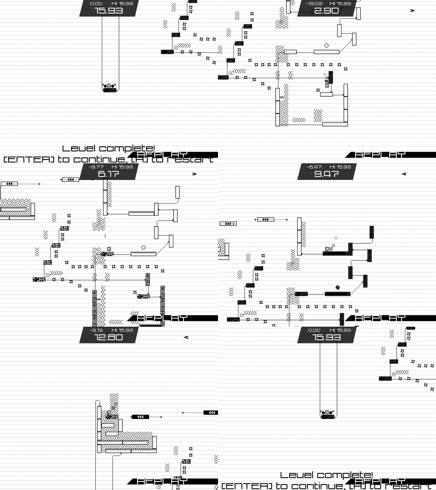
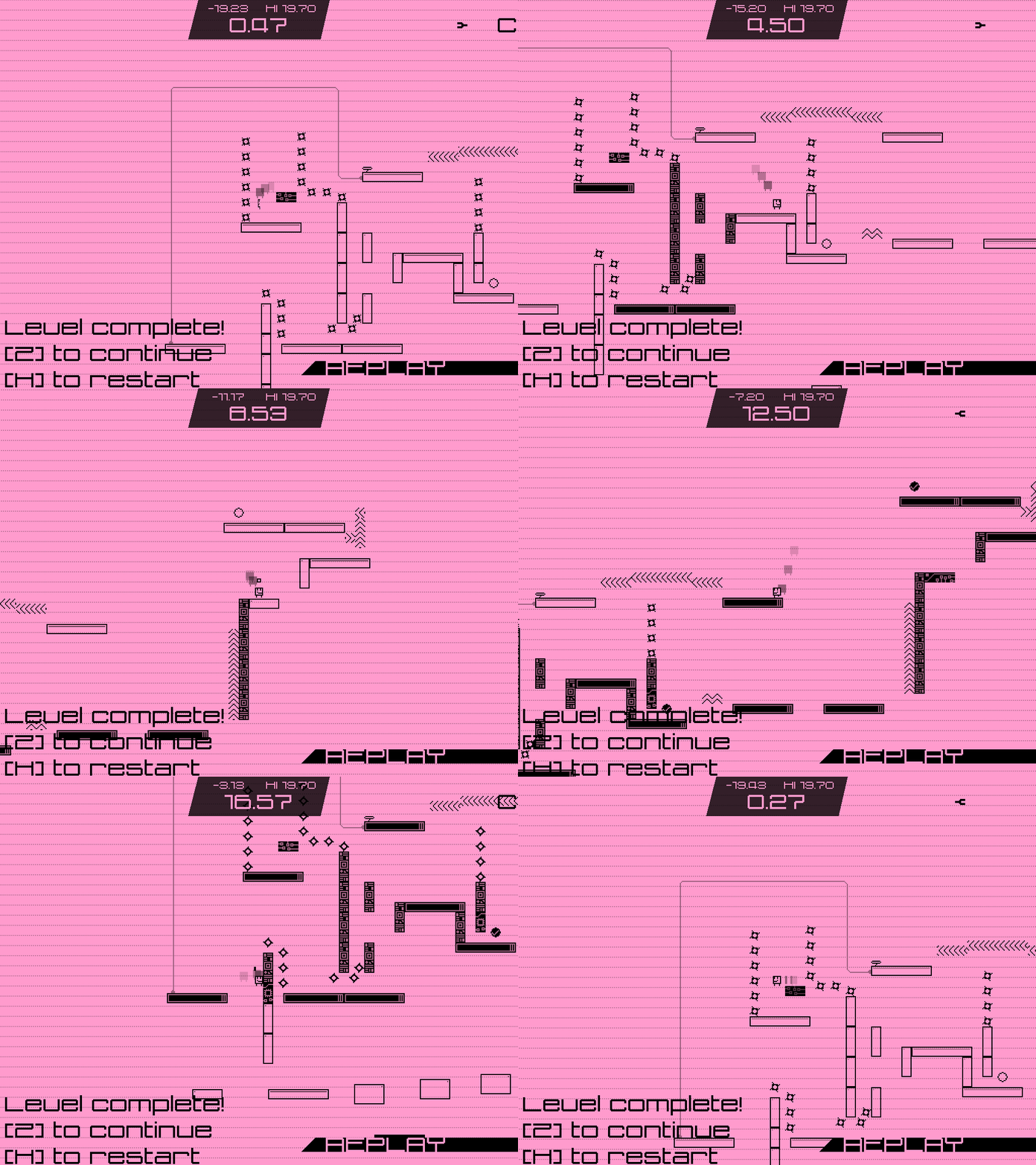
This is how replays work in Mobility: Once the players hits a button, the timer will start running and the playthrough will be recorded. During the level, an array is updated each step/frame with the buttons that register presses. If the player reaches the finish, the game restarts the level and starts the replay, and will repeat all button presses the player made. The game is re-enacting the playthrough.

The big upside of this replay system: very low file sizes. The game records the state of five buttons, so for the length of the replay, that theoretically means five bits (or rounded up to one bit) for each recorded frame is enough. The downside is that the replay could desync, not be identical to the original play anymore, if the game logic during the replay is handled differently somewhere in the game. Even a single desync could quickly ruin the replay. Today I've been hard at work minimizing the possibility of desyncs.

To submit the replay to the GameJolt API, it needs to be formatted as a string, but the replays are recorded in-game as an array. So we need both a script to turn that replay array into a string, as well as translate it back to an array.

This is what the script that turns the array into a string does:

- It checks for the frame which buttons where pressed, then turn that into a single number/real. (It adds one if Left is pressed, two if Right is pressed, four if up, eight if down, 16 if [R].)

- It turns that number into a single string character that represents that number. (so 1 becomes '1', 10 becomes 'A', for example)

- It adds the new character at the end of the current replay string.

It does these steps for as long as the replay array is. If you want to get an array out of the replay string, you just do these steps in reverse: take a character from the string, find out which value that character represents and set that value, and from that value, figure out which buttons should be pressed on this frame.

Next up, I'm going to look into a way to reduce the file size of that string. Right now, the amount of frames in a replay equals the amount of bytes. I'm sure I can get that smaller somehow.

And a small update to the map screen:

https://gyazo.com/5ec7509bb0d73ffde79ba8c967449aeb

https://gyazo.com/586f87fca0577026a10f3b3505b2ac30

Okay, so I managed to reduce the data size by about 40%. If two of the same characters appear after each other, it'll replace it by one character, but capitalize it. Since this data needs to be uploaded as a string anyway, this only reduces the data size as a result. I think optimizing things like this, packaging the same info in less data, is a super nice puzzle to figure out. I did something similar to Mobility's replays in the Box Kickers X's level editor, trying how to save what is an array in-game as a save-able string.

In the meanwhile I'm having another little dilemma. I even stepped in at the Indie Dev Hour for opinions. As listed before, the game has multiple difficulty levels, Easy, Normal, and Hard. Normal is the experience the game is designed around. Easy simplifies it by making it easier to activate the platforms, and makes this even simpler if the player is having trouble. Hard is the opposite, all checkpoints are removed and platforms appear shortly after they are used by the player, and is severely more punishing. Another earlier post in this dev log describes it in greater detail, but this is enough to understand my problem.

The problem is the naming convention. Hard should actually be called something like 'punishing', since it actually steps up the difficulty by quite a bit from Normal. Meanwhile, Easy should have a label like 'Beginner', but it mustn't make the player feel that he is a beginner (or 'noob'), but making him free to use it if it doesn't work the normal way (some people have that tendency against handicaps, accessibility features, or Nintendo's Super Guide). 'Normal' indicates that it's the intended experience, so that name is quite okay, unless I find something better.

It might seen as a little detail, but it's quite fun to find a solution for it and the final product will definitely be better thanks to all these small design thingies. I'll let you know if I figure out some good names.

One of my fave indie game developers Two Tribes announced that they're shutting down after the release of their final game RIVE this September. Kudos to them for being one of the reasons I got into playing indie games in the first place.

For names of the difficulty, for Easy I'll pick 'Relaxed' or 'Chill'. This indicates that it is a more relaxed or less taxing way of playing, while not necessarily indicating it's easier, although that can be derived from the name. Most likely it'll be accompanied by the byline 'For everyone!'. For Hard, I'm thinking of using the name of the game ('Mobility!') as the highest difficulty name. This is a thing done often done for osu! levels where the highest difficulty level name is a small joke that relates to the song or song name. And accompanied by the tagline 'No mercy.', this will draw in the good players while keeping the others away from a punishing experience.

In the meanwhile, my level design partner is making sure my bug fixing list stays filled. Unidrax messes around a bit and before you know it your buglist is one addition richer. It's a gifted ability of him. Today, he found out that if you hold a button and then unfocus the window, the game never registers that button being released and keeps thinking you've pressed it. We use Gyazo to quickly record and share bugs. After that I throw it on the list, and will keep it in the back of my mind when working on the game. It's never a bad idea to have (someone else) thoroughly bug test your game.

Thanks for reading!

(1 edit)

Slow progress last week. My partner was busy with a test week, so I figured I would work on my other project, a Sokoban-inspired puzzle game, which seems to be nearing completion. Talking about that seems out of scope for this 'log, but it's coming along nicely, although each individual puzzle takes a lot of effort to create.

The only new additions in Mobility apart from bugfixes were new levels, of which I'd be glad to share a GIF from.

https://gyazo.com/6a40f242b51a323f687ad84476c2cf79

I'm starting work on the overworld. It needs to be a good place to practice, not too big or difficult so it's easy to get from A to B, and act as a breather for the difficult levels scattered across the map.


Here's the dialog system. It automatically adjusts it's height depending on how big the text inside it is, which is a huge boon. Furthermore, the text is quite big, the text has shadow while to box itself is slightly transparent, which all goes into making it look cool and minimalistic. I'm planning to scatter a few of these talkative spaceship employees to give the player tips or just start some small talk.

Just finished fixing all the desyncs in the replays. It's actually pretty tough to find out what exactly is the reason the replay is not equal to the played game. As explained above, the game records which buttons where pressed on each frame, and 're-enacts' the playthrough. Often a desync is caused by values being overwritten or the key pressed of a single step before. I've been struggling with this for some time now so it's good to have this out of the way.

Spent most of the past and this week working on a Picross/Nonogram client, but it's code turned out to become so incredibly messy and buggy that it's simply no more fun to implement features into it (alongside other factors). So I hope to pick up speed with Mobility again, although I have a hard time deciding what needs to be implemented first. I'm thinking of working towards a playable demo with a part of the game all wrapped up, and use it to test and gather some feedback to shape the rest of the game. I'll see.

I don't know how I haven't seen this before, this looks great!

Thanks!

So I've been working on support for multiple characters! All characters need to fit 10x10 (or anything else in which a 8x10 collision mask makes sense), which limits it a little, but is probably a neat addition. Maybe I can also give the characters unique abilities but that's something I'll decide further down the line.

[MP4]

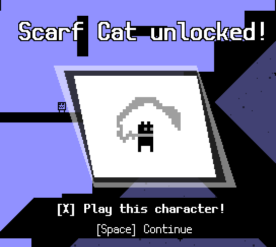
The first extra character to make it in is the Scarf Cat. It's one of the characters from one of my prototypes that never got finished, but I liked the character and recycled it here. I'll probably put in more characters from my previous games, provided they fit inside the 10x10 limitation... There's one little dude from a game I made three years ago that still regularly makes cameos in my games, which is probably the next one I'll add.

I've also implemented a system to send messages and feedback to me from within the game. This will allow me to gather more comments in case I would publish a demo, but will also be useful in an eventual full launch of the game. The feature was set up surprisingly fast with the GameJolt API and its corresponding Game Maker library.

Also working on implementing Sonic-like grind rails. Very tricky to get the momentum for that right, but I'll share a GIF of it as soon as I have the sloped rails working.

(1 edit)

Showing of the Scarf Cat, as well as the new grinding rails! This new gimmick is quite Sonic the Hedgehog-inspired, but operates on it's own custom set of rules.

First off, once you land on the rail, it takes your current horizontal speed, increases it a bit and locks that in until you leave the rail. It applies the horizontal speed, then checks if you've just passed a slope, and if true, it also adjusts your vertical position. And if you press [Down] while going down a slope, your speed will increase a ton, but going up a slope will decrease your speed. While you can't do long jumps or backflips from the rail, you can still jump from the rail, which you can use to correct your momentum. The grinding rails are also an excuse for me to overuse particle effects :P

It's fairly difficult to come up with ideas for gimmicks that aren't feeling too 'gimmicky', and while I feel I've done a good job on this, I definitely want to test it some more.

Been tweaking the grinding rail physics a bit. My buddy already played with them a bit and made this level:

https://gyazo.com/6b5e4572c51765f85c9f44821147f5cc

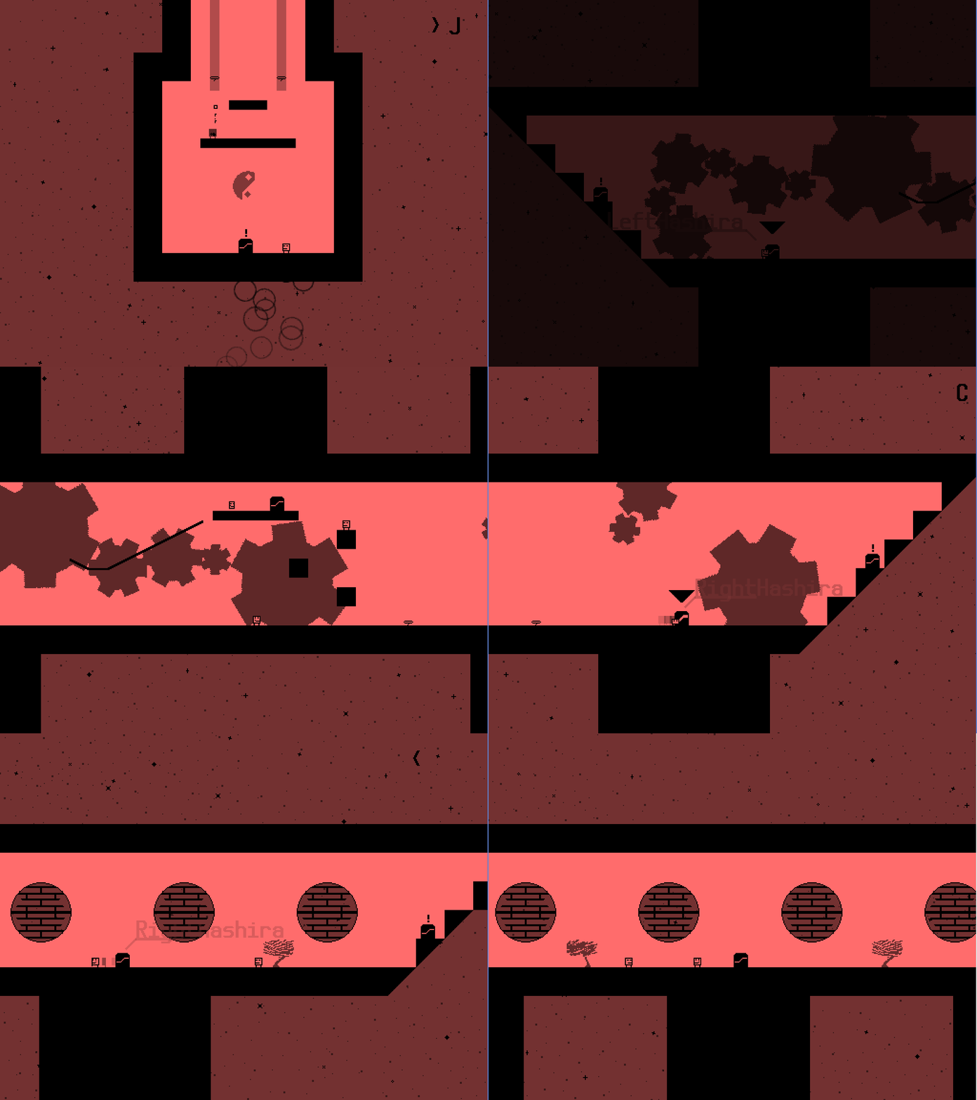
We have also been progressing with the overworld of the first ship, the 'Arrowhead'. I've been making hologram screens showing useless but cool-looking graphs. Unidrax commented on that the 'windows' in the ship looked more like the ship has gaping holes in its hull, so they've been replaced with transparent windows. We've also finished all overworld rooms on the ship.

Now, in the levels the camera follows the player perfectly, keeping him in the middle at all times. But on the overworld that makes less sense, in my opinion. This is why the overworld uses a noded camera system: every room in the ship is divided into multiple zones, and once a player is in a zone the camera targets the middle of that zone, and otherwise it targets the player. This camera system has originally been designed for a puzzle platformer (where the camera is kept still when you're in a puzzle room), but a slightly adjusted version of it also works in the Mobility overworld.

To finish for today, here's the top overworld room of the Arrowhead: https://gyazo.com/15e41368eaf51a5079e08ecdab6c6202

Looks fun so far!

Thank you!

Mobility has been catching dust a bit because I am doing work on Tahira's Tower (a puzzle game I'm also working on). I like taking on two projects at the same time! As I explained to theMeaty earlier in the week, if I get tired of working on one project, I swap to the second one. Unidrax however has kept producing levels using the grind rails and made this really cool one:

https://gyazo.com/eb728c9f20f014e612dfc039951ae381

Since I have a vacation now, I also have the time to pick up some stuff aside of those two. For example, I just released Micro Massive II, which was in a finished state for over a year, but I never found the time to tweak it to the level I wanted it to be. It's not that I didn't wanted to, I just kinda forgot about it in the light of the new games I were working on. Since I have not released any game yet this year, I found it an appropriate time to finally pick it up and put all finishing touches in. If you are interested you can grab it here.

Mobility was temporarily put on the backburner so I could focus all my attention on Tahira's Tower, which released just now! As you might know, actually finishing a game takes up a ton of time and effort, making sure everything will really come together in the final game, which is why I chose to make Mobility lower priority for the past month or so to fully focus my efforts on this other game.

Now that Tahira has finally been released, I'll continue work on Mobility! More info hopefully soon...

Another less active month because I was having quite a hectic month! But now I'm picking up steam again, and since last time:

- I fixed all bugs on the bug tracker. As you might know if you're involved in game dev is that fighting bugs is basically a fight you can never win, but at least I eliminated all known bugs for the time being. (It feels great finally empty that list, by the way!)
- Integrated this cool option menu! I'm sure I expressed this already in this topic, but I'm a huge fan of accessibility in games, and love customization settings in general, and that is primarily why this is necessary. I'll go more in-depth about it once it's more finished, but here's a GIF anyway:


- Soundtrack switching! This is an idea I coined to the musician I'm working together with (the same dude who I worked with on Tahira's Tower for the music). You see this in games like Fire Emblem Awakening and Guacamelee!, where a different variation of the same track plays based on the situation in the gameplay. I thought it would be a cool idea to switch the track between the overworld and the levels, where a chill version of the track plays on the overworld and is replaced with a more pumping track in the level. I got this working in-game today with some initial tracks, and it works and sounds awesome so far, and would love to show you once I have more finalized music.
- I'm planning to expand the overworld with some new spaceships. The current idea is that there are multiple spaceships that the player is tasked to repair, and finishing one by beating the boss or some other event, the ship is fixed and next one unlocks. Also more info about this one soon as it's more fleshed out.

I'm hoping to get posting here back into my habits by teasing all of this stuff here, so see you again soon!

(1 edit)

Mostly text today, but here's a little GIF showing off my new particle effect!


More about that in a later post, today I'm going to talk about sound effects!

This is usually one of the last things I do in my games. Most of the time I settle on BFXR-generated effects, and sometimes my games don't have any sound effects at all. I did it fairly early this time in my attempt to make the game as 'juicy' as possible.

For anyone unfamiliar with the term, juiciness indicates to how responsive the game is to your actions. In an attempt to increase juiciness, one could add particle effects, screen shakes, flashes, and other effects. My favorite talk on this subject was given by Jan Willem Nijman, 'The Art of Screenshake', where he presents a very visual examples of the steps he takes to increase responsiveness in Vlambeer's games.

Together with the sounds, I added a script that allows me to easily play sounds, and change their pitch. The pitch is how fast a certain sound plays, and makes a sound sound higher or lower if you change the pitch. This is useful in a game, since you can use the same sound multiple times (like the jump sound effect in Mobility), and changing the pitch each time the sound is played, you can avoid the effect from becoming annoying. You can also recycle the sound effect: right now, a 'tongue click' (it's better than it sounds, honest!) effect is played once you pause the game, and the same effect is used with a lower pitch in the game's dialog boxes. I can also control the volume each individual sound plays as,

The doors in Mobility overworld require two [Down] inputs to enter-- the first one is to open that door, and the second is to pass through it. As such, I wanted a relatively dramatic, sci-fi-y door opening effect, and I managed to find one.

Finally, I wanted a cool effect for my room transition. I settled on this 'swoosh' effect. More sound effects could be added later, but this is a pretty good start so far, and at least I broke out of my cycle of shoving the problem of end to development.

Features added since the last post:

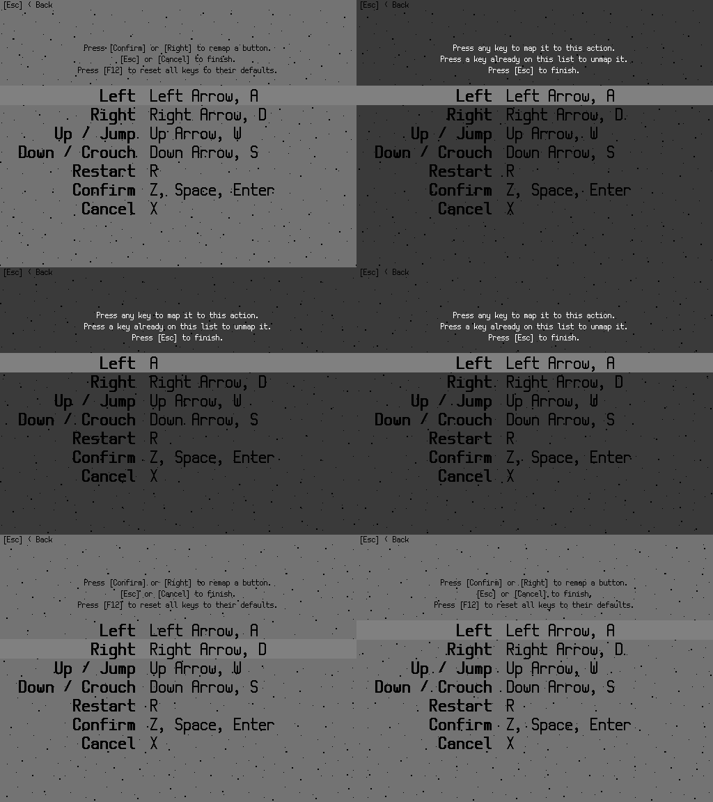
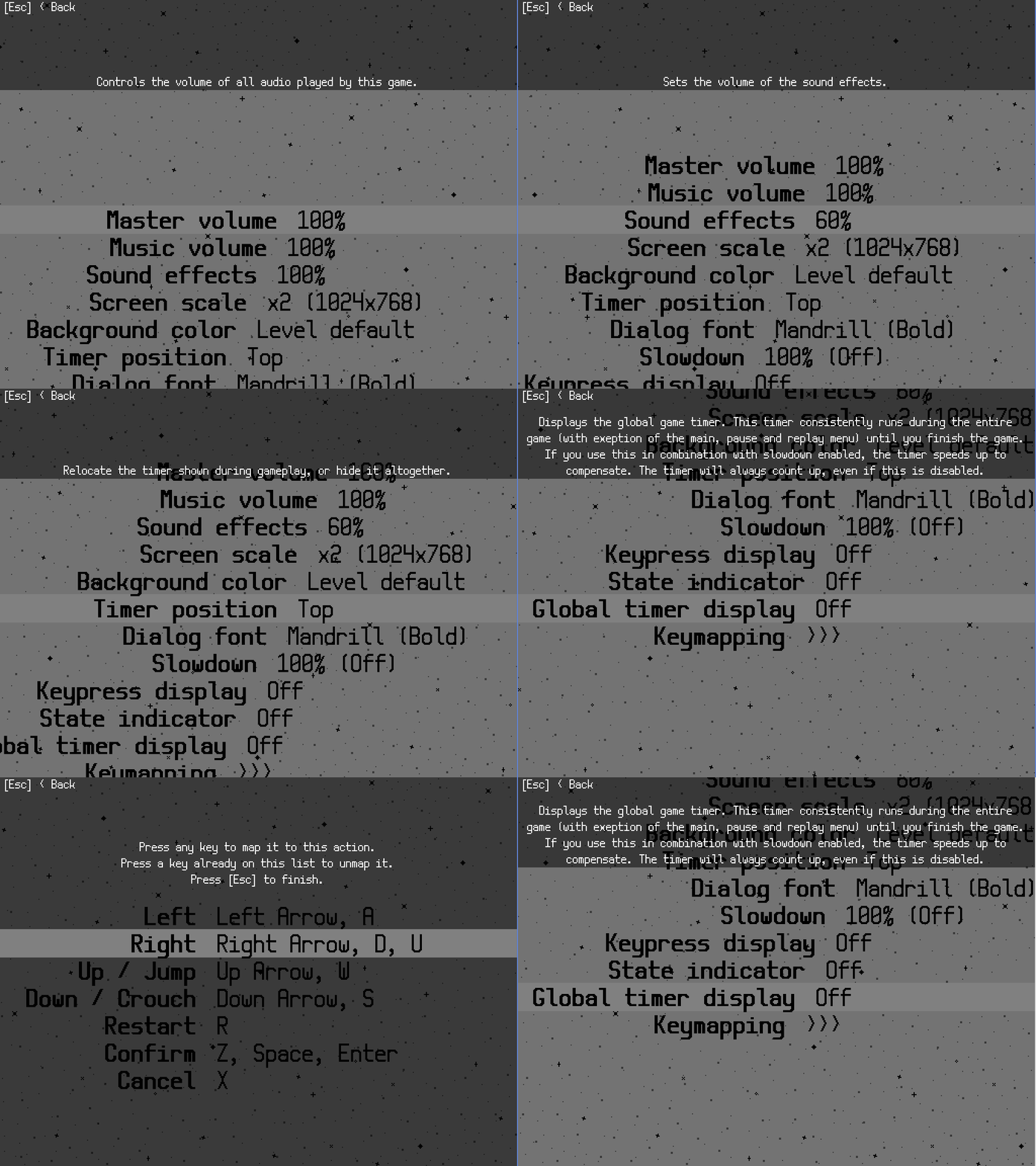
- Key remapping! This was already available behind the scenes (this is really one of the things you need to do consistently from the start of the project or it requires a lot of code lines to be replaced), but what I still needed was a little menu to change those bindings in a comfy way. I could reuse the setting menu controller here, and after fixing a few problems, it's finally operational. The only problem is that it doesn't support saving yet, but the saving of progress and settings is usually one of the last things I do on a game project, so it's fine for now.

A problem is that the game does not uses the mouse in any way. I already made a keymapping interface for one of my previous games, Box Kickers X, where you can click the key you want to remap. In other keyboard-only remapping interfaces, I found it very easy to screw up my controls by doing weird things like mapping [Left] to [Right arrow] and vice verca by accident, to give you an example. There are a few failsafes in my version to prevent most of them, including a 'Reset to default' setting.

- Another new particle effect that plays when a block is activated (notice the squares popping out of them). Not really sure about this one yet, it looks cool, but I feel it could be better.

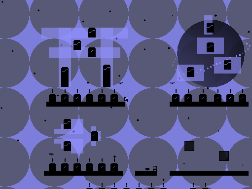
- Me and Unidrax are also working on a new spaceship. It's shaped like a Torii (read: a special kind of gate often placed near holy shrines and other sacred locations in Japan), which we gave the punny name Starri. It's interior is WIP and not very fancy yet, so I hope to give you screenshots of it later.


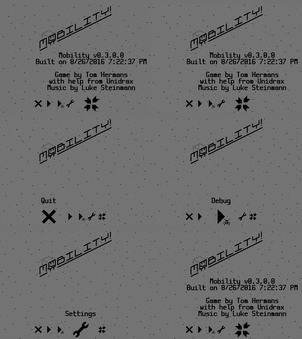
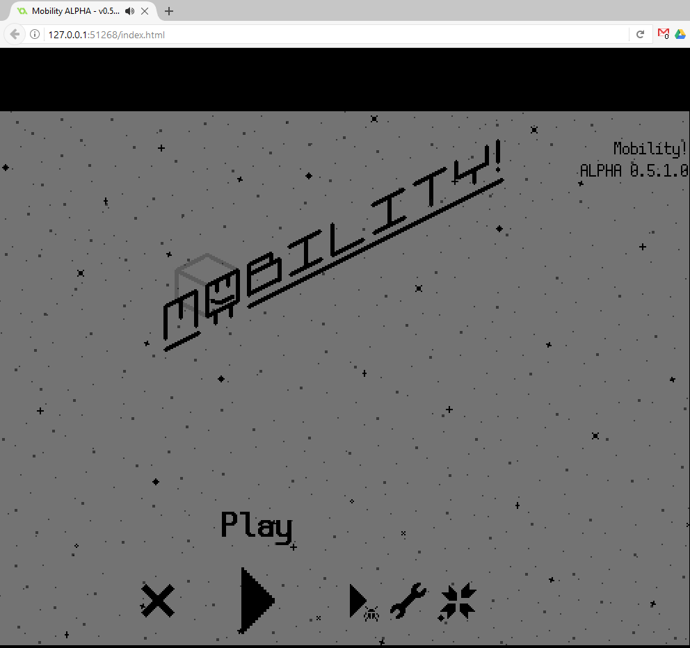
- Last but not least, here is a totally new title screen! For now, it's just a comfy way to get to the debug room and game settings quickly, but it's already quite fancy and I'll make sure to make it super fancy later on.

That's all for now, folks! For now, I'm planning to fix some bugs, and then get back to design levels and the overworld. Thanks for reading!

This topic got to 1000 views while I wasn't looking! Thank you all for reading my posts. We're going slowly but steadily right now, progress is still being made!

So lately I've been allocating levels to the overworld. These two things are designed mostly separately, as in that the overworld and level design do not influence each other in a major way. We produce a bank of levels, a bunch of overworld rooms, and then start to allocate the levels to those overworlds.

This was a bit of a vague process, but since of late I've been able to get a bit more structure into this: by simply sorting all levels we created on difficulty, giving it a number between one and five. Then I look how the general difficulty distribution is, and if it's all right, I bundle levels of similar difficulty levels in groups. If there are not enough levels to fill an entire group, that means levels need to be adjusted or new ones need to be made to fill up the gaps. Such a group can then be distributed across one spaceship in the overworld. The list also keeps track of levels that might be more frustrating than have fair difficulty that need to be polished.

This might seem like level design 101 for some, but who hasn't hit an annoying difficulty spike in some game which took eternities to overcome, if at all? I mean, my game does already do a lot to combat that (by offering difficulty selection and other options), this is just another step to a game that builds up the difficulty nicely, and just good game design overall.

I'll have more screenshots for next time!

Here's another apology for not updating this thread often enough.

I've been working on another spaceship that will serve as its own contained overworld. You use them to travel between the levels. I didn't want to do a boring level select but spice it up a bit more, and because I can make the levels purely contain gameplay and put everything else (people you can talk to, story events, minigames. The original inspiration for the overworld came from how games like Dustforce and Stealth Inc. 2 handle theirs.

I want to keep the graphics really simple to read, which means most decorational stuff goes into the overworld. That is what I've been occupied with lately. Here are some cogweels:


I forgot to set the rotation point (sprite origin) in the middle of the sprite first. I though it looked funny so here it is. Below is the end result:


I know the cogwheels don't connect perfectly, but I think it looks cool, so I'm going to keep it this way.

And here's a new particle effect for the engine outlet of the ship! Not sure about using stars as particles, but I'm pretty happy with it otherwise.

(1 edit)

Just released Sokobanana and my new website two days ago, so I found the chance to get a bunch of Mobility work done yesterday. I think I'm going to put posts related to Mobility's game design mostly on these, and just put cool gifs of things I've done on here so I can update it more often.

So yesterday I finished most of the Starii. The only thing I aren't yet sure of is it's selection of playable levels, but I think that all levels still require testing to some degree, so I branched that into it's own separate task. I also fixed a bunch of bugs and graphical errors. Here's a tour:

With that done, I'll focus on making the next ship. Here are a few teasers:


I've also been making a (very rough) concept for the final ship of the game...

I also implemented a global timer, that starts at zero when a new game is being played, and ends when the game is beaten. I might expand its functionality later on, but it's already somewhat sufficient for speedrunning.

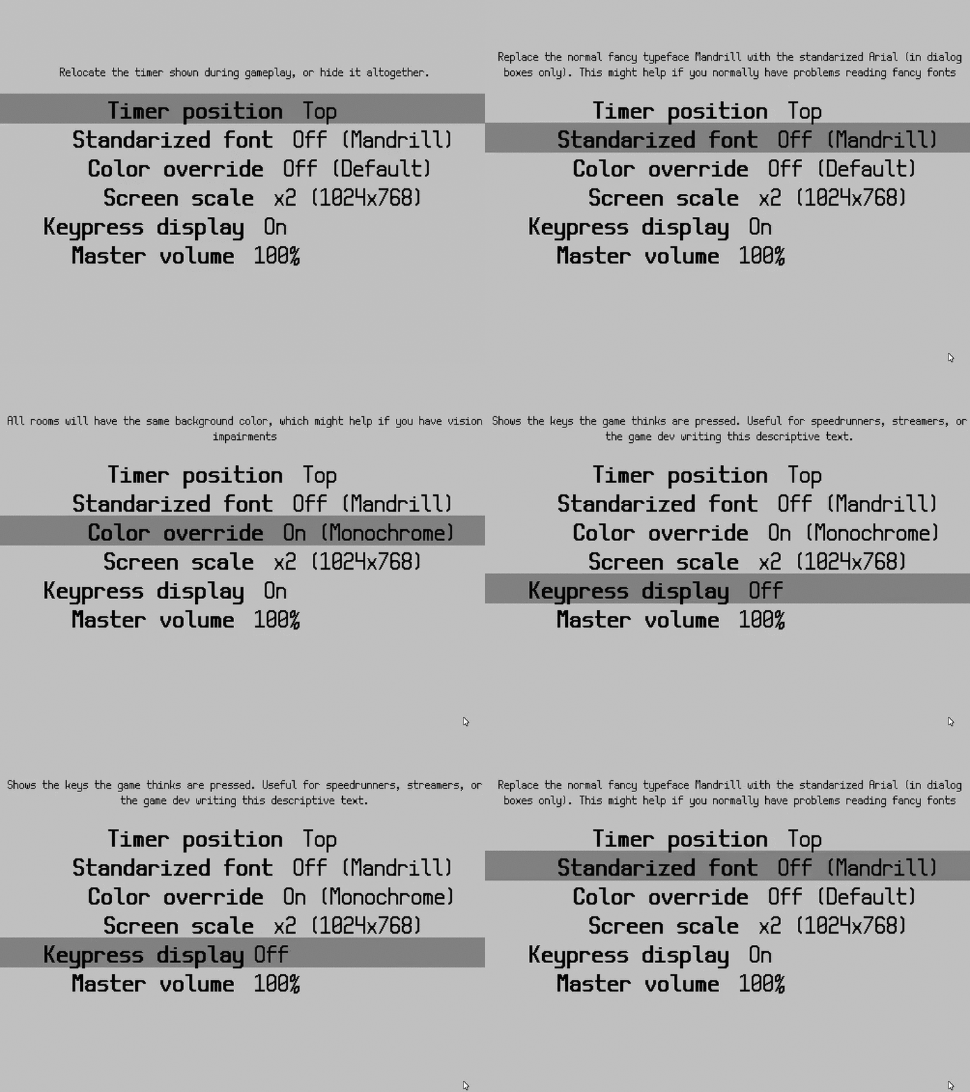
Do you remember the settings menu? I also updated that quite a bit, because the amount of settings available didn't fit on the screen anymore. And the descriptive text has good contrast with the background now. I also implemented a feature that allows me to sort the settings manually, independently of how they're ordered in the code. (That doesn't sound like a big deal, but it makes my work of maintaining the settings menu a lot easier.) There are still a few additions I'd like to make, but I like where it's going.

Edit: formatting

Zelda's finally releasing tomorrow, so I'll make a blog post before I'm occupied playing that.

Since last time I made a website for Mobility! It's at http://mobility.auroriax.com.


It is primarily a showcase of GIFs of the game, and is intended to link through to this devlog or my Twitter. It still needs a bit of polishing which I'll do once I make a trailer for the game. (I don't make trailers that often, but seeing the large amount of time I spent in this game so far, it'll probably be worth it!)

The other thing I've been doing is putting together a new spaceship, the Meteore. I teased it in the last post, but here's a nearly finished version of it:


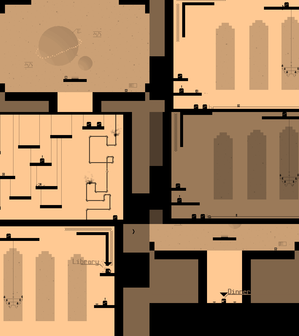
I made a concept for a spaceship that's intended as a hub, which contains the initial training for the game, and via which you can travel to other spaceships. It was originally drawn by Unidrax some time ago but left unused, and we decided to reuse it to replace the bland original design.


And remember the draft of the final spaceship from my last post? I polished that up a little, the intention is now to break through the layers of the space station and get to the boss room in the middle. I hope this is a good beginning for a great finale of the game!


Also, I redesigned the debug room yesterday. There's a door to every room in the game here, levels and overworld rooms. Previously, it had the doors to overworld rooms to the left, and normal levels to the right, but now that access to the levels have been assigned to each overworld room, it was quite messy. Now doors to the levels have been arranged below the ship they can normally be accessed from, and yet unassigned levels are at the bottom of the room.

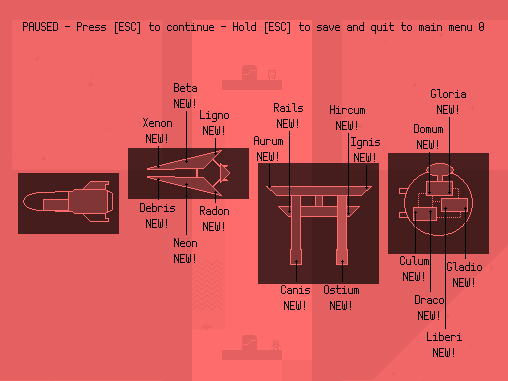
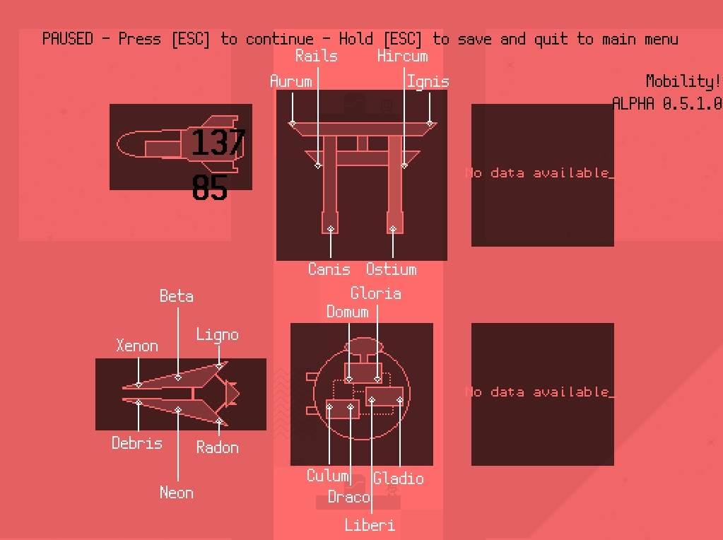
After I finish the Meteore, I'll continue upgrading the UI of the pause and settings menu in the game! I already showed the settings menu in the last post, but the pause menu needs the most work: here's how it looks like currently:


The idea is to split the info over three screens: this one is mostly done but needs some re-positioning of some elements, one will have a full overview of completion throughout the entire game (sort of like the overview in modern Mario games) and one with information like the ship's background story and game controls. More about that next time, though!

Getting Mobility working in a browser has always been a bit of a stretch goal for me. I use Game Maker Studio, but the code the HTML5 compiler generates is really hard to debug, and error messages are really hard to make sense of. Usually it just then boils down to which objects are in the room, removing those until I find the one that causes it to break, and then removing/commenting scripts on that object until things no longer break.

But in my last attempt, I pushed through instead of giving up. The previously game-breaking bug seemed unsolvable during my previous attempts, but it was really just a few lines of script messing it up. So I finally managed to get it to work.

I also think I've made the first browser game to feature remap-able keys! (When I was looking at itch to see whether games featuring both already existed, I was reminded that my own game Box Kickers X does. I totally forgot about that...)

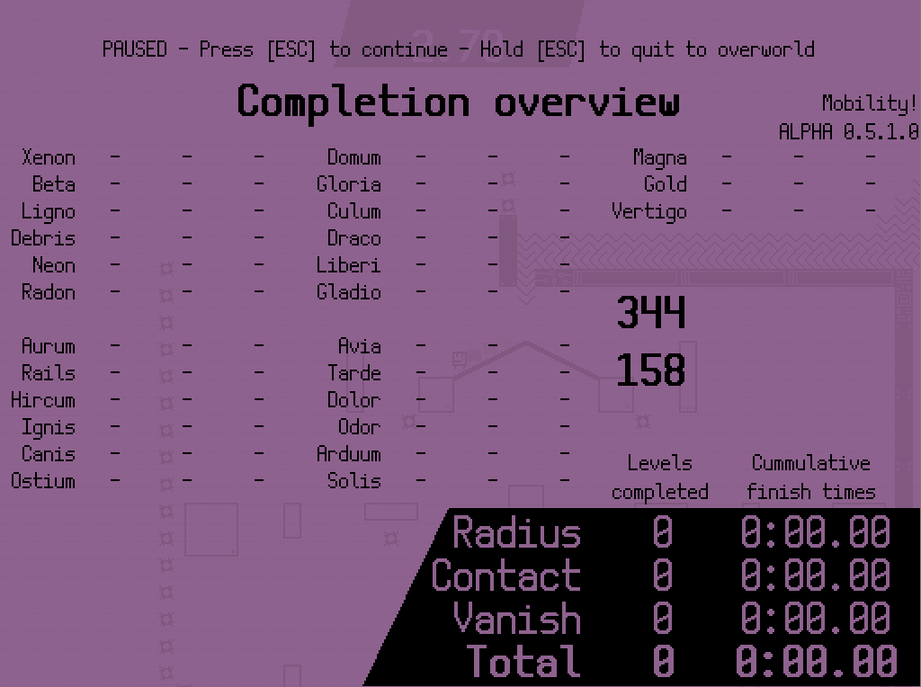
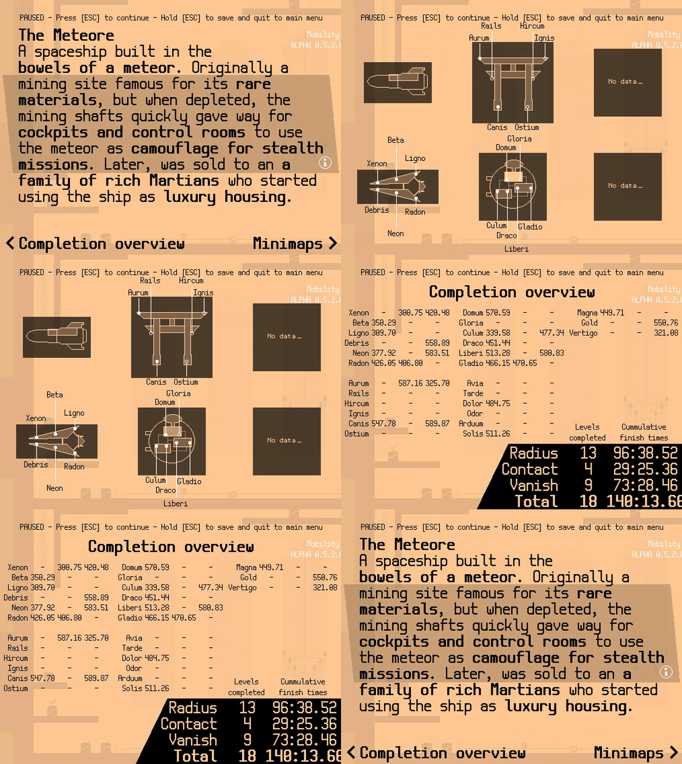
In other news, I've been updating some UI. Here's the brand new completion overview:

The goal was a completion overview like available in modern Mario games, where you can easily see everything you've done up to this point, and anything you might have missed. It shows all level names, sorted by the spaceship you can find them in, as well as a summarized completion time. I also included a debug feature which allows me to randomly populate the highscores to see if this menu can handle it. There are some things I do not yet like about it, like the calculation of the 'Total' time, which takes the time from the highest difficulty you beat a level on, and then adds those times of all levels together. So I want to introduce some kind of time penalty for that, but I'm not really sure how that's going to work yet.

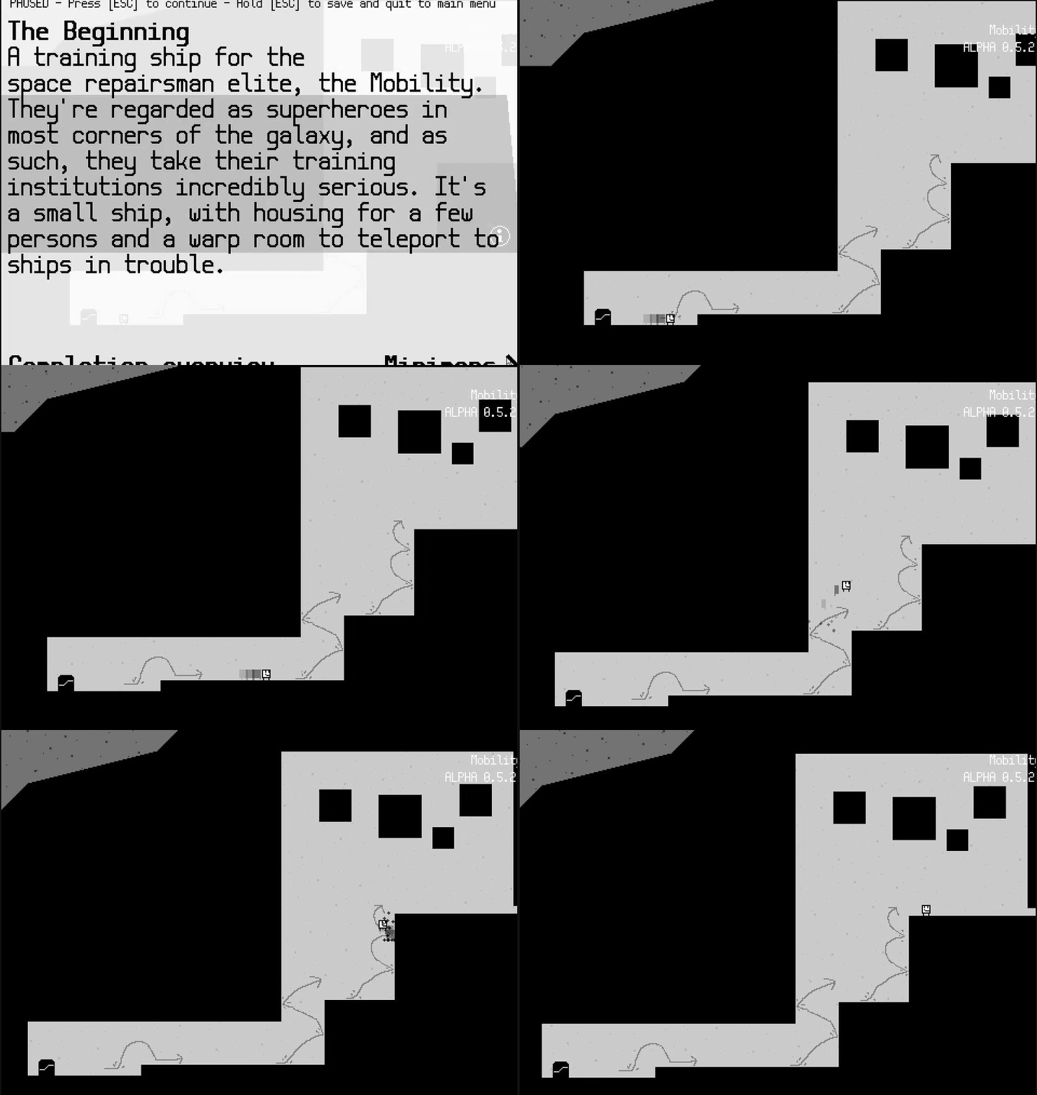
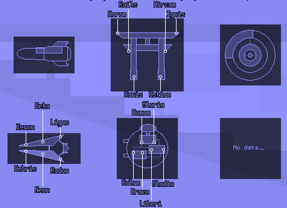
And I've also given the minimaps a slight facelift.

Every map is aligned neatly now. Spacing could still use a bit of work. I've removed the time from this overview, but since you can open the score overview with just a single button press from here, you can use that instead. The white colors on the lines and text work better on dark backgrounds, but lesser on white backgrounds, so I'm thinking of making the label white or black depending on how dark the background is.

I've also been implementing a feature where players can submit feedback to me while still in the game. I need the feedback, because I want to make this my best freaking game ever. Here it is, really simple, and not really polished, but it's functionality is sufficient. It also sends a few bits of metadata like the date, version number, which difficulties/modes the player has been playing and his cumulative amount of time. I'm planning to make it pop up after completing the first world in the game in the alpha version of the game I'm sending to testers soon.

Finally, I released a blog post recently about making your UI flow as silky smooth as possible, and I'm using Mobility as an example of how I have done it and why. I'll likely go more in depth on this in the future.

Here are some new things I've been working on. Might seem a bit little, but I've been busy with other stuff as well-- including Zelda. Enjoy!

Controller support!

This will sadly only work in the Windows version, but it works wonders. You can also remap the controller just like the keypad, or disable it and use joy2key instead.

Game Maker's support for gamepads is really limited. There were a lot of strange issues and limitations that I had to write my own code to recognize when buttons are pressed or released, and to keep the lag down. (Doing a lot of calls to the joystick destroys the frame rate for some reason.)

Not only that, but there's also the issue that the state of a joystick button can change in the middle of the step. So the game could think a button is pressed in the beginning of the step, yet when checking later near the end of the step, the button seems to have been unpressed. My replay recording system did not account for this, which caused it to break.

To top it off, I had to write my own alternative of io_clear to work with controllers as well. I normally use io_clear when opening a menu, it makes sure that the same button press can't both open the menu and select an item on that menu in the same frame. There's no equivalent for io_clear for joysticks, so I implemented it into my own button pressed & released system.

Playtesting!
Recently, I started a playtesting group and had some of my friends and peers join in. Recently, I sent out a build of Mobility via there. For playtesting, I ask players to set up OBS to record gameplay footage, record their playthrough, then using WeTransfer to get the video file back to me.

I've been watching a lot of GDC talks lately, and one that jumped out was a talk from Adriaan, who made Hidden Folks, explaining his playtesting procedures (http://www.gdcvault.com/play/1024132/Playtesting-A...). A lot of points hit home for me, in particular watching people play instead of making them, say, fill out large forms, or instead of taking their suggestions literally, took at the reason why they're giving that feedback and solve the core issue.

There are quite a few points of interest these tests brought up. Like, everyone immediately understands that you have to activate all blocks to complete the level, with little explanation. It also clearly shows the less effective things, like players not knowing they can do certain actions they need in the later levels of the game, like long jumping, restarting, or opening the map.

To counter this particular problem, I redesigned the tutorial to explain the extra jumps you can do. It now explains backflipping, long jumping, and double jumping up front. I explain these by drawing arrows showing off the intended movement that the player should mirror to pull it off. Some other rooms on the same ship have also gotten a light redesign.


And this is the stuff I'll be focusing on in the coming weeks or so.

Game ending
Slowly but surely I'm beginning to see the end of this game's development! The most important bit of work left to do is to create the last world of the game. My past games didn't really work towards an epic climax, so I'm planning to amend that with this game.

Trailer
I really want to have a nice trailer for Mobility. The current plan is to create a little teaser trailer sometime soon, then make the full trailer once the game's near finished.

I've created one other trailer for my games so far: Hexaria. Looking back to it, it's kinda bad. It doesn't really have clear goal the trailer tries to show, and doesn't explain gameplay well enough to interest people. I'm planning to invest a lot of time on this, and I'm planning to make the teaser once I've included some small fixes.

Endgame
I'm planning to add a little achievement system in for players who completed the game and would like to invest some extra time into getting better and higher scores. The way I'm conceiving it now is that players can 'overclock' spaceships, where your score on all levels on the ship is combined into a cumulative counter and you need to bring that down to make the spaceship faster. And maybe, if you do well enough, you can unlock an extra difficult bonus challenge!

To end for today, here's a gif from the updated pause screen:


Since itch.io added support for devlogs, I'm looking to convert this thread to a devlog. But until I've figured that out, here's a good old community devlog post!

Tweaking grind rail physics
Multiple testers ran into this problem, so I tweaked it so it feels more natural to use. Once you landed on the grind rails, you could no longer steer yourself, but you could gain speed by crouching when going down, or jump of and gain air control. That appeared to be unintuitive for my testers, so now I'm allowing players to control their speed directly by pressing left and right. You still have less control compared to walking, but it's better.

Another thing is that the game allows players to jump for a short while after falling off a platform. I disabled that on grind rails, because it would allow players to do a special jump (long jump, backflip) shortly after falling off. However, it was a noticeable user experience flaw, so I fixed that as well. Now, jumping off the tip of a grind rail is significantly more satisfying.

Also, boosters now also work properly, allowing the player to achieve ridiculous speeds in some levels!


More audio
When thinking about making a trailer for Mobility, I was thinking of making the audio a bit more impressive. Thus, I added some extra sound effects! Now there's a little pop when you activate a platform, a sound effect that plays when you complete playing a level, and when a block vanishes in the highest difficulty of the game.

Now I'm not really sure whether the game has too much sound effects playing at the same time, overloading the soundscape. A tool I'm using to prevent sounds from getting too stale, is changing the pitch of the effect each time it plays. That works pretty well, but if I add any more sounds I need to find an extra way to prevent audio from getting annoying.

If you want an example, here's when an error with the sound with the default Windows 'Ding' sound played in various pitches instead of the intended sound effect.

New difficulty selection
I've redesigned the difficulty selection a few times in the development of the game, and now I had to do it again so I could include leaderboards.

If I really want to allow for a competitive experience, the leaderboards need to be presented as up-front as possible. In most highscore chasing games, you need to go into another menu to display the scores which I think makes it pretty hard for players to have a clear view of the scores.

Similarly, I think just displaying the top 10 scores doesn't show enough about what's happening on the leaderboards. I'd rather have a more complete overview, so I'm using the Fibonacci sequence to show ten score points from all across the top 100 to give a better impression of the entire leaderboard. I'm not yet sure whether this is comfy once I start integrating it with the GameJolt API, but I'm keeping it for now.

Previously, you selected your preferred difficulty before the level loaded. Now, you do it when you're already inside the level, to allow you to hover over the leaderboard and look at the replays in the list! It's a pretty neat feature that I might expand later to allow ghost races or something.


That's it for now! One last thing-- I updated the Mobility website to include a form where you can sign up to my release mailing! If you want to get an email when the game comes out, head over to http://mobility.auroriax.com

(3 edits)

Just a heads up that I'll also be keeping the devlog on it's dedicated itch.io page! If that's more comfy to follow for you, go for it. I'll also be keeping this thread up to date to make sure that, when development on this game is finished, this thread becomes the most complete development documentation for any game I've developed thus far. Thanks for staying with me thus far, and let's complete this game-- the finish line is slowly but surely coming in sight!

Cumulative timer

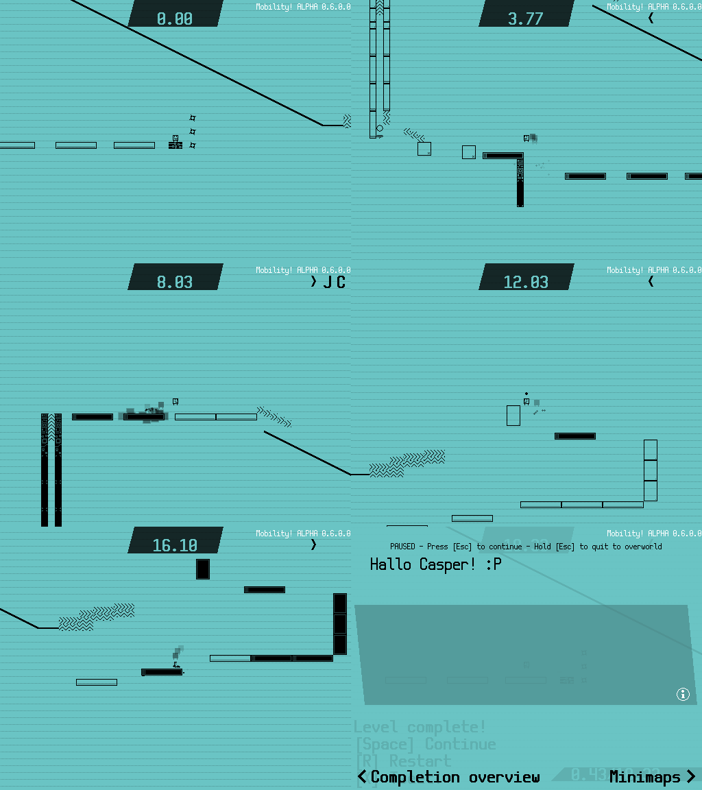
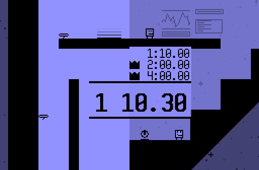
I do love running for short times in some time chasing games, but I often stumble with the problem that players aren't really motivated enough via the game to do this. Leaderboards aren't really enough motivation for me, personally. So I've been making a little timer. If you complete the game, each spaceship will get a timer that shows the completion times of all levels on that ship added up. It takes the time of the highest difficulty you've beaten it on, and adds a few minutes penalty if you beat if you beat it on a lower difficulty to give incentive to complete the level on the highest one. If your time is under a certain par score, you are awarded a medal. And maybe you can also unlock some super secret stuff with medals? That would be really cool, now wouldn't it? Here's the fastest time I could get on the Arrowhead:


Text outline

Since this game uses both very light and dark background colors, and interface elements in this game are often either partially or entirely transparent, it can be quite difficult to put text on the screen that looks nice with both light and dark backgrounds. This made some text quite hard to read in some circumstances. I already tried things like text shadows and changing the text color depending on the background color, but those were only ban-aid solutions, really.

Then, I got the idea to try text outlines. This is a good way to combat the contrast problem, since if you aren't able to see the outline, you are able to see the text inside it, and vice versa. The problem is that Game Maker doesn't support text outline out of the box, so I made a script that draws the text eight times, each time offsetting it by a single pixel from the origin point on both the x and y axis. It looks strange if used by itself, but by drawing the normal text on top of that, we get the intended effect. It also fits really well with the very little colors that the game uses.

If you put the transparency a bit lower, it also generates a subtile glow effect, which looks really neat on door tags:


Checkpoint

I had one particular playtest where the player avoided the checkpoints. Curiously, I asked why. The conclusion was that they compared them to the circle saws, the main hazard in this game, and saw the (round) checkpoints as a similar obstacle.

For those unfamiliar, this is called a false affordance: basically, it means that an object or function is different that what the player thinks it's intended for. This is because the shape doesn't obviously imply the function, or in this case, the users compare something that they saw earlier. This can create quite troubling situations that can significantly impact player feel: in this case, the player missed the checkpoints, making the game significantly more difficult.

So to make a long story short-- checkpoints are diamond-shaped now. I haven't tested it it solves the issue, but I hope it's better than before. I also added a sound effect that plays when it activates, so now almost every important action in the game has an accompanying sound effect.

Sound Test

So this game does have an original soundtrack, actually! Haven't shown too much of that yet, but I might do that in a later log post. But it's good enough to warrant it's own Sound Test in the game. Here's how it looks:

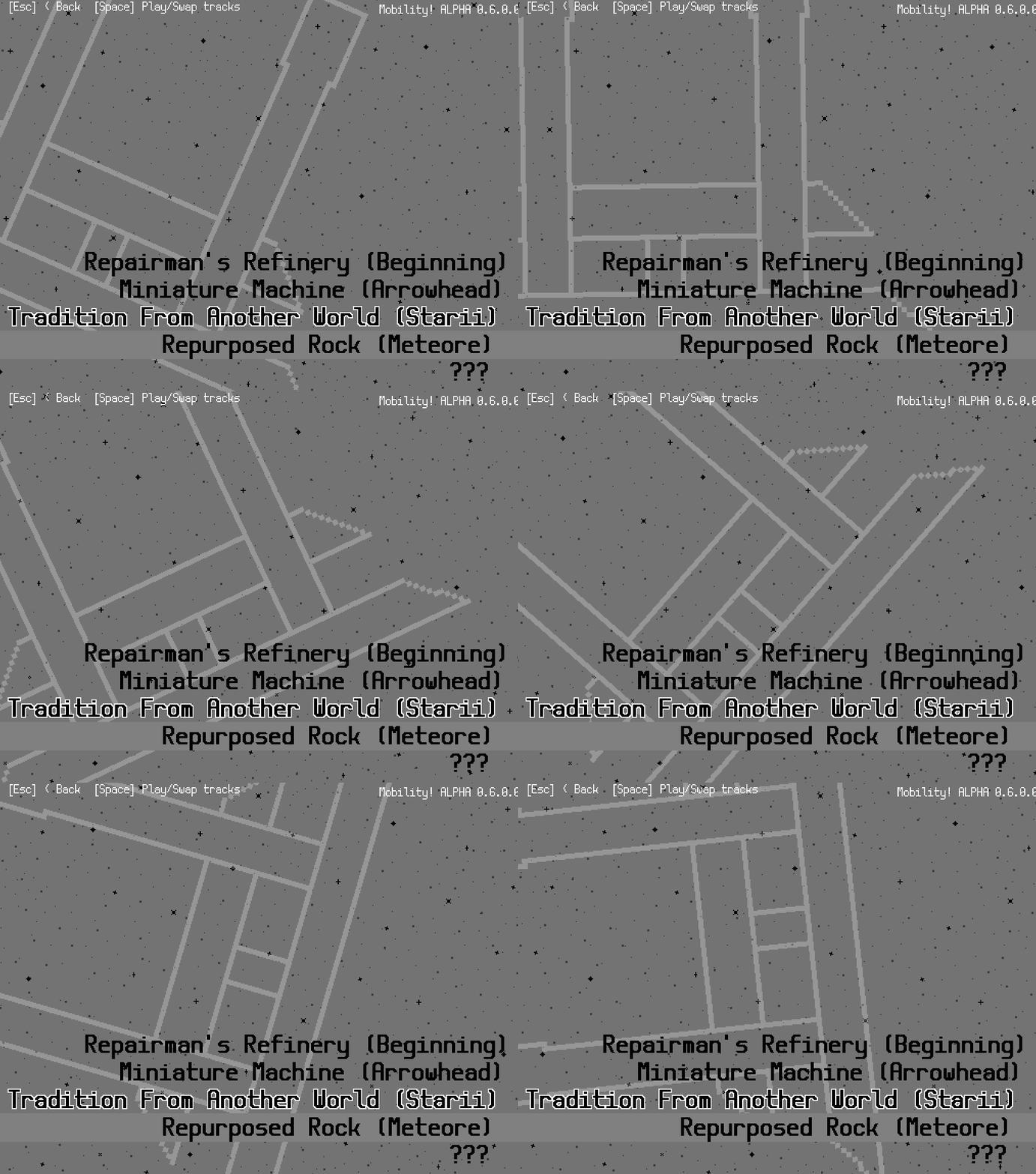
Not sure if I'm overdoing it with the rotating spaceships on the background, but it looks pretty cool.

We're putting together the last spaceship of the game together currently! I bet I'll have some pics for that next time. See ya!

(edit: formatting)

The most prominent thing I've been doing since last time is making the final boss! But first, let's talk about the final ship in the game.

So basically the Star Fix (by far the best/worst pun we've come up with yet) is an evil, greedy corporation, and they're also competing with the Mobility. I'm sure there's a good reason you would want to travel here during your training, right?

I can at least tell you that you're going there to defeat a boss!

Here are a few reasons why I've never created a boss before!
- It takes a bunch of time to create and polish such a boss. Time you could've spent on actually making the rest of the game, which more players are likely to experience, more fun.
- If you're making a game where your character has no access to any offensive moves (read: most of my past games), actually battling a boss becomes kinda hard. You need to create new mechanics in order to make that work. Introducing new mechanics at a final boss is a no go for several reasons.
- You need to make a bunch of moves for that boss that feel fair, don't glitch the game out and can also be changed up so the boss becomes harder to damage the closer it is to defeat.

Here's why I am making one for Mobility:
- I just want to try it out at least once. I've got good base ingredients to make a boss with this set of mechanics.
- Most of my previous games kinda ended with an anticlimax (e.g. without warning, the game is suddenly over). Since this game has a little amount of story, I do want to wrap it up nicely by building up to the climax nicely.

So let's make a final boss! It looks like the main character, but it's a lot bigger, black and also a robot.

Doing the robot!

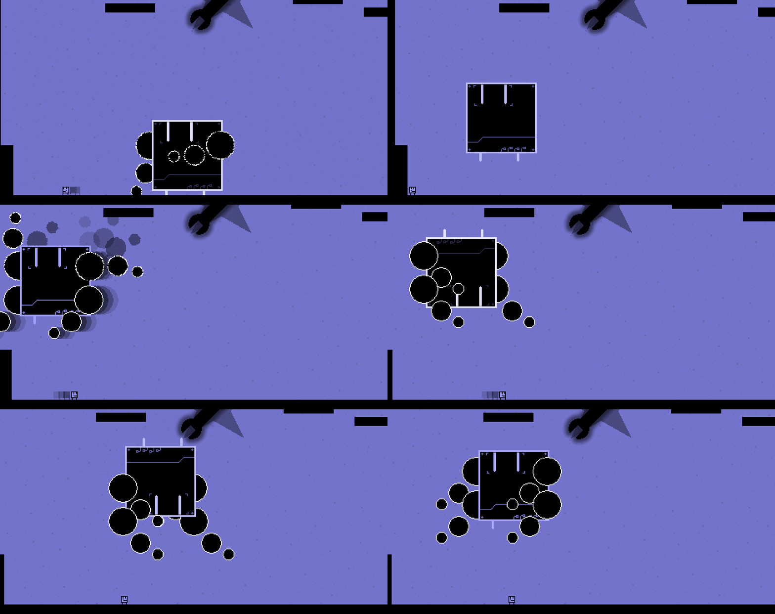
So the boss is basically a moving platform. It has some arms that snap to its body. The arms are deadly, and you need to avoid them to reach the robot and touch to deactivate it, like most other platforms from the game. Then, it'll reactivate itself a couple of times until it's defeated.

Teaching it to flip around

You can touch its body (I think I'll replace the big arms with circle saws later) to deal damage to it. Which means that, most of the time, you will be jumping on its head for damage.

There were a lot of funny accidents while programming the boss.

Getting the robot to move right was kinda difficult. It kinda looks like it's dancing...

I even made a little ARMS clone by accident!
I think I'm being followed...

That's it for now, but you will definitely see more shenanigans from our little big robot friend.

The final boss of the game is quite a handful of work. I was already expecting that (see my last devlog post for details) but it was still surprising how long it's taking me! The only thing I've really achieved so far is to get initial versions of all attacks implemented into the game. But they're all pretty cool, so take a look!


Throwing arm attack

The basic idea behind the boss is that it's a big robot with deadly arms. The arms are the main way the robot attacks the player, and I can control both of them individually. So I made an attack where the arms are launched in the direction of the player. I had some trouble to get the homing of the arms work in a way that works and feels fair. The way I did it was to add a warning sign where the arm shakes and turns into the direction of the player, so the players know in advance that they need to dodge an arm.

This is currently also the attack that leaves the final boss most vulnerable. The boss can be damaged by jumping on it from the top or hitting its left or right side, just like every other platform in the game. (This does not yet work in all difficulty settings, but I'll fix that later.) That way, I barely have to program any logic regarding damaging the boss-- I just need to make sure it recovers to an inactivate state a few seconds afterwards.

Flail attack

The boss swings its arms around itself while moving in the direction of the player. Very simple and effective. Since the boss moves quite fast, this is the perfect attack to wall jump upwards to dodge the attack and then fall down to hit the boss on its head. Very hard to dodge if you're close to it, so once you see the arms start moving slowly, prepare to run away.

Once the boss is hit, it will recoil by doing a variation of this attack while standing still. The arms will also rotate into a slightly different direction. This forces the player to retreat, after which the boss will fully recover and can be damaged again.

Jump attack

The bot flips up in the air (diagonally, targeting the player if possible), hangs there, shakes, and falls down. It will keep his arms above his head, so if players happen to be below the bot when it falls down, they'll be crushed instantly.

So what's next?

I'm actually quite happy about these attacks. Currently, I need to make these attacks feel fair and leave good weak spots on the final boss. Then, I'll implement health for the boss, and maybe a final state. This is what I was thinking of in regards to the final phase (a very quick prototype, please don't mind the inaccuracies):

But I still have to see it that actually makes it into the game...

Other stuff

I made a logo for the Star Fix, making a rather literal representation of the companies' name, and animated it like a shady neon sign.

Also, Unidrax (who helps building levels and the spaceships from time to time) found a sprite for a toast NPC I made a while back as a joke, and turned it into a playable character!

That's it for today.

The game looks fun ! Can we play it in the browser ?

(+1)

The eventual goal is to have the game playable in the browser! While my priority is the Windows version, a browser version is something I can and very likely will make. Though it'll take some more time because I need to fix some browser specific bugs.

you got my attention :)))

Thanks!

Another Mobility devlog is here!

Wrapping up the story

This chapter has some spoilers for the game's ending.

An state-of-the-art story was not my goal for Mobility-- as long as the motivation to continue playing is there, and the gameplay metaphors are decent, it is sufficient. (I'd really to dive deeper into story on a future project, though!)

One thing that did bother me was that that most of my games ended rather suddenly or in an anti-climax. That's one of the reasons I'm building a final boss for this game-- to help round the game off better. But there needs to be a bit of story behind that boss as well, as well as the ending of the story once it is defeated.

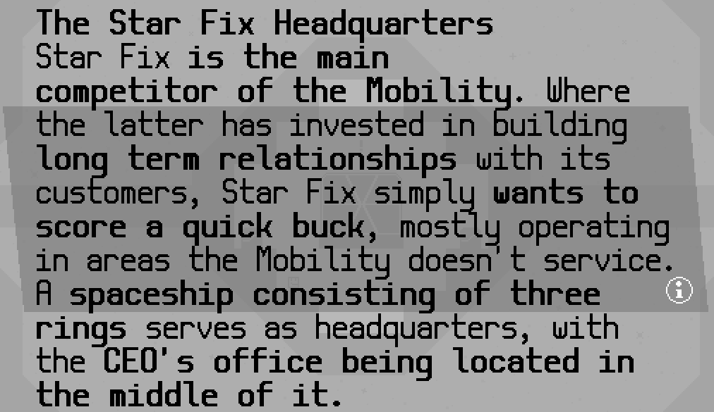
Introducing Star Fix. This company directly competes with the Mobility, while also sabotaging all of the spaceships you were sent out to fix! In the final chapter, the Star Fix CEO kidnaps the crew of your home base, and you need to go to the Star Fix Headquarters to save them.


The demolished home base, The Beginning, after the attack

On the headquarters, the goal is not to repair the ship, but to sabotage it to gain access to the boss chamber. While the gameplay is the same, platforms will start off in their black 'activated' state and deactivate when hit, which I thought was a nice detail. Doing so will give the player access to the center of the ship where the CEO is fought.

The door for the final boss room has a fancy animation to help build up the climax a bit.

But then, how does the story end after the boss fight? I had already written up some diary entries the CEO is supposed to have written, and scattered then around the headquarters. In them, the CEO describes that the sabotage plan was actually an attempt to increase profits, but in the further stages of the plan it seems that Star Fix is actually nearing bankruptcy. Once you enter the boss room and enter dialog with the CEO, he just got word of the bankruptcy, and decides to direct his anger towards you.

I'm currently writing an happy ending for the story. It would seem too easy (for me, as a story writer) to have the main character pull out some fists and punch the boss through the window into space, but that would be much to cheap, and contrasts the rest of the story too much. Instead, I'm considering having the boss tell a little bit about how he became head of the organization, and then rebuild Star Fix to cooperate with the Mobility instead of working against it, which seems like a fitting ending.

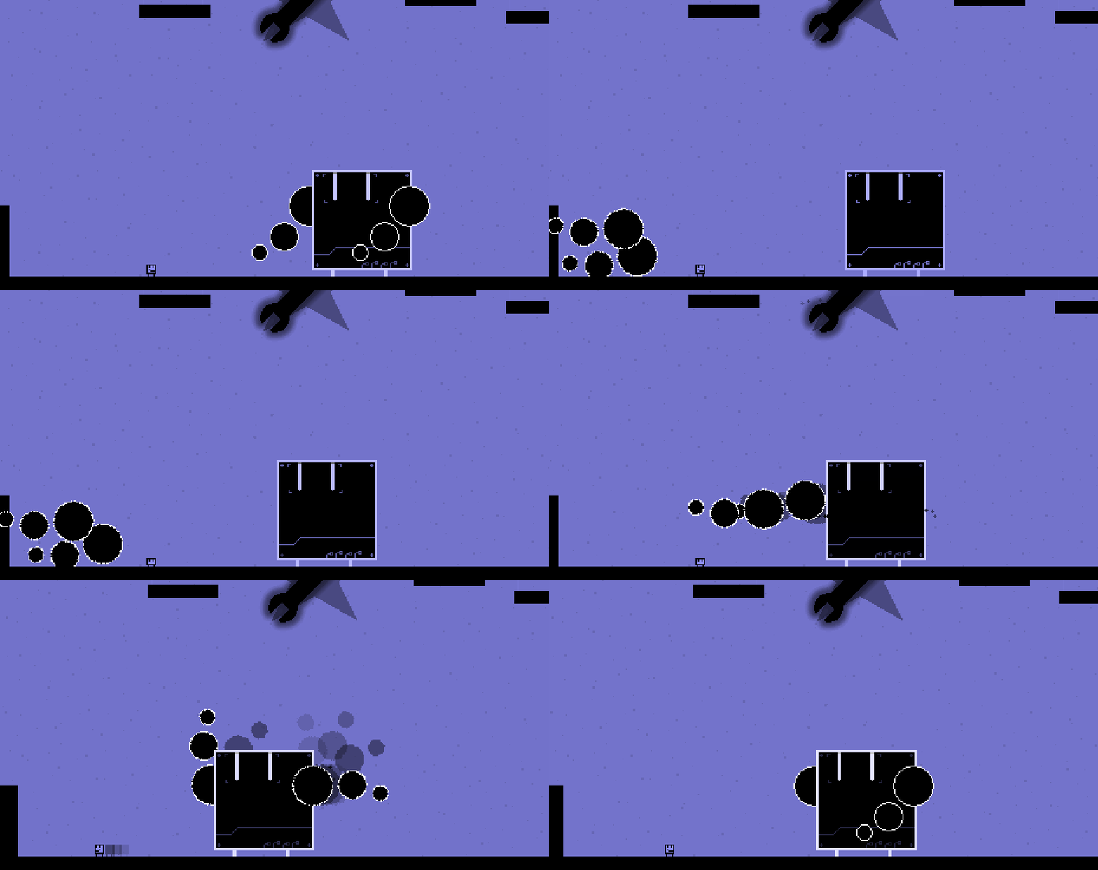
I'm still decorating the final spaceship, but I've gotten these fancy bubbles to work.

One final note: did you notice you'll get to fight an actual *company* boss in this game! A fitting last joke for a game filled with silly NPC humor and dodgy use of Latin for level names.

Bugs!

Man, I discovered quite some bugs the past week.. Most of these were game-breaking, even! I'm not going to explain how I fixed them (my code's a bit too messy for that, sadly), but you might find it interesting regardless.

First off, if you finished the level and got hit by a spike on the same frame, the game would count it as a victory and record your high score, but would reset the level instead of showing the replay. Another one I found was that you could still jump when you get hit by a spike. Normally, the game transports you back to the last checkpoint in just a few frames, but the jump sound effect would still play, making it awkward. There even was a crashing bug! This had to do with the replay array not being correctly initialized upon level load, causing the first frame of the replay to be missing when it was played, causing the game to break down.

Another really weird one caused all grind rails to count as activated platform every minute or so when the level was played on the Vanish difficulty, causing you to either finish the level within three seconds, or being unable to finish it at all, even after activating all blocks. Even better, this bug could've been in the game for a few months without being spotted at all.

It's a good thing I've found and fixed all of these, because these would be frustrating or even game-breaking to encounter normally. Morale: I (and you too, probably!) should take bug testing more seriously.

Other stuff

After the final ship is done and the boss can be defeated, I'm going to do another round of playtests which will hopefully result in the final list of desired tweaks for the game. I'm also developing some prototypes to see which project I could develop after Mobility is finished.

I'd really like to restate how much work has gone into this (seemingly simple) game. It's been almost two years since development started, the longest I've ever spent on a single game, and it's mostly been just me for that time! Please, do not underestimate the time developers put into making the games you like.

Thank you. I'm going to continue tinkering at the game! See you later--

A lot of things have happened since I wrote last month, so lets get to it!

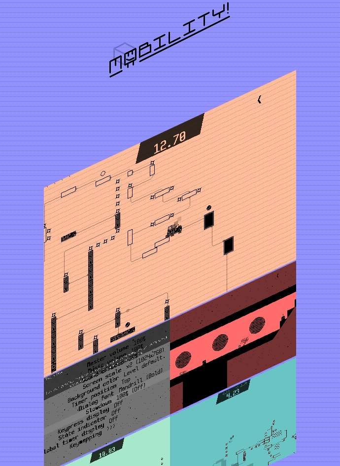
New promotional art

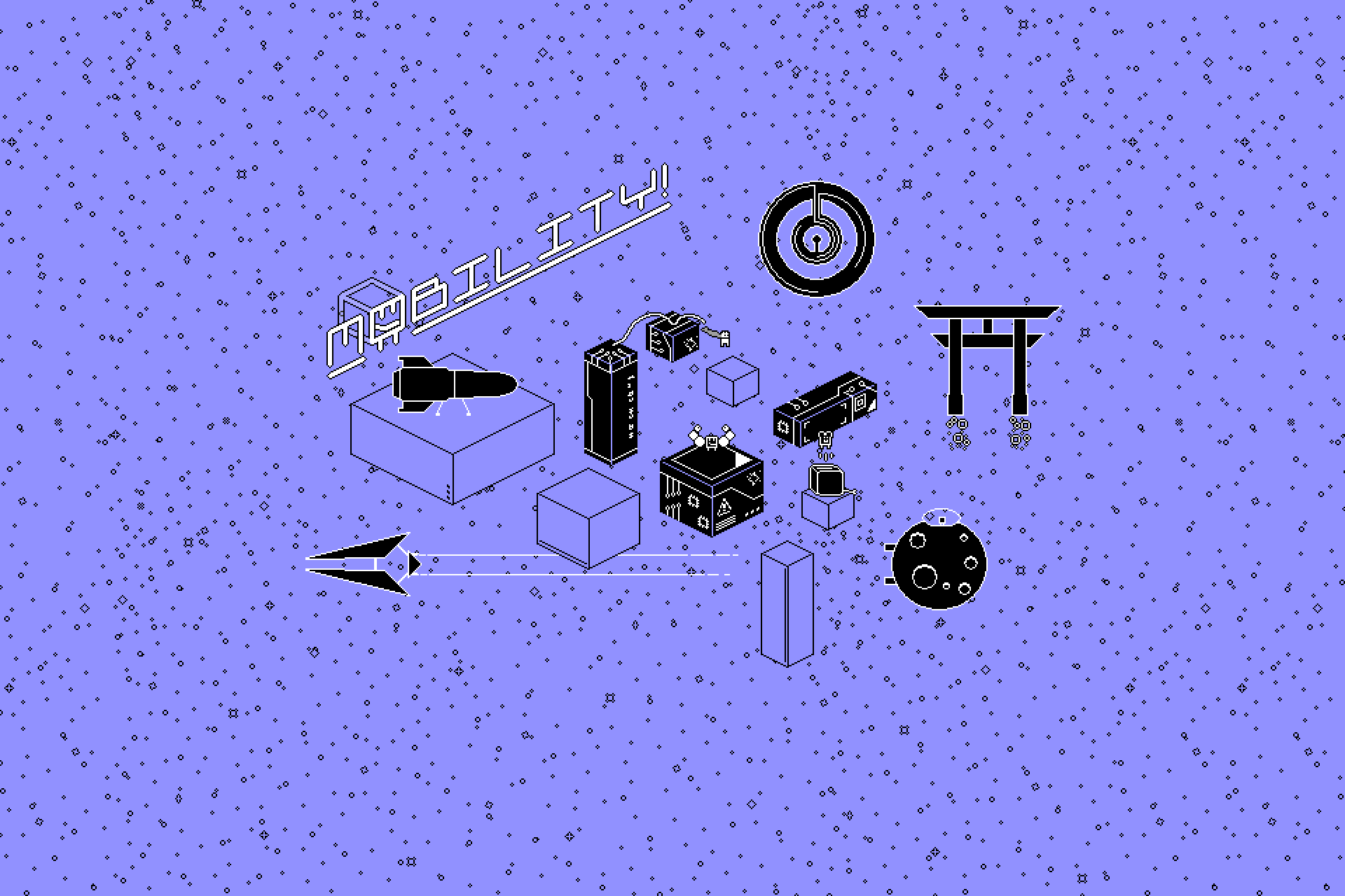
So I've been working on some banner art and some other goodies. I already uploaded it to most portals I'm hosting the devlog on, so you might've already seen it.


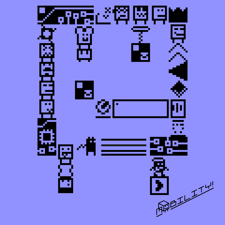
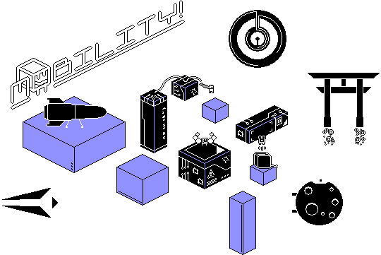
This uses an isometric style that I really like using, and neatly fits the overall very minimalist style of the game. I'm also preparing this artwork, which is the sprite of the main character using other sprites as building blocks:

More playtests

I had two more people playtest Mobility in the meanwhile. I had them play through the entirety of the game, with exception of the final boss (who was not finished yet). The results were very interesting.

One of the things I spotted was that nobody used the backflip, a move in the game that allows you to do a higher jump by jumping while crouching and standing still. Reasons for this are that the move is never explained in the game, and is also never really necessary to complete levels, unlike the long jump for example. This is why I decided to remove the backflip from the game completely. A bit harsh, perhaps, but I was thinking for longer about doing this, and from what I've seen, nobody is bothered by the lack of the move. I still need to adjust some levels slightly to compensate, but overall this removal has a positive impact on gameplay.

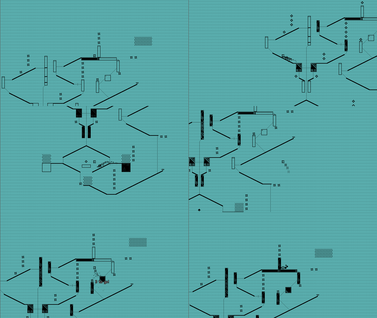
Another change that I was experimenting with was a progress bar. It fills up for every block you activate, and is full when the level is completed. It didn't really work in that state since, once again, nobody noticed its existence. So I changed my approach slightly: when you've almost activated all blocks, a little text pops out of them saying '3 more!', indicating the amount of platforms yet to activate. I haven't tested it yet, but I feel it works pretty well so far. This also avoids the scenario where the players has completed the level, but has skipped some blocks by accident, and this new feature will alert them in time.

Some people even thought the game was too easy, and I'm experimenting with a new difficulty mode specially for them. It is currently named 'Growth', and is simillar to Vanish, except once the blocks disappear after being activated, they turn into slowly growing spikes. Not really sure if I want to have this in the final game yet, but it is already pretty frantic and could be a nice 'secret' mode.

There where other items as well, but these were mostly just small topics. Playtesting can be super interesting, and the only way to discover problems like these. I'm currently preparing a post about playtesting for beginners on my blog, so please look forward to that!

Character unlocks

Mobility has had support for multiple playable characters for a very long time, but has always been an afterthought. I want to keep the game as accessible as possible, so you don't have to complete every level in the game to be able to reach the ending. Nonetheless, a lot of players still do this, but weren't really rewarded for it-- which is where I'm re-introducing the playable characters as unlockables.

The Scarf Cat and toast character I introduced in last month's post
are unlockable, the other two characters will be implemented later.
Characters will not differ gameplay-wise, because that's too much
trouble for me to implement.

Final boss upgrade

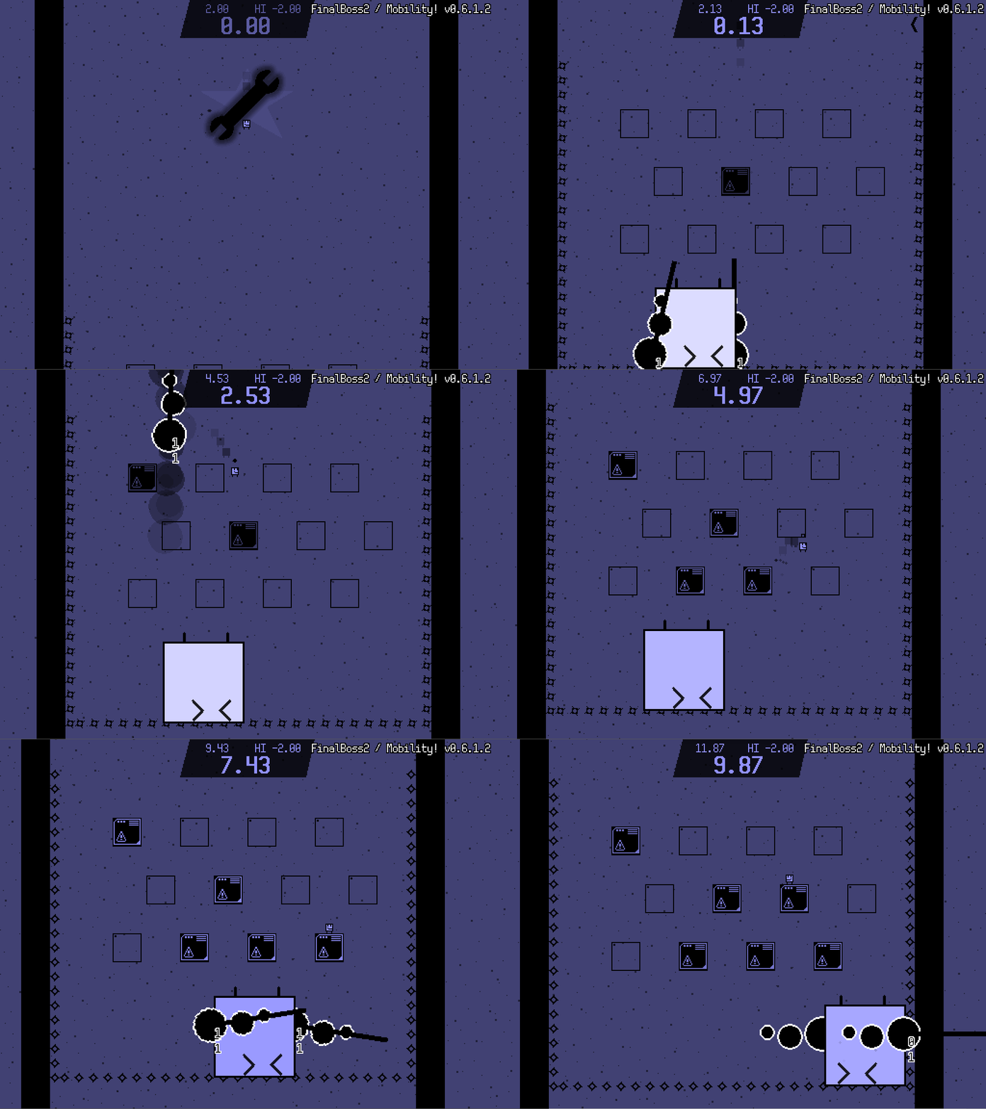
For the first time in quite a while, I've made some progress on the final boss! Under more, the aiming bugs are fixed, and I'm building a new arena to do battle in. The current arena is kind of empty and pretty dull, but I'm thinking of keeping it as the intro of the boss fight to help teach the mechanics.

The room is now a tighter space, and there are normal blocks in the middle. I'm thinking of giving the boss a spike shield, which the players can disarm by activating all blocks. I'll also add some new attacks to replace the flailing arm one in this level.

That's all!

After the final boss is finished, I'll start polishing it until about the end of the year. I'm not sure if the game will release this year (a December launch period will be very risky, even for a free game-- I'd rather wait until Jan or Feb), but at the very least I'll attempt to finish it this year. Thanks for reading!

Here's what I'm guessing will be one of the last devlogs before the game releases! I forgot if I wrote about this last time, but my goal is to finish the game by the end of the year, allowing me to polish and release it early next year.

So here's my progress!

Widescreen
The default resolution of Mobility used to be 512x384. That's a strange setting, and I'm not really sure why I originally chose it. I finally got around to changing it to 640 x 360.

This caused a bunch of issues-- for example, you could see some areas of the overworld rooms not being tiled because they weren't supposed to be seen before. UI elements that weren't anchored correctly were now misplaced, as well. Luckily, these problems were both quite easy to fix, and now, Mobility has pixel perfect scaling when set to full screen on a 1920x1080 monitor.


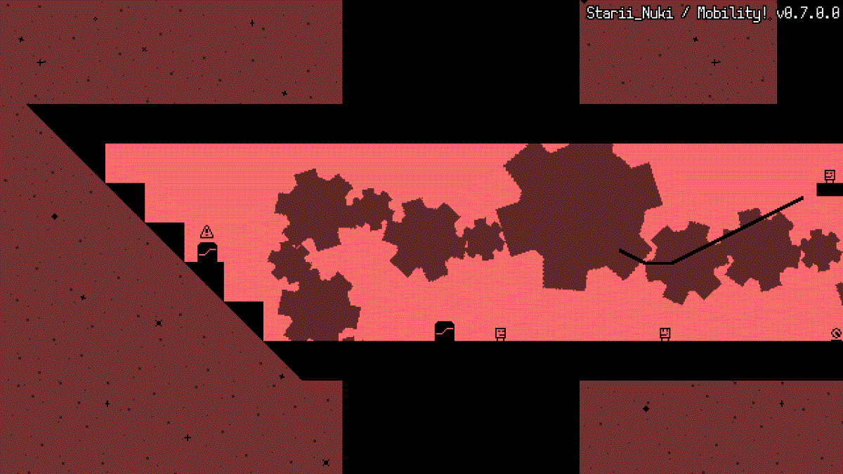
Especially very horizontal rooms like this one on the Starii now look quite nice.

The final boss
As I predicted, it took a long time to get this baby to work. But it's almost there. And I do think it was worth my time to build it.

The boss now has a shield, which can only be de-activated when the player activates all blocks. So now it's more like a normal, though slightly longer level, but this works pretty well.

I'm still putting in the final touches, but I'm really happy with it so far. While the boss is quite easy on some difficulty levels, I'm also considering building in a function to skip the boss for people who don't or can't deal with the boss, and allow them to see the ending as well.

Also check out the thunder effect on the boss shield and arena borders, which I'm generating entirely from code:

OpenDyslexic
Something I've wanted to do for quite some time was to integrate OpenDyslexic as font for the dialog boxes in Mobility. I already had a system where you could set the dialog font, so I just had to download OpenDyslexic, install it, add the font in Game Maker, add it to my font selector, and list it in the credits. It was a really easy inclusion that I hope some players will benefit from.

This particular character will tell you about your statistics at the end of the game. I'm super interested in seeing what kind of stats people get at the end of the game!

Wrapping up
I'm currently working on my very final task list with features that will need to be in at the release of the game. Huge remaining tasks are programming in the game's ending, finishing the final boss, adding a save system, polishing the game, bug testing, and making a trailer for the game's release. I've decided not to do leaderboards at the moment, since it would take me a lot more time to ensure these work and replays can also be uploaded and played back. Let's see if I can get most of that done by the end of the year. Thanks for reading!

Here's one of the last devlog posts of the year, and—if all goes well—the last devlog before the game releases.

Some say that the last 10% of work on a project is actually another 90%. Another saying goes that a game is never finished, just in a good enough state to ship. Both of these are true for me on this project—as much as I've liked to work on Mobility, I'm glad to move onto something else after it is wrapped up, and improve my planning so it won't take two more years before you can play my next game.

Let's get to the good part, shall we?

New levels

At the very last moment, I'm creating some new levels to improve the variety a bit. Take a look:

Growth

I added a new difficulty setting called Growth. It's like Vanish, except the block will turn into a hazard after it has been stepped on. It will also slowly but surely grow in size—if you don't hurry, passage might be blocked off later.


I playtested the game previously with some players who thought Contact was too easy, but Vanish was a bit too hard in some cases, and wanted an in-between setting. Now Growth is the new extreme, and Vanish becomes the new in-between option. This might seem like a stupid solution that doesn't solve this particular issue, but don't forget everything is relative—the mere existence of Growth makes Vanish look less intimidating.

Translation system

Currently I'm putting the final touches to the game's dialog. That means I'm doing spell check, trimming texts to remove unnecessary words, and changing word use in some places (I have a tendency to use words that are more fancy than is necessary).

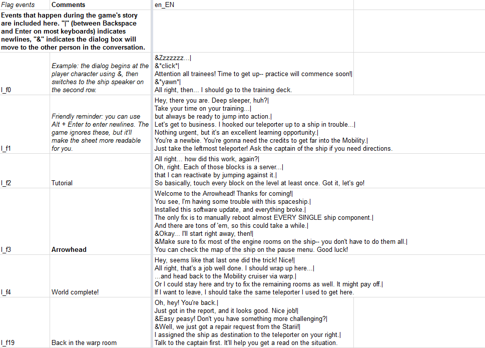
Problem: The game's dialog is scattered all throughout the game code. If you want to change one character of dialog, you have find that, and to change another, go to a completely different place. So I made a sheet that contains all of the dialog. It took some time to find everything in the game code and paste that in there. But now, at least I can change stuff quickly.
But then how do you get that dialog back into the game? I based my method loosely as described in this Gamasutra article, and made a function that can export all strings as Game Maker code which I can paste into the project.

This had three big benefits: - I now know how many strings, words and characters the game contains, and judge how much work it would be to translate the game in another language. - I can use spellcheck to fix the last few typos that remain in the game's story dialog. (I found three of them, so it was totally worth it.) - All of the game's text is in one place that can easily be searched and then exported to a format the game can read.

And for the record: the story of Mobility has 3400 words, nearly 20000 characters, and consists of 57 individual conversations. And that's only all of the dialog, without counting all other text in the interface.

Trailer

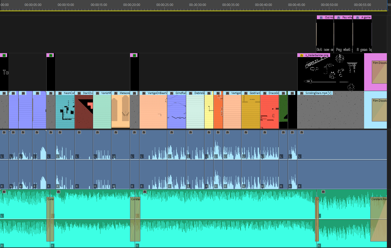
I'm also working on a game trailer for Mobility. More on that in the next devlog when I can actually show you the trailer, but here's my timeline for it so far.

See you next year!

will this game cost? and if it will how much?

(+1)

I'm not putting the game behind a paywall to make it as accessible as possible. I am enabling pay-what-you-want, though, so players are still heavily encouraged to make a donation, because I put in a lot of work (most of my free time from the past two years) and would appreciate it if people sustained the effort. I'm looking into providing some kind of goodie for players that donate, but no details on that yet.

It's finally happening on the 17th this month!

You'll be able to play the game within a few days from the moment I'm writing this. I'm super glad to finally have finished the game, and can't wait to see your reactions!

If you want to help me to make the game a success, consider supporting my Daycause. If you join, you'll be able to compose a message that gets sent out on your social media the moment the game releases. If you'd like to help the game to gain some exposure, you can help me here!

I can confirm that it'll have Windows, Linux (Ubuntu) and Browser versions on day one. See you then!

Mobility, after two years of development has finally been released! You can get it here.

Soundtrack


Luke Steinmann made some fantastic music for this game, and it even supports soundtrack switching! You can grab it on https://lukesteinmann.bandcamp.com/releases as a pay-what-you-want soundtrack.

Translations

Although I'm mostly done with the development of the game, if there's enough interest I'd like some help to translate the game into multiple languages. I will need to put in some effort to implement that into the game, and translate the game into Dutch myself, so I'll only do it if I can add at least two other new languages. I'm not sure if I can support non-latin languages or right-to-left ones, but I'll look into that if you email me. The story of the game has about 3300 words of text, and if you add all interface text, I predict the game has about 3800 words in English.

If you're interested in volunteering, write to  with:

  • Your motivation
  • What language you want to translate the game in and your proficiency with that language
  • If you know someone who is willing to double check & edit your translation
  • And what kind of tools would be helpful for you to help streamline the translation process.

Cheats

Mobility has some cheats! I've already given out some hints in some channels. There's one hidden in the trailer somewhere, and another in the release email I sent out. You can enter cheats by pressing [Tab] on the title screen, and then entering the code. A little sound will play if the code is accepted. Good luck with discovering the codes!

Future plans

Mobility was my attempt to take an existing game genre and make it accessible to people who don't play those games a lot. Next time, I think I'll design a game for that audience right off the bat. I don't think I'll spend another two years making my next game, so I'll be making a lot of smaller and more experimental games from now on.

That said, I do think making Mobility was an excellent journey. It is my most polished game so far, has a complete original soundtrack, with the development process recorded in the devlog, and I met most of my goals I set for this project. One more goal I still need to achieve is to make the actual release of the game a success, so please help me by sharing the game with people who might be interested in it.

Thank you so much for reading, and enjoy the game!

(+1)

It was so great to read all of the progress you made with this! Thanks for sharing your thoughts.