no worries! (≧ ω ≦)ノ and thanks for playing!
parkdraws
Creator of
Recent community posts
Aw thanks Ross! (≧▽≦)/
I was hoping if one keypress turned you 45 degrees and you always moved in one of 8 precise directions, you could do stuff like double-tap to quickly apply a new velocity at 90 degrees, or triple-tap a direction to make a very hard turn. Possibly this would let you move around more responsively because you can always be certain of what velocities your inputs will result in. The main motivation for this was I had a lot of difficulty with navigating around the two electric gates where the first enemy appears the last time I played.
I put more time in and tried shooting with the repairbot this time, I see why you would want to preserve finer rotation. It might be sufficient to add a modifier key which allows you to rotate 2x as fast while it's held?
About the animation, I'd personally avoid adding more rotation sprites since pixel art suffers outside the 8 major rotations, even if it results in some ambiguity about the stored rotation ^^;
Hey this is a fun game! The art, music, and sound effects suit each other really well.
Maybe there is a frame-rate issue with the jump? I think it should be possible to jump here in stage 5:
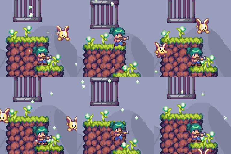
(It was also not possible for me to reach any platform in stage 4 but I could beat it by waiting for the bunnies)
I usually encounter this type of issue when the main loop is executed at render/compute speed instead of fixed time steps, computers with different speeds will end up jumping or moving at different heights.
Great job on this game though, this is a really successful jam game (*/ω\)ノ”
I liked this game a lot, if I could choose one thing to improve I would probably like for Senti to be able to push the camera around as long as Lalo was still on-screen. Ah, and probably would like to have the action/cancel buttons available on x/c in addition to the existing enter/backspace and space/esc. Some of the puzzles required a lot of inputs just to move an object a couple screens of distance and for both of the default keybinds you have to reach and find esc/backspace, which kind of takes you out of the experience.
It's fun to travel around with a party member. :) Good work!
aaaaah I love the main menu music!
putting a limit on the player's bullet distance feels clever to me, one problem I had to iterate over in my own shooter was destroying the weak enemies the moment that they appeared at the top of the screen. I feel like this solution works well in your game since you have upgrades that affect the bullet distance.
the player death particle is also rad as heck
Ohh I imagined it would be scarier than it was. I liked the texture/mesh for the forest trees.
The two eye icons animating when you close your eyes was a great touch, I think using the title and UI as hints for success was really nice. The communication of mechanics/objectives through the tv/text objects in game was handled nicely too. The movement/input reaction speeds felt good too.
In theory you could memorize the path from the gate to any key and retrace your steps with your eyes closed, so I wonder if anything could be done to make memorizing parts of the path easier and more fun. This also lets you eventually add more difficulty or mobs or twist mechanics, as the player gradually navigates more successfully with their eyes closed, right?
Maybe there could be different foresty footstep sound effects, each a slightly different pitch or crunch, and assigned to specific movement in the 4 cardinal directions, so a player could memorize their paths a little easier by associating the sequence of sound. Or new floor tiles could be introduced that have a different texture/sound/associated mechanic.
This game has a neat thing going on, nice job
As someone who once took 2 years to add actual stage content to a jam game that was otherwise feature complete, I relate a lot to working on systems instead of levels. :P
I liked that there were multiple paths to the end. I also like the tiny automatic bounce when you defeat an enemy with the dash and the patterned screen transitions.
whew this is almost perfect, I think the hitbox issue is a problem with perspective. I walked into the spikes and screencapped the positions I died at to see what was going on. (apologies in advance, this comment ran long but its not all about the hitbox!)
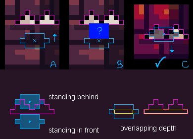
A and B is the same death, I am guessing that the player hitbox is placed on the body, around the size of the blue square in image B. However the player's feet haven't reached the spikes yet, they are at different depths on the Z axis, the player really appears to be standing some distance in front of the spikes at the time of death.
In image C, we can see that the hitbox does make sense when moving downward. The player's feet (small x) are clearly in the middle of the spikes.
Putting the hitbox on the whole body makes sense in 2d platformers because there is no depth, but in 2.5D / isometric games I think the hitbox should be sized and centered according to the shadow. (The 'height' of the shadow is approximately how deep or round the character is, so it doesn't need to be 1px high like the yellow box in the graphic above and could instead fill the shadow, the yellow was to emphasize the center of depth).
ok but with that out of the way, the rest of the game is actually amazing and full of great details. I love the color palette. The duck and especially the ghost animations are *super* good.
The very first time I got to the switch and expected the screen to fade to lead to the next level, but instead the music changed, and the dungeon tiles started flickering to the beat, and then the ghost pops up behind me in the same corner.. the moment the objective clicked I had a huuuuge grin (and then I immediately died on a floor spike).
Anyway I got to the switch again and then after a little time passed in the dark the tempo of the music changed and the ghost... stopped... AND STARTED DANCING? (it-it was dancing right?) I mean I think the mechanic was to allow the player to pass by the ghost, especially when the random spawn position turns out to be disadvantageous right, but it felt like it had a personality, and was almost perfectly in sync with the beat.
The handwritten letters and little flicker in the title animation, excellent. The gleam on all the spikes, slightly offset from each other, and used as a hint/reminder in the dark? awesome. particles on the thwomps, awesome. the unique music for the victory screen, A++. progression screen in between stages, feels good. Tiles flashing in the dark on tempo with the music, super awesome.
So I think the hitbox needs another fix, kinda badly, but the rest of the game is truly fun and well polished. I think this is an overwhelming positive jam outcome.
Also, I'd encourage you to use a gif in the first 2 screenshots, because the animations are really strong in this game and people will be able to see that when they mouse-hover your game in the jam gallery. Currently the victory screen and title screen as the cover/1st screenshot didn't give me a clear idea of what in-game looks and feels like. (I personally love GifCam for its convenience and small gif filesize, tho you may want to temporarily resize the game and record gifs at 256x256px to get the best length/filesize/framerate ratios).
I should have played more past day 8 -- I had only memorized 3-4 recipes so I believe the difficulty still has room to ramp up over time, or else other difficulties could start with more recipes/customers from the beginning. The initial curve feels good to me though!
I would happily pay for a 2-4 kitchen local multiplayer without any expansion of the features other than displaying whomever had the high score after 7-14 days ( ̄ω ̄)
whew it's really, really good. the art is cute and the music and sfx are effective. I was always just on the edge of being overwhelmed. got saved by the clock a few times but never had an unhappy customer at the end of week 1.
I would actually.. really like to play this in a local versus scenario against my wife or friends to see who runs a better sushi belt :D
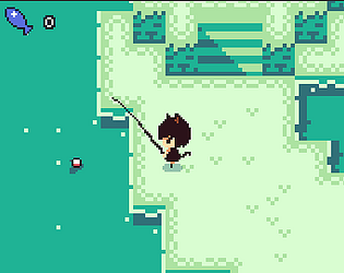
I'm on Firefox 68.0.2. The other day I was trying to reproduce and somebody started discussing dinner while I was fishing with a line out, when I looked back at the game I couldn't exit the fishing state after pulling in the line ^^; If it's Unity, I have experienced very similar bugs while using coroutines and could describe possible solutions
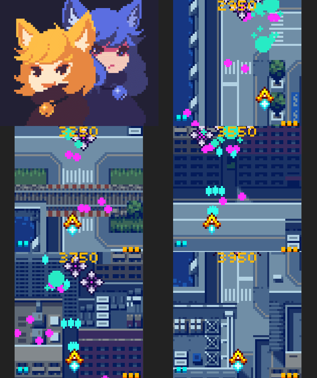
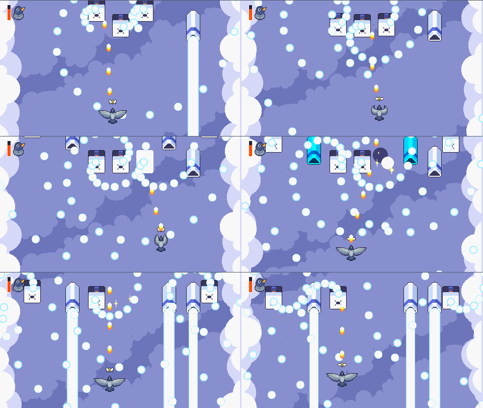
The shooting and movement design comes from Mushihimesama! I think it does a lot of cool things in the bullet hell space, though I also think I am more of an "admire bullet hell from afar" type of person than a veteran :P
I did try a few smaller bullet sprites and found it difficult to track them visually, but this is good feedback! I definitely think I need to adjust some of the big waves near the end and/or their bullet velocity, because I think it's too easy to get trapped. In a good design I don't think using a bomb should be required to pass certain waves. Thanks for playing!
My feelings are mixed because I see a lot of small details that were good, but there were also a lot of small details that could improve the experience.
The effort on the camera movement and lighting effects is clear. The blue fish uses one of my favorite enemy behaviors, and it has great animations while going between states. :D The fire particle animation felt good, and I see you even had a unique cactus animation while it was burning. The text scroll and sound effects are good details, and kicking tumbleweeds around is fun. The music is great, the daytime track is a good thematic fit. Running around leaves tracks in the sand!
While exploring I got stuck on a lot of objects. The bones in the sand probably don't need a collider. I think the cactus hitbox could shrink to the blue size, or even better shrink to the pink size, and then handle the player and cactus sprite's order-in-layer based on their Y position. This lets you walk behind it, and not unexpectedly take damage or get stuck when walking above it. Using a circle collider on the player might also improve navigation around corners without much effort, I'm not sure if there is any downside.
For the combat I agree that the cursor should be more visible. It seems like the blue fish HP has already gone down from the value it had a few days ago? The revolver just takes 2 shots to beat it now, which feels better!
The energy meter works really well for the flamethrower, since you can imagine it has overheated or something, but it is kind of frustrating on the revolver. Maybe it could have 6 bullet icons instead, when the last shot is fired all 6 bullets are immediately restored after a simple reload timer.
Good job to everyone involved (*・ω・)ノ
The walk animation and dialogues are cute! (=`ω´=)
Sometimes the length of a hack caught me off guard, but I'm not sure what I would do to balance it. Since the cursor and the target input are the same color, maybe when the cursor is flashing over an input the text color could change to dark green so it always remains visible.
Ah, I think I just figured it out, but the math equation hack didn't make sense to me at first. I thought I was looking for a pattern in all of the equations, but you just need to solve the bottom one huh? Maybe the equations that are waiting to be solved could use the medium green color to fade them out a bit.
Great work!
I love the design of this game, I haven't seen this style of matching mechanic before and I think it pairs really well with rogue-like mechanics.
I kinda wish the target matching color below the 6 enemies was more prominent, I think you could comfortably increase the 1px squares to 2x2. Or maybe increase the contrast/saturation in the color palette, since it's largely midtones?
I didn't get to the end but I probably ran 8 or 9 times, it's fun. Nice music too!
Love the pastel colors and pixel art (*/ω\) Using top and side views is fun, reminds me of Tales of Phantasia.
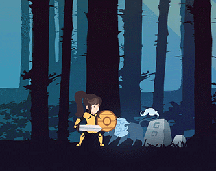
I wasn't sure how to beat the cactus enemy without getting hit, I think it could be better if the spike was more predictable? Maybe always shoot it at the same vertical position with a clear anticipation sprite, or have a unique sprite for high and low attacks so the player knows to jump or stay grounded.
The completeness of this game is really impressive. I also liked the boss designs, and the timescale when the player gets hit was a great detail. The music was excellent from beginning to end. The level selection menu is really stylish.
I would like the enemy ships and player bullets to stand out more from the background, but I am having a difficult time thinking of a good change to the palette.. usually I would avoid black and grey, but the black background feels like it comes from one of those science class planet posters right now, and that's pretty cool too.
It felt good to have a goal and see the progress rewarded in various ways through the UI, including the ending. Nice work!
thanks for the report! I've published a new web build with exceptions enabled, and I reduced the .NET requirement from 4.x to 2.0, could you try that? I'm also on firefox (68.0.2) so I think it was most likely the .NET requirement..
I am working on an exe too, but it will take a little more time to get right.
That’s great, maybe add the +- keys in the description :D
I picked Matthew because I valued the physicist and engineer more for the task of rebuilding civilization, even though I wondered if they could accept that. You’re right that I imagined various endings to the story even before making the decision, so I think it was an effective design. I wonder if the end of gameplay could be signaled a little more clearly somehow, maybe even just “fin” on the bg image.
Yeah the dream totally got me, I didn’t want to spoil anything but I laughed.
I absolutely love the visual style.. it's so good and I can't praise it enough.. The objective is cute too, I feel motivated to help repairbot succeed.
Since the robot only flies in 8 directions, I kind of wish I could tap left/right just once to adjust the direction.
This game is a great accomplishment, good work.
ooh this is nice, I like the variety of enemy patterns and item effects and their distinct colors. the special had a cool animation. I love the title screen's text design and music! I think someone else was right that the sound could be rebalanced during gameplay, I'd like to hear the music emphasized over the bullet sfx.
this gripped me a lot more than I expected, is it intended to skip to the title screen when you make the difficult decision at the end?
this reading technique seems familiar to me, was there a speed reading app that presented one word at a time in the past? I think this is a fine technique, if it's handled programmatically maybe players can even adjust the speed using +- keys.
maybe the glowing lights (from the mainframe etc) could be a different color from the green text prompts, I was a bit anxious that I was missing text content on some screens. or maybe it would be even better to change the "exit" prompts to orange, I definitely did miss a couple by wandering around in the wrong order.
nice work, and good writing ( ̄ω ̄)/


