Indie game storeFree gamesFun gamesHorror games
Game developmentAssetsComics
SalesBundles
Jobs
Tags

matticgreek

44
Posts
3
Following
A member registered Jul 14, 2017 · View creator page →

Creator of

Recent community posts

I loved this. Fantastic presentation. Beautiful art, good choice of mellow music, the radio soothingly conveying astronomical facts is genius, and the puzzle gameplay of searching for star clusters and assessing whether they might fit any of the desired patterns is creative, not to mention potentially educational as well.

It would be cool to tie the radio messages to whatever constellation you are trying to complete or have just completed, if you didn't do that already. I wanted more information about the specific constellation I was trying to connect, like its name, haha.

I think this explores the part of the theme about "what does it mean for things to be joined together?" very well. I'm not sure if it really gets at the other part, i.e. "what does it mean for that connection to break?"

Overall, very nice job—a soothing play that really stands out.

Nice work! This is a very interesting concept. Switching between different modes to position the box the way you need it is a creative spin on the standard "figure out how to press all the switches" puzzle game.

I wanted a "retract chain" option/mode to pull the box to my location. I got stuck a few rooms in because I couldn't figure out how to get the box up into the corner, which was frustrating.

This might be very interesting with actual physics on the chain; on the other hand, it might ruin the precision and make the game impossible, so you'd need to try it out, haha.

The text was hard to read, and I think there was music mentioned on the title screen, but then no actual music?

There's some great potential here. Thanks for the submission!

I agree with these observations. The game could use more feedback, for sure. Each vaccination you pick up increases the "Max People" count, so I assume it increases how many people can join you. But you have to be looking closely to even notice that number going up. Something like a "Max People + 10!" that appears above you when you pick up a vaccination could easily address this.

Agreed, I felt a nice Katamari Damacy vibe.

Nice job on this! I wish there were a rating category for "mechanics as meaning," for which I would give you five stars, because I love how this is a) very topical and b) expresses the vaccination situation through the game mechanics, i.e. the more vaccinations obtained, the more people can be together, but also the harder it is to avoid the virus. That's brilliant.

I enjoyed this! Momentum-based action is always fun, and the swing-and-release has a nice Spider-Man vibe, which seems blatantly intentional given the title and theme, haha. It was quite satisfying to swing around the levels as gracefully and quickly as possible (right-click all the way!), and I really wanted to focus on that; maybe this is well-suited for speedrunning? Less satisfying was trying to push the flies into the web—I felt like I couldn't quite get the hang of what motion was necessary there, and would appreciate more focused level design to teach that application of the mechanic. But overall I had a great time and played this longer than I meant to. And the hand-drawn signage is super-charming. Nice work!

This is such an interesting mix of a turn-based game where everything draws from limited action points and a traditional Metroidvania / action game. Really quite creative. It doesn't quite work because a big part of the joy of Metroidvanias is the fluid feeling of moving through the space, and having limitations on basic movement saps some of that joy. But it does turn movement itself into a kind of puzzle, and that's very interesting, too. I enjoyed playing through this and would like to see it taken further.

(2 edits)

You can press "r" to restart the level. I don't think it says that in the description, but I learned from another submission to try it anyway, haha.

This game is hilarious and I love everything about it.* The Game Boy-style retro art and sepia tone really knock it out of the park. And it's a genuinely clever, funny conceit tied in well to the gameplay. The whole package feels like an excerpt from a full, published game, so major kudos for that.

*Except maybe the sound of the projectiles firing; that one gets a bit grating.

I ran into a couple technical issues. The sound effect volume seems to be somewhat unbalanced—occasionally the projectile sound would be really loud, but then quieter again, even in the same level. I also encountered major lag and performance issues in the level following the introduction of the conveyor belts (i.e. the one that starts with the falling stalactites).

Overall a very impressive submission. Making a funny game, let alone one that plays well, is a real achievement. Well done!

Oh, I forgot to mention that the mouse cursor got really sluggish and unresponsive when I switched the embed window to fullscreen, but when I exited fullscreen it was fine. Not sure what was going on there.

I enjoyed this! I played through three or four levels and didn't get the feeling of anything being out of control, but I see from other comments that things occur in later levels. The presentation is quite impressive, especially the satisfying sound and visual effects when swapping tiles and removing matches.

I agree with jermrellum's comment that no real strategy is required, and adding that is what would elevate this. In the levels I played I didn't see any actual challenge or way to fail. You could limit the number of moves (though that would require designing the levels by hand in a way you probably didn't have time for) and/or have consequences of making a given move that could build to a failure state. This would also necessitate some way to anticipate when and where the golden tiles would show up. But what you achieved in the jam's time constraints is impressive.

It did bother me that matches that occur serendipitously don't register. On many occasions the board would start out with a match or one would fall into place but it wouldn't disappear until I manually swapped tiles around just to cue the game. It takes away from the otherwise-stellar presentation.

All in all, very nice job, and congrats on finishing your project!

Haha, you also got the moonwalk!

Nice work! Especially for being your first jam. You should be proud!

As a big fan of music games and especially ones that don't just do the Guitar Hero thing*, I love the idea of the level visualizing and reacting to the music. That's an impressive technical feat as well. It'd be great to see the idea developed further, to the point where you have to pay attention to the music and plan around your knowledge of it in order to progress.

*Not that there's anything wrong with that.

A couple technical notes. The game window is really tall! Haha. I couldn't fit it all on my screen, even in fullscreen Chrome, without zooming out. Also, I'm not sure how I did this, but somehow when landing a jump I managed to get the guy stuck in the left-facing animation even as I was moving right, resulting in a moonwalk. It was awesome. I spent some time afterward trying to recreate it but could not.

Congrats on finishing a jam project!

Ah, nice, that's good design.

(1 edit)

This is a really interesting idea. I love the concept of a game that plays itself and have tried something similar in the past (less elegantly). The trick—if aiming for more than a gag—is to find some way to make it still fun. In this case there's definitely the potential for a management-sim-type experience, which you tapped into with the upgrade system.

I was confused by how that system actually works, even with the game description, and would suggest adding more feedback and clarity about a) what the currency actually is to buy those upgrades (is it money or experience?), and b) what the upgrades actually do. To be fun any management sim has to offer an intimidating level of granular control and detail with clear cause-and-effect for every action, so it's quite an ambitious goal to tackle for a jam—kudos to you.

I enjoyed zooming out and in and watching the little people battle it out. It reminded me a little of Red vs. Blue. Overall, a cool idea and project. Congrats on your submission!

This is very cool! Nice work to all of you. The presentation really impressed me. I appreciated the small touches like each button on the controller in the UI being pressed when the respective key is. And the integration of the framing device into the gameplay itself is quite clever. The flames on disabled buttons, the actual button names appearing inside the tiny flames on "screen"—I loved it.

Making the kick home in on enemies was a smart design decision because it compensates somewhat for lost directional controls and enables recovery. The game did get frustrating when I lost enough controls, though. At that point I was just spamming what buttons I had left, and it wasn't especially fun. If you were going to evolve this concept, I'd suggest adding and balancing abilities such that each can compensate for the loss of the others in some fashion, probably just requiring a different play style. Ideally the player should be able to recover even when down to a single input, just like it's still possible to win in other games when you've only got a sliver of health left. But if all you've got left in your game is literally "Left," then you're pretty much out of luck.

Anyway, excellent job, and congrats on a completed jam submission!

This reminds me of N++ and games of that ilk, which I like! And I always appreciate a good wall-climb. The game fits the theme well in that I'm frantically trying to move about and hit switches before the floor drops away, and I don't really have time to plan a route or strategize or really think in any way, so it feels out of control. The downside of that is that it takes away from the fun, as I feel more like I just got lucky if I managed to beat the level. Then again, luck is in the name, haha. I enjoyed the sound and animations, and the art is clean and readable.

The upgrade and seed menus were intriguing but ultimately confusing, and felt more like afterthoughts. I'd suggest explaining them in the description on the game's page. Especially the seed menu—I have some familiarity with the concept of seeds in randomization, but not everyone does, and I still had no idea how to actually use the menu.

Despite the luck basis, I had fun with this. Nice work, and congrats on completing a jam project!

Ha! Nice, now I see the button in the upper-right; somehow I missed that before. And it serves me right for not just trying the "R" key. But yeah, I'm glad you added it to the description. I was like "why would they add back and next buttons but not restart? that doesn't make sense," haha.

Thanks again! Yeah, I tried the game out on another computer with a Retina screen, and sure enough, I had the same issue. Bah. I haven't spent much time making UIs in Unity so I don't know if there is an easy solution for this, like some checkbox I didn't check or something. But it's good to be aware of the issue.

All I did to map the UI onscreen was to create a Canvas, add several text components inside, then use the anchor/pivot settings on each one to position them in the lower-left corner of the screen (or lower-right in the case of SPACE), and then tweak their x and y coordinates. I don't know why that positioning would be thrown off by a different screen resolution/density. My best guess is that the Canvas itself has a size/resolution and relative position to the rest of the game screen that is affected by the display in question. Will have to do some research.

You're right that it's more inconvenient to have to look at the corners of the screen than wherever the player is, but that was actually my intention. I hoped that would add to the funny, frantic, out-of-control feeling I was going for, sort of similar to the concept of the Wii U game ZombiU, where you have to look between the zombies closing in on the TV and your items on the GamePad in real time. But I take your point—the application may be different enough here that it doesn't really work.

I appreciate the kudos and all the feedback!

I did something similar for my own submission, but in a different genre; it's interesting to reflect on the concept from another angle. I liked that the controls are always very legible and consistent in their positions relative to each other, even as their shared position on the keyboard moves around. I wanted some warning that the controls were going to change. Without that, it's mostly frustrating when it causes a failure.

I'm intrigued by the tilt mechanic, especially because that's the name of the game. In practice I never triggered it. I did it intentionally just to see what would happen, and I found the loss of control interesting (and thematically appropriate), but I'm not sure platformer is the right genre for it. There's not enough going on at one time to inspire frantic inputs that might lead to tilt, and if there were, it would mean the situation was already overwhelming, so the tilt would only aggravate that. It might be better to rethink it as a way of punishing reckless action, or something like that.

Anyway, nice work completing your project, and thanks for sharing!

(1 edit)

This is great! Solid puzzle design with clever use of spatial reasoning. The mechanic of equipping/unequipping the special ability, and the way it persists through death and combines with the respawn locations for puzzle complexity, is quite interesting.

I wanted a "restart level" button! Several times I made a wrong move and couldn't complete the level, and had to use b/n just to restart the current level.

Very impressive—felt like a full-fledged tiny game. I got some Braid / Super Meat Boy vibes.

Nice work! I enjoyed this. Kudos on completing a project within the jam!

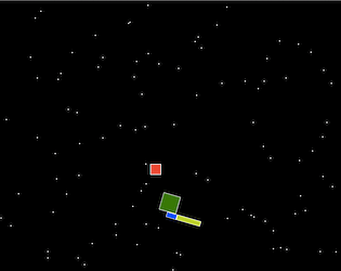
I see from the other comments that this was your first time making art for a game—you should be proud, because it turned out really well! The presentation really makes this. I love the star field and how hectic it gets, literally spiraling out of control. The bouncing enemies and their happy expressions are so cute that I felt bad about squashing them. Not so "peaceful," space-person!

As another person pointed out, you did a good job at pacing the gradual increase in enemies. It builds nicely. I wished for more feedback about how I was doing, though. Perhaps a count onscreen of how many terminals are out, e.g. 3/10 => 4/10 => 5/10 etc. Without something like that constantly going up, I didn't get a strong sense of increasing danger, even with the additional enemies, fires, and spiraling stars. Eventually I just left the game alone for a while to see if there was actually a fail state (which there is, and it's very cinematic—nice). So I don't think the feeling of being overrun is quite there.

Sound would really help create that tension as well. In fact, your game's description is a bit of a tease because it says "when suddenly you hear a noise" but then you start the game and...no sound, haha. Another thing that would help is to add a little mechanical complexity to reactivating the terminals. But all in all you did a great job at realizing the concept in the time allowed.

Loved the coffee machine. Just let me press a button in front of it to play a coffee-brewing or -pouring sound—that's instant gold.

Much obliged!

Thanks so much, that does really help. Looks like the height of 768 may have been too tall to be practical. I have trouble fitting it all onscreen at once in the default view, too. Good to know for next time. Appreciate the feedback on the text placement, as well.

Thanks for trying the game and for the feedback! Frantic humor is definitely what I was going for so I'm glad it worked. So glad you enjoyed it! Agreed on the presentation needs; making time for that will be my goal for the next jam.

(1 edit)

Awesome, thanks so much! That's great to hear. Agreed sound would help a lot. Thanks for trying the game and for the feedback!

Thanks for confirming this, too! Hmm, the gate not being visible plus the text being small definitely implies some resolution shenanigans. Would you be able to share a screenshot of what you see when you load the game? If the top of the embed window is visible onscreen but the gate at the top of the level is not, that is baffling to me and I'm having trouble visualizing it.

Nice, thanks for confirming the issue; I really appreciate the follow-up. If you get a chance, check out my reply to Jknapp's screenshot further up in this thread. I'd love to figure out what's causing the discrepancy (so maybe I can avoid it in the future). The text definitely wasn't meant to be tiny or hard to read in any way.

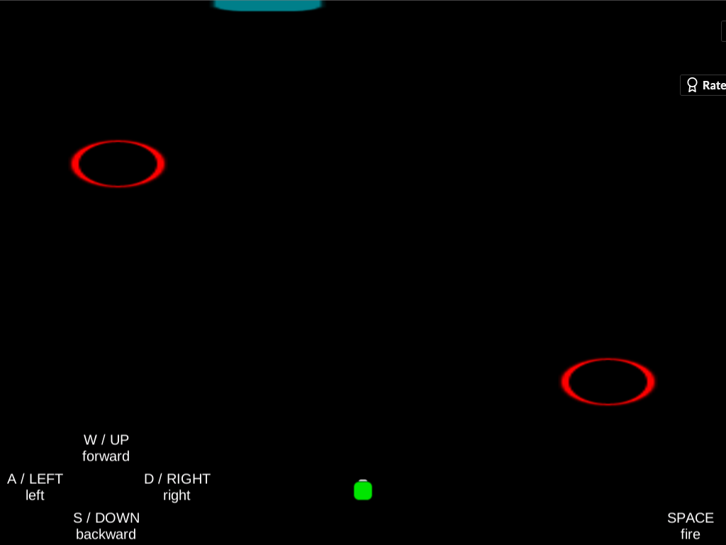
Thanks for following up and for the screenshot! That's really interesting—it shouldn't look like that. I attached a screenshot to this post of what it should look like. I'm really curious what would explain the difference. I tested in Chrome, and it looks like you're running Safari, so I thought that might be it, but I tried in Safari (and Firefox) and it still looks right for me. Now I wonder if it's Retina vs. non-Retina. Are you running on a Mac with a Retina screen? I'm using an older Mac without Retina. So that could be it, or maybe just the different resolutions of our screens (I'm at 1440 x 900). The game objects in your screenshot still look the right size and in the right location, so perhaps this is an issue that only affects UI elements. Definitely something to learn...

What it should look like (minus the "Rate" banner in the upper-right):

Thanks for trying the game and for the feedback! That makes perfect sense. I had hoped to add more "juice" to the control switching, but ran out of time.

I'm also unable to play this. I'm in Chrome and was able to load the game—though it took a long time—but then got what appeared to be a hang when I clicked Start from the game menu. Then suddenly there was a loud noise and a flash, and the visuals crashed with a browser alert about WebGL context being lost, or something like that. What I assume is the game music continued to play, but over a gray screen.

The first two levels don't have enemies, just the black hole hazards; I'll make that clearer in the description. Thanks for trying the game and for the feedback!

Thanks for trying the game and for the feedback! That's interesting that the controls were tiny for you, as I tried to make the text pretty big. What device were you playing on? The build is set to 1024 x 768 resolution so I suppose if you're running a much higher resolution then things might be tiny. Agreed on the need for more visual cues and sound.

That all makes sense. Yes, tweaking the timing of the control switching to a) allow for people to get comfortable the first time (longer delay) and b) provide a challenge even once they know what they're doing (shorter delay) was a design challenge that easily eclipsed the time available. Agreed on the need for juice as well; implementation ate up the whole time.

That's interesting about the resolution issue. I haven't built enough web builds to know offhand what would explain it. The build is set to 1024 x 768, which should fit easily on any modern monitor, without needing to use fullscreen (in fact, fullscreen seems to expand the play field, which is very strange to me). Perhaps the window was scrolled down a little so the gate was offscreen?

Totally agree that it's not clear when you've died and restarted vs. cleared the level and moved on. That needs clarity.

Thanks for trying the game and for the feedback!

Thanks for trying the game and for the feedback! I'll add more to the description.

This feels like a classic arcade game, with simple gameplay and ever-increasing challenge. I kept waiting for it to ask me to insert a quarter to buy some breathing room, haha. It definitely captures the feeling of an out-of-control situation, so it fits the jam theme well. The gameplay itself may be too simple—it gets tedious fast, and it'd be hard to sustain interest for the requested five minutes, even if the difficulty didn't ramp up so fast as to make that practically impossible. I'd suggest reducing the duration to win (maybe a minute? or two at the most), as well as decreasing the difficulty slope, and maybe adding another mechanic or two (that you do have control over). I loved the presentation. The audio is simple and effective, and the animation and art is delightful, especially the way visitors' heads hang as they leave, and the way the dogs run them off. It would be nice to indicate visually somehow how much persuasion a visitor will need—I can see how not revealing that information contributes to the out-of-control feeling, but it was mostly frustrating, and I think the number of visitors is sufficient to overwhelm. Thanks for sharing!

Huh, interesting. It should be that when you finish the first room, the door at the top turns from red to green, and then when you go into it, you move to the next room and there's a new batch of enemies. I wonder why it seemed like nothing happened for you. Did you play the fixed version linked in the description?

In any case, thanks for trying out my game, and for the feedback!

Makes sense; sounds like I could clarify that. Thanks for the feedback, and for playing! I like the fixed version better, too.

Love the idea. I felt a bit overwhelmed by all the differences from regular chess. I think it would have been enough to shuffle all the pieces after each turn. That would have turned it into a kind of "reflex" chess, where you just try to make the best of each random deal. The betray/destroy events felt like too much. They certainly fed into the "chaos" concept, but in a way that made the game more confusing and less fun. I would also have preferred to see the standard graphics for the chess pieces. Any of the above factors individually would be manageable, but with all of them at once, I didn't feel able to engage with the game as chess at all, which made me less inclined to put in the time to familiarize myself with each difference.

It's an impressive technical achievement, though, especially with all the options and configuration. Maybe just presenting the features sequentially or as different modes would be sufficient, instead of all at once.

RTS is an ambitious genre to tackle, especially for this jam theme, so I commend your ambition. It's an intriguing idea, but I'm not sure that "RTS without units" actually works as a concept. If you look at Mark's example of Snake Pass as a platformer without jumping, the core genre concept is not jumping per se, but rather navigating a space with gaps and verticality, and jumping is simply the most common means to do so. Snake Pass still has platforming, just without jumping.

I would say the core concept of real-time strategy is commanding units in a smart way, (typically) against an opponent, with time pressure. The fun of the gameplay comes from having to coordinate, managing multiple things simultaneously. When you strip away units, what you have can't really be called an RTS anymore. It's an action game (if you have enemies) or maybe a puzzle game (if you don't). So as intriguing as your premise is, I have a hard time making the case for calling the result an RTS. You're not a commander, you're just directly controlling one dude.

The way I see to do RTS in this jam would be to make an RTS where there are units, but you can't *command* them. Or maybe you can control them, but there is no strategy to it. Don't know how either of those would look - like I said, it's a tough concept!

Love the Pikmin shoutout. It does have a bit of that feel. Thanks for sharing your game!