


Play game
Press ? to ?'s itch.io pageResults
| Criteria | Rank | Score* | Raw Score |
| Overall | #3395 | 2.419 | 2.419 |
| Fun | #3464 | 2.290 | 2.290 |
| Originality | #3833 | 2.419 | 2.419 |
| Presentation | #4544 | 1.968 | 1.968 |
Ranked from 31 ratings. Score is adjusted from raw score by the median number of ratings per game in the jam.
How does your game fit the theme?
Controls are unreliable.
Did your team create the art for this game during the 48 hour time slot?
Yes
We created all art during the game jam
Did your team create the audio for this game during the 48 hour time slot?
Yes
We created all audio during the game jam
Leave a comment
Log in with itch.io to leave a comment.
Comments
Even though it's literally the first thing that comes to mind when thinking "out of control" I joyed this quite a lot. Reach with unintentionally humorous moments it really kept me on my toes. Presentation could use some work, but overall I liked it.
Thanks for trying the game and for the feedback! Frantic humor is definitely what I was going for so I'm glad it worked. So glad you enjoyed it! Agreed on the presentation needs; making time for that will be my goal for the next jam.
Cool idea had fun playing with it, adding some sound would definetly increase the experience, great job, keep it up!
Awesome, thanks so much! That's great to hear. Agreed sound would help a lot. Thanks for trying the game and for the feedback!
Fits the theme pretty nicely, I think if there was some sort of indicator as to how your controls change would benefit the experience.
Thanks for trying the game and for the feedback! That makes perfect sense. I had hoped to add more "juice" to the control switching, but ran out of time.
I'm not sure if something went wrong just for me, but there didn't seem to be any enemies?
The first two levels don't have enemies, just the black hole hazards; I'll make that clearer in the description. Thanks for trying the game and for the feedback!
Fits the theme well. I really didn't feel in control lol. Hard to read controls cuz they tiny, Needs more visual cues to know which way your facing and its a little empty feeling maybe adding some sound.
Thanks for trying the game and for the feedback! That's interesting that the controls were tiny for you, as I tried to make the text pretty big. What device were you playing on? The build is set to 1024 x 768 resolution so I suppose if you're running a much higher resolution then things might be tiny. Agreed on the need for more visual cues and sound.
Maybe its just me, but the font seemed small and hard to read to keep track of the changes.
Thanks for following up and for the screenshot! That's really interesting—it shouldn't look like that. I attached a screenshot to this post of what it should look like. I'm really curious what would explain the difference. I tested in Chrome, and it looks like you're running Safari, so I thought that might be it, but I tried in Safari (and Firefox) and it still looks right for me. Now I wonder if it's Retina vs. non-Retina. Are you running on a Mac with a Retina screen? I'm using an older Mac without Retina. So that could be it, or maybe just the different resolutions of our screens (I'm at 1440 x 900). The game objects in your screenshot still look the right size and in the right location, so perhaps this is an issue that only affects UI elements. Definitely something to learn...
What it should look like (minus the "Rate" banner in the upper-right):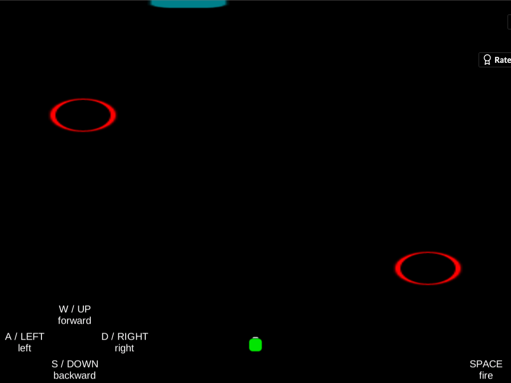
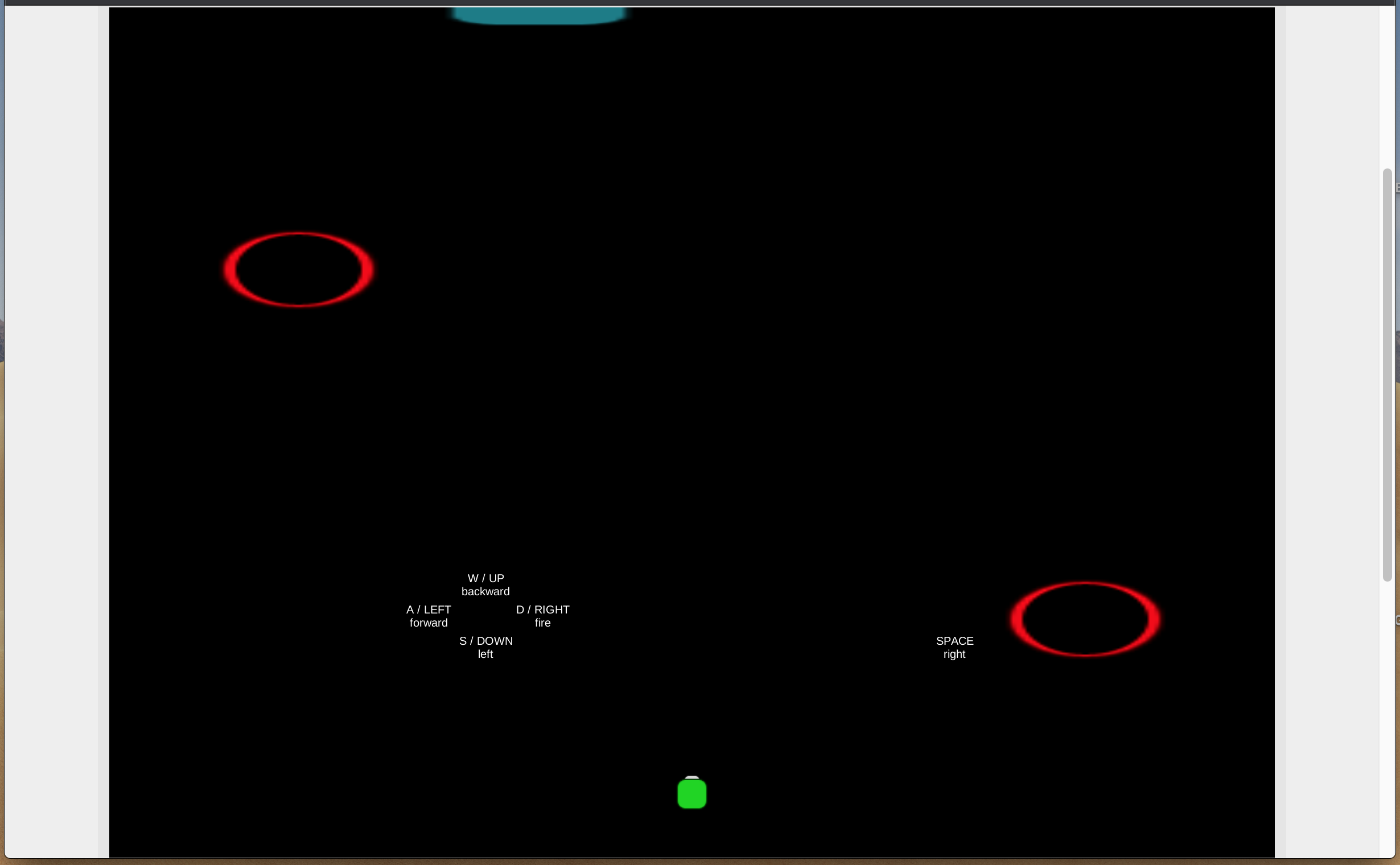
2560 x 1600 with retina. Hm, that could be a factor. I am curious to see how you have your UI mapped in your game, because it does seem like it is skewed on my screen. Notice how its directly below your red ring on your screen and mine its closer the center. Your text definitely looks bigger on your screen. However i still see it as small/ inconvenient to have to dart my eyes back and forth. That's only because it supposed to convey the most important information to the player in your game. This is just a suggestion for post game jam but maybe surround your character with the UI that way the player can keep an eye on the action while also being able to see the control changes. Ultimately, I think alternating controls is an extremely hard concept to implement while keeping your game feeling good so kudos for trying this.
Thanks again! Yeah, I tried the game out on another computer with a Retina screen, and sure enough, I had the same issue. Bah. I haven't spent much time making UIs in Unity so I don't know if there is an easy solution for this, like some checkbox I didn't check or something. But it's good to be aware of the issue.
All I did to map the UI onscreen was to create a Canvas, add several text components inside, then use the anchor/pivot settings on each one to position them in the lower-left corner of the screen (or lower-right in the case of SPACE), and then tweak their x and y coordinates. I don't know why that positioning would be thrown off by a different screen resolution/density. My best guess is that the Canvas itself has a size/resolution and relative position to the rest of the game screen that is affected by the display in question. Will have to do some research.
You're right that it's more inconvenient to have to look at the corners of the screen than wherever the player is, but that was actually my intention. I hoped that would add to the funny, frantic, out-of-control feeling I was going for, sort of similar to the concept of the Wii U game ZombiU, where you have to look between the zombies closing in on the TV and your items on the GamePad in real time. But I take your point—the application may be different enough here that it doesn't really work.
I appreciate the kudos and all the feedback!
Just to confirm about font size, it was small when I played it as well (in web browser on MBP 15”). My screen as a whole was enough to make out the text, but I did feel inclined to lean in to read it sometimes.
Nice, thanks for confirming the issue; I really appreciate the follow-up. If you get a chance, check out my reply to Jknapp's screenshot further up in this thread. I'd love to figure out what's causing the discrepancy (so maybe I can avoid it in the future). The text definitely wasn't meant to be tiny or hard to read in any way.
Okay, I've revisited it and found that the blue gate is in the display (at the edge), but the Unity player on for this game is exceeds the height of my browser's visible display. It can be mitigated via the web browser's zoom-out (Cmd -) and scrolling. I'm playing on Chrome web browser on an MBP 15".
I've taken 3 screenshots for your reference: in-browser as is, in-browser zoomed-out, and full-screen Unity Player. The text's font size & displacement from the intended position can be observed here, too. Note, however, that the control-text being closer to the center of the screen in this case makes them much easier to glance at compared to being at the bottom corners as intended (though I personally would prefer a cluster at the top-right, where HUD stuff is often placed).
[ As Is ]
[ Zoomed Out ]
Hope that helps.
(Please excuse the size.)
Thanks so much, that does really help. Looks like the height of 768 may have been too tall to be practical. I have trouble fitting it all onscreen at once in the default view, too. Good to know for next time. Appreciate the feedback on the text placement, as well.
I pretty much agree with apiruxb: it's an interesting little idea, but needs a bit more juice to help the player figure out how things have swapped around, and give things a bit more of an impact/consequence.
A small balance notes: It might be my resolution, but when I first started the game in non-fullscreen, I couldn't see the blue gate I was supposed to aim for, so I was pretty lost. I was especially confused when shooting the only things I could see (a black hole) didn't do anything, and driving into it didn't seem to either. When the blackhole eventually sent me back to the start, I initially thought I had beaten the level haha
Also, the levels seem short enough that once I figured out the actual goal, I was able to rush through most of them without having to deal with any controls switching. Not sure if there's a good way around that.
That all makes sense. Yes, tweaking the timing of the control switching to a) allow for people to get comfortable the first time (longer delay) and b) provide a challenge even once they know what they're doing (shorter delay) was a design challenge that easily eclipsed the time available. Agreed on the need for juice as well; implementation ate up the whole time.
That's interesting about the resolution issue. I haven't built enough web builds to know offhand what would explain it. The build is set to 1024 x 768, which should fit easily on any modern monitor, without needing to use fullscreen (in fact, fullscreen seems to expand the play field, which is very strange to me). Perhaps the window was scrolled down a little so the gate was offscreen?
Totally agree that it's not clear when you've died and restarted vs. cleared the level and moved on. That needs clarity.
Thanks for trying the game and for the feedback!
+1 on the resolution issue.
Before seeing this comment, I had no idea there was a blue gate at all. It wasn’t in the visible area when I played it (in web browser on MBP 15”).
Thanks for confirming this, too! Hmm, the gate not being visible plus the text being small definitely implies some resolution shenanigans. Would you be able to share a screenshot of what you see when you load the game? If the top of the embed window is visible onscreen but the gate at the top of the level is not, that is baffling to me and I'm having trouble visualizing it.
^ I've responded to both issues in the comment thread further above that you mentioned.
Much obliged!
It seems like a last-minute submission, so I'm assuming that is the reason why there are no descriptions on game objectives or win conditions.
The changing controls on a timer is a nice spin. It would have been nice if there were more consequences and gameplay interactions to give that spin more of a weight or impact on the experience.
A good idea, but the gameplay needs some consequential interactions and feedback cues. Nice job completing a game project in 48hrs.
Thanks for trying the game and for the feedback! I'll add more to the description.