Thank you very much for your feedback and the kind words! They mean a whole lot, seriously. <3
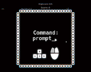
The mouse issue is unfortunate, but it probably might help to start each "round" with the cursor placed to the right of the screen! Thank you again!
Cyber Twilight
Creator of
Recent community posts
Yup... unfortunately, we were unable to verify that in itch.io before the jam period ended, and the team was super burnt out. :(
https://gamejolt.com/games/folclore/430486
This is the same version - with the ability to play fullscreen, if you want to try again! Thank you for your time!
EDIT: Oh wow, turns out I just realized Itch.io has that option too!
I'll go ahead and add a warning to the description's header about it - please press the fullscreen button on the bottom right for the full experience!
Thank you once again!
Glad to help! And I'll offer as much feedback as possible!
About the music, specifically: It feels like a cacophony. As in, it feel slike a lot of loud, incoherent rhythms mashed together with no cohesive glue between them. Making it less loud (or better yet - a voluem slider) would be the first step absolutely - but there's also something that you need to keep in mind: What is the pace of your game? Does this help the pace? Not help? Or worse: hinder it? Because maybe for a game about reflection (which requires some thought), a blast of cacophony isn't the best way to go about it. And I couldn't hear the SFX or anything - I'm judging purely the music I"ve heard while travelling through the levels. I actually think SFX would help a lot with game feel!
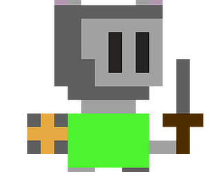
One more suggestion, if I may: That's a great excuse. Use it and abuse it: actually make it so that the stab only comes out when near the enemy, or funnier yet, when you dodge besides the enemy you instakill him with a flashy cut, just like Metal Slug! I mean it - use and abuse that excuse. Wear the inspiration on your sleeve! Heck, make the enemy placement, enemy positioning, all around metal slug!
A lot of game designers fear wearing their influence on their sleeve, but I really honestly believe it only helps your game: It's what you do different that makes it stand out, after all!
We tried to keep the scope to a minimum, and we still felt overhwelmed! Turns out it's really hard to make a game like this, specially with a robust team where you have to make sure everyone's in the right state of mind for the game at all times!
We've learnt from that too (Our first experimental game) and trust me, this was one of the first things we thought of making for the game. We even have an interaction system implemented! (but not actually linked to anything in the game sooo- virtually useless hehe... whoops)
Thanks for the suggestions, we really enjoyed 'em. And thank you for playing!
Incredible idea, and I love the execution! <3 Simple and effective!
I do want to take note of how flimsy your "flow" graph is (Skill needed / difficulty ratio per level over time), with a VIOLENT thrust upwards mid-way and then a violent thrust downwards near the end. Level design is a key in a game like this, so watch out!
And you know what would be interesting and immediately make the game super replayable? A Par system and a level select, maybe a few medals for doing so. As a huge flash game fan, this seems like one amazing one ready to be put on some sites out there. Really well done - probably one of my faves of the jam!
Great idea that requires a lot of balancing!
I believe the play area to be too small for such a "fast-paced" game. A lot of times you don't have time to react - and you need that!
But you've got excellent vision of scope - this is indeed a jam game, and all it needed to be was simple and fun. You've got that!
I also recommend much more game feel, it's another thing your game sorely needs (besides more mechanics / obstacles and stuff, but then again, jam). Overall, nicely done!
Since I believe the music to obviously be something you hadn't had time to properly manage, I'll focus my criticism on game design purely (although kudos on the aesthetic, it looks good!)
I'm having some issue considering this a shooting game without shots - because it feels more like a Strider-esque or Zelda 2-esque game, IE, an action-adventure game. I also believe the "Dodge" mechanic needs to not only get a rename, but also receive more focus - that's one of the most fun parts of the game! I could imagine an entire game about reflecting shots with a shield in a 2D Shooter - and that'd basically be a 2D shooter where you can't shoot! You've got a lot of potential here - you just need to improve a lot of things in terms of game feel and level design (and god the music) and you're absolutely good to go! <3
Great concept, and the aesthetic is really charming! I love how the paddles are greyed out to help you indicate where they'd be usually and to show you this isn't your typical game!
HOWEVER, I... feel very little impact on the board itself. As in, I left click and I have NO IDEA if I'm doing anything without any power up (Which I didn't even know existed in your game!). I feel like it lacks a bit of game feel on that aspect - which is really important. I also had tons of issues with actually getting the ball stuck, and that's something that you unfortunately lose a LOT by not having different paddles that you can send the ball in different angles - less aiming power. WHich is really important for a pinball. So you gotta ask yourself: Should I alter my main mechanic? OR accomodate my level design around that?
Good submission either way, nice!
OH MY GOD I GOT TO THE END AND THOUGHT THERE WAS SOMETHING ON THE BOTTOM OF A TUNNEL AND DIED WHILE LISTENING TO THE SECRET THING AFTER THE BUTTON ;~;
NOOOOOOOOOO
Urgh. Yeah, you're right, checkpoints really ARE important. Even though I did it in one go, it isn't that accessible to players. But you've got that figured out already - as you have figured out a LOT of interesting scenarios that makes the idea work! I Actually think you can expand this idea in so many different ways you could actually make a fully-fledged game all around it!
However, I believe that, while the level design is already pretty great at teaching you stuff, it needs some tweaking, specially if you try and make a "flow" curve following your game's skill-to-difficulty ratio, you'll see it isn't exactly a straight line and it swerves violently up and down several parts. Not only that, I think you could do a lot of fun stuff with the fact you can't jump while on the ceiling. Suddenly a spring on the ciling is something you have to be careful, maybe! (and not just part of a challenge that starts on the ground). Also, again, I feel like there could be more situations making use of the fact you float above chasms. But honestly, execution is amazing, and I can see you're a talented and experienced dev having a lot of fun! (I swear I really REALLY wanna try beating the game again to get to the ending again. I want to see it alllll ;~;)
Simple, to the point, effective. Very little on the innovative side - but you're probably the best example in this entire jam of "Keep It Simple, Stupid" and of excellent, pitch-perfect scope.
In keeping with the "Simple, fun, addicting" thing you're going there, maybe some study of arcade games such as Asteroids is required - what made people keep playing them? There's a social aspect to it - leaderboards! Online or no, it'd have been that extra plus your game needs to be - honestly? Almost perfect.
I do have severe issues with the debris being almost the exact same shape, colour and opacity (being only slightly more opaque) than actual asteroids. There's something to be said about simplicity, but that's the downside - lack of clarity. I'd have suggested making the debris slightly bigger circles - so you have two circles (stars and debris - background noise), a square (asteroids - objective and/or enemy) and a triangle (ship - the player/you).
Great job!
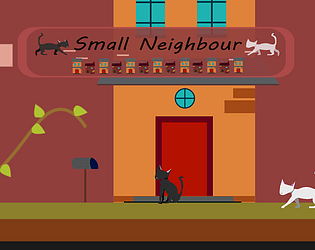
omigosh what a cute game <3 And I think it's the little things - especially how you can control everything by mouse and how it's basically a puzzle platformer with a skill/timing element - that makes this game so awesome. Well done indeed!
I do have issues with the level design, lack of music and lack of proper game feel, but you guys focused on your ideas (and on giving it 4 different mechanics for it to work as well as it does), so that's definetly not something to be helt too accountable on a game jam. What I MIGHT, though, is the fact that, despite there being an AIMING Element (especially on the rocket jump case), it's hard to gauge exactly where I"m going and what arc I'll do. I guess I just have a lot of issues with the rocket jump being really finnicky. Glad you guys realized your game is about trial and error and made the respawn extremely fast. That's the stuff!
Besides a few game design issues as well, like which objects are interactible and being an almost entirely mouse game where resetting is important but it's on the KEYBOARD (AAAARGH NOOO), this actually has a crapton of potential! It has this casual good fun that I can see working really well somehow on the mobile! Very nice job :3
INCREDIBLE idea, and almost-as-incredible execution. One of my faves in the jam as well - it's simple, to the point, and a great apotheosis of what the theme is about.
The aesthetics, comedic timing and music are all nothing short of incredible - I would call it absolutely flawless if it weren't for the font, which, while obviously used for comedic purposes, kind of foregoes useability and readability. There were ways of making the font silly/stupid ironically without actually looking like it was a silly decision unironically.
I can't stress how great the comedy was enough - I laughed really hard when he flipped me off and when I cried - impeccable SFX!
When it comes to the design, the micro decisions of game design (IE stuff like waypoint system, and lack of quality of life changes such as the text staying there if I say it to the dashboard instead of the driver) are indeed lacking, but the macro idea (and execution) are just goddamn amazing. It's a real beauty, too, that this is such a great core gameplay loop that you're allowed to formulate different strategies - even when only inside the car (As in, for instance, a possible strategy is to stop yourself on the sidewalk and plan your every move carefully, another possible strategy is to input the commands on the fly and react quickly - and here's another one, planning them out and timing them properly. Or maybe all of these!), and the commands are just robust enough that I rarely felt like it wasn't my fault.
Rarely. Here's when I DID indeed feel like it wasn't my fault, and that it was unfair: When I had to look behind me, or to my left, and I couldn't. Or, even more to the point, when I didn't really properly know where to go besides a vague idea through the waypoint system. When I tried tabbing then pressing enter quickly and it read as me talking to the dashboard - therefore making the driver not listen to me. That's what I meant by micro game design lacking - it's these details that make all the difference sometimes between an amazingly feeling game and an unfair-feeling one.
HOWEVER, these moments were... maybe not few or far between, but definetly didn't mar the experience. The idea REALLY shined through and I could easily see this becoming a fully fledged game with a few more tweaks and better level design. Congrats!
Okay, this... this might actually be one of my favourite games in this jam. I genuinely think it's a perfect prototype for an amazing game. And I just have one very simple defense as to why:
The ammount of possible strategies you can make with so little elements is astounding. It really, truly is. Because the mechanic is so intuitive and effortlessly manageable, with, let's say... Oh!
Let's say there's a simple enemy shooting at me. Here's everything I can do with that that I can think of, wtih the possibility of there being much more: I can A) Simply reflect every shot straight up with the well, B) gather the shots around indefinetly so that I have an infinite battering ram, never killing him C) gather the shots around and swing it at him as soon as I can, D) Gather enough shots to mount an ACTUAL WALL OF SHOTS that are standing still, protecting myself from any subsequent flier that tries to pass through that, D) Gather enough shots, go far away, and snipe him, E) Gather enough shots the repel them in a shotgun pattern...
That's ONE enemy of ONE Type.
It's simple, yes. It's super crude, yes. But you know what? Against all odds, that also adds to the experience and speaks to just how much the idea shines through any presentation or additional design (IE how health and score works, which is not exactly 100% part of the core gameplay loop). Which is also my one and only complaint about this game: It does only one thing. Amazingly, almost perfectly, but yeah, only one.
And that's all you can ask of a jam game. Amazing work, really.
<3 Thank you for your comment! "The Begginer's Guide" absolutely was another one of our influences - one of our game designers even played it beggining-to-end in-jam! We wanted to expand much further into the idea, but we found out during development that making an experimental game or a walking simulator, even as a group, does not lend itself that well to the philosophy of rapid prototyping that is one of the cornerstones of success in a jam. We've learnt a lot - it's our first game like this, in fact! - and we're very happy that we're seeing players feel different things playing the game and coming to their own conclusions! :3
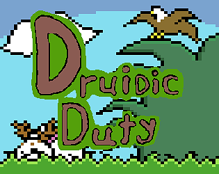
Wow, I ADORED this idea! And it has neat execution and nice graphics too!
However, there are places where it's quite a bit unintuitive. It's completely intuitive to get him to keep going somewhere, but, for instance, if he's going somewhere and I start punishing the "go", and let's suppose he sees nothing. What DO I want him to do? Take off? Turn? And what if he takes off, and I favour that, am I saying "Yes, I did want you to take off in this istuation" or "Yes, keep doing that"?
Because when I reward the parrot for turning to the proper place, he interprets it as "being rewarded for just turning". That's actually part of the fun in this instance - just keep him spinning while I think! Bit of a "bug turned feature" situation in a game design standpoint. However, the issue is when this happens with OTHER stuff. It's specially frustrating when there are only two blocks to manuever and you have to hope that the parrot will understand that, as soon as he land on the block (because he needs to, there's no ther way), I WILL NOT want him to go forward OR turn.
You've made an idea that has HEAPS of potential and you can build on it for a long, long time. But you've also "shot yourself in the foot" of sorts: You're making an AI. You're making a game about machine learning. Even if it's a simplified version. That's both amazing for a game jam - but also terrifying to think about keep working on it. Still, kudos - it works, it's beatable, it's inventive and you've done it all in a jam!
I won after a while - and I kind of felt it wasn't a rewarding win - as in, I didn't feel like I deserved to win that. That's good - but also bad.
That's good because your game has a CRAPTON of potential! It can be a super addictive game of rapid thinking and foresight - and honestly, it may very well work as a commercially viable game. I can see it polished and put on Androids or somethin' - it really is great!
But that's bad because you made a game that lives and dies by its balancing - and it really shows... because it lacks it. I mean, I'm sure you struggled with it most of the development cycle, but the thing about this game is that it's clear that it's extremely hard to make it fair and balanced. Stuff like possibly getting 4 "shields" and not being able to put them correctly (being forced to depend on the fifth slot), stuff like the shots' hitboxes, and even very abstract, core issues like: If the ships are going to shoot from the side and shoot before even entering the screen properly, it's literally almost impossible to defend from that or to mount a defense that both encompasses left, right and top, specially considering the random aspect.
It's really, REALLY tricky to balance it, I can see that from a mile away. But everything else - idea, execution, jokes, scope - everything is top notch. I really think it's a game worth working into after the jam. Well done! :3
Larissa's comment said it all but I want to add that it really humbles me to have inspired someone. We wanted players to take whatever they could out of the game, any conclusions whatsoever about Imposition, Creativity, "Art", or even Narration or Contemplation or anything else the player might reflect about. Thank you for being living evidence that our game was a game worth making! <3
And from a design standpoint: We didn't define it as a satire or a parody beforehand, but we ended up making a bit of both, skewered more towards parody, since, as Larissa said, we absolutely adore Walking Sims - No joke, four of the six members have Dear Esther, Gone Home, Stanley Parable and even Myst as personal favourites - so that's saying something!
And lastly, thank you SO MUCH for the suggestion - now that I've gotten some time to update the page, you'll find a cutesy lil' spoiler warning right on the top. I've been wanting to make the page easier on the eyes, so I'll probably update it further eventually. Thank you for helping with that, and thank you for your amazing comment! (I... I'm not gonna lie, I teared up reading it the first time ;~; <3)
So, this one is tricky. The level design is excellent, and it has intuitive (even though not perfectly intuitive, I'm looking at you, mushrooms and your slanted head) learning process and it's actually a really great idea for a puzzle game. But that's just it: It feels like a puzzle game. Not... a shooter without X.
Besides that, my biggest gripe was how cumbersome it was when I misplaced a mushroom. I needed to:
Press X > Click the mushroom > click the mushroom button > try another form, or maybe the same form > try another angle, or maybe the same angle > try another position, or the same position
That's a lot mouse clicking in disparate places (being on the top of the screen to place it on the bottom deosn't help a whole lot), and it causes a sort of "inverse decision fatigue" on the part of the player, where he kind of just micro fears placing it in the wrong place and hesitates more than he should, specially on a trial-and-error game.
Sorry if it sounded harsh, but I actually liked the game and beaten it! It's really just two gripes I had with it, because I really enjoyed the execution! Nice work!
O-oh gosh, thank you! <3 Jam constraints have skewered the game a bit, especially in technical places and "Thing is ready, all we gotta do is put it in" department. But thank you for your feedback, truly! You, in fact, gave me the most concrete way we could have improved the feel of the game: Longer exposition and more gameplay time, a longer "retention graph" so that our point is driven home in a more organic way! Urgh...
And thank you again! We actually watched Mark's Visual ACessibility video mid-jam to help us make proper subtitles - we.... failed in the implementation, yeah, but I'm glad we tried and that it was noticed! Thank you so much for your feedback <3
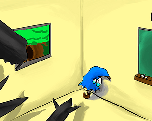
So, a turn-based horror game, eh? I had to learn a lot of things by m'self, but it's a nice, concise, jam-perfect idea. Well done! The execution could do some work, with improvements on AI, gamefeel and, especially, both sound design and balancing (Ran into a room where I couldn't do anything because, I presume, nothing was spawned there.), but that's part of... well, actually, it's something to think about next jam: Will my game have tough-to-implement elements? Should I avoid it or make the game more about it?
No right answer, I believe, yours is as good as any. GJ!


