
Thank you! I plan to add a printer friendly version once post-jam revisions are done!
A member registered Oct 10, 2020 · View creator page →
Creator of
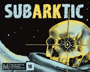
An icy adventure for the Mothership RPG. A lonely caretaker requests assistance. Countless souls are at stake!
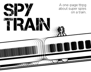
A one-page TTRPG about super spies on a train.

PCs seek the home world of a miraculous plant, but find they may be walking into a trap. [An FFG SWRPG adventure]
Recent community posts
- Love the cover art! Monster and title and text box in one
 And can't go wrong with Kyle Ferrin NPC art.
 - Layout is clean and readable, colour accent used well.
- Fun module! 'Find a way to escape' is a great motivation for the crew. It's written with a very cinematic style which offers a lot of support and instruction for a newer GM to get to the action.
- I don't really understand how trading Vivienne to Emil is an escape condition (doesn't he already have her?) or why he's even still interested in capturing her.
- It would help to be clear that the NPCs are part of the science mission - mission patches? And also clear who the 'her' in Pell's notebook is.
- Are the Metazymes stats individual, or do they act as a swarm? If you get through one stat block, do they just keep coming?
- I like the rolled encounters! Some juicy horror moments.
(errors: Vievienne's horrified = Vivienne's horrified)