Play game
ILoveLucyChocoFactory's itch.io pageResults
| Criteria | Rank | Score* | Raw Score |
| Visuals | #8 | 4.294 | 4.294 |
| Audio | #10 | 3.706 | 3.706 |
| Overall | #13 | 3.824 | 3.824 |
| Fun | #16 | 3.588 | 3.588 |
| Interpretation | #24 | 3.882 | 3.882 |
| Gameplay Innovation | #30 | 3.059 | 3.059 |
Ranked from 17 ratings. Score is adjusted from raw score by the median number of ratings per game in the jam.
TV Show Name/Season/Episode
I Love Lucy - Chocolate Factory Episode
IMDb link to episode
https://www.imdb.com/title/tt0609243/
Episode description
https://www.youtube.com/watch?v=NkQ58I53mjk
Please list any pre-made art/music/other assets that you used.
None.
How many members in your team?
Team of 1
List your team's social media / website links!
NA
Anything you want to say to players before they play?
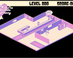
Use Arrow keys only for gameplay/navigation. Escape is used to pause (only works in main part of the game)
Leave a comment
Log in with itch.io to leave a comment.


Comments
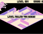
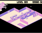
Liked this game. The gameplay was fun, and the increasing difficulty definitely made it feel like the episode. I also liked the color palette, the losing animation, and the heart transition. I also like the way you did the music volume, though some indication of what that was would've been helpful. The only problem I had was that the actual game area could've been bigger, even if it meant the logo in the top left was smaller, or just on a menu screen. The dialogue text was really hard to read as I had to zoom out. Overall, fun game.
thanks for giving the game a try and providing feedback! I think u make a great point on the game area needing to be larger.
really cute and fun and very much to the point :) i couldnt pass more than 4-5 levels but it moves seamlessly between the fails so it doesnt feel like a bother to replay a level. you should add a little number to indicate the level so ppl can feel their progress better (if there is one i didnt notice it).
my only comment is that there's a lot of unused space. maybe you could arrange the room a little tighter so you could scale it up a bit and your eyes wont want to wander around so much and stuff like the text bubbles could be bigger and more readable.
I think the level number is top center of screen. Great point on the game having a lot of blank space. I agree a larger game area would have greatly benefitted it. I did realize that as well late into the dev cycle and didn't want to put time into zooming in as I was concerned it may break other UI assets. Thanks for giving the game a try and feedback!
Hey there! Super enjoyed the game! My friend and I loved all the little things you put in there, especially Lucy's trademark whine! Great job on the gameplay, the art, and the music. I do have to ask, was there more walk-around gameplay originally planned?
thanks for giving the game a try! You are right I originally planned on freedom of player movement and a overcooked type of game. However, although I'm familiar with Unity, I decided to try their isometric tile engine for the first time and had too many issues with sorting. I also thought the overcooked gameplay might have been a bit too big of a scope for the project. So it had a time advantage as well in really limiting player movement and using a simple rythim gameplay style.
Cute graphics... my reflexes are slow..its the first god view game ive ever played in a jam
Thanks for giving it a try!
The graphics look really cute, and the gameplay is fun, although it does get a bit hard for me after a few levels. I like the heart shaped transition screen, a nice touch! Well done :)
Really great visuals and audio! I enjoyed it overall, but a bit tough for me. An excellent entry, you should be proud!
Thanks for giving it a try, I appreciate the kind words.
super cute :-) love the overall aesthetic - and also the game-play - congratulations
Thanks for playing!
Such a sweet game. The 4 color visuals are brilliant!
Thanks for the kind words!
Nice game all around, nice aesthetic, fun gameplay, an excellent interpretation of the episode, an overall fun experience. My only suggestion is to allow a fullscreen mode, as the space the game takes up can't fit on my screen.
Oh there is a full-screen button (lower right, it can be kinda faint but its there). Thanks for the input.
Nice aesthetic and cool logo, and not too familiar with I Love Lucy but the interpretation of the episode seems spot on! The gameplay was a little too challenging though, and I feel that the window for button pressing to match up was too tight. I simply couldn't get those 4 in a row right. Managed up to level 9.
Thanks for giving it a try. It is challenging, and i can understand the difficulty. If i can get a bit technical when the tiles cross over the square area it is possible that a button press will go against more than one arrow. The program always defaults to the first one, but only if it wasn't previously considered missed. Say you have both up arrow and right arrow both evenly in the square (half and half). If you then pressed right it wouldn't count as it goes against the up arrow (as it is the first one that entered the area). Of course the up arrow would be considered missed and wouldn't count again if you hit right it would correctly count against the right arrow (as the up had been set to missed). I'm not quite happy with the implementation as perhaps it should consider any correct within all tiles in the area and not just the first, but i need to go back into the program and try to solve the issue.
Ok dug into the code and fixed the issue described in your post i think. As long as a key is in the box then the correct arrow will be cleared now.
I liked it! the audio works very well, good visuals too.
Thanks for playing it! Glad you had fun.
Very nice! Great show/episode choice, and nice job with the game-boy-ish 8-bit theme.
Thanks for the kind words. I enjoy working with a limited color palette.
A lovely 8-bit recreation of one of my all-time favorite tv shows, and my favorite episode of that show. Thank you for the walk down memory lane. I do think that the game doesn't meet the jam's rules though, as it's less inspired by I Love Lucy and more of a here is an 8-bit I Love Lucy episode. But in any event, the game is fun, and well made. Congrats.
Thanks for the kind words, glad you enjoyed it.