Play game
Platty: The Single Platform Adventure's itch.io pageResults
| Criteria | Rank | Score* | Raw Score |
| Adherence to the Theme | #751 | 3.875 | 3.875 |
| Originality | #885 | 3.500 | 3.500 |
| Overall | #907 | 3.458 | 3.458 |
| Design | #1037 | 3.000 | 3.000 |
Ranked from 24 ratings. Score is adjusted from raw score by the median number of ratings per game in the jam.
Leave a comment
Log in with itch.io to leave a comment.




Comments
Funny simple game with funny physics. Nice work.
This made me laugh! It was like trying to balance an egg over your head; just the right amount of difficulty. Nice!
Check our game! https://cerosware.itch.io/one-stick-shooter
It's a cute little game! I really like the idea of a hot wire game with indirect control and the presentation is adorable.
I do wish you had a little more control over the character though, especially in terms of horizontal movement. I think if it was possible to make reliable and somewhat precise throws, that would open up possibilities for much trickier and more interesting levels, where maybe the platform can't go everywhere, so you need to throw the character above an obstacle and catch them on the other side.
One option to do that without changing the physics too much might be turning the character into a ball and the platform into a shallow bowl like some of those BotW shrines.
This is a really interesting idea but I feel like it would work better if you could actually control the character as well. For most of the game I felt like I was just playing a sort of schmup without the shooting bit, never really needing to bother tossing the character.
Thank you for your feedback! I understand what you're saying. This is something that, after further reflection post-jam, is caused by the platform & character interaction encouraging very chaotic controls, while the level design encourages very preicse controls. The two didn't flow well together due in large part to a lack of time and experience with level design on my part. But overall, I agree with what you had to say. Thank you again for your feedback!
The idea is very cool!
The one thing I didn't like was how slippery the person on the platform is. I think a little bit more traction would be better. But overall very nice Game.
Thank you, we appreciate your feedback! We've heard a lot about the physics and interaction between the character and platform and we're going to keep it in mind, should we continue development of the game. Thank you again, we appreciate it!
Great concept!
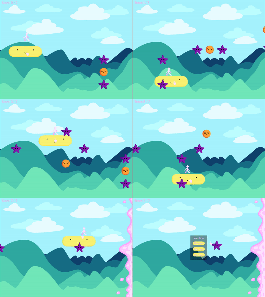
First off, the aesthetics are adorable. What an idea to have Patty the Platform escort the character to a comforting wall of pink goo.
It was very difficult. In some ways it felt fair; in others, not as fair. Perhaps this could be solved by making the player feel completely in control of their horizontal positioning? I mostly achieved this by bouncing the avatar to the left or right, which takes up vertical space, which can get you killed. That might be an intentional decision, though.
In the final level, with the two collectibles that are at about the same X position but one is higher than the other, I decided to just skip one of them. But then I found out I needed to collect it, and I panicked a bit. But I figured out the trick for getting it, and that felt nice. (I see now that you solve that problem in the GIF you uploaded)
I figure you are aware it doesn't have sound haha. That's probably the most obvious detriment.
Nice job!
Thank youfor your feedback! Overall, I think we're 100% happy with the aesthetics, all of that came together super well. We decided to make sound design an optional thing that we'd do "if we have time" in the jam. We ended up not having time. Oops.
Regardless, I'm glad you figured everything out, especially in the last level! The physics and interactivity between Platty and the character is something we've heard a lot about in feedback. Some love it, some find it frustrating. The conclusion we've come to is, we can view the interactivity between Platty and the character as the problem, or the level design as the problem. On one hand, the levels require tight, intricate movement and control. Which is fine on it's own. But when paired with the wacky controls, it becomes a problem, and vice versa. The two things are fine in isolation, just not together. At least, that's our thoughts on it at this point.
Personally, I don't think the level design is the most fun part of the game. I, and I feel a lot of others, found just tossing the character around like a ragdoll to be the most fun. While figuring out how to get all the collectables wasn't horrible, I feel it isn't as fun as just tossing the character around. A big part of it is just that the last minute level design didn't facilitate that very well.
Thank you again for your feedback, we really appreciate it and we're glad you enjoyed yourself!
I liked the idea of using the physics to throw the player through and past obstacles, if the controls could be cleaned up a bit, it would be interesting to see puzzle where you have to fling your character past obstacles some more, a fun time overall.
If you have time, would love to hear what you think of my game; https://itch.io/jam/gmtk-2019/rate/461074
Thank you for your feedback, I appreciate it! I thought something similar, I think the most fun part of the game is just throwing the character around a whole bunch. Just didn't have much time to do super amazing level design, unfortunately. Overall, I'd love for the controls to be cleaned up some, time will tell if this happens or not. I have your game on my list of stuff to try before the jam is done, I'll leave a review for you when I'm done with it!
Very fun good take on theme felt a bit bland with no sounds tho. one of my favorites so far.
Hey, thanks for the feedback! Sound was on my list of optional things if we had time. Unfortunately, the deadline crept up on us and we didn't have time. We didn't have a sound designer on our team so we would've had to get stuff from the public domain as well, so it would've taken a good while to find and implement. I would have loved to do it, but that 48 hour time slot isn't very forgiving xD Thank you for your feedback, we really appreciate it!
Nice job! I appreciate the work you two put into this. More in-depth review incoming:
Design [3/5]: A lot of other people have commented on how the controls feel imprecise, so I guess I'll start this by throwing in my own two cents on the matter. Yes, the controls are imprecise. Yes, the physics are a little chaotic. Sure, it's difficult to control your character. The thing is, I don't think any of those are weaknesses all by themselves. Character movement and physics don't exist in a vacuum: they exist in a game. A game which has levels, puzzles, and decisions to make. My point here is that having an imprecise character can actually be a positive thing if the rest of the game's design facilitates that. For example, I Am Bread is a game where you play as an awkward physics object that is terribly difficult to control. However, it's still fun to play because of the unique level design, aesthetic, and hilarious narrative. Having said all of that, my main criticism of your design is not that the controls are imprecise, but rather that the levels and the objective of the game didn't really feel like they were designed to work with the way you control your character. I think this game's biggest strength is being able to throw your character around like a ragdoll using the platform, but I don't think the rest of the design capitalized on that strength.
To explain this point in a little more detail, I think one of the most questionable design choices was to make this game an autoscroller. For me, the most fun part of this game was flinging your character into the pink mush at the end of the level, basically treating the platform like a catapult. That was genuinely fun, but I wish there had been more moments like that intermingled throughout the levels. The fact that it's an autoscroller means it's usually far safer to just keep the player on the platform at all times until you reach the end of the level, slowly avoiding the enemies and inching towards the collectibles. I think it would have been far more fun if you had more freedom to toss the player around, having a camera follow the action until you reach the end of the level.
There's some more missed potential in the obstacle design. The enemies have an interesting property: the player dies if they touch one, but the platform can just move right through them. One idea that popped into my head as soon as I started playing was "ooh, it would be cool if there was an obstacle that the player can go through, but the platform can't". Such an obstacle type would require you to toss the player through it and then find another path for the platform to take while you find a way to catch the player. I'm not criticizing you for not including that idea specifically, but I do wish there were more obstacle types than simply moving killzones for the player. Again, I think you might have had more range in that respect if this game wasn't an autoscroller.
Considering the dissonance between the controls and the level design, I can't give this a full rating in the design category. Having said that, I think the controls are fun. As I mentioned above, it's really fun to toss your player around like a ragdoll. I just wish the game was mostly about that rather than slowly and precisely avoiding static obstacles. The controls are imprecise, but the level design often requires you to be precise, which just slows down the action and subtracts from the fun of chaotically tossing the player around the screen.
Adherence to the Theme [5/5]: I can see the argument that this is a platformer with only one platform. However, it doesn't exactly feel like a platformer to me. This feels more like a physics game to me. But I understand that's a pretty subjective point, so full credit from me for adherence to the theme.
Originality [4/5]: There aren't too many physics-based games where you can't actually control the physics object directly, so that's pretty cool. The only other example I can think of is Rocket League, since you don't actually control the physics-controlled ball directly, but this game is something totally different. The enemies, however, feel a little uninspired and didn't stand out to me, and collecting objects didn't feel terribly unique either.
Overall, good job! Keep doing what you're doing.
Oh boy, we got a lot of feedback here, thank you so much! I'm gonna unpack this one piece at a time and give my thoughts.
Design
I like the example you gave with I Am Bread. I think I didn't see the controls as a problem during development, as I got used to them. I think, as you said, it's just a problem with it being an auto-scroller with precise movement required, which is why it's often seen as a problem. When it could also be instead seen as just a level design problem. That's a fault in the last-minute level design (all levels were done in the last few hours of the jam, unfortunately). But I absolutely agree with what you said with that.
I've noticed everyone always tried to throw the character around like a ragdoll like you mentioned because that is genuinely fun. During development and even now, I'm just not sure how I'd turn that mechanic into full on coherent and controlled gameplay. I think my biggest problem in this regard is, I'm not sure how I'd take this, a 2D game, and make it not a side-scroller. That's the part that has me the most confused, I feel.
Regarding the obstacles, I had a similar idea with having more varied obstacles. Actually, I had the exact idea you had for the exact reason you mentioned, to allow for the character to be thrown around more. This was unfortunately not a thing entirely because of time constraints for both team members on this project, although I wish we had focused on that more than the elements that we did, looking back.
Should you or anyone else see this, do you have any recommendations for, should we continue development, how to make it not a side scroller and instead capitalize on the chaotic nature of tossing the player around in such a way that the level design enables that? I'm just not entirely sure how we'd be able to make that happen, it's something I've thought about throughout development and don't have an answer to, even now.
Adherence to the Theme
What you said makes total sense, I can see the argument being made that it's actually a physics game. I think approaching it that way could help a lot, should development for it be treated as such.
Originality
Thank you, I appreciate your feedback on this. I may look into physics games more, as it's not a genre I've played too much beyond a few games here and there to look for inspiration if we continue development on this. But I absolutely agree with what you said.
Overall
Thank you for your feedback. You took what was probably a different stance from most other people and I think that opens up a completely different way of thinking about the game. You've given us a lot to think about and while I'm not sure where I would take it from where it is now at the time of writing this post, it would be fun to continue, if we found a good direction to take it. That direction is honestly, probably treating it as more of a physics game rather than a precise "move the thing through things to get other things" type of game. I've said it a lot already, but thank you again for your well thought out post, we really appreciate it. I hope the rest of the jam treats you well!
It's important to recognize that I wasn't criticizing the game for being a sidescroller, but for being an autoscroller. That is, the problem is that the camera is always pushing you further along the level. It puts you under constant pressure to keep moving, when what players really want to do is take their time, aim shots, and take them. In fact, I think that if the game was a sidescroller that didn't auto-scroll, it would give you much more freedom as a level designer. One way to implement it would be to simply have the camera always point directly at the player, regardless of where the platform is. This keeps the pacing in the player's control, so they have lots of time to aim and prepare a shot. Hopefully that makes sense. If not, feel free to ask more detailed questions. I'm also happy to talk about it on discord if you want :)
As for your question of "should we continue development"? My answer is simple: if you still feel passionate about the project, definitely! Nobody gets their design exactly the way they want it in 48 hours. If you still feel like the project has potential and you want to keep going, then keep going with it.
I like that you're thinking critically about your design and looking for ways to improve it. If you keep that attitude, I think you will only stand to improve as a game designer.
I think that makes sense! Since you offered, I might fire off a discord message to discuss ideas sometime in the next few days. I think my struggle is I haven't played a lot of physics games and I'm struggling to imagine something similar to take inspiration from, or how to the game function in a fun way with it not being an autoscroller. I also have minimal practical experience as a level designer, so that's something I need to work on as well. Overall, I appreciate your feedback and I will hopefully be in touch with you soon!
Harder than it looks! Fun little game - love the characters :)
Thank you, we appreciate it! We're super happy with how the art turned out!
I managed to figure out a technique for moving the character so was able to complete the levels but I agree with others that the physics made it a bit weird to use.
I think the idea is pretty good and it was presented well. I think some more satisfying physics could make it a great game!
Thank you for the feedback! That absolutely makes sense, I've gotten a lot of comments similar to that. I might make the physics better in the future, should we choose to continue development on this. But that's an indefinite thing that only time will be able to answer for now.
Beautiful art, color choice and design, this can be a really fun mobile game!
I thought about something like that when the jam ended. I have an iphone but not a mac so idk I'd get xcode to be a thing to make it an app, but I've considered figuring out a way to do something like that, as I'm very interested in making mobile games and stuff like that.
Cool, keep going!
I like the colourful graphics and that the concept is easy to grasp. I'd say that sometimes the game goes from challenging to simply frustrating. But overall a good effort! Keep it up :)
Thank you for the feedback we really appreciate it! I understand what you're saying, in hindsight, it can be a bit tricky to mess with.
The visuals are really nice in this game but unfortunately I found the control of the character rather frustrating, the person would slip off or not follow my platform properly (which is perhaps a design choice but it wasn't for me if so). Besides that I think you've hit the mark with the theme and it could be quite fun if I could throw the character around with some control. Nice work :)
Hi Pet Pumpkin, thanks for playing and leaving feedback, we really appreciate it! At the time of the jam, I, as the programmer, made the physics you found frustrating a design choice. However, in hindsight, I think it would have been smart to get a small test build out to a few people to get feedback on it (there was no testing done outside of myself). Just about everyone has said something similar to you about the physics. Some found it fun, some found it frustrating, but it's always been the biggest talking point of the game outside of the cute artwork.
If I were to do it all over again, I'd love to have had a little more time to test the physics and get feedback, because the code that causes the "stickiness" (for lack of a better word) between the character and platform is just a single line of code that I originally implemented as a bug fix. But that bug fix, after changing other stuff, probably isn't a problem anymore. So if I were to do it all over again, I'd have tested this sooner and fixed it so the controls feel a lot better.
I think everybody has loved throwing the character around too so some better level design and physics would definitely encourage that and make it a lot more fun. Overall though, the game was made in just 48 hours and this is the first jam this team has done at all and our first time working together, so we're very happy with it despite it's flaws.
Again, thank you for your feedback and we really appreciate you playing and telling us what you think!
Cute design, fun gameplay and strangely challenging on the last level.
The platform is a bit slippery and you dont always feel in control. Took the idea of platformer with only one plataform and really created something new, not what i was expecting but a nice surprise, the game oozes charisma.
(Weirdly enough, slapping the girl to catapult her with the platform is really effective, which says more about me than the game to be honest.)
Thank you for your feedback! I appreciate all the critiques you gave, it's very helpful. After getting a lot of feedback here on itch and discord, I've found most people critique the physics with the platform and the character interacting. There's a few other things I've heard as well, but I feel had that been better in time for the jam, most of the other critiques I've heard would be insignificant to non-existant.
However, it makes me very happy to hear that just about everybody loves the art style! It's very cute and we're super happy with it. I think just about everyone has also, in the first level, attempted to just THROW or SMACK the character around a whole bunch because it's fun to just toss them around. Some of the later levels involve careful maneuverability but I wonder how fun it'd be to have things be a bit more freeform with throwing the character around with better controls (like I mentioned before) since everyone seems to enjoy that. It's something to think about.
Thanks again for your feedback, I really appreciate it. Thanks for playing!!!