Play game
Monster's itch.io pageResults
| Criteria | Rank | Score* | Raw Score |
| Presentation | #159 | 4.000 | 4.000 |
| Overall | #328 | 3.276 | 3.276 |
| Gameplay | #368 | 2.897 | 2.897 |
| Originality | #488 | 2.931 | 2.931 |
Ranked from 29 ratings. Score is adjusted from raw score by the median number of ratings per game in the jam.
What do you like about your game?
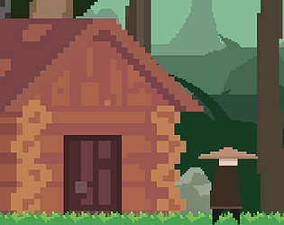
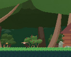
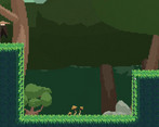
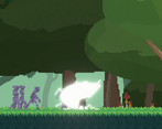
I'm really proud of the attacking animations, and I like the pixel art style I achieved :)
Leave a comment
Log in with itch.io to leave a comment.



Comments
It is short, but looks like the beginning of an interesting story. Liked the pixelart and the movement was pretty cool. The dances at the end were fun to watch. Very nice implementation of filters. Combat wise, I think it has room for a lot of improvement. Also, enemies had too much health, which made the fighting sequences a bit tired. By the looks, perhaps is your inspiration based on Dust: An Elysian Tail? If not, I highly would recommend getting the game and studying it, or watching videos about it. You can learn a lot from it. Best of luck!
Thanks a lot for the feedback :)
I will definitely take a look at the game you recommended, and yes there's a lot of room for improvement for the combat and platforming mechanics, maybe someday I'll keep working on this project and make a full game out of it 👀
Again, thanks a lot for your support and also: Best of luck for you!
short and simple. A nice game, i think the movement mechanics are underutilized: the focus was the story but you get this random platforming section that should either be more developped or removed but as a showcase of the possible mechanics a longer game like this might have i guess it's fine. A funny thing when the people started attacking the character i just stood there taking the hits, my idea was seeing if there was a fail state but i didn't really want to kill anyone so i tried to leave before accepting my fate and finaly do what i was supposed to do
Nice game. Loved the art style a lot.
Could you give it a try? Thanks.
https://itch.io/jam/acerola-jam-0/rate/2582496
Good and nice game !
I love the art style in it so much, the gameplay was fun, my favorite part was the enemy sprites they were cool to see move around~
Last night I couldn't watch you live because of my slow internet, but today I saw it and I gotta say you made me really happy 🥲.
It was fr a special moment for me because I never saw anyone playing one of my games before. I loved your reaction in the end with the dancing and all 🤣🤣 I laughed so hard with you haha
Thanks for giving my game a chance and I hope to see you again in future game jams (if things get better where I live and I get the chance to work properly)
The ending is amazing. The story in general is great and got me invested really fast. I agree that the combat is a bit stale, but it's fine because I think the visuals really make up for that. Really really good job :D
Thank you!!
I saw you in the comments section of last night's stream 👀.
I'm dying to try your game! (The screenshots are just amazing) but my internet just sucks (42 Kb/s right now, the download keeps dying) and I don't have electricity almost all the time, but hey! I think I'll get outta here soon 🤣
Thank you for your support!! And I wish you guys the best :)
I really loved the art on this one! The fact that some characters where 3D animated but still had that pixelated look was very cool in my opinion. I agree with some comments saying that you should have gone one way or another, full 3D or full 2D, but I still enjoyed it a lot. The music fits very well the atmosphere of the game and overall is quite immersive.
Very good looking again and good luck with it! <3333
I really liked how artistic the cinematic moments were, and the little things like having the real monsters have a greyish color. Added a lot to the atmosphere and story. Controls felt nice too, solid platforming and had no issue dealing hits in and than dashing away from enemy hits so great work there!
Thank you so much for playing!! I apriciate your kind words :)
I tried downloading your game a couple of times but it's too heavy for my internet...I live in Cuba (average 43 Kb/s download speed where I live)...
I absolutely love this! The story you’ve created and told is incredible considering the game lasts around 5 minutes, and I think the ‘cinematography’ of the game is incredible. Every moment of the story was so good, because every word you wrote had a purpose and together they told an incredible story. The final moments, with the shader effects and the pitch-shifted music really had a lot of impact.
I also thought your art was impressive. It must have taken a lot of work to put together all those attack animations, but it paid off. Very polished art for 2 weeks of work.
The only way to improve this game is to add more, something that is obviously very hard within a game jam period. I wish there were more levels, and I wish there was more combat. I will say though that the combat is extremely easy, and I have no idea how health works in this game but I found I was able to stand still through basically all the attacks while spamming my own without any problems. I also wish you used the pixel font throughout to add to the overall game feeling.
Overall, I was really impressed playing this game, and I think with a little more work it could be turned into a full game post-jam, and I’d certainly play it if you did do this :).
Thank you!!
This is why I love the game development community here 🥲. People are always nice to everyone and give a lot of advices, along with some nice words that always encourage us to keep working with passion
Thank you for your kind words, it means a lot to me that you played my game!
I will take your advice and work on the weakest points for my future projects :)
I enjoyed the story part of your game
Liked:
- Visuals: Background, Main Character, Combat
- The story you told
- The music was very fitting too
What could be improved:
- Combat: The combat was very bare bones and felt like a chore for me. Attack, dash, attack, dash, attack, dash...
Not a lot of change. I feel you could have gone without it and instead focused even more on the story part and the storytelling
- Visuals: The 3D models which were pixelated looked weird and out of space with the main character not being like that. Either you could have gone full 3D models or sticked to 2D in my opinion.
Cheers <3
Alright! Those are some useful tips, thank you for that :)
You're totally right, I should've gone full 3D instead of making the player that way, but im the end I didn't have enough time to make a 3D model for the player, not to mention animate it later haha
Thank you for playing!
i though, that was the idea:D
like the main hero is d i f f e r e n t
Very impressive art and sounds, and more or less the story shows the reality of our society that "monsters are not born, they are made".
Enjoyed it but maybe in future you will add more gameplay to make the game more fun and make it slightly difficult so that when I finish the game I should have a sense of accomplishment.
Overall a GREAT GAME!!! and I hope to see more such games in the future.
Thank you for playing my game! I really appreciate it :)
Yes, I know what you mean, and I intended to do it, but I didn't have enough time haha
*Fun fact: here in Cuba we have to face 12 hours without electricity...daily 🤓
Still you are doing great work and that's amazing.
Very nice art style and sounds. I really like the mood of the game with these cutscenes and the story. Maybe to improve your game's visuals even more, you could try to have a better consistency between sprites (using the same style for the player and the monsters, keeping a constant pixel size), but it still looks very good right now.
Thank you for playing!
Yes, that was the idea, I only used those sprites for the player as a starting point, but then I ran out of time haha
I love the animations! Your work on the ambiance is also great. In particular the moment where you use a distorted sound.
I guess this is your designing choice for an artistic point of you, but for me, you should add health indications. During the first fight, as it is a long one , I was wondering if it wad a bug or if i had to die for the scenario.
Good entry anyway!
Yeah I just thought it would be cool not to know when the boss was going to die, like in Hollow knight haha
(You can't actually die, by the way 🤣 I didn't have time for that feature)
This game looks really nice. And you can jump, and dash, and slash a sword. The way the sprites work is really cool. The twist ending got me laughing.
But... here comes my critique:
1. So many cutscenes! I think switching some of them to more enviromental storytelling would make the message stronger. Especially at the end, where something sad happens. I think it would be sadder if we interacted with the thing that was hurt more (I couldn't make out what or who it was, but I think the moment was supposed to be sad. I assumed it was my dog.).
2. Add feature to change the keybinds. Or at least take the dash off the left shift. I couldn't use it too much, because my PC would produce a pop-up if I press left shift too many times in a row.
3. Although the sprites are really cool, the difference in animation style between protagonist and the npc sprites is a bit jarring. It would be a good idea to make them consistent.
4. It would be nice to have more content. I know, I know, this is a game for a game jam. But you have so many different mechanics here, but not much to do with them! I suppose a critique that there is not enough of a game can be treated as a compliment of some sort.
Wow! Those are actually really good advices 👀. I knew my game needed a lot of improvement but you mentioned some things I hadn't even though about
Okay, so:
1- The cutscenes were the last thing I made :( that's probably why I went the easy way and just animated those scene that way. I will definitely take your advice on interactive stories in the future!
2- I never thought that was a problem until now, but now that you mention it, I did have to change that pop-up thing in my laptop when I first played a game with that feature haha, I'm just used to dash with the left shift, but you're totally right
3- I used those animations for the player as a starting point and then didn't have time to make the player's 3D model haha
4- You're right, I spent too much time on creating flexible systems for me to be more comfortable, again: the game was going to be larger but it was too much anyways (the combat system only is much more than that, I literally made something where you can create as many combinations as you want with as many key + click combination as you can think of!)
Thank you again for such a great and useful feedback! And thank you for playing :)
Well put together game, art really shines
Thank you!
I went with that style because it was easier for me to animate in 3D and render in 2D 🙌
I absolutely loved the story in this, wonderful pacing and actually left me wanting more. The combat has a lot of potential but did feel slightly unfinished or perhaps not used to its full potential, would have perhaps liked some ranged projectiles that needed to be dodged by jumping perhaps. Great use of the assets you used/created, reusing the same scene for all elements of the story was enough which I think was a great move to allow for more time to put work into other elements of this game which really shows. Brilliant work!
I really loved that cinematic touch that you give to the game, the combat also feels very good and the animations are incredibly fluid
Thank you bro! The only thing I regret is not having more time haha
Things I like:
Things that need improving:
Thank you so much for that feedback!!
Yes, the combat and platforming mechanics ended up being kinda useless, the game was going to be larger than that and I was planning on adding a bigger map (for testing platfoming skills) the enemies were suppoused to be smarter but I didn't have enough time to put it all together...even the story was too short (I had to delete a lot of scenes).
Anyways, thanks a lot for playing, I get really happy when someone else out there in the world plays one of my creations :'')
The actual gameplay wasn't the best, although I can tell that wasn't the focus. The combat doesn't really have any skill, or is very difficult to actually avoid attacks. Being good at the combat isn't necessary, however, as the focus is the story.
The story was a nice, short, philosophy question and a brief exploration of it. The actually way is was shown was nice and engaging, particularly the way it worked with the audio.
The presentation was amazing, I liked the art style and the artistic choices were nice. I do know some people don't like "pixel art" that is just downrezed 3d models, which is what I believe this to be, but I don't like the aesthetic. Particularly of those that you can fight.
Thanks for the feedback!
Yes, the story was supposed to be the main focus, and it was originally going to be a bit larger, but I ended up facing some troubles related to the country I live in. Overall I'm satisfied with the result 🙃✨ even though it's not what I expected it to be at first.
Regarding to the art style, I was aiming to achieve something like Dead Cells, but I didn't have enough time to polish everything, but I don't dislike the result either.
Thanks a lot for taking your time to elaborate such a nice feedback! I really appreciate it :)
Greetings from Cuba 🙌
Really great animation and graphics.
Thank you :)
I actually love that style, I appreciate you played it!