love the music and the attack animations. this is really cool.
This vod will be gone in a few days but in case you wanna see me try and figure it out:
love the music and the attack animations. this is really cool.
This vod will be gone in a few days but in case you wanna see me try and figure it out:
uhh
- the map screen is clear enough except for how moving your mario works, i'm confused about that, probably more clear if i played DUNGEON ENCOUNTERS first.
- game would generally benefit from a lot of little things that DARKEST DUNGEON does during battles for clarity, such as being able to hover the mouse over an enemy at any point to see their status.
- also at some point in the future a little dictionary with what the status and elements are would be great.
- everything else is peam
i think that the currently selected unit should be highlited more, maybe with a more contrasting overlay, or a pointer above.
is there a way to heal outside of battle? it's really easy to get ambushed by enemies, and if you are already at low health from a previous battle you can get steamrolled before even having a chance to do anything.
in general i don't like the entire ambush mechanic, it makes me feel like i'm not in control of what happens
the music adds SO MUCH to the experience it's incredible, it feels frenetic in a very exciting kind of way
Thank you for playing Federx! There's no way to heal out of combat right now until I bring the menus back for the next update.
You can try to avoid getting ambushed entirely by kiting the enemy cells until you can initiate combat yourself to get the first turn. It will be an important dynamic in the full game to stock up on consumables to manipulate your movement.
I like the art, though personally I would prefer colors. Animations are great. I kinda just spammed skills and won without losing anyone.
I think i will reiterate what others have observed:
Started the game and was confused by the "overworld" map. Ofc a lot is missing there so confusion seems natural. When the first combat started it was a bit quick for me. Suddenly i was hit by 4 skellies. The attack order was confusing as others said. What confused me even more was the HP of my party. Since the initial attack was so fast, i didn't remember which party members were injured. There was no max HP there, so i was a bit puzzled who to heal with the cleric. The next turns i figured out its probably the warriors in the front.
Combat itself feels great and has a lot of polish. The style is still gorgeous as it was the last time i played. Im curious how the overworld thing will turn out and how real goblins will look like.
Fighting feels a lot more deliberate than before, though I think I’d prefer FFX’s turn list thing instead of just showing current and next under the party. That way it would be easier to tell when the enemy is actually going to go, and you could even show previews of what effect each attack/skill might do to affect the turn order.
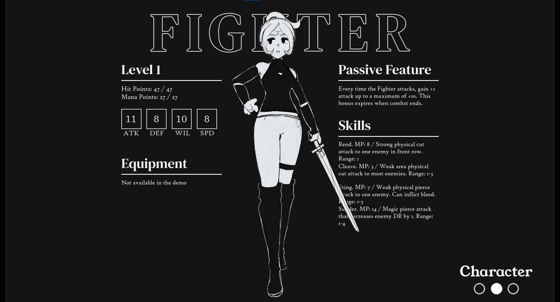
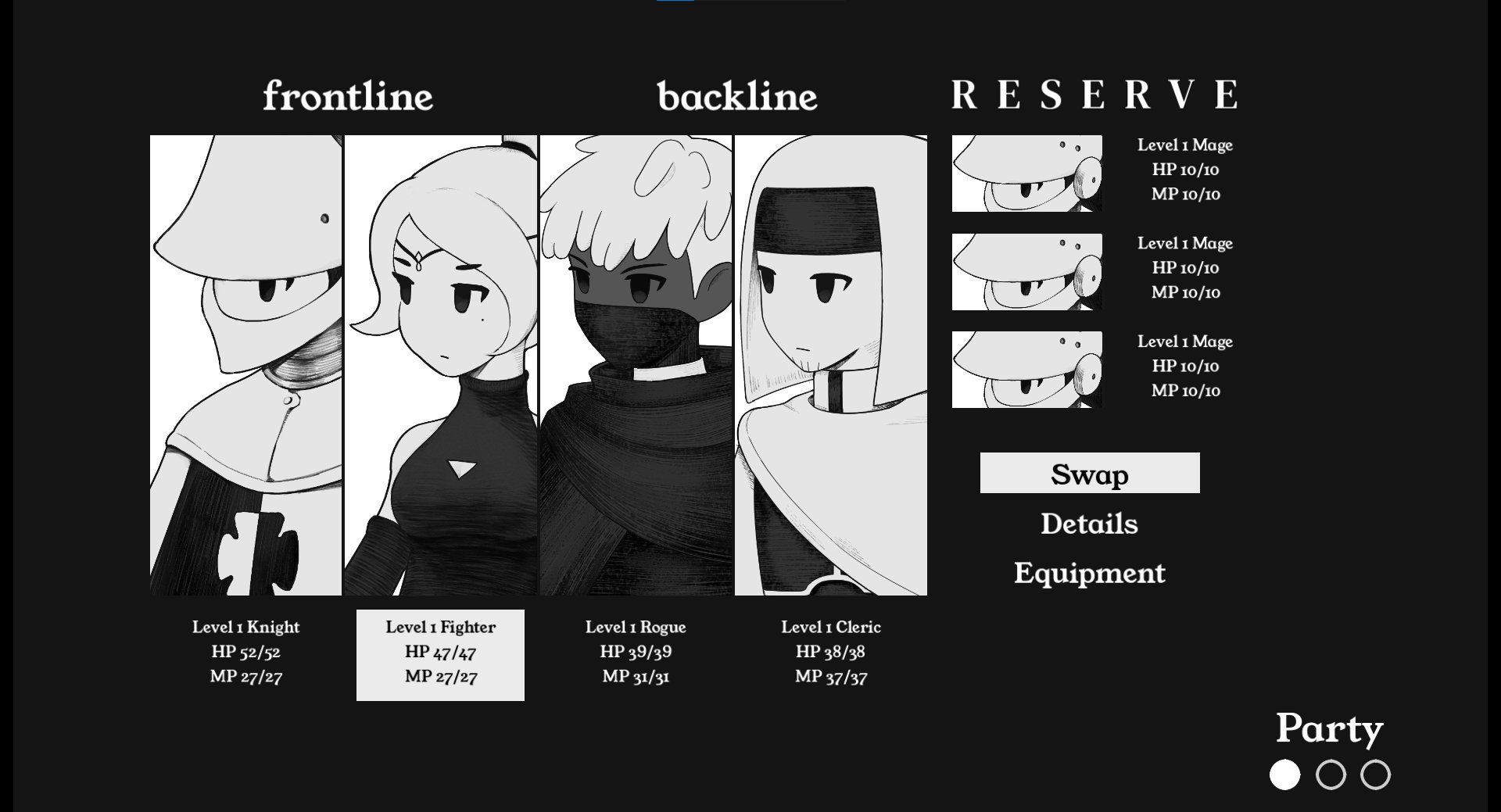
Is there a way to set a default marching order? Because it definitely seems like the Knight should be out in front all the time, the fighter doesn’t seem to last as long up front.
Seconding needing some way to show max HP, particularly for the player characters. I think I saw you experimenting with this on discord already though.
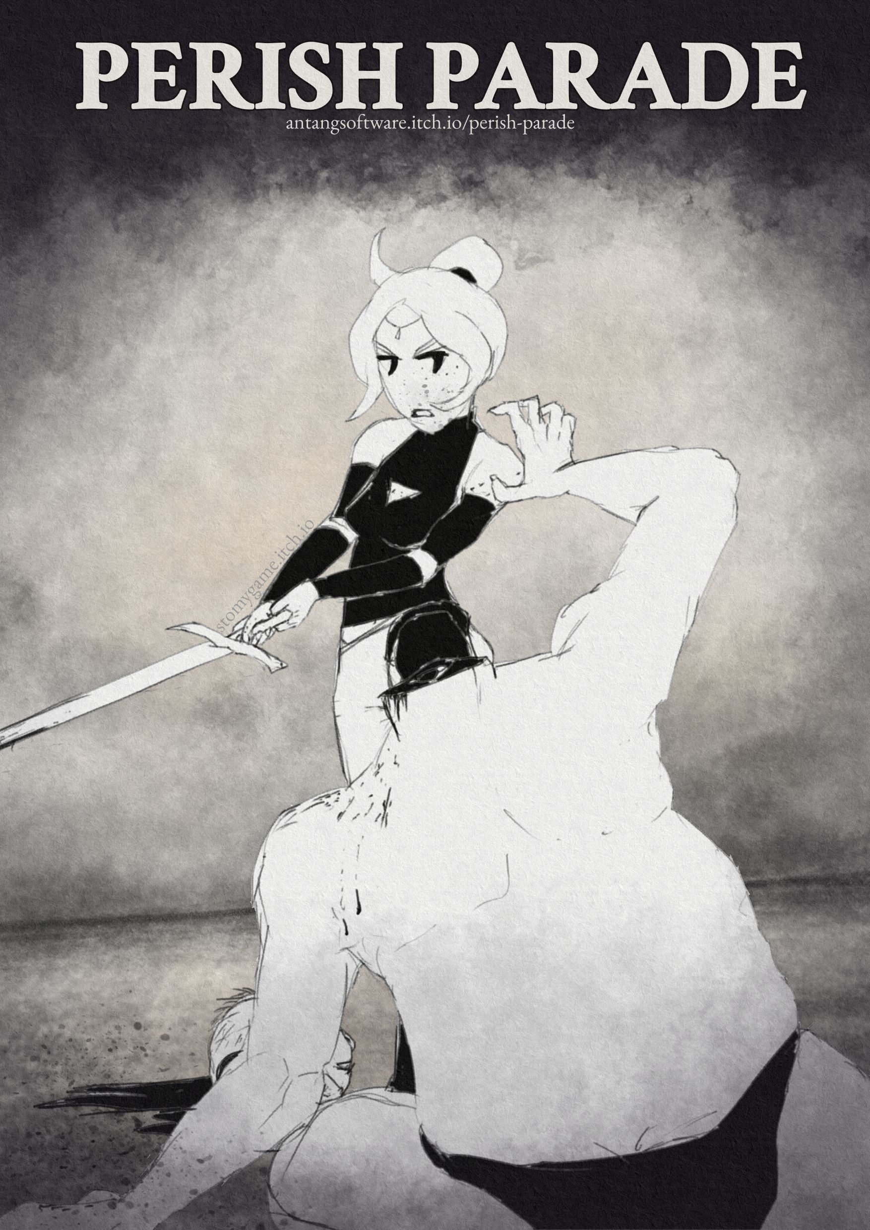
Didn’t have the patience to draw another skeleton, I’m sticking to an hour each for these fanarts, so I drew what I guess could be an ogre instead, enjoy:

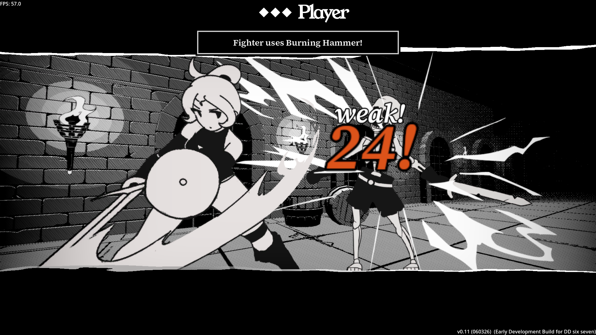
Thank you for playing Stomy! I'll try out a more transparent turn order, but in this iteration there's no skill that would affect your turn order, instead everybody's turns are sorted by agility. The turns are also round-based now, meaning one side needs to spend all of their turn icons first before the other side can act. The rounds can be ended earlier by dodging or extended by hitting critical hits, which respectively cost the party extra turn icons or save them.
No way to set the default formation for now, it will come in a later update where I add menus and more customization options.
Thank you again for the fanart Stomy! I love it.
-Pressing spacebar while in move mode on the map turned my screen gray, and it seems to be soft locked.
-White outline for character being selected for this action is not enough, being black and white means it's easily missed. Instead make the outline bigger, or add a block highlight underneath him, like under the floor or something. Also highlight the portrait in the bottom left perhaps.
-Having to click back and forth was annoying, kinda wished attack was the default action, or allow keyboard use for menu inputs.
Game's alright.
I'll start with the positive.
And for some points of improvement
I was trying to you mouse and arrow keys to move didnt notice for a bit that only WASD worked
except during scene loading seems to be a solid 120fps
the attack screens look cool.
but the move order is confusing, and the teal highlight color is too subtle. I think an arrow to show whose turn would be better also if there could be a turn order icon queue somewhere. i kept thinking the bottom left portraits would be the turn order but its not.
song is pretty cool
Nice. I enjoyed the black white and grey aesthetic. Neat. Although the game area looked good. The UI felt a little. Sad. Anyways, I had fun. Thanks for sharing.
Definitely a cool game. I felt the combat was well balanced and rewarded figuring out the enemies weaknesses.
Great combat visuals!
Some thoughts:
Overall a great prototype! Looking forward to next updates!
First run:
Great music. cute girls. Lost 3 dudes in one surprise encounter because I thought right click just let me pick turn order, but turns out it was skip turn. Seems like you want more strategy, I went boom boom all attack and it didn't go so well. Slime titled encounters are skeletons. Map movement is rigid, look into input buffer to let players queue inputs before the animation is finished.
I'm usually not a fun of diagonal maps where up input can mean either diagonal right or left, unnecessary complication. look into letting users use num row keys to input commands during battle.
1 is attack, 2 opens up skills, allows you to press 1-4 to input skill etc.
Art is really good. I was also really surprised when the camera moved in combat I thought it was fully 2d.
In the current state the overworld movement seems superfluous but I'm guessing you have more plans for it that just weren't ready for this demo.
I will say deciding when to heal is kinda awkward since I the main battle screen only displays current health and not max health.
Also the fact that this game has press turn wasn't clear at all. When I was playing I didn't really understand how many turns I was getting and why my guys got to make multiple moves per turn until I went to go write this comment and read it in your changelog below. Obviously a tutorial could help but I think having sound effects and more explicit UI would be a better solution to make the mechanic intuitive.
Really cool Demo, I'll be keeping my eyes on this one!
Overworld movement is an idea, one of the things that Darkest Dungeon lacks is proper choice in how to approach a dungeon but idk if it's necessary to have move points and turns, a simpler system where the player moves somewhere and maybe triggers an encounter or doesn't would be better. Similarly let player use their items whenever.
When it comes to combat there's really no reason to split normal attack and skills and there's no real reason to have an MP system (although there's no real harm in it if balanced properly with ways to rest). I don't want to just point at Darkest Dungeon and tell you "do that instead" but it's undeniable that your game is taking inspiration from it and that game does things the way it does for a reason. Sometimes less is better and unnecessary submenus that lead to one single attack actions are never better.
Cool looking game though, I wish the gameplay would be more interesting but I'm looking forward to seeing how it evolves.

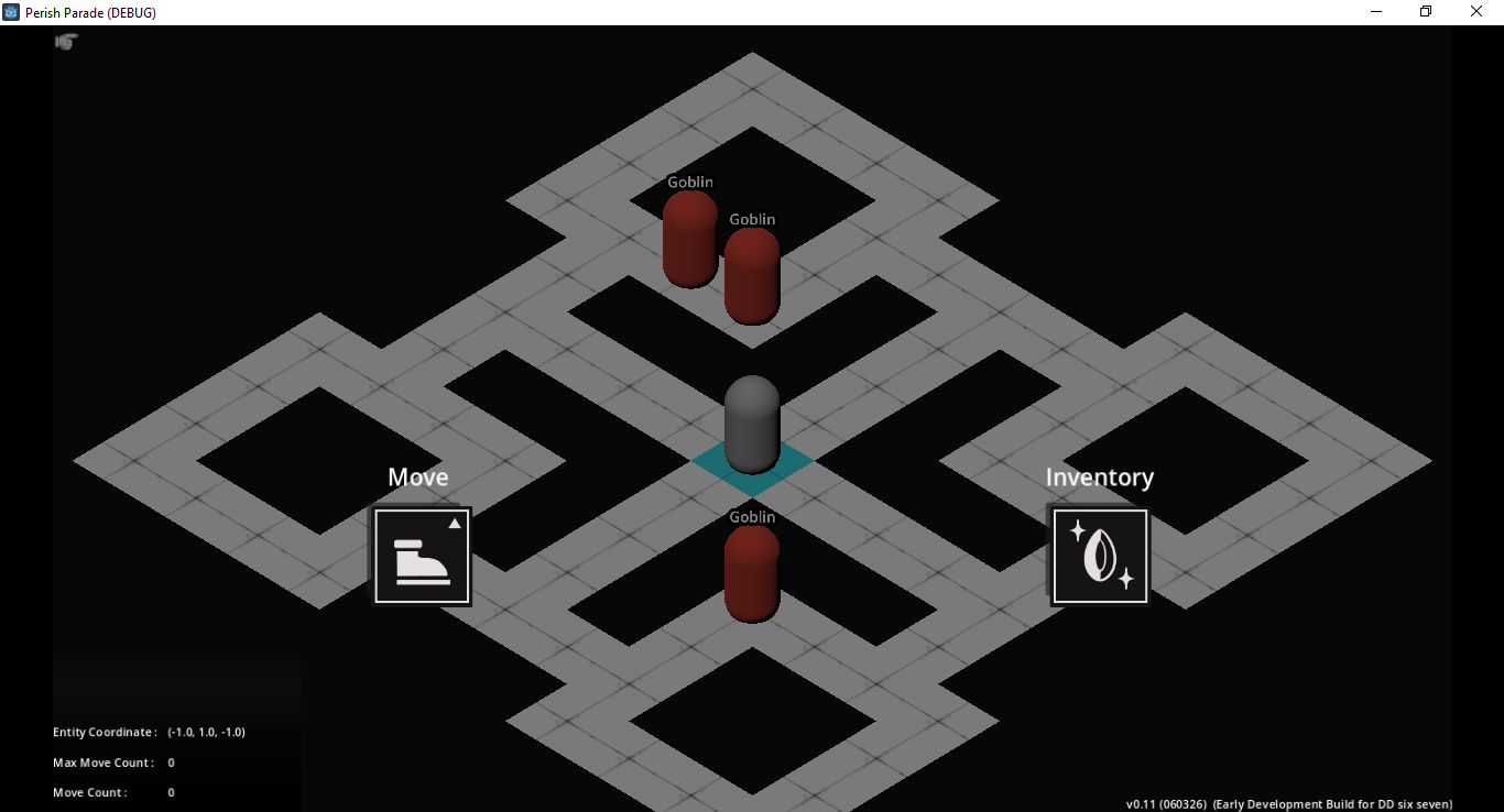
You are ruining your beautiful game by putting this dogshit tactics hell overworld on top of it.
PLEASE just do a STS map. I cannot imagine a scenario where this meta game becomes fun. It's just tedious nothing at worst, at best it's exploiting pacman-ghost AI.
Obviously I'm reacting this way partly because the overworld is unpolished (I can't click on tiles to move??? I have to use WASD... IN DIAGONAL ORIENTATION??), compared to the combat which is so polished and nice.
So it's good that you haven't polished it, because it means you can throw it away, which you should.
KISS: Just do a STS map where I click a node, choose 1/3, and go to the next fun combat encounter!
Fantastic action flow. I think both ogres and slimes look a lot like skeletons. It's a great start.
Leave a comment
Log in with itch.io to leave a comment.