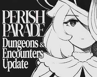
It's in game! But I've closed it since. Don't worry about it now
A member registered Jul 06, 2021 · View creator page →
Creator of
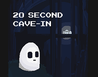
Guide little Ghostling back to his family in this Tetris-platformer hybrid.
Platformer
Play in browser
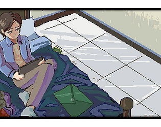
Lana secara kebetulan menggali kenangan masa lalunya, bisakah dia memperbaiki dan berdamai dengan masa lalunya itu?
Adventure
Play in browser