Play game
A tour of Sweetland's itch.io pageResults
| Criteria | Rank | Score* | Raw Score |
| How good is the art style? | #16 | 4.167 | 4.167 |
| Should this entry qualify for the next round? | #19 | 4.125 | 4.125 |
| Would you want to see more levels of this game? | #20 | 3.917 | 3.917 |
| How unique is the location? | #25 | 4.000 | 4.000 |
| Is this a well thought out level? | #44 | 3.125 | 3.125 |
Ranked from 24 ratings. Score is adjusted from raw score by the median number of ratings per game in the jam.
Which game engine did you use?
Godot
Leave a comment
Log in with itch.io to leave a comment.


Comments
Tasty, tasty! Had a blast with this on stream. Love the location and I'm really curious to see which approach you'll take with gameplay if we continue our round one entries into round 2. Great stuff, GhostBit.
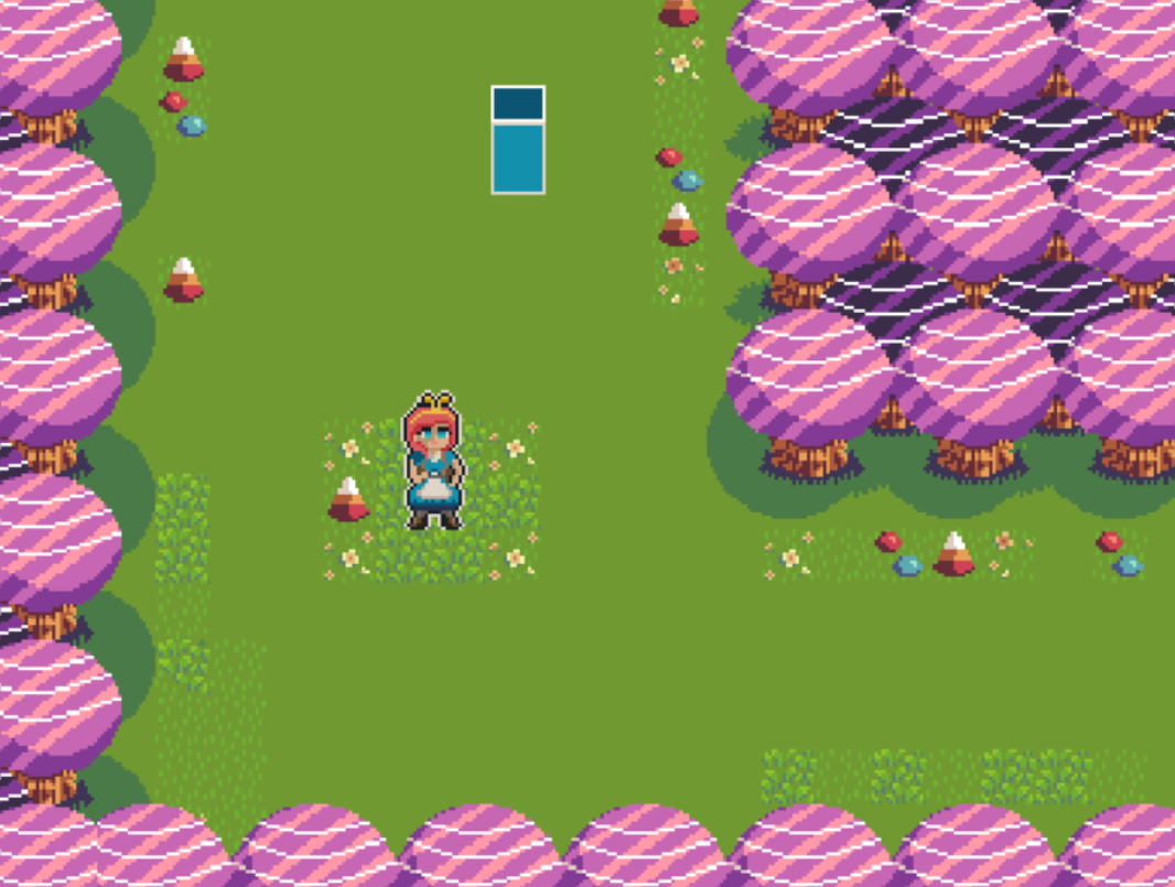
I like the art style.
The art style for the creatures and level were great.
very nice art! Like the colour choices and the enemy animations too!
Very nice candy-themed level! It is also awesome to see how your artstyle has improved over time, nice one Ghostbit :))
thanks, i have gotten better, i appreciate it
Sweet level! I love the lollipop enemies the most, excellent animations all around. Some nitpicks are that the player collision should only be at their feet, and the house and ground sprites are a little out of place due to the inconsistent pixel size and flat texture respectively.
I'm fully aware of the house being out of place due to scaling issue and outline, but what did you mean by this?
ground sprites are a little out of place due to the inconsistent pixel size and flat texture respectively.
if you can please elaborate more, I would love to improve my pixel art
Heyo! I m
eant to say:For example I love this scene's grass:
While this scene feels incomplete, possibly also due to the blocky patches of grass:
Hope this clarifies things! The game still looks great by the way, I'm just nitpicking at the things that I would change hahaha. Keep it up!
ooo i gotcha now! yeah i got lazy with decorating so i stopped after that scene lol
Really cool world you've got here chockfull of amazing pixel art. Would love to see those enemies in action! I have one nitpick though with the gingerbread house; It feels off due to its black outline and inconsistent scale. As the black outline stands out quite a bit, (just an idea) you could use this to your advantage by having black outlines around sprites to indicate that you can interact with them (houses, enemies, items, npcs, player, etc). That way players will easily be able to distinguish between the environment and important things.
ooo great advice on the outline! Will end up probably doing that, thanks yeah I do need to tweak the scaling a bit as well, thanks for playing
Wow Ghostbit! The art is really sweet! I went right first and wow! those monsters are my favourite, top quality work of simple leg limps on a detailed body, plus those eyes and mouth are haunting! (well done man! Amazing animations and personality!)
being full of excitement I go back to the pretty lady and head up, see a nice clearing, oh look some lollipops, still smiling, still excited from the twin big candy bois can't wait to comment about them, AND BOOM, SKULLS
I have to say, I actually got chills. Seriously.
Superb blending of enemies in the environment, showing how this sweat world hides some dark secrets. Cherry bois were also nice, but those skulls actually shocked me, I was even waiting for the trees on the edges to do something after that.
Thanks Spoonsweet! Really appreciate all the kind word sir!
I think you've done a great job with the art style! I love this concept, and am excited to see where you go with the gameplay and story, and future areas of the game!
Thanks! Hope I advance so I can work on it some more
got to say another great entry by the great ghostbitstudio just wish the collision would be a bit nicer by that I mean you can get stuck on corners and edges real easily but other than that just a few wrong z indexes but it is great I would love to see more maybe even some combat or something
yeah I loosely focus on collision, will polish afterwards, thanks hope I advance
Haven't seen anything like this before (aside from maybe Candyland, the board game). Pretty well executed. Would liked to have seen a little more of an objective. But I can tell the focus was definitely on the art/visual design. Well done!
Really nice start, I really like the mix of colorfulness with some scary monsters! Would love to see where you take this gameplay-wise if you build off of it.
i Know! we will see if i make it to the next round
The world is colorful. The world gives me Alice in Wonderland vibes. It's all good, but the only thing I can't explain is the ginger bread house. For some reason, I feel something is off about that building. Maybe it's because it has a different outline or something like that. But besides that, everything looks great.
yeah maybe because it has an outline and everything else doesn't, that's probably why...
So beautiful ! Love the colors and the fun but creepy vibe, can't wait to see more, well done !
Cool level. A tiny issue with depth sorting, but that art style is good, and the design looks neat.
cannot wait until i can kill the food bois next round
Yummy! Looking forward to munching on some enemies.
Fantastic art and animation, loving the sweet themed level and can't wait to see what your main character is going to look like
the art here is super cool and I love all the enemy animations. I really hope this makes it to the next round so I can see where you take it!