
Indie game storeFree gamesFun gamesHorror games
Game developmentAssetsComics
SalesBundles
Jobs
TagsGame Engines

GameFavorites

1,094
Posts
17
Topics
44
Followers
19
Following
A member registered Jan 07, 2022 · View creator page →

Creator of

Recent community posts

How well thought out was the design of all characters involved?

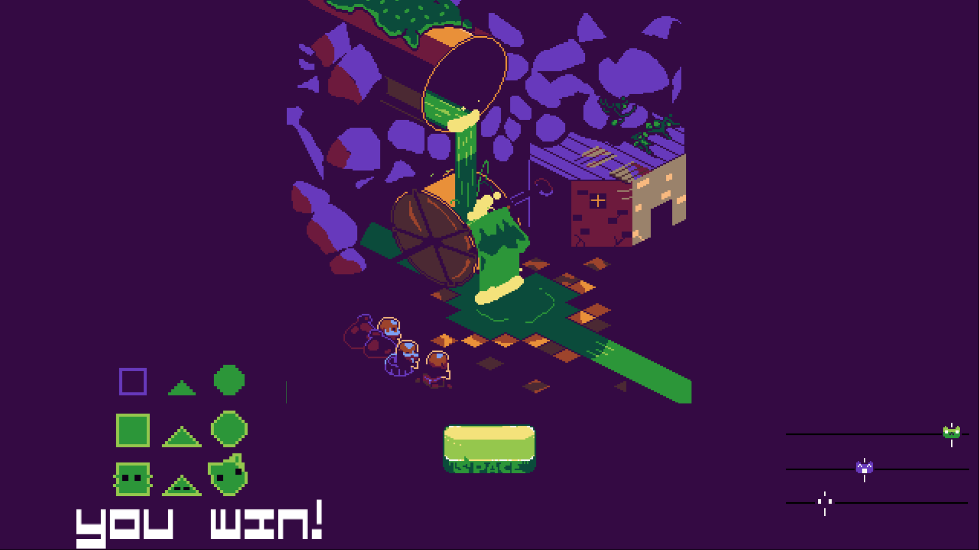
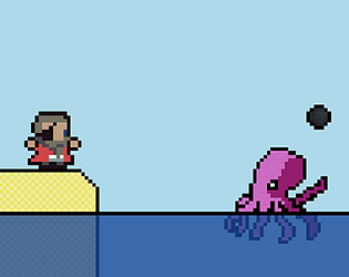
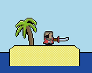
Pawn does a good job at telling you how to play the game and having a voice gives the character a lot of personality. There is a solid variety of enemies with distinct movement and behaviours. The invisible ninjas are my favourite mechanically and the pandas are my favourite aesthetically. On the defensive side - the archers, knights and monks that can be purchased are great for the strategy of defending the towers and it’s good to have archers in the tower that enable you to engage with enemies directly.

How much fun was the Boss Fight to play?
Unfortunately my towers were destroyed just one wave before facing the Troll King in battle. The buildup felt good though and even though I only saw him on the start and end screen, his design with that massive club looks awesome and certainly makes for an imposing boss presence.

Rate the Technical Complexity & Execution.
The match 3 game has surprising depth. The swap mechanics are interesting and the fast pace of the combos felt good. Also, the addition of the upgrade cards adds a nice layer of complexity to the economy. One technical observation - the knights tend to overlap and clump together. While I'm unsure if this affects their hitboxes and makes them die faster, improving their spatial distribution would improve the battlefield visually.

Did the game include 2 distinct game genres and how well did they mash together?
Absolutely. There is a lot of synergy between the match 3 and lane defence genres. While it doesn't have strict lanes per se, the horizontal attacks remind me of Plants vs. Zombies. Using the puzzle side to generate cash for hiring units (knights, archers and monks) works well with the battlefield side for defending the towers.

Was the game well polished?
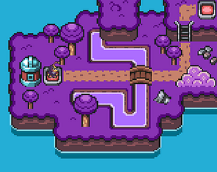
Perfectly. The world came to life with all of the little details like the trees swaying in the wind, the tides of the sea and the translucent clouds floating by. The smoke particles and sprite layering were great. I also liked the UI polish such as the cursor changing and the way the box zooms forward with the number of waves until the boss is timed well. Having an end screen when you lose is great and I love how it shows piles of dead bodies that fill the entire screen to show the scale of the conflict. Just a minor observation - there does seem to be a terminology mismatch in the how to play section where it refers to items as gems but it doesn’t subtract from how I’ve rated.

Hey spoonsweet! It’s nice to hear that my comments are helpful and making a positive difference. Your boss intro animation is top tier for sure and is definitely something to take pride in, the time and effort you must have put in really shows! I think you made all of the right choices and while the water/weight idea is pretty interesting, climbing the yarn ropes feels very natural for a transition and feels really good to jump on. Also, that match 3 quota system is a genius idea and I’ve never seen that before in a match 3 and it works so well. Best of luck!

Thank you RicoTV! I’m glad you liked the juice and the music. It’s always good to hear from a fellow dev who made it to the end of one my games and I’m happy the redeploy system helped you jump back into the action. Also, I really appreciate you staying active and supporting everyone's entries!

Thank you! It's great to hear that the polish and aesthetics stood out to you. Thanks for playing!

Thanks for the feedback! A missile for the Apache is a killer idea - it would definitely crank up the tension, especially if it was a homing missile. It’s interesting that you mentioned endless runner, that’s actually the vertical platforming mechanics in disguise! My game is a tribute to The Adventures of Dino Riki where the floor is just as dangerous as the bullets. I designed the fences/groynes, rocks, river and landmines to require a platforming mindset, even though the camera is top down. You are 100% right on the explosions, my apologies to your ears! I'm working on a fix to properly prevent that audio stacking for the next update. Thanks for the detailed feedback, it definitely helps me a lot!

Thank you so much! I’m glad you liked the checkpoint system. It was a challenge to build because I wanted that seamless arcade flow where the player never spawns into a death trap. I totally understand being on the fence regarding the genres - and it’s probably more like a tightrope than a fence. My goal was a seamless hybrid inspired by a NES game called The Adventures of Dino Riki. That game was a bit of a diamond in the rough that pioneered the mix of vertical shmup and platformer. I see massive potential in that combo and tried to rework it. I used the bomb/bullet dodging and shooting for the shmup half, then integrated the jumps over fences, rocks, landmines and a river for the platformer half. The boss was then designed to test both skills at once. Thanks again for the detailed look and the kind words.

Thank you! I’m glad you enjoyed the aesthetic and that the credits gave you a laugh :D You’re totally right about the explosions - I’m working on a proper fix for that audio stacking to save everyone’s ears! It’s interesting that you mentioned endless runner and I can definitely see how it feels that way. My goal was actually a seamless shmup/platformer hybrid inspired by The Adventures of Dino Riki which is a bit of a lost genre. I've always wanted to see more of this sort of genre mix where you have to watch your step as much as your line of sight so I thought it would be good to try it out myself. Anyways, thanks for the great feedback!

How well thought out was the design of all characters involved?
The bouncy slime animations make the enemy movement look nice. I like that there are different colours, sizes and that some have shields. The boss is nice and big, and I love how happy he is as he looks around at all of the destruction. The tentacles are by far my favourite enemy design.

How much fun was the Boss Fight to play?
It’s fun. I really like the build up to the boss and I like his entrance. It’s great that the boss can run away during the fight if you don’t vanquish him in time. I especially like that the boss summons tentacles that can destroy the card slot if you don’t loosen their grip in time.

Rate the Technical Complexity & Execution.
The technical execution of the leaderboard adds a great hook for replayability. The various card mechanics are diverse, well balanced, have expandable and switchable positions and their different effects are interesting, especially the lightning ones.

Did the game include 2 distinct game genres and how well did they mash together?
Yes. Deckbuilder and shooting gallery were the 2 distinctive genres I saw. I’m probably wrong calling it shooting gallery with it not having a gun but that’s the Cabal game style it reminds me most of. The mashup works well because the deckbuilder adds strategic depth to the usually twitch heavy genre.

Was the game well polished?
Absolutely, your games are always super polished. There's a screenshake during the boss’s arrival. All of the characters have sprite layering and hit detection. The hover over text instructions are clear and informative. The way the cards are brought in, dropped out, their squish and tilt frames and loading up animations are all awesome. I must admit, it can get pretty hectic towards the end and I reckon the majority of people love it for that reason. But for me personally, my preference would be to go for the less flashy and more precision route with less enemies and less cards. I’m not sure if this would be good or not but maybe changing the hand into a crosshair and having it be an auto firing machine gun or powerful sniper. I absolutely love how the gold coins pour from the cards but I didn’t like the coins moving to the top corner as I found it distracting and drew my eyes away from what I wanted to be focusing on. I think adding a pixel clock icon next to the countdown timer would make a great addition but these are just minor things to what is already a perfect 5 out of 5 polish.

How well thought out was the design of all characters involved?

The hero has an absolutely amazing entrance and I like that he’s got a bow that can later on shoot magical arrows. The different types of enemies are visually impressive and it’s good that the boss Auriel stays on screen throughout the whole battle to provide extra tension.

How much fun was the Boss Fight to play?
Building the character up ready to fight Auriel was super fun but the actual boss battle itself at the end of the waves didn’t leave a lasting impression on me as I don’t think I saw him do one attack. I played a few times and each time was different, sometimes I won, sometimes I lost and every time was fun. I loved listening to the awesome sound track and I liked the look of the boss and how he taunts the hero at the start.

Rate the Technical Complexity & Execution.
I have never done an inventory system but it looks like it would be very technical, especially since it has gone above and beyond a standard system. The sheer number of different items from common to legendary are amazing and I love their descriptions like the bow made from wood that never touched sunlight. The different effects are equally impressive and I like the burn arrows the most which have a limited supply and once run out automatically deletes itself from the inventory. I also like that you have upgrades and that you have to tetris fit the items and you can even rotate them. The goddess blessings are a great addition too and I like that there are so many stats and strategies to win and alongside all the randomness of the rewards, it makes for a great game with a lot of depth.

Did the game include 2 distinct game genres and how well did they mash together?
Yes. This is a perfect execution of a stationary horde survivor genre mixed with an inventory management genre.

Was the game well polished?
Yes and no. The juice is definitely there, the volume sliders, special effects and the dynamic rain angles and so much more are beautiful. However, there are a few bugs (like the chest softlock on the boss), QoL things (like full screen and restart button missing) and UI quirks (the right pointing arrow for Expand Left) that if remedied would take the polish the extra mile. There’s also a few broken items like the cheese and Dawncharm which have incredible ideas but just don’t seem to work.

How well thought out was the design of all characters involved?
Extremely well thought out. The mouse and cat are fantastic characters and it makes a lot of sense for them to be enemies. The mouse has such an iconic look with that long red scarf and I love the physics applied to the way it drapes behind him and the way it is taken off to be used in grappling is awesome. I also love how he eats the cheese too and the candy cane sword is really novel. The Christmas antler headband on the cat is the icing on the christmas cake.


How much fun was the Boss Fight to play?
Super fun. Sneaking past the cat boss as you go through the room was a lot of fun and the movement and attacks of the mouse and cat were all really great. The one on one encounter at the end was an epic showdown moment and I liked the checkpoint beforehand and how you have the baubles to swing on and the bells. I think the sounds really elevate the game too and having the quietness of just your own footsteps with ambient sounds of birds and wind from presumably an open window in the dead of night set the starting scene perfectly. I love hearing the cat purring, it’s one of my favourite sounds of all time. Lastly, when the boss music kicks in, it heightens it way more had there been music throughout.

Rate the Technical Complexity & Execution.
Grappling is a notoriously difficult mechanic to get right and it was implemented perfectly here. Also of note, there was a checkpoint, wall jumping and a parry system. I personally didn’t use the parry as I find pressing the shift key a bit fatiguing for my pinky finger. The camera scrolling to show where to head to was smoothly done.

Did the game include 2 distinct game genres and how well did they mash together?
Yes. It has platformer and stealth as the 2 genres. The platforming was done exceptionally well. I feel like there could have been some good opportunities to expand the stealth in the game, for instance being able to walk inside the candy house and see your player in the window would be awesome, maybe a mouse hole in the skirting board and being able to walk behind the glass snowglobe could be fun, especially if the snow rises up when the cat lands on the table.

Was the game well polished?
Yes. I like the text fading in and out when providing tutorial instructions. The sparkle and red targeting on things that can be grappled was nice and clear and the objects were very creative, especially the light switch. To further enhance the polish, adding an exclamation mark or shadow where the cat is going to land when it is pouncing would help telegraph the danger. There’s a lot of little details that I like such as hearing your own heartbeat when you see the cat. Lastly I just want to say that I think the ending screen is the best I’ve seen so far.

How well thought out was the design of all characters involved?

Very. I love how the game starts with a cat swallowing yarn, such a good animation there and I like the little backstory it provides for how the cat becomes a yarn boss. I like the way the boss bounces around the screen damaging the blocks and the different attacks it has, which are telegraphed perfectly when it stops in mid air. The head poking out at the side before dropping the yarn looks very nice. I like the attention to detail on the player’s hair, the white flash it makes when she takes damage and the controls feel smooth.

How much fun was the Boss Fight to play?
It’s fun, especially because I managed to win! The match 3 puzzles were a highlight for me, I loved how the blocks used different yarn patterns and how it adds more types to match as the game progresses. It’s also really good how it keeps track of which matches you made on the side bars as well as in the puzzle area. I also like how the green ones add to the timer. The action phase is fairly good and I appreciated having safe zones to learn the boss's patterns. Having one way platforms would improve the movement and adding smaller yarn balls to dodge could provide an extra challenge. I also think the water should be a hazard that kills the player to raise the stakes.

Rate the Technical Complexity & Execution.
I imagine the most technical aspect was doing the match 3 game, especially with handling the combos and it works flawlessly. The physics for how the yarn boss bounces at different speeds and angles is great and I like how the reflection in the water shows the boss reflection especially when it’s close to the water even as it changes animations.

Did the game include 2 distinct game genres and how well did they mash together?
Definitely. It was crystal clear that the 2 genres were puzzle and action platformer. I really like how in the action segment you have to stay close but not too close to the danger that the yarn boss poses if you want to climb up the loose yarn strings in time. I also like that the action phase has different levels and that it shows the cat trying to get out of the yarn. Then the transition where the player climbs up is super awesome and adds a lot of polish and makes it clear that you are trying to unravel the boss, especially as you go into the puzzle phase.

Was the game well polished?
Absolutely. It's got great cutscenes. Those volume sliders at the start are amazing, labelling them as SFX, Music and Master would make it perfect imo. I like the different texts that pop up when matching 3 or 4. I like how the shadow on the boss stays in place even as the boss rotates. It’s good how the blocks have a little bounce to them when the boss bumps into them too. Finally, the cat winking at the end is a super nice touch ;)

How well thought out was the design of all characters involved?
Epic. The ancient battle robot god that Crunkle asks you to fight against is super duper cool, probably the best looking boss I’ve ever seen. I especially like how it rises up from the ground, crushes a house with its huge metal fist and then stays in a shoulder slumped position. I also like how it transitions to other phases too and is a great downtime moment between the action. Seeing the boss launch missiles from its back and then having it rain down is awesome to see and dodge and I like the inclusion of warnings and telegraphing for all the rockets, missiles and rocks he slams into the air. The main character is excellent too with an awesome ledge hang ability that fits well with the level design and it's always great to see Crunkle again.

How much fun was the Boss Fight to play?
It's a lot of fun when the boss is attacking. I think keeping the action flowing more would be really awesome. Seeing the boss in different phases is really fun too as it makes you wonder what is going to happen next and the excellent music and sound effects compliment the game’s atmosphere perfectly.

Rate the Technical Complexity & Execution.
The ledge hanging is technical and really well executed. I like the random locations for the multiple attacks and their corresponding warnings. I also like how the rocks roll and how the boss can destroy the command buttons later on. Everything seems really well made and professionally put together and I liked using my gamepad to play the game.

Did the game include 2 distinct game genres and how well did they mash together?
Definitely. Mixing a platformer with an RPG in the way you have done is not something I’d ever think of but it works extremely well. Being able to jump on top of and take cover under RPG command buttons is a neat concept and I like how entering them does different types of attack and heal. Running inside what I think is the robot’s arm or gun in a 3D perspective is really cool and it reminds me of early dungeon crawler RPG's. I would have loved to see this and the dart attacks expanded even further gameplay wise but what there is, is really good.

Was the game well polished?
Yes. Having a well designed title screen with sound options and an intro cutscene is good polish. There’s great looking impact effects when the rockets land. The heart beating especially when beating faster on low health is great and made my own heart beat faster. To lean into that immersion further, it would be awesome if the music tempo increased slightly on low health. I also think a freeze frame on the game over screen and muting the explosion sounds during the 3D sequence would be awesome. It’s clear when the character is taking damage due to the flash effect. The game over and game completed screen is well made too.

Hi all! It's crazy to think we started with 108 devs and now we are down to just 21. We've certainly reached the cream and it's going to be sad to see some really talented devs leave this round. I actually got knocked out in the dev vs dev last year so this one's going to be a nail biter. Best of luck everybody!

Here is my top 3 prediction for round 3 - the semi finals

1st - Loten (TamaGory)

2nd - Mateo Torres (You Are What You Eat)

3rd - smartmagpie (The Life and Death of cute food friends!)

Beyond these three, I think anyone's game could make it to the finals. Also, don't count on my prediction being right - I'm a dev, not a psychic!

Was the game fun to play?

It’s super fun. I loved switching between fighting the hordes of enemies to looking after the pet. The loop of feeding freshly dead bodies to increase health, petting for happiness and boosting energy by switching a light off when it sleeps so it can use magic is such a fun game loop. I especially like that the bodies go rotten and that the magic spells feel powerful and juicy. Being able to choose which path the pet evolves is amazing too and I love how there is so much choice.

Did the game include the core elements from the original?

Absolutely. The character starts by hatching from an egg and has different life stages. Looking after the pet’s needs (health, food, sleep and happiness) was included. The pet calls for your attention. If the pet is fed a rotten body, it gets sick and you can heal it with a herb. The branching evolution path is done exceptionally well.

Was there a clear path of progression?

Definitely. The tutorial explained how the game works in a fun low pressure way by using the training dummy. Getting a high happiness score was a clear objective. Defeating enemies and looking after the pet’s needs was a clear and well balanced method to progressing.

How good was the audio and sound FX?

The background music is brilliant and I like that there are multiple high quality tracks that keep the atmosphere fresh. The sound effects are all juicy and I like that you have volume controls for music and SFX. 

How well implemented was the UI?

Exceedingly good. Being able to enter your own name and the pet’s name at the start is great and I love the leaderboard, especially because I got 6th. The colourful bar charts for stats are easy to read at a glance. I also really liked the control scheme where you can hold the left mouse button down for continuous attacking and petting. Swapping the custom cursor with 1,2 and 3 was very intuitive and the skill point presentation is the cherry on the top.

Was the game fun to play?

The core combat remains engaging, though I found the fun leans more towards the character's actions rather than the new pet mechanics. While having animals fighting alongside you in the arena is a fantastic concept, especially with the distinctive designs, the pets feel secondary to the action. I like that you can stab forwards, swing around and even use a blunderbuss to shoot bullets. I also like the non lethal takedowns and how your pet can follow you and change to an aggressive stance. But I think to ramp up the fun, focusing more on the pet training side of things could be beneficial. So there could be some mini games where you actually see yourself doing the training of the animal and it could make the bond with the animal feel more interactive.

Did the game include the core elements from the original?

Yes. There are 3 different pets and the type you get depends on how you play. I got a wolf the first time and then when I released it in the wild after 7 battles, I bought a new egg and got a lizard. It’s great that you can train the pet’s aggression, loyalty and discipline as well as adding elemental damage to the attacks.

Was there a clear path of progression?

Definitely. I got an egg from the beast vendor who gives clear instructions to go to the arena to hatch it. You then do battles in the arena with your pet and you can choose how you want to train your pet and there’s also a ghost mode which is great fun to see and I tried it out a couple times. Stats are displayed at the end of battles and show your progress.

How good was the audio and sound FX?

The music fits the medieval atmosphere perfectly and is quite pleasant. Having separate volume sliders for the music and SFX is great. The hit sounds are satisfying, though I’d love to hear more unique and distinct sounds for the different animals.

How well implemented was the UI?

The UI is very clean. I like that the pet can be renamed and the names of the characters are displayed in the arena in stand out colours. Having the UI in the top right corner for the status was a great placement whilst also being informative. It could just be my eyes but I think the red gun crosshairs blended in too much with the background and white might have been a better choice of colour. Lastly, I really liked the way the cooldown UI was shown. 

Was the game fun to play?

Not entirely for me, though I do respect the appeal for fans of the genre of games like cookie clickers and harvest moon, which are popular for good reason. The thing I enjoyed most was watching the emoji’s multiply and seeing them move to the things I gave them and watching them express happiness was genuinely charming.

Did the game include the core elements from the original?

Definitely. Looking after the pet emoji’s needs (water, food, play and hygiene) was well implemented and getting the resources from the mini games was a really clever design choice, especially how they linked together. Drag and dropping the poo and dead emoji’s into the shredder to prevent sickness was another core element that was well met. While resource tracking is solid, I think the farm sim could be further improved by using the water from your collected resources. The game does lose some connection factor, as it’s harder to form a bond with a mass of emojis than with a single individual. However, much like people who nurture ant colonies, there is a unique appeal to managing a large group and it does start small to begin with.

Was there a clear path of progression?

Absolutely. The game eases you in with an easy to follow tutorial which explains everything very nicely and at the right pace. Getting as many emoji pets on the screen is great for a main goal. The upgrade shop helps with progression through various means. The achievements are plentiful and have multi tiers to each so there’s a lot to keep you busy.

How good was the audio and sound FX?

The audio is a mixed bag. The sound effects are excellent, distinct and satisfying and communicated their action perfectly. But the background music actually hurt my ears, forcing me to play on mute for the majority of the time. While the in game mute button is appreciated, adding separate volume sliders for music and SFX would improve the experience. Something I think would be super cool to add to the game would be a music player so you can pick what you want to listen to within the game itself for even more immersion.

How well implemented was the UI?

Exceptional. I absolutely love your ambition of creating a whole operating system for the UI. The windows 98 look is great, fits the Tamagotchi time period perfectly and adds a lot of polish to the game. Having the correct time displayed in the corner is a nice little detail and I think I caught a glimpse of a screensaver too at one point, which is a nice touch. I can think of a few minor tweaks to improve the UI with the main one being making the text and desktop icons bigger to improve readability. Opening, closing and minimizing the windows worked great, especially if the game is played in full screen mode to hide your own tabs and taskbar, which is the way to play the game for the best experience. For the water plant game, I like the +1 though the droplet icon doesn’t seem needed and I like that it’s blue for water. The slider would be nicer in my opinion if it was bigger and that the water bucket moved in sync with the slider rather than lerped for smoothness which makes it appear laggy. The rainstorm where it multiplies the water supply by 10 is a great idea and I think a dark cloud would be more fitting than a star but I like its inclusion very much. Its collision box could be more generous though. Hovering the cursor over a poo or emoji was great how it changed to a hand and that it lifted them off the ground with a shadow and made them bigger to signal that you are lifting them up. I think if the hand had a grab animation frame when dragging, it would look really cool but I understand that this didn’t exist in windows 98 and the same could be said about having red close buttons. The speech bubbles on the emoji’s are great and I like that things fade away if not consumed to keep things tidy and to stop a spam strategy. While not a big deal, it would look more polished if the emoji’s were updated with their sprite layering so that the emoji’s in the foreground overlap those in the background. Overall, this is up there at the top for UI with Evengy’s game. Really impressive. If I could give more than 5 stars I would.

Lol, I loved your detailed review! Once I've cleared a few more games from my list, I’m definitely diving back into yours to figure out those intricate puzzle designs, especially since I noticed you’ve posted explaining things a bit more now :) 

Really glad that you picked up on the cycle of events in my story, I wasn’t sure anyone would notice that. I do like that bone crushing sound too, apparently it was made by someone crunching on a hard candy. 

Regarding my UI, my thought was to split the screen, so left icons for eating and right icons for staying warm. Since an egg is warm when freshly laid I decided to put it with the other warmth based icons. The core loop of my game is a balance of hunger and warmth, where increasing one decreases the other, with happiness being the average of the two. 

Thanks again for the thoughtful feedback!

Was the game fun to play?

It was a solid experience. Watching the battle royale play out was interesting and seeing enemies take each other out was really cool. The training phase was less interesting in my opinion. Dropping weights and clicking the juicer didn't quite live up to the same excitement. I think to make the training more fun, it could lean into the mini game aspect more but that is just my opinion and I’m sure there are lots of ways to increase the fun further in other ways. 

Did the game include the core elements from the original?

Of course. Hatching out of the egg looks incredible and I love the build up it creates. I loved the different life stages and the final form where he’s black was a personal favourite. Building up the character’s stats felt core to the experience and the battles, though different, remind me of a Tamagotchi device that actually had a battle game in it.

Was there a clear path of progression?

Yes. It was very clear that you train the rascal and send him to battle so that he has an opportunity to evolve. During the training, it made sense that the dumbbell increased his strength and it was clear to me that you dropped it on him. As a side note, I think it would look really cool if he had arms to catch it. Throwing the rascal to increase health worked but I only knew to do this from reading the description, however, it's not essential for progressing and I see this as a cool extra feature. It’s also clear that the 4 colours in the food dispenser could increase the 4 stats.

How good was the audio and sound FX?

The music in the training area is full of energy and matches the style of the game perfectly. I really like the battle music but it did get a bit buggy the moment the battle was finished, could just be my computer though so no points down on that. Sound effects in the training area were nicely implemented, with things like the weights dropping on his head sounding great and there’s a bouncy sound too when hit. I feel like there could be a few more places for sound effects like opening the treasure chest. Then there’s the battle sounds which were all very solid, I liked the bat sounds and slashes a lot.

How well implemented was the UI?

Clicking to break the egg open is such a great opening both visually and functionally with it determining your starting stats. In the training area, the bottom bar has the stats presented in a nice way with bright friendly colours and a consistent bubbly art style. The icons are easily recognisable for what they do with numbers adjacent to them for health, speed, strength and field of view. I especially like the use of a custom cursor and how it changes to a hand when over the weights and the character, then how it changes to a closed fist once grabbing them looks totally amazing and is definitely a highlight UI feature to me. It also changes to a spanner/crowbar when over the treasure chest but I think a key might look better there and I think the treasure chest could benefit from some colour to match with the rest of the scene. The timer works great and I like that it keeps track of the completion time at the end, mine was 04:53. The hover over effect on the battle arena button looks great. I feel like it would be better if the juice went down inside the juicer and its colour matched what you picked. I would have preferred the juice colours to match the icon colours. So red juice to match the red heart for health, green for speed, white for strength and blue for field of view. There could be some text when you hover over the red juice that says something like +5HP

Was the game fun to play?

I enjoyed reading the criminal profiles and a prison is a great setting for the game. While the game feels a little simple at the moment, I think there is potential for more fun things to happen and I noticed more was planned. I think it could be cool if the prisoners sometimes misbehaved and tried to escape when you unlocked the doors to feed them. To lean into the fun, maybe a mini game or 2, something like try to find the contraband in their room and you have a time limit to spot something suspicious. Or a mini game that increases the inmates happiness like a basketball hoop in the yard. 

Did the game include the core elements from the original?

Yes. I liked that instead of looking after an animal, you are a warden looking after prisoners. There are also essential needs such as feeding (burgers), hygiene (mopping), and discipline (slapping) and I like that you had the sleeping aspect too.

Was there a clear path of progression?

Yes. I like that the intro gives a clear goal and that he tells you to look after them for 10 days. Unfortunately for me, I think 10 inmates was a bit much for me to look after. I got up to day 5 before everyone was dead in their bed with one inmate dead after I slapped him too much on day 3. I think my ideal setup would have been 2 prisoners to look after and to keep it on a single screen. 

How good was the audio and sound FX?

The opening voice adds a lot of personality and polish. The background music was pleasant. The sound effects of my actions were responsive. I’m not sure why the doors opened so much but it sounded good though. 

How well implemented was the UI?

The date and how many days completed is very clear in the bottom left corner. The inmate files were easy to open and read. The way the actions become visible by putting the cursor in the lower half of the screen keeps things tidy and I like the hover over effects. Left clicking to do an action felt natural and the same can be said about right clicking to get off them. I like that each prisoner had a name. The animated emoji icons were easy to recognise their needs while also looking good. When it’s light out and the clock appears, it’s good that it visibly shows the passage of time by going around in a circle and I think it would be even better if the hour hand on the clock moved with it.

Was the game fun to play?

Definitely. I liked this game way more than I expected to once I spent a minute to understand how it worked. Switching between the modes to keep the numbers down and seeing the robot evolve is great fun. The mini game where you have to predict the next bit isn’t the most exciting game on the planet but it’s not terrible by any means and I kept at it until I got a score of 5 out of 5. Maybe something cool could happen when you win like some text that scrolls with WINNER! I think something like a binary puzzle could be a more fun game to include while still keeping with the robotic nature of the game. 

Did the game include the core elements from the original?

Yes. I can definitely see the alert system from the original which is great. There’s also a robot that makes a good replacement for the creature from the original. The robot can also change forms and it animates nicely. There’s lots of stats to manage and for this game that takes the form of charging the battery, overclocking the cpu, cleaning the overstack and removing viruses. 

Was there a clear path of progression?

Yes. Progression is done through the runtime which affects evolution of the robot so it starts with a BitBot, then evolves into a ByteBot, then a KiloBot and MegaBot etc (I love how the naming convention ties into the size of numbers so it will be giga, then tera, then maybe all the way to zetta).

How good was the audio and sound FX?

The background music is really nice to listen to. The sound effects for the menu beeps were great. The warning noise is definitely what I’d expect for one, and while it isn’t so nice to listen to, it does the function well and makes you actually want to fix the problem quickly. 

How well implemented was the UI?

Exceptional. I feel like the game is centred around the UI and there’s both Human UI and Debug UI. The icons in the human UI have a nice clean minimalistic style that corresponds well with what they do. I like that the white changes to blue to stand out on the button you are on. The text rolls in really nicely on just the one icon that you are on to keep things looking good. The dot matrix style feels very fitting for the 1990’s time period. The clock takes centre stage due to its importance for the robot’s evolution. The clock has an interesting style to it and tells the correct time on the real time mode and it’s great that the simulation time can be increased by 2, 10 or 60 times faster. I think 60x is only useful if you are in sleep mode so you have got to be careful going that fast otherwise you risk system health. 10x seems fine in the debug mode and maybe 2x is doable in human mode but it depends on the pace you want to go at. The pause and complete failure is conveyed really well with the moving yellow lines over the icons and I like that you can easily restart the game again. The input buttons on the bottom makes sense with the return button taking you back to the top left corner quickly where you need to do most of the stuff like recharging the battery and removing the viruses. Going into sleep mode means no need to worry about issues and if you got it in real time mode you could also sleep without any beeps. I like that sleep mode is limited to just between the hours of 9pm and 9am each day for that purpose.

(1 edit)

Was the game fun to play?

Absolutely. I reached the end, found the secret panel with the hard drive in and successfully prevented the Xlander Virus from corrupting TinyTotchi. The dark twist was an unexpected but welcome twist. Doing a bit of fruit ninja on the oranges was fun and the wave survival with guns kept the game engaging.

Did the game include the core elements from the original?

Yes and with a cuteness factor x3. I like that the 3 characters have names and a personality. The core stats for their health and needs were well integrated in the game. 

Was there a clear path of progression?

Yes. It was clear from the tutorial that each stage would last 45 seconds and I progressed through the different stages with no trouble. I initially struggled a little on the battery section because I was clicking on the screw rather than dragging it but it didn’t take long to figure it out, maybe a drag arrow could help though. 

How good was the audio and sound FX?

The menu music is incredibly catchy and fits the cute imagery perfectly. It’s great to see the volume sliders for music, sound and speech. While the character phrases are great, Owl's swearing caught me off guard. It’s funny, but a content warning might be a good idea for younger players. The sound the rainbow vomit makes is great when customising them, as too is the gameplay sounds.

How well implemented was the UI?

Putting the battery in to start the game is a nice realistic touch. The UI blends seamlessly with the same consistent art style of the game background. The icons at the bottom (diamonds, phone, lightning bolt etc) look great. Having the character stats at the top is a great position and it’s clear which character each belongs to and how they each have a different need. The tutorial arrows with the text inside them are helpful too but it can look a little busy.

Was the game fun to play?

I think for me the fun comes from the storytelling. I particularly liked the phrase “before you lies the vast pale - an inhospitable stretch of snow and wind”. I would have loved to see the story expanded further, particularly at the camps but there is enough to tell an interesting story. I managed to return my embyr from the crater to the citadel and I hope we get to see your character return to the stars in the next round. 

Did the game include the core elements from the original?

Yes. I think choosing a flame for a character to look after is a novel idea and I liked the look of the 3 phases where it gets bigger and I particularly like when it smiles and blinks. Feeding it with tinder is a great alternative to food. There’s also stats and resources on the main page that can go up by using tinder to heal and it can take damage from the cold. 

Was there a clear path of progression?

Progression is very well defined. Taking a fallen star on a journey is great and seeing where you are on the map is a good indicator of your progression. I also like that there is at times a different route to take. Also, the story progresses nicely over time and the end goal of reaching the citadel is clear from the start.

How good was the audio and sound FX?

The 8 bit sound effects were charming and I think the short tune at the end is very good. I feel like the game could benefit if there was some background music that lasts a little longer to fill in some of the silence though. The beeps were clear for when you can and cannot do any more healing. I think being able to feed while the stats page was open would be a good thing too. 

How well implemented was the UI?

Being able to name the character is awesome and I am surprised this is the only game I have come across so far that has done this. The letters A,S and D worked fine for me but the 7 letter limit could perhaps be more generous. The typewriter effect is great and I like that you can click to reveal all of the text at once. For the stats, I understand that HP is health points but I wasn’t sure what FP and DP (defence points maybe?) meant. I’d love to see some further clarity on what the 3 coals (volatile, smouldering and dense) did and what the starting coals (energetic, cautious and brave) did. The UI on the map was great and it was clear where I was and where I was heading. I also like that there is a restart button at the end. 

Was the game fun to play?

Absolutely. The 6 mini games are super fun and strike a perfect balance in difficulty. The grading system (bad to excellent) feels fair and I appreciate that the game is forgiving enough to allow for an overall excellent even with just one slip up. Just to let you know, I did encounter a softlock bug in the pancake game and is not anything I will rate down on. It only triggers if you perform bad on purpose which most players won't do, but the game freezes up rather than progressing to a fail screen.

Did the game include the core elements from the original?

Definitely. There’s an instant hit of nostalgia from the start screen where you can immediately see the distinctive cracked egg shell screen as well as the 3 button layout. It included fun mini games, which were way better than the original in my opinion. It’s done the feeding aspect perfectly, going above and beyond in fact. I like that you can give the pet some love by petting it. Using sleep to fade the screen to the next transition screen is really great. The hatching animation is so good and he’s such an adorable animal too, especially when he smiles. There’s also a few different looks to the animal, with an egg on his head being my favourite. 

Was there a clear path of progression?

Yes. The process of hatching from an egg and completing 3 mini games (breakfast, lunch and desert) in which you can choose which order to take them in was handled really well. I like that you can see past versions with the food path on how you got them and your ratings for each.

How good was the audio and sound FX?

I think the game could benefit from some background music. But the sound effects such as the clock ticking, the stove burning, chopping apples, menu clicks etc were all great. 

How well implemented was the UI?

Very good. The navigation felt intuitive and I like that the food got bigger when selecting it. The instructions for each game were very clear and I love the little joke - you’re telling me an egg fried this rice. The ending screen where it shows the spot light and the text "your cooking was not good enough" is brilliant. Overall, the UI is all very good. 

Was the game fun to play?

Your artwork and animations are top tier and watching how everything interacts is a lot of fun. The game seems to be intentionally cryptic but trying to figure it out and piece it all together is certainly part of the fun. I’ve managed to accidentally mutate my cat with a mix of too much medicine and lava I think, which is a hilarious and unexpected outcome. I’ve also got one of each shape green on the factory screen but I’m not sure what it means yet. From what I can tell, the book has fractions and I’m seeing if they are equal or not. It’s all very puzzling but in a good way. I’ll probably have to check back in the comments to see if anyone has worked it all out to see what I’ve missed seeing. 

Did the game include the core elements from the original?

Absolutely. The cat is adorable. Feeding cake and fish looked great. Giving the medicine looked great too and the game certainly has the hygiene aspect done in a very cool and original way. Pouring the lava looked amazing and is a great way to clear the poo.

Was there a clear path of progression?

This is the one area that feels a bit opaque. Currently, there isn't a clear indicator of an end goal to me at least. While the mystery is fun, a subtle hint at how close I am to achieving the end result would be great to add in.

How good was the audio and sound FX?

The music is top notch and fits well with the game. The sound effects are equally impressive and I think all of the things like the people saying aha to the cat complaining etc adds a lot to the enjoyment of the game. 

How well implemented was the UI?

In a word, I would say the UI is stunning. The main buttons look amazing especially with the shine effect and I love the little details like the keyboard letters written on the bottom of each of them. They animate really well and I like that you can use a mouse or keyboard to press them. The volume sliders are the best I’ve ever seen in any game, those cats on them add a lot of personality. The bars at the top looked great too with the images inside them, but I wasn't fully sure what the blue one represented.

Was the game fun to play?

I beat everyone and it was cool to give a blue apple to a baby ping and go into battle with the little guy. The artwork on the characters and scenery is great and I like the shopkeeper a lot. I love that you can create a team of up to 6 creatures who all look distinctive and the whole game loop is great.

Did the game include the core elements from the original?

Yes. It was great seeing which character was going to hatch from an egg and to see their different life stages was really cool. Seeing my alien joe get big for the first time was awesome. You nailed the feeding aspect with a great choice of foods which made sense like spinach for strength, I can’t help but think of popeye there. 

Was there a clear path of progression?

Yes, the progression was very clear. Choosing how to feed each creature was good and I like that there is a max limit so it makes the choices matter more. It’s also really good seeing the characters increase in size a few times and the 10 challenges were fair. 

How good was the audio and sound FX?

The different music tracks used throughout the whole game are really excellent and fit the game perfectly and I liked all of the SFX too for things like the death, hatching, stats etc

How well implemented was the UI?

It was good seeing the characters move around in the park and clicking on the one I wanted was easy due to the number next to them which was essential when you have 3 lemmy’s like me. Being able to reorder the team order worked as expected. I appreciate the fast forward button in battles. One suggestion I have is that the battle text box could be replaced with a visual indicator like a hand pointing to whose turn it is to make it feel faster. Everything about the UI in the shop was implemented really well, especially the scroll bar.

Was the game fun to play?

This is a super fun game. I managed to defeat the black cat and win the game. The concept for how it works is genius and I love how you pass the skills on to your descendants. All of the characters look great and I like the interactivity with adding hearts to yourself and sending bolts of lightning to the enemy during the battles. Not something that will affect rating, but slowing the clouds in the background could be a good thing.

Did the game include the core elements from the original?

Yes. I like the variety of food friends and having the food friend being determined by the base stats that you choose is an awesome way to handle the branching paths element from the original. 

Was there a clear path of progression?

Definitely. It’s great that the stats improve with each generation and it’s clear that you have to defeat each enemy to progress and that they get progressively tougher.

How good was the audio and sound FX?

The sound effects like the button clicks are crisp and satisfying. However, the music could use more variety in my opinion. The tracks for the main game and death part sound okay and are well-implemented and loop seamlessly but because the loop is so short, it becomes a bit repetitive and the tune stays stuck in your head.

How well implemented was the UI?

Seeing the physical buttons on the device go down is cool and I like that you have kept to the traditional setup with the 3 button controls and square screen. It’s hard to think of much to make the UI better as it’s already great, the only thing that comes to my mind is adding the letters A, S and D on the device buttons but I get that the original didn’t have letters so I don’t know. The navigation felt very intuitive and I understood how to play the game instantly without even playing games like this before. The way the stats are added and how the start button becomes selectable feels very natural and is awesome.

Was the game fun to play?

Absolutely. Conquering the world felt rewarding and it’s satisfying placing soldiers strategically and watching the battle unfold. I didn’t do much of the clicking to attack as that wasn’t as much fun to me but it’s certainly a good thing to have in and I found most of my fun in the placement of guards and archers etc.

Did the game include the core elements from the original?

Looking after a king is a nice creative twist. The core elements are definitely there, evolution of the king felt meaningful and the feeding apples and morale system translated the classic Tamagotchi hunger and happiness mechanics perfectly.

Was there a clear path of progression?

Very much so. The evolution stages looked great and I especially liked Bling King. The cycle of getting money, spending it in the shop and getting apples and feeding the king is great. I like that you also get better units like the machine gunner and snipers later on.

How good was the audio and sound FX?

Music is really excellent, I could easily listen to it for a long time. I like that you can also change the volume of both the music and SFX. The sound effects were great too and I especially liked the crunch of the apple sound.

How well implemented was the UI?

Everything was labelled well, buttons had a nice bounce to them and it was clear when the king needed apples. I liked that the window can be closed and placing soldiers was easy to know where they can and cannot be placed. The inclusion of a refresh choice at a cost was a good thing to see too. Something I thought was pretty neat was that you can choose to restart the game again or keep going after you win. Just a constructive note, the shop and evolve buttons did occasionally obstruct the play area so maybe a mountainous bit of land could be good there. I also noticed a bug where the first soldier purchased is automatically placed on the field in the position you first click but it’s nothing game breaking and doesn’t detract from the fun. 

Was the game fun to play?

I enjoyed the challenge of reaching a legendary creature status with all three characters. The minions are a fun mechanic but once I figured out how to create more of them, the game became too easy, still fun though especially because I could set my own challenge and try to win with as few as possible. I think it could be cool if 2 minions on one space doubled the speed of the upgrade but in trying that I noticed they can stick together.

Did the game include the core elements from the original? 

The unique creature designs felt very Tamagotchi to me while still being original and I think being able to choose which one to start the game with is a great idea and all 3 look great. I also like that they have different starting stats. Increasing their strength and speed stats with minions fits well with the general idea of building up a character’s stats like in the original.

Was there a clear path of progression? 

Surviving the waves of enemies and being a hero was a very clear goal and I appreciated that upgrades take progressively longer over time and that there are different enemy types and numbers of them in the waves. The upgrades to the player with the minions is a really neat way of increasing the player’s ability and is definitely a highlight of the game.

How good was the audio and sound FX?

The music is pleasant to listen to and the attack sounds are nice and crunchy and provide good feedback. The dripping sound effect while not bad or anything, it did feel a bit too frequent to me and I think it would work better as a notification sound for when an upgrade is complete. 

How well implemented was the UI?

The opening character selection is brilliant and sets a great tone. The writing is clear and it makes the game very easy to pick up and play. While the hover over text works well on the menu, I’d recommend making the descriptions static, perhaps in a fixed corner so they don't block the view of the minion area.

Was the game fun to play?

I like that you can pick up and drop the character and it’s good watching him jump around like he’s got a mind of his own and that he’s clever enough not to leave the screen. To make the game more fun, I think being able to interact more could be good, things like having him flail his arms when being picked up, rolling a ball to him and having him fetch it or block it would be fun or maybe he follows your cursor, especially if there is a little obstacle course for him to balance on stuff and go around. I know that you mentioned time was tight this round and even though you didn't get to polish it as much as you usually do, I’m glad you managed to submit something.

Did the game include the core elements from the original?

Yes, it included a very big one which is one very cute looking animal, which I love the pixel art for. I also like that the shadow always stays on one side even when turning. The character also has a few different emotional states which is good to see. I think they were activated based on time spent and I got up to the crying state after seeing a happy and sad face. I can see that there were other ones like a sleep image in the description page and I thought it could be cool if it was activated based on not clicking on anything for a while, a happy one if you move him up and down and maybe a sick face could be if you move around in circles a lot.

Was there a clear path of progression?

I’m thinking the progress came from the emotional states, so there is some progression here but I think there is room for more. I think a good goal would be to figure out how to get every emotional state and get an achievement for that and there could be other achievements to aim for if it expanded to some gameplay. 

How good was the audio and sound FX?

I didn’t hear any unfortunately but there is good opportunities for where SFX could be included, I think where he’s bouncing on the floor and with the impact animation where he squashes and getting the particle effects would be perfect for something and maybe some sort of background music that changes based on the character moods.

How well implemented was the UI?

To upgrade the UI I think it would be cool if the cursor changed to a hand when hovering over the character. I’m sure with more time it would have been amazing as I know your other games Cell and especially Warp did good on that front.

Was the game fun to play?

It was such a cool moment to see which planet revealed itself at the end! So far I’ve managed to create two Jupiters, Saturn, Uranus, and the Moon. While I wasn't always 100% sure how my clicks were influencing the outcome, the mystery of what will be created kept me clicking.

Did the game include the core elements from the original?

Absolutely. Switching from an animal to a whole planet is a brilliant twist on the original formula. The stats you chose (temperature, water, life and stability) and how you change them fit the planetary theme perfectly and having 11 different possible outcomes is a good variety.

Was there a clear path of progression?

The different growth stages look great and provide a clear visual sense of progress. I did find myself guessing a bit on what triggered the evolution, initially I thought it might be 0% stability but it felt a little more random than that but it was clear how each stat could be controlled with the buttons. A cheat sheet or a small hint system for how to get the different planets could be a cool addition, especially if you get just one hint for each planet made.

How good was the audio and sound FX?

The SFX are unique and sound great and I especially liked that the planet talks at the end. The music changing with each of the growth stages is a brilliant touch, though the track itself felt a little repetitive over time. A slightly smoother or more ambient melody might help it feel more space-like for longer sessions.

How well implemented was the UI?

I liked having the percentages inside the bars to track stats and the auto-increasing stability was a nice realistic touch. I wish the stats were slightly higher up or to one side so as not to cover the planet. The white border around the selected button makes it clear what is being pressed and I like the hover over effects for them. I think changing the buttons from black to green or blue would really make them stand out from the space background and moving them closer together would make it faster to press. I like that you have a restart button at the end of making a planet so that I can try to make the other ones with a different strategy of course. 

Was the game fun to play?

I really enjoyed the 3 mini games that I played (protect the egg, dodge the obstacles and feed the lamb). They are awesome games and I was able to understand and get far in them in no time. Also the game as a whole stays very true to the original and it’s great to see the pixel art designs.

Did the game include the core elements from the original?

Definitely. This is a very faithful recreation that has improved on the original in many ways. The pixel art for the characters is excellent and the variety of characters you can get adds a lot of replay value.

Was there a clear path of progression? 

Yes. Having specific unlock requirements for different characters is a smart design choice and gives a clear goal.

How good was the audio and sound FX?

Most of the sounds were solid and fit the vibe well. The voice clip during the time setting phase at the start felt a little out of place to me but I can see how the robotic voice fitted with the time period. Overall the sounds are good, maybe some background music could be a nice future addition.

How well implemented was the UI?

Starting the game by pressing W, E and R was a clever way to teach the controls immediately. The icons look very nice and were easy to navigate, though I found it a bit confusing when I could highlight certain icons but not select them. Also, adding a reset icon within the game would be a great quality of life feature so players don't have to refresh the page to try for a different character but it's not super important to have.

Was the game fun to play?

Seeing that Crunkle intro was a fun way to start the game and the artwork throughout is fantastic and is always a joy to see. I managed to get my pet spider to live for 32 days as an adult and I loved the little details like the fly buzzing around the skull. The cleaning mechanic with the tornado looks great too. For the hat mini game, I think to push the fun further, it could have multiple coins falling at once and being able to move the hat a tad faster.

Did the game include the core elements from the original?

Definitely. choosing a spider instead of a cute animal was a brilliant choice and fits the Crunkle lore perfectly. The game mechanics also share a lot of elements with the original.

Was there a clear path of progression?

Yes. Watching the spider grow larger provided a good sense of progression, whilst the RIP gravestone at the end is a perfect way to see how well you did. 

How good was the audio and sound FX?

Music and sounds were excellent and perfectly set an unsettling atmosphere. I also liked that the volume can be adjusted at the start, though the default levels were spot on for me.

How well implemented was the UI?

The UI is very intuitive. The buttons are well labeled and the highlight effect makes it clear what's selected. I also liked the feeding button being darkened while it’s still an egg sack and the text being dark when you can’t afford certain foods. The mood icons were very easy to recognise and having a manual in the description page was a nice addition.

Was the game fun to play?

Absolutely! I knew I was going to have a good time from the moment the character hatched. There’s a fantastic variety of mini games here, some are definitely trickier than others but they’re all super engaging. I really enjoyed the balance between the training sessions and the battles. The visuals are polished and the game is very easy to get into and have fun with.

Did the game include the core elements from the original?

Yes, it captures the spirit perfectly. I loved watching my character evolve from an egg to a fox and then to another stage of evolution before the big fight with Hoop. Managing the stats felt meaningful and added a nice layer of strategy to the gameplay.

Was there a clear path of progression?

Definitely. The link between training and progression was very clear. It felt rewarding to see how my training directly impacted my ability to get further in the game.

How good was the audio and sound FX?

Having separate volume sliders for music and SFX is a great touch. The music itself is fantastic and the sound effects throughout the game are high quality and really add to the experience.

How well implemented was the UI?

The UI feels very professional. The buttons at the start have a great pop out effect and the button changes make the menus feel very responsive. The training layout is clean and easy to read. My only small suggestion would be to add an auto restart or a retry button to the Game Over screen to get players back into the action even faster.

My top 10 prediction for round 2:

1st - Quick Time Attack - urbandrei

2nd - Warp - Benim

3rd - 3 Minute Miner - Loten

4th - Subtext - SQLPY

5th - 001:TIMING PROTOCOL - shegi_4

6th - Crunkle’s Jab n Jive - Dev Pirates

7th - Untitled Game About Fireworks - p4songer

8th - FlipSide - GameFavorites (Probably being a bit optimistic for myself here)

9th - Skeletons in Space! - smartmagpie

10th - Stealth ImPOOsible - Bryanna The Stinky Frog

It's good to see you expand on your round 1 game and I like that it's not just a 1 on 1 fight as I initially thought it might be so that's good to see. The game has a lot of depth and swinging the sword around is pretty cool. I like that there are boxes in the arena and I think having a smaller arena could make the action more intense. I have a fun thought, it could be cool if you could kick someone outside the arena to kill them and maybe they sink in water or drop off a cliff

The claw machine QTE mechanic is brilliant! Being able to choose between a sideways or downward start adds a really nice layer of strategy and it felt great to time the hits. I managed to grab the gold, silver and bone keys and took out all but 1 of the 10 enemies past the big door. I like the cutscene and all of the drawings. A few thoughts to polish the experience even further: I'd love to see the skeletons start on a red heart (2 health), which it could turn pink (1 health) on the first strike and then shatter on the second. Some enemies could even start with a pink heart for variety. During that epic big 10 enemy fight, the bouncing QTE's got a bit chaotic and I think it would be awesome if each enemy was tied to a unique letter or number. As you defeat each skeleton, their button could disappear, making it a lot easier as the fight progresses. Really impressed with your game and I think it is going to do really well this round!

It's great being able to shoot the AK-47 in this round. The reload QTE is a cool use case and I like that you can look around on the spot while the awesome animation plays. The level is good and there's plenty to explore and I can really see the potential here once it's got everything you want in it. I have some potential ideas if you continue your project which I hope you do: I think it would be cool if the reload QTE gets faster if on less health and different guns could have different size areas to press in and there could be a QTE to kick a door down successfully

I managed to get 14th place on the leaderboard :) This is a fun game that's really easy to pick up. I loved the QTE system and how it combines with the movement of the character. Hope you stay well :)