Play game
See no evil's itch.io pageResults
| Criteria | Rank | Score* | Raw Score |
| Visuals | #13 | 4.250 | 4.250 |
| Fun Factor | #41 | 3.250 | 3.250 |
| Overall | #50 | 3.094 | 3.094 |
| Polish | #57 | 2.938 | 2.938 |
| Music and Sound | #59 | 2.875 | 2.875 |
| Overall | #64 | 3.000 | 3.000 |
| Balance | #97 | 2.250 | 2.250 |
Ranked from 16 ratings. Score is adjusted from raw score by the median number of ratings per game in the jam.
Video URL
https://www.youtube.com/watch?v=-JXAW_5bh-s&feature=youtu.be
Leave a comment
Log in with itch.io to leave a comment.


Comments
- Not very well balanced because of the hitbox. You barely have the time to see the zombies sometimes as their hitbox is rather huge. You die pretty easily.
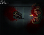
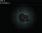
- Might be too zoomed in. Would be nice to be able to see further. I know you aimed to give a claustrophobic feel but I would have liked to be able to see at least as far as the bullet could light
- In most games, "R" is fine to restart. Not in any shooters! The player might expect "R" to reload, not to restart.
- It's easy to see that the bullet doesn't come out from the tip of the gun.
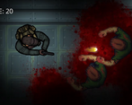
The atmosphere is pretty good though! Good sounds, visuals and all. Nicely done on that regard!
Thanks so much for playing and for your feedback! The hitbox is something that I'm getting a lot of feedback so I might need to implement some of the "forgiveness mechanics" the butterscotch boys talk about! I felt that players who want to see more could spam the fire button and light up the room that way and remember where things are rather than being able to see everything outright. If I add reloading I'll probably swap out the restart button, but to be honest I probably won't add manual reloading, what I might do is add in automatic reloading after a certain number of shots so that the player will have to time their shots against the zombies better.
- About the hitbox; yes. We usually prefer smaller hitboxes for anything that hits the player (and bigger for any attack from the player) rather than the opposite because it will feel unfair if an hitbox is too close to what we see (especially because the hitboxes are moving). The player is more likely to forgive a favorable outcome and more likely to feel frustrated if the unfavorable outcome is frequent. Especially if the hitbox is a square (it often should be)
- About the spam fire, you could make the light decrease as the bullet travels space to avoid that. But the lack of visibility feels like it's downright impossible to understand what's going on. An alternative solution would be to have a "cone" of light in front of the player. It could fade a bit, but the idea would be to let the player "control" some of his visions. That way, it's more interactive, but still scary because you can't light every place. Think of Doom 3 and how light plays a role in this game.
- About reloading, yeah I personally think R can never be a restart button for shooters. It's in our habits to consider R to be a reload button. In any case however, Restarting should often be an uncommon key or simply in the menu. Unless the game makes you very likely to restart of course, in that case R can be fine. Maybe still not in shooters though.
In game jams, it makes sense that the restart button is not in the menu though, since it works a bit faster; but still be careful about the restart option :p
Also note that if the reloading takes time, it can be a good idea to let the player reload at will so that he can preemptively not have to deal with a reload in the worst moment.
The graphics are awesome and the lighting effects are spot on, I feel like the spawn of the zombies can be unfair sometimes however due to the amount of game overs I had with a zombie spawning on me maybe for the future they can spawn outside of the border and walk in.
Really neat visuals. Interesting take on the theme too.
I'm guessing the game is zoomed in so much to make you feel further sandwiched.
Nice lighting and smooth controls. I felt pinned quite quickly though.
Would you say you felt... sandwiched? ;)
The lighting and sound gives it a really cool scary vibe! My main feedback would be to make it a little more forgiving by making the character collider smaller. Sometimes I got game over when I didn't think my character had been hit. Nice work!
A lot of fun, and I really like the blood splatter. There was a moment when I was surrounded that got me really stressed out xD
Nice up close camera, gives the game a good claustrophobic feel!!!
Thank you so much! We wanted people to feel "sandwhiched in the void!"
The visuals are awesome ! I'm a bit sad to have no credit menu. Good job. (Highscore : 99 ^^)
99?! WOW! Even I couldn't get that! I bet the floor was just covered in blood then ;) We'll have to build a credit menu asap!
The art is 5 out of 5! Excellent job on the use of lighting. I've tried to do that in Gamemaker Studio 2 a few times and just could never really master it. Nice concept. My highscore is a 10 :)
The lighting was us but the art credit goes to rileygombart here https://opengameart.org/users/rileygombart, I had meant to include that above! So glad you liked it :)
Somehow made it to 27, as the zombies really pop out of nowhere. Nice use of lighting to enhance the zombiefest feel. Not bad for a first jam!
Thank you so much! I wrote a script to stop them from spawning directly beside you but they have a tendency to sneak through the dark ;)
Great job on your first game jam! I liked the use of light, very cool!
I would suggest a health bar or maybe a death animation, it was a bit jarring at first to just be thrown back to the start screen. Good work overall!
Yeah we would have loved that, time kind of made a few choices for us but a gameover screen would have been perfect!
Definitely one of my favorite games, reminds me of the SAS zombie assault games and Dayz.
Thank you so much! It's our first game jam :)