Play game
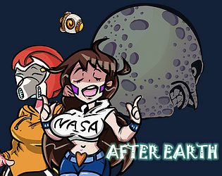
AFTER EARTH's itch.io pageResults
| Criteria | Rank | Score* | Raw Score |
| Visuals | #33 | 3.917 | 3.917 |
| Sounds and Music | #34 | 3.458 | 3.458 |
| Overall | #104 | 2.875 | 2.875 |
| Innovation | #125 | 2.500 | 2.500 |
| The Experience | #147 | 2.292 | 2.292 |
| Theme | #181 | 2.458 | 2.458 |
Ranked from 24 ratings. Score is adjusted from raw score by the median number of ratings per game in the jam.
Leave a comment
Log in with itch.io to leave a comment.


Comments
Nice effort on this game.
There have been a lot of comments about it already, but indeed, taking the character's control out of the player's hands does leave them feeling robbed and frustrated, so it should probably be avoided as much as possible.
Overall, the game feels very ambitious, which can be both a good and a bad thing. I tend to embark on overly ambitious projects for game jams myself, so I know that all too well. It's easy to get lost along the way while working on many different features, and to never really make them come together. If instead you manage to focus on making the core gameplay enjoyable, without any additional fluff, then you have a solid base to build upon, and the whole game will usually feel much more coherent.
In this case, I think just refining the time actually spent on the planets, and trimming the rest for now, would make for a nice game in itself.
Yes. I think you also have the same experience to want one great game in Jam. This is also my problem during jam. I want to make one game satisfied with myself. Also I want the game complete. In my first jam in Ludrum dare 43 Its hard to work along in the last 24 hours(continuous 48 hours). I can make the art, code while It feels very alone. If I only focus on the core features Also the graphics cannot match on my faviorate. So now I have one team with my classmates while new problems happened. We lack of time management and just combine all elements together. Although We worked in one room for several days while We did not have enough communications. So the third time I cut some teammates and try again. But I still cannot balance the game I wanted with the completed game.
Your comments makes me feel my real problems I should think about it. Not only for this game, Also for some plans what game I want to make during jam. What game I want to make during daily life. Really appreciate for your comments. Not only for its treasure, But also you point my really thought about it. Very appreciate!!
wow i really like the art style and the overall seems very nice ! but the character movement is so strange and it makes the experience weird so i didn't manage to play that much, sad because it could have been amazing. other bad point : the character, why ??? you did an amazing work (if you designed it) for the main page's and dialogue's characters so why a floating head :( but i think with some little update to fix the bad stuff its really good !
if you want to check and maybe rate my game : https://itch.io/jam/blackthornprodgamejam2/rate/378986
Yeah All sprites are made by us and some images have references. In terms of the character only have face, first reason is not we want to ignore the leg and hand which can decrease our character animation. The second reason is that we spend so much time on graphics. The order of the character is lowest which caused we did not have enough time to design it.
Your comments are real treasure for us and each words are the truly great advice for your game. Some problems are happened and We ware not realized. We are willing and going to fix and update later to make the game better. BTW, I am going to enjoy & rate your game now~
yes i understand the lack of time, you can be sure that i'll be testing it when you'll update it !
Thanks bro~
Congrats for finished the game, well done.
I liked the art style, but maybe it's too detailed for such small sprites in the game.
Controlling the player is difficult and cumbersome. If he was faster, he might help.
Please, rate my game too =]
https://itch.io/jam/blackthornprodgamejam2/rate/378954
Yes. We paid attention to the graphics and ignore leave enough time on game design and the gameplay which caused some terrible experience. The design of the random movement is to simulate the unstable gravity on this planets. While almost every player does not like this design and I respect our coder and allow her to design it. But in the next step we will delete this design and try to realize this function in another way. Sorry for some uncomfortable experience during gameplay. Thanks for your comments and I am going to enjoy & rate your game now~
I really wish that this game could be as good as it seemed... However, I didn't enjoy it, and here's why.
So. to summarize - it could've been an amazing game, if only it didn't ruin the experience in first few minutes... Anyway, all of you did a good job and I wish you luck with your next projects!
Be sure to rate my game and leave some feedback too :)
https://itch.io/jam/blackthornprodgamejam2/rate/379272
Thanks for your comments and I have rated your game. Very nice game.
Yes I really much focus on the graphics and ignore the character and the colorless map design. The unstable gravity (random movement) also the terrible game design from many players' comments. Its true that I paid more attentions to graphics and ignore the core design and I have one bad command of English Grammar. I will Update this game and optimized these elements. I really thanks for your comments because these problems really happened and I should fix them. Also the SFX I will low the volume and sorry for any uncomfortable experience during gameplay. Very appreciate for your recommendations.
The movement of the character didn't feel good. It felt slow and difficult, which I can understand you going for that feeling, but something more was needed to make the movement feel good.
Yes, We have been aware of our unstable gravity design is not satisfied with we want. We will in the next update delete this design for comfortable experience. Really influence player mood. Sorry about that and Thanks for your comments indeed. Hopefully next time we can offer one better game.
Graphics and sound are nice, but ingame the graphics look a bit colorless. The game seems to be far from finished. Needs a lot of love and attention on playability (palyer movement made me seasick ;)) and overall gameplay. Great start here.
Yes. The unstable gravity (Seasick Movement) design would be delete in the next update soon. Its really influence player experience; At the beginning we want to make one huge game while we still need to step by step and continue make it. We would first optimize the current gameplay and focus on other continuous thing as well. BTW, colorless graphics is one great advice because I seldom pay attention to the color match while its really important when all sprites combine together. Especial in the maptile I know that the color is full of gray which feels boring and less motion. Very nice recommendation! Appreciate!
The effect the mouse position has on the player's movement is pretty janky now, if instability was what you were going for then I look forward to seeing you develop it in a way that makes movement fun and intuitive to the player on how they can optimize their movement. The size of UI elemeents and how close some are to others makes for a cluttered, confusing first impression
Cute art all around though.
Thanks you. We are going to develop later and delete some wired places such as the movement and some UI elements. Hopes next time will offer better game to you guys~ Your comments are considered as treasure for us~
My feedback after I played the game:
With all that said, it seems like lots of effort was put into the game. The game should be a bit more intuitive though, no one wants to read instructions to know what to do.
Thanks for your playing and comments
Thanks for your comments and we are considered as Treasure. I will update in this part first after this jam and Sorry for some uncomfortable parts when you played my game.
Ahh the movement made it really hard to want to do more than 1 level, it was so frustrating. Nice game though. The art and music were really nice. The in game list of things to collect were different from the one at the start of the level and then the amount I collected was different again.
Yeap. We try to delete the random movement later because its really influence player experience. According to the collecting items, maybe we put many unnecessary items in this game. The reason is to offer many items to let the player to choose and drop. But as one demo, I did not realize it would cause troubles to player. I will change and adjust later. Sorry for some confusion during gameplay. And we are appreciate for your comments which encourages and inspires us lots~Have a great day!
Overall a really solid game.
Sound and visuals are really good. Nice art style, but there are a few things that needs some improvement.
But I would really see where you go with this game. So maybe respond to this message when you have continued to work on it.
Btw, I would really appreciate it, if you rate my game too ;)
Hey Thanks for your reply.
And we can promise you that this game will update after rates and we will make the game complete. Your comments are really honest and encourage us lots. Most problems are really appeared for us and some problems we aware but we ignore it during this four days. but we will update and willing to offer one better game in the next time.
Very appreciate your treasure comments and have a great weekend! (I am going to enjoy and rate your game as well)
I would write a comment, but I would say exactly what Fire Totem Games says here. Keep working on this game!
Thanks bro. We have decided to continue to make the game completed. At least make the game plot complete and makes player happy & comfortable during gameplay.
The game looks really nice and I like the art style very much. Only thing i did not really enjoy was the player movement. But for the rest the game was amazing great job.
The design of the movement is due to the unstable gravity in this planet. Perhaps this is not a great experience during play. After the jam we will try to decrease the random movement distances or delete this effect. Sorry for some confusion during the game. Appreciate your likes our efforts as well. we will try to update later and hopes you can enjoy it. Have a great day ~~
nice!
Thanks for your likes. And hopes you enjoy this game jam and Have a great weekend~
Game looks great, I love you art style - I think I've told you that already on one of your entries.
The idea is nice, I have a question regarding the controllers, I sent it to you on discord, so I'll await your response.
The UI at the top seems to be cut out for me, perhaps it's the webGL resolution on the site?
Anyway, that issue aside, good job!
Yeah I found the same problem The top part is covered. But I cannot re upload again when i found this problem because the system is closed. Firstly before the system is closed, I try to change the background color makes looks not clear. But it cannot solve the problem. Thirty minutes ago I try to change the default webGL resolution from 640x360(default) to 960x540. But also one top part cover my game. My teammate said some game canvas size would change a little bit when the game is compressed to WebGL.(Maybe true I am not sure). She said 1024x768 would be best choice next time.
Thanks for your likes and recommendations~have a great weekend~
This game was created for BTP Game Jam #2
Controls
StoryTelling(Game Plot)
Almost 200 years later, earth is out of resources. NASA frequently commands spacemen explore to unknown planets. You are one of them. During the process, you would face many missions such as collecting rare resources, finding previous missing teammates or fighting with aliens. After all missions completed(our game stop on that, but we will update later after this game jam), you would bring hopes back to the earth and rebuild the uncompleted homeland. Then you have to explore again and again for human. Earth would possible get revenges from other explored planets randomly. How to balance and maintain earth with other planets is one deep question in the future.
Tool used
Graphics
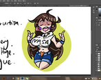
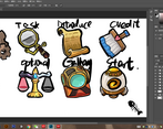
All the images are created by our teammate Zheyuan Zhou which used Photoshop CC and Adobe illustrator CC 2019 to draw it. Some images have been referenced by other images. But we can promise that all images in this game are created by ourselves and we keep the original files.
Audios
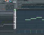
All the BGM and sounds effects are created by teammate Dan Zhu which used Garaeband Software created.
Game design
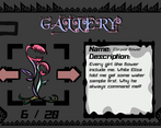
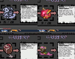
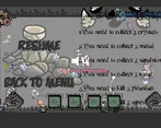
Because This is one demo, We have unlocked all images in Gallery. Also We add the guild icon during the game. You can follow the UI around the canvas to find the resources in the game.
Next, our team decided to continue updating and improving to make our game more organized and perfect after the jam.
*Hints*
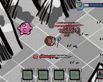
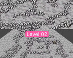
We have attached the screenshots for player who may be lost in the strange planet.
Team member
THANKS
First, respect BTP to offer much tutorials on his channel. Then appreciate all players which spend time playing and rating our games. Yes, I said YOU~ YOU ARE AMAZING. Both of you improve & inspire us and update the game world.