


Play module
Like Day and Night - Triptech³ Submission from Ominous Anomaly's itch.io pageResults
| Criteria | Rank | Score* | Raw Score |
| THEME — How well is the jam theme used? | #8 | 3.840 | 3.840 |
| ART — How good is the art/graphic design? | #17 | 4.000 | 4.000 |
| WRITING — How does this read? does it emanate with horror, humor, drama...? | #30 | 3.480 | 3.480 |
| FAVORABILITY — how much do you personally like the submission? | #31 | 3.200 | 3.200 |
| Overall | #31 | 3.314 | 3.314 |
| GAME DESIGN — How good is the game balance or concepts there in? | #37 | 3.120 | 3.120 |
| LAYOUT — How well does the module get across information? | #38 | 3.120 | 3.120 |
| UTILITY — Does complexity inspire game prep? Or Is it very "Pick-up-n-Play"? | #48 | 2.440 | 2.440 |
Ranked from 25 ratings. Score is adjusted from raw score by the median number of ratings per game in the jam.
Leave a comment
Log in with itch.io to leave a comment.
Comments
Having reviewed all but ten entries, I only have time to rate the final ten but not provide a written review. If you want detailed feedback like I've given others, hit me up on Discord (xopods) and I'll give you some after the ratings close.
The layout, art, and presentation are all praiseworthy. The contents inside are very imaginative and eventually reminded me of The Dark of Hotsprings Island once I realized what I was really reading!
For some reason on my first readthrough I thought that I was missing something in regard to context and I imagine I might not be the only one. It's clear on reflection that this broader location is of course a sandbox and not an "adventure" in and of itself, straight line or not. My only real feedback is that even a small bit of direct-to-reader introduction might help to clarify what this Z-Fold is really for. As it stands it presents a lot of nouns and exposition that on first read are difficult to parse - "...The Regent is actually The Prince in old age, sent back in time to feed The Prince thereby..."
Full marks all over so don't get me wrong I just realized how I began with the wrong expectations the first go around!
The layout and art design are absolutely fire. The overall environment setting is great, and I especially love the bits about the axes of the prophet's teachings. From a warden's perspective, if I were to run this, I would love to have a more theme-specific party motivation generator. Are the players external to this world or a part of it, and why do they want to stop or hasten twilight? There are similar one-shot motivation generator tools online, but it would really spice things up if there were something more module-specific. The religious elements make me wonder if players are acting out of some similar motive.
Great feedback on the content and game mechanics - I've got a good idea of what now needs tightening and pruning, and everyone's comments have been really helpful!
That's given me a great idea on the logo - if I printed it, I think I'd have it in a plastic slip with a full-logo sticker.
On the design layout, I tried putting the landing area at the top, and also flipping the left and right columns so the relic would be mentioned first (comment from Deadnought). In short, it was a bit of a disaster, so I'll share how it worked out and what guided the choices. (see below - I'll go back to the before and tidy things up from there... )
Putting the Landing Area at the top messes with the feel of exploring into the jungle/ruins - you feel like you're descending, not going deeper. It also means that the Plateau at the top of the Stairway is underneath it in the text, which is a bit jarring. The map also feels very bottom-heavy once flipped, even after some adjustments. The solution here was to highlight the starting area on the map and draw attention to it at the bottom. I might try and get a visual cue on the title page or draw a bit more attention to it on the map/key spread.
The left/right flip was a bit more of an aesthetic choice, but the images and text simply balanced well in the current locations. As is, there's a lot of text on the center panel, but because it's in the middle, it doesn't feel overbearing. I think I'll put in a few more crossreferences like "the relic found in the sealed relic chamber", etc. to make it clearer instead.
A word of warning: the above is partially due to the way I wrote it up into the layout, figuring which bits needed images and using a pseudo-grid to balance things out, which kinda locked me into the current state. I can see an alternative layout which is more corner-structured than ascension-based, but it would take too much work at this point. A way to avoid this would be to sketch out and test the possibilities a bit more before committing to any one path early in the process.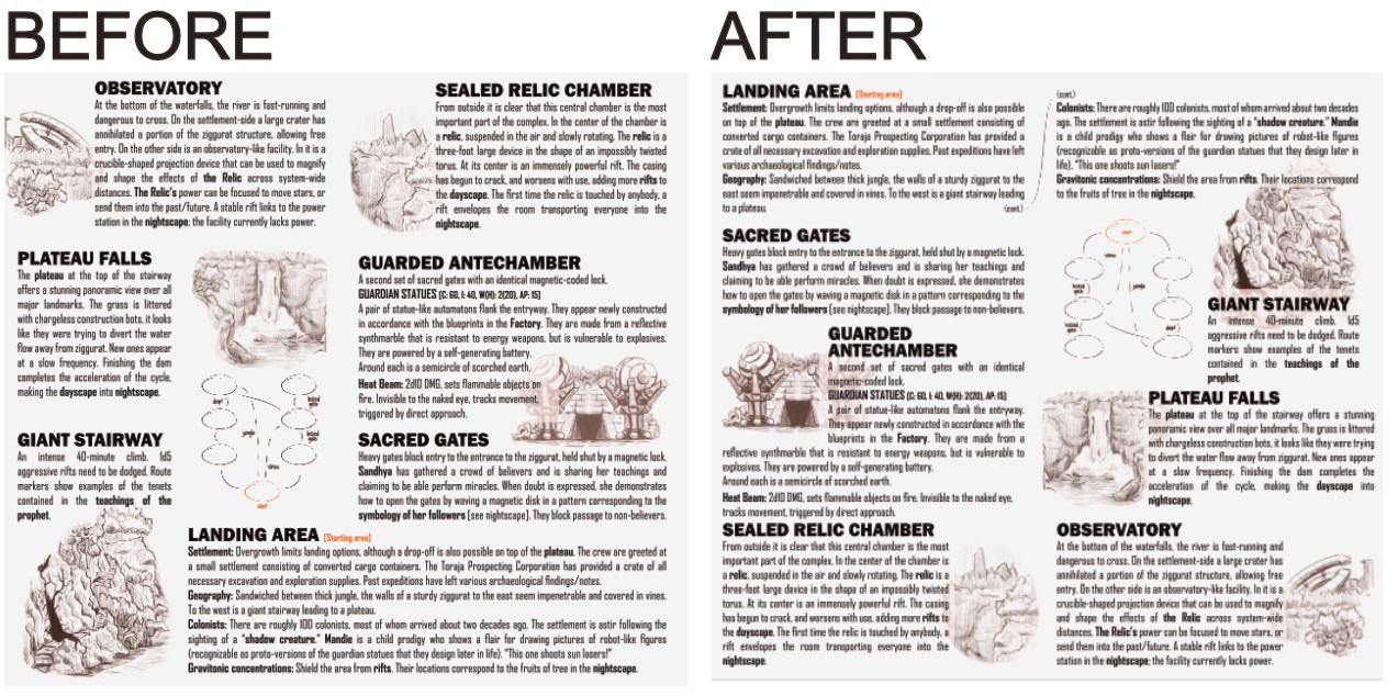
This looks beautiful and the idea is really cool. I think my only substantive note is that I would call out the "object of the game" and mechanically what can happen in a separate paragraph early in the trifold (usually I use the cover or inner flap for sorts of key info like this). I find myself scanning around looking to see what is the relic, why do my players want it, how do they switch from day to night, etc. I would rather have that already in mind and then I can continue reading and simply soak in the wonderful setting and beautiful art and design!
Aesthetics are on point and art is good. Fun to see a z-fold module!
Mechanics are cool but, as it stands, players don’t have a lot of reasons to interact with them. A more robust objective and increased player interaction at locations would go a long way.
Overall, novel mechanics and a good visual style. Tightening up the flow could make this really pop.
It’s insane how much you were able to fit in here. The concept is so cool too. And I love the way it is communicated in the physical design of the pamphlet.
It’s maybe a bit overwhelming for the medium, especially with the amount of tiny text: feels like it would either do better as a full size or a simpler module… but I may just be projecting lol.
Can’t wait to see more of this setting.
Wildly cool stuff!
I won't reiterate too many of the points already raised here.
This is such a cool location with some exciting internal logic. The z-fold format and two sided framework helps flesh out Tribune as a dynamic location. I think this premise and its major features are deserving of a larger zine.
The main concern I have is actually turning out a play scenario fitting the setting. The factions and their conflicts aren't as plainly laid out as they might be in a larger project format. As the OSR and NSR scenes often preach Situations Not Plots, the way these elements come into conflict could have used a little more focus.
The 'fighting fate' percentage roll feels almost too simple a system for what it determines, as it seems like a roll to see if this apocalypse can even be averted. I would have preferred that be rigid, or the space that mechanic takes up be used to expand the outcomes section to include the day phase colonists.
Thanks for the comments, super insightful and gives me an idea what to do with the Fate bit!
Wow. An absolute stunner. Cool ideas, good execution, and a novel way of reinventing the humble trifold.
I love the interaction between day and night versions of the world and the concept of the star time travelling to feed itself. Crazy! I think the design and art are great.
Some questions and feedback:
This is so dense with creative ideas. It sounds like you're planning to flesh it out, so I'm excited to see where it goes.
Pamphlet is Z-fold - the moment I printed out a mockup and folded it I spotted that I actually screwed up and night should have the title page on the right. Stretching across the fold - yeah that could be an issue.
Split title is deliberate - the two halves as equal possibilities. Though I couldn't figure out a way of starting in the nightscape, it would be an interesting inversion.
Other stuff - *nods* *nods*
I think this is popping off in a lot of respects!! Beautiful layout, really excellent use of color and art for locations. Logo treatment rocks as well! Only visual critique I have is that there's a decent amount of incredibly small text that I think would not come out readable in print. I like the dimensional flipping, the NPCs, and a lot of the encounters!
Overall, though, I gotta say there's a Lot going on and I found myself pretty thoroughly stumped on how to tie it all together. Individual elements had connections that I could map out and get a sense for, but they all intersect and overlap and time-travel and pulled me around in a lot of directions at once. Personally, I'm a big pick up and play pamphlet kind of guy so this is partially preference, but some more space for starting hooks, possible endings, and Warden guidance would make a huge difference for me.
Don't get it twisted though, huge respect for the layout and for taking such a bonkers swing. Time travelling dimension hopping star is crazy shit!
Cheers for the notes! In my playtesting that also came up - there's a whole ecosystem but what actually happens in it? I'm going to add a three-act structure of events to give it more momentum/direction. The rifts are also ended up needlessly complicated - the crew basically *have* to interact with them to progress the investigation, but if there's different types they don't know what's going to happen. My plan is to have one big nasty one on the nightside, and the rest be stabilize-able (maybe the magnetic disc...?).
Hi there. As a person who also worked with day/night as a motif I was very excited about this module. And you really have some interesting ideas. I wish there was a category for originality, because the time loop and jumping between the Dayscape and the Nightscape is a neat mechanic. I was thinking about a similar mechanic for another idea I had, inspired by a game dev friend of mine's mobile game The Silent Age. You should check out that game, it's really nice. There are also, by now, quite a few time-loop games, so I would check out those for how they manage the inner workings of that.
Now regarding your module, I found it quite hard to wrap my head around it. Like take the introduction for example. It seems like it perhaps comes out of a discussion in discord about Regent is the Prince etc (correct me if I am wrong), but for someone who didn't follow that, it felt a bit technical and verbose. It at least could get to the meat of the module faster.
Then take the warden notes of "The dayscape is caught in a loop, the nightscape exists after the loop, as well as during the loop". This seems needlessly confusing. Is it after, or during, or maybe the nightscape just exists? I am not sure what is meant, so I cannot give a suggestion how to improve this.
Then there are a lot of descriptions of mechanics that don't feel like they integrate with mothership. Like in Rifts "there's a 30% chance of disappearing with a pop...". When and how? and shouldn't it just be a d100 roll?
Layout-wise I would also work with the usability of the map. It seems like flipping would be happening a bit during a play session. It would be nice if the areas that are the same would align when flipped so there is less cognition used on finding the corresponding area.
Again, Theme, ideas and art are great. I would personally look at improving the writing, layout and utility of the module, and a bit of Mothership game design streamlining.