Great feedback on the content and game mechanics - I've got a good idea of what now needs tightening and pruning, and everyone's comments have been really helpful!
That's given me a great idea on the logo - if I printed it, I think I'd have it in a plastic slip with a full-logo sticker.
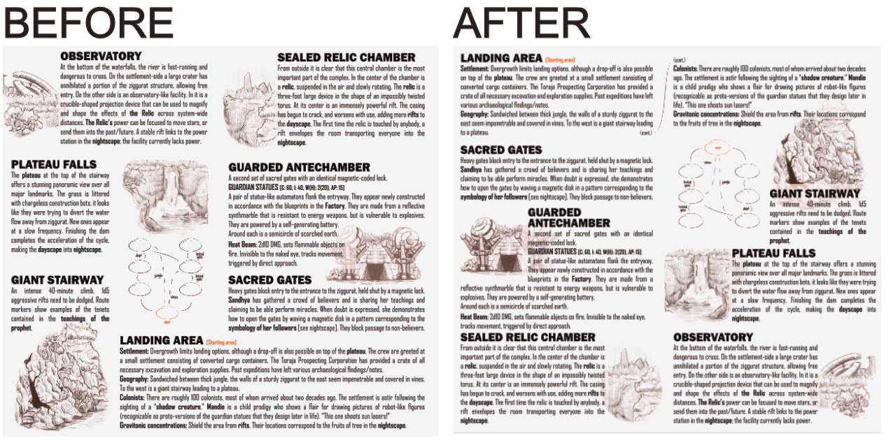
On the design layout, I tried putting the landing area at the top, and also flipping the left and right columns so the relic would be mentioned first (comment from Deadnought). In short, it was a bit of a disaster, so I'll share how it worked out and what guided the choices. (see below - I'll go back to the before and tidy things up from there... )
Putting the Landing Area at the top messes with the feel of exploring into the jungle/ruins - you feel like you're descending, not going deeper. It also means that the Plateau at the top of the Stairway is underneath it in the text, which is a bit jarring. The map also feels very bottom-heavy once flipped, even after some adjustments. The solution here was to highlight the starting area on the map and draw attention to it at the bottom. I might try and get a visual cue on the title page or draw a bit more attention to it on the map/key spread.
The left/right flip was a bit more of an aesthetic choice, but the images and text simply balanced well in the current locations. As is, there's a lot of text on the center panel, but because it's in the middle, it doesn't feel overbearing. I think I'll put in a few more crossreferences like "the relic found in the sealed relic chamber", etc. to make it clearer instead.
A word of warning: the above is partially due to the way I wrote it up into the layout, figuring which bits needed images and using a pseudo-grid to balance things out, which kinda locked me into the current state. I can see an alternative layout which is more corner-structured than ascension-based, but it would take too much work at this point. A way to avoid this would be to sketch out and test the possibilities a bit more before committing to any one path early in the process.