
Indie game storeFree gamesFun gamesHorror games
Game developmentAssetsComics
SalesBundles
Jobs
TagsGame Engines

Ominous Anomaly

28
Posts
44
Followers
51
Following
A member registered May 08, 2024 · View creator page →

Creator of

Recent community posts

Great feedback on the content and game mechanics - I've got a good idea of what now needs tightening and pruning, and everyone's comments have been really helpful!

That's given me a great idea on the logo - if I printed it, I think I'd have it in a plastic slip with a full-logo sticker.

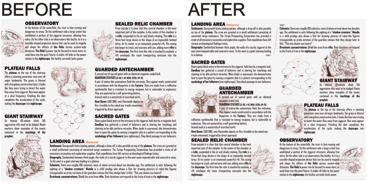
On the design layout, I tried putting the landing area at the top, and also flipping the left and right columns so the relic would be mentioned first (comment from Deadnought). In short, it was a bit of a disaster, so I'll share how it worked out and what guided the choices. (see below - I'll go back to the before and tidy things up from there... )

Putting the Landing Area at the top messes with the feel of exploring into the jungle/ruins - you feel like you're descending, not going deeper. It also means that the Plateau at the top of the Stairway is underneath it in the text, which is a bit jarring. The map also feels very bottom-heavy once flipped, even after some adjustments. The solution here was to highlight the starting area on the map and draw attention to it at the bottom. I might try and get a visual cue on the title page or draw a bit more attention to it on the map/key spread.

The left/right flip was a bit more of an aesthetic choice, but the images and text simply balanced well in the current locations. As is, there's a lot of text on the center panel, but because it's in the middle, it doesn't feel overbearing. I think I'll put in a few more crossreferences like "the relic found in the sealed relic chamber", etc. to make it clearer instead.

A word of warning: the above is partially due to the way I wrote it up into the layout, figuring which bits needed images and using a pseudo-grid to balance things out, which kinda locked me into the current state. I can see an alternative layout which is more corner-structured than ascension-based, but it would take too much work at this point. A way to avoid this would be to sketch out and test the possibilities a bit more before committing to any one path early in the process. 
Very polished in every regard! My one comment would be some details on how the infection works on androids and AI and whether that's different to humans.

Art style is awesome. 

The setup and ecosystem are pretty good, a bit more story and reason to be there, time pressure, or links between the five chambers (reasons to go between them) would provide more interest and break up the potential linearity. 

I felt the hub map structure is a bit underused - if they keep returning to the center, then that's an opportunity for escalation and suspense. The chamber effects are getting there.

The stack of dice made me want to have a rotating puzzle. Here's an example of what you could do: For any given roll of five dice, I think (!) it should be possible to rotate them so that each side has 2 pairs. As a Strength Check, crew can rotate one dice and all above it. If the crew knock over the dice, something bad happens, you reroll the dice and stack them up again. 

I meant the question table - both between the minds and within each mind's questions. Ah, but looking at it again, I do see that some are phrased to be more player facing (as these will almost always go to players via the higher/lower rule and vice-versa), so that could have been your intent there. 

Nasty nasty nasty. Could do with a content warning for some players! Clever design and layout. I agree that this would really benefit from another page or so just to flesh things out. The decoherence stuff is cool, but takes up a lot of space for what it is - it's a big ask, but would you cut or simplify it? I appreciate it is currently functioning as a second axis of threat, but it's thematically operating in quite a different space from other aspects of the adventure.

I quite like the idea of using the ship as a more permanent campaign fixture, and you've provided the support for that. The red immortal adventure part could be spread over the course of various other adventures, and needing a constant supply of blood is a great and unusual motivation for the crew.

Ambitious! 

My immediate instinct is that the mechanics of shunting power around and repairing stuff doesn't have a lot of design space to it for crew counts above 2 or so. There's some optimization and choices to be made, but it's hard to keep it interesting for everyone. The maintenance guy is just going to be making the same rolls all game. I think the successful board games in this space remove any possibility of backseating, giving each player their own little mini-game in which they have to make the best decisions, given exclusive knowledge that they can't share.

This is a really tough nut to crack and risks getting way more crunchy than the Mothership baseline. I've yet to be convinced by any implementation of either the 0E or 1E ship rules, and I don't think I'm alone in that.

Ship design and graphics are great, as is the cover art.

Thanks for the comments, super insightful and gives me an idea what to do with the Fate bit!

(1 edit)

Pamphlet is Z-fold - the moment I printed out a mockup and folded it I spotted that I actually screwed up and night should have the title page on the right. Stretching across the fold - yeah that could be an issue.

Split title is deliberate - the two halves as equal possibilities. Though I couldn't figure out a way of starting in the nightscape, it would be an interesting inversion.

Other stuff - *nods* *nods* 

There's hard and soft resets, but your scenario is on the extreme hard end.  The core of the issue is that resets delete player agency and the feeling that what they did mattered. This is also distributed unevenly across both players and crew - some people will engage more, and some of the crew members will have got more done, or have more suited skills for the situation, exacerbating certain players getting more spotlight. 

The most successful modules turn the reset into a feature rather than an inconvenience, as well as making it a clear part of the puzzle that can be a positive. 

In terms of solutions... I think dialing down the hardness is one option. At the moment the reset works like magic, but it could also be an absolutely horrific physical process. If the process is flawed, limited or messed up (or gradually getting worse) then that allows more actions to be retained across realities, and consequences to slip through and persist. The other key source of continuity is puzzle pieces - knowledge is another means of crossing the reset boundary (the main means in fact), so you could make figuring stuff out a more central mechanic. 

Really enjoyed this, and have a strong idea on how to play it! Tightening up exactly what's happening with "the pilgrim's transcendence" is about all I had question-wise on how to run it.

Super small thing, but I love how the gradient bars are always alternating between dark and light, so it never bothers you how long they are or the speed they go from black to white - genius!

One design/layout point - not quite sure how the text above the title on the front page fits in, and it's likely that's the very first thing people read, italicizing (or something, not sure what?) it, making it smaller or turning it into an in-universe quote could de-emphasize it a bit.

In response to your request for more comments from the Discord, I'll go a bit heavier on the nitty gritty:

Design/Typography:
- Bullet points: Try to keep them a bit more aligned, and keep the second line of text starting where text on the first line begins.
- Capitalization after a colon: Prefer the capitalized version, but ask yourself if you need the colon. Also watch out for double colon use and avoid if possible.
- Bold text: Be a bit more judicious, perhaps keep it to nouns (simplify longer ones). You have color coded characters so you could also use that, though it's already at risk of getting too busy.

Game design:
- As I understand it, the resets would happen a bit too early once characters die - you could put in a delay there, to be after the second H.O. dies? There's also no possibility of NPCs dying in front of players as that also causes a reset. But then the Baba Yaga hunts youngest remaining? Didn't quite follow here, but playtesting should produce an answer.

- Groundhog day scenarios can be frustrating, how have you prevented that?

Theme and setting: It's implied, but I think the environment would also transform to match the current myth. There's not much space left in the locations section, so telling the warden to get creative about that could be a neat solution.

Cool stuff: NPC ages! I don't see many pamphlets with this in, and while not necessarily essential, it's a good anchor to have at your disposal.
The offset print effect: Nicely executed, good color choices
Myths: Nice collection, I would want to give enough time for each to shine if I ran this.

I struggled a bit with the structure, and seeing what information is important to grasp immediately what I can read as I run the adventure. Reorganize that and do a thorough editing pass and you'll have room to flesh out the cool (oops, pun unintended) ideas here. 

Much of the art/design has already been said, watch the thickness of details - look at things in pixel mode to get a clear idea of how things will appear. Also bear in mind that black ink tends to bleed outwards a bit, so thin white lines become even thinner depending on how it's printed.

Interesting idea, good questions even out of the context of the three characters (though some are a bit too similar). 
If this is what a Warden is looking for, then they've found it!

Solid on the whole, could do with a bit more of hook and motivation, perhaps an NPC or two to interact with, but easy enough for the Warden to work with. How does the infection affect less biological androids?

Art/Design: Not my cup of tea... loud and not particularly thematic. You could reskin the whole thing and not really lose much of the character of the module. The straight cut corners - these are basically a rite of passage for anyone who hasn't had a graphic design education (myself included). We've all been there, but the next step is to use them for purpose, supplement them with added details or deliberately to conjure up a particular aesthetic - like with the "What Really Happened" section - that usage looks cool!

It took me a while to figure out whether the map was vertical or horizontal.

Logic: The Warden kinda needs to piece things together from various places, having a tighter overview and introducing concepts as you go would improve digestibility. 

"Can be found" I'm guilty of this one, too, but I keep seeing it this week. One lesson I'm taking from the jam is to just say "There is" or "X is" instead of using this kind of construction. 

Well conceived, well-written overall. Minor points:
- The one place you could tighten up the writing is the logs: there's a lot of "them", "it", "we", and it didn't quite read as in-world enough for me. 
- Mechanically the two saves a round thing didn't quite strike me as the right numerical balance, but I'd have to test that out.
- I had to look up "anomaly" to find it was the "solar anomaly", you might as well include "solar" each time just to make that clear. 
- "may attempt" -> under what circumstances? You could make his behaviors more fixed and based on specific triggers.
- random encounters: I wanted more!

Overall it's a bit heavy on "gotchas" where unavoidable events or traps spring without much in the way to warn players. They should have warnings, ways to avoid them, clues about theme elsewhere, or weaknesses to exploit in order to escape their effects. A specific example would be for the alien countdown to be readable with the right skills.

There's a lot of interesting ideas, but the trick will be to tie them into an interesting adventure. There's a lot of space dedicated to the vault puzzle, but the solution isn't particularly compelling, and the temporal processor thing felt kinda unnecessary. I think you need to get down to the core questions. What's the Curator up to in the big scheme of things? Why should the crew care? What's the survive/solve/save?

What Joshua said about outlining - it's a bit too much, and a reasonable amount could have simply been avoided by how text boxes were arranged or shaped. You're also going to have to get in there and manually fix the kerning issues that the font has with all caps. 

Also, I wasn't too sure how I'd use this, felt like more of a starting point or part of something larger.

Really strong and original idea at the core (haha) of it all. What you have is also well-written and clear (although there's room to add more). I think the random table for descent should just be a strong sequence of layers (Wardens can skip the ones they don't like or reorder/randomize themselves). The relics could be tied to locations. Once the crew gets inside, the threats are a bit limited. Explicitly having the giants going mad all around them, maybe one hunting them through ruins, etc. would add some dynamic pressure - falling rocks aren't that exciting on their own, so use those a bit more sparingly or have them trigger other events (you're already on the way there, but can go harder on that!). I'm not sure how I'd effectively convey the A/B choice and its consequences at the end to players. What would a third option look like? What if the crew never go to the generator? The module seems a bit reliant on certain sequences of events, both on the descent and exploration. Good job overall though, I'd use this as the strong basis for designing my own larger adventure.

A lot can be done with some sensory cues - if the ship is lashed together from salvage, poorly lit, and decorated in chains and grizzly trophies (more like a Klingon vessel?), then that will make it much more like The Rock or something along those lines. That can also be worked into the graphic design - it's all super shiny right now ;D

Cheers for the notes! In my playtesting that also came up - there's a whole ecosystem but what actually happens in it? I'm going to add a three-act structure of events to give it more momentum/direction. The rifts are also ended up needlessly complicated - the crew basically *have* to interact with them to progress the investigation, but if there's different types they don't know what's going to happen. My plan is to have one big nasty one on the nightside, and the rest be stabilize-able (maybe the magnetic disc...?).

Hard to score meaningfully, as a day or two's work on any aspect would completely transform what's here. I like the pyramidal map structure and the overall premise - good luck getting the system together and going!

Really impressive how the map and map key both show the same connections so elegantly. Tight design, easy to read and looks easy to run! I've written a thing or two similar to this, and the one thing I run into is "Does it need to be Mothership"/"Why is it Sci-Fi Horror?" If I was running the module, I'd amp up the characters to each be scarier in their own rights (rites?!) - but that's clearly not the tone you're targeting, so pinch of salt and all... ;D

Well-conceived, super useful tool to have at a Warden's disposal, solid visuals!

My one big comment would be that although there's branches and a variety of things to do within each location, the overall linear map structure can make it less interesting when players ask "So where do we go next"? At that point the choice becomes "Do we turn back now?" - that's some interesting design space to explore.

So wild! I want to run this in Mothership

Love this module! Awesome puzzle, the mechanics naturally lead players toward horror, and a nightmare mapping exercise.😈

Hullo, awesome list! How do I get on there? ;D