

Play Mothership module
SLUG MODE: a drug-fueled diversion for Mothership's itch.io pageResults
| Criteria | Rank | Score* | Raw Score |
| WRITING — How does this read? does it emanate with horror, humor, drama...? | #3 | 4.091 | 4.091 |
| UTILITY — Does complexity inspire game prep? Or Is it very "Pick-up-n-Play"? | #6 | 3.955 | 3.955 |
| FAVORABILITY — how much do you personally like the submission? | #8 | 3.682 | 3.682 |
| LAYOUT — How well does the module get across information? | #10 | 4.091 | 4.091 |
| Overall | #11 | 3.714 | 3.714 |
| GAME DESIGN — How good is the game balance or concepts there in? | #14 | 3.545 | 3.545 |
| ART — How good is the art/graphic design? | #16 | 3.591 | 3.591 |
| THEME — How well is the jam theme used? | #17 | 3.045 | 3.045 |
Ranked from 22 ratings. Score is adjusted from raw score by the median number of ratings per game in the jam.
Leave a comment
Log in with itch.io to leave a comment.
Comments
Okay loved the lore, love the utility, loved the vibes! I’m torn on the Art because it looks really cool and gets super vibey in all the right ways (gives me major Peter Max meets Lisa Frank vibes… which is something i never thought i’d say haha) BUT the art unfortunately works actively against readability which is kind of important haha. The lack of contrast, the shift in fonts… again all deliberate and helps to build the vibes of a pseudo simulation drug trip… but its very hard on the senses and distracting.
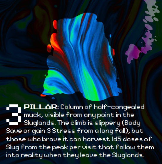
I only have one nitpick (other than overall legibility) is in location 3 “The climb is slippery (Body Save or gain 3 Stress from a long fall)” i would change long fall to “Bad Trip” you know for the drug pun…
This review sounds more negative than i want it to sound… i honestly love this module and rated it in the top 10 of the Jam for me personally! i think that my issues with the art sound stronger than they are because I don’t want such a good module to be held back by anything… even if the thing holding it back is that it looks rad as shit!
This was so concise and well thought out!
I really like that it can be introduced as easily as someone in a crew finding or being given a vial of Slug.
Also, I really liked the good choice of fonts to give it a real funky vibe.
Thanks for all the praise!
And yeah, that easy in was definitely my intention. I imagine this comes in either because the crew finds a dose of Slug randomly looting, someone gets curious enough to buy it from a dealer, or someone picks up that APoF sidequest hook about dragging someone's boyfriend out of his Slug addiction. I honestly think it could be fun if the Sluglands was just one player's obsession off to the side in a sandbox campaign, something bizarre the others don't really get!
To echo the other comments in this thread, expanding on the effects of Slug is novel and easy to slot into a game. I did find the layout a little distracting at first, but the print friendly copy is easier to read.
I like this one.
I'm glad the alternate layout helped, and that the material seems easy to deploy! Thanks for reading it.
I love the consequences of a bad slug trip. The fact that Slug can be ruined for everyone is so fun and cool! Turmoil on the black market!
Some more contrast for the text on the bright background page would help readability a bit. The printer friendly edition is definitely appreciated!
Thanks! I really liked the accidental panic button nature of the players destroying the Sluglands - it's probably the objectively moral thing to do, but nobody wants to lose their psychedelic hangout spot!
I can definitely look into darker font.
Really great ideas here, but I personally found the font hard to read. But then I'm getting old, and my eyes aren't what they used to be.
I can talk to my layout artist about it! Was the black-on-white/print-friendly version any easier to read?
A modular expansion to the Slug drug found in Pound of Flesh, this pamphlet provides its own version of what actually happens when you’re under the influence, including a fantastic table of people to meet, and various locations to explore in its quasi-virtual world.
Rather than providing a full adventure, this is a resource to effortlessly slot into any campaign featuring slug, where it will be entirely plug-and-play.
My only minor nitpicks are that I could have used a little bit more contrast for readability of the text on the bright-coloured page, and some guidance on how to telegraph the effects on interacting with the “amenities” of the sluglands.
"Effortlessly" is quite the compliment - thank you SO much! I'm so glad this one seems to be doing its job <3
Would it be alright to quote this positive review on the product page?
You're very welcome to!
I might try and gather all my mini-reviews up into a blog post, and if so, I'd love if the quote would link there, but absolutely put it on the page!
A wonderful concept. I love how it can be tied into the story with tips, encounters, and a hype. And yet it is so ephemeral and not to last. I dare you to find a campaign that would not benefit from this little sidequest with possibly huge impact. Great work!
Thank you so much, that's really kind of you to say! I'm glad you enjoyed it.
Could I quote this review on the product page? I really like it!
Sure, go ahead.
You've made Slug into such a fun mechanic. I love the idea that it's somehow tied to this other entity that uses it as a means of sapping intellect from people. Very fun!
Mission accomplished, then! I've always thought's Slug's tiny write-up and single plot hook are super compelling, but not quite substantial enough to actually use. I made something I needed!
I love that Androids get to participate in the trips too, that's neat!
A Pound of Flesh explicitly calls out the shared hallucination as being "virtual," so it felt fair to let them in on the fun, too!
(+) Fun and light hearted take on diving into a organic cyberspace-like space with simple locations that are enticing for players to interact with
(+) Diverse and fitting group of NPCs that gives interesting perspectives on the drug, like the contractor that uses the drug as a seperate domain for secrecy
(+) Super clean yet highly abstract artwork that makes me wonder how it was done in the first place
Glad you like it! I'm really proud of Kangaroo, that fixer you mention, and also really like Sunday (the Solarian evangelist) - even if a player only takes Slug once, I wanted them to potentially get hooked into all sorts of different non-Slug stuff afterwards.
I can see this slotting into a campaign really easily. Lovely writing to capture the various trippers in a couple of lines - with possible hooks leading out from the sluglands. Funky hallucinogenic powers, always at the expense of Int. Great stuff!
Appreciate it! Who needs Intellect, anyway?
Thanks so much! I really wanted a friendlier horror here than most Mothership stuff.
Could I quote this review on the product page eventually?
if you want i can put it in the comment section of your product once it is up =)
Great and consise character descriptions!
Thanks! They're my favorite part of this, too - I love that if all you do is just hang out talking to weird people, taking Slug is pretty much safe.