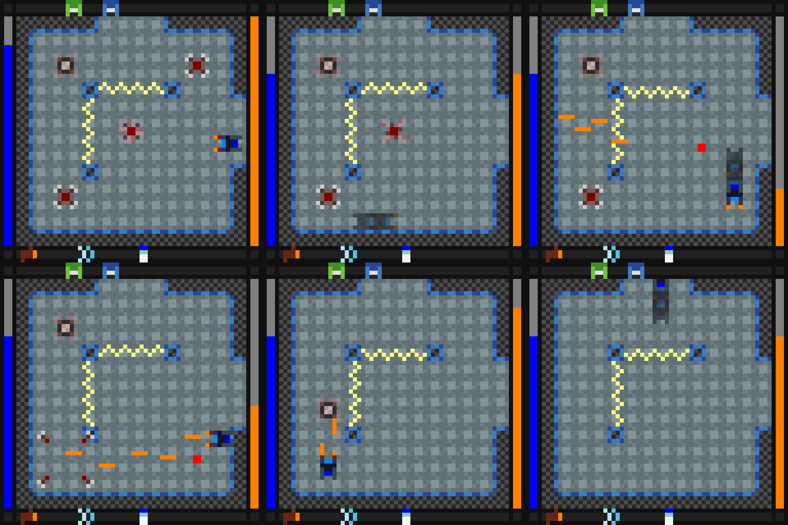
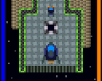
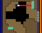
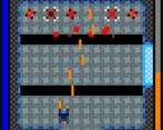
Play game
Asteroid Omicron's itch.io pageResults
| Criteria | Rank | Score* | Raw Score |
| Enjoyment | #2 | 4.583 | 4.583 |
| Authenticity (Use of 64x64 limit) | #2 | 4.917 | 4.917 |
| Overall | #6 | 4.438 | 4.438 |
| Audio | #14 | 4.167 | 4.167 |
| Graphics | #47 | 4.083 | 4.083 |
Ranked from 12 ratings. Score is adjusted from raw score by the median number of ratings per game in the jam.
Leave a comment
Log in with itch.io to leave a comment.


Comments
Fun game!! I included it in my LowRezJam compilation, if you’d like to take a look :)
Thanks for featuring the game. I'll be sure to check out the video.
papa bless!
Wow, great entry! Super impressed by how much gameplay you squeezed into the low resolution (and short timeframe)
Thanks. I was a bit worried about how small I had to go with the sprites to fit everything in there, but I think it worked out pretty well.
Probably my favorite so far. Pretty much everything about this is perfect, and I feel like naming everything I liked about it would be redundant, as I would pretty much be making a list of everything in the game. The level designs are brilliant and the combat is addictive. I was finally able to beat the game after around an hour. Amazing job!
It's great to hear that you liked it so much.
This is a phenomenal entry, one of my favorites for gameplay. I really wish it supported controller input because it's quite difficult, and I really wanted to finish it! Too hard for me on a keyboard... the heat shield was as far as I could get. Great level design, great music... the graphics aren't beautiful, but they convey the mechanics very clearly. Full marks.
I'm glad you enjoyed the game. It's unfortunate you couldn't finish it, which is why I made quick gamepad version that you can download here:
https://drive.google.com/open?id=0B7xSEB22hPp3SUxhNXFvekdrdjQ
It should be compatible with your old save file - just make sure to choose "continue" on the main menu. Also, try not to use it for rating.
Controls
Wow, awesome! Thanks! I will definitely play this later. :D
Update: I have a USB controller (Logitech Dual Action), but doesn't work with the Windows machine I used to play AO! Boo. Only my Mac likes it, not sure why. Oh, well... I'll try to finish the game someday using just the keyboard. >_<
Oh, that's unfortunate. Good luck with the keyboard, I guess.
this game is pure fun!
I'm glad you liked it.
Nice game ! I'll try to go to the end !
The first enemy encountered is hard to beat :P
Thanks, and good luck.
Wow, as usual, you give a lot of content to play with! I really love the progression with its zelda-like upgrading style! It feels nice to have a full game like this!
I have several regards towards the gameplay though. The game is hard, but I don't think it's always for the good reason.
I've seen myself struggle with the control way more than the enemies. The first thing about the control might be subtle, but the use of the arrow keys would make more sense to me for more simple games. Here, to me it felt awkward, for some reason. it might be because of how the arrow keys are depending on the keyboard? in my case, the arrows are slightly closer to each others than the wasd directional stance. At least, I've noticed the wasd keys (well... zqsd keys for french keyboards) felt often more comfortable, and thus should usually be preferred (probably has to do with them being on the left rather than the right); ideal is to have a choice, of course. But as I said, might be subtle.
The real issue to me, and I don't know if it was the same for other people, was the fact that shooting prevents you from changing direction. At first, I thought it was very handy. Until i've seen myself being often, very often, shooting at the wrong direction because i was turning while shooting (and would often shoot first), wanting to shoot in the direction I was moving to. Although it's useful to move while still shooting at the same place, it got me killed more times than it helped me. Ideally, you could think of a way to include both. Like, using an extra key to prevent yourself from turning? I don't know.
Another thing would be the hitbox; often, you'd want to make it easier to aim at stuff, and easier to avoid thing (allowing you to increase the difficulty in another way, for example making the enemy shoot faster; but since you're harder to hit, it would balance it out). This is because it sometimes is due to a pixel that we didn't expect to touch us, or that were too hard to anticipate. It's better for the player to feel "advantaged" even if it means making the game harder. (at least, it's better to feel that the game is hard because the enemies are tough rather than how you get touched).
Aside that, pretty good job! I likd the final boss, although I felt he was moving towards you too systematically, making it tedious to attack him. It would have feel nice to have a monster with more energy, but you being able to sustain fire for longer.
OH, speaking of which. One other thing i felt unnecessary was how quickly your shooting meter depletes. It feels okay sometimes, but at some point it really feels like you need to wait forever, or it's anoying how you gotta pause while the enemy has 1 health; and pause ALL the way because it stops when you shoot. I get that you didn't want the player to be able to shoot too much, but I think it shouldn't be annoying to shoot. Easy solution would be to make it go in "charge mode" way faster, or maybe make the bar charge each time you touch or kill an enemy. that couple with the fact that you lock your direction when firing made it surprisingly frustrating at several occasions.
I hope my feedback is helpful!
PS: Also, the font was very, very hard to read. It's a challenge for such a resolution, but I think there is a point in which you need the text to have a minimum size to be readable... :/
Hey, Kwisarts. It's good to see you participating in this jam.
Zelda-like? Come on, it's obviously Metroid-like upgrading! The game has a Varia Suit ripoff and everything. Regardless, I'm glad you liked the progression.
I don't think there's anything inherently wrong with using directional keys. Being able to choose the controls is definitely nice but it's one of those low priority things that often gets left out with a limited time frame. Having to use an AZERTY keyboard certainly wouldn't help with the A being out of place. In the future I'll make sure to bind any A actions to Q as well.
You may have trouble with the direction lock thing, but I imagine the game would be a nightmare without it. It's mainly combined with shooting so I can get as much functionality out of as few keys as possible. A dedicated strafe key is a good idea, though. The issue is just finding a good key to use. I guess I could try using Shift and finding another way to interact with the lift.
I know what you mean with the hitbox, but it's a bit hard to tweak with such low resolution. I tried a 2x2 hitbox at some point but it was weird being able to walk halfway inside walls plus it made it easier to fall into pits. I guess I could try using a different hitbox for different types of collisions, though.
The slow movement of the final boss was partially done in attempt to make it feel more threatening and creepy, though perhaps it didn't result in the best gameplay. Admittedly, I don't have much experience with making bosses and the boss here was a little rushed.
The ammo meter is so limited because I intended for it to be upgraded - this was just its starting state. The original plan was to have collectables that would increase your max ammo (and ones that would increase your max health). However, I left it too late and didn't have enough time to redesign the levels to have optional areas for the collectables or balance the difficulty with the stat increases in mind.
I'm not a big fan of the font, either. The S looks like a C, the N looks like an H, the M looks like a W... It was basically the first small font I found when searching online and I never got around to changing it.
When I say zelda-like, I mean because of the top-down view, the way you get new items. (both metroid and zelda have that item thing going on)
For the lock fire thing, at least in my experience, it's what made later levels harder than they actually were. I kept shooting in the wrong direction because with my habit of shooting, i'd start shooting before turning (or close enough for it to be considered done first) making it terrible when I try to turn to attack an enemy (i lost a lot of health because of it); might depend on the players habit, but at least we know one person who was affected by this :p
About the hitbox, it's true that it's kind of unavoidable with such a resolution... I was thinking about making the bullets have a different hitbox (smaller when enemy, bigger when player) but due to the resolution, it might be difficult. But yeah I guess having an hitbox for registering hits from bullets could also be an option (but with the time frame of the jam, maybe it isn't that easy)
Gotta say for the Boss though, aside from him being too fast, it did feel like a good boss fight.
Ah I see, too bad for the weapon cooldown, I did hope while playing to upgrade it; it's a nice thing that the weapon got upgraded in power though! (though it would have been nice to have an upgrade in power sooner to feel a bit more powerful against some enemies; perhaps between the final power and the initial)
As for the font, I myself used pixelated. It's a bit big, but it's the smallest I found that seemed readable.
Wow this is a really great entry! I would've liked a bit more fanfare at the ending, but can't say I have many other complaints. The difficulty was very well tuned for keeping areas challenging without being too frustrating.
Thanks! Sorry about the abrupt ending. I didn't plan anything for the end beforehand and ran out of time to add much to it.
A very nice game you got here. Maybe visually not that impressive, but the gameplay was certainly quite enjoyable. Took a bit of effort to make it to the end, but it was defenitely worth it!
Thanks! It's good to know you managed to reach the end.
Watching the video of this Definatly made me want to play it
I'm glad you thought it looked interesting.