Play game
Monster Master's itch.io pageResults
Criteria | Rank | Score* | Raw Score |
Audio | #61 | 3.739 | 3.739 |
Graphics | #63 | 4.043 | 4.043 |
Overall | #92 | 3.772 | 3.772 |
Authenticity (Use of resolution restriction) | #162 | 4.261 | 4.261 |
Gameplay | #177 | 3.043 | 3.043 |
Ranked from 23 ratings. Score is adjusted from raw score by the median number of ratings per game in the jam.
Did you work in a team?
We were 4 members.
1 Programmer Gameplay
1 Game Designer / Level Designer
2 Sound Designers (1 FX and 1 Music)
Yes this was a pretty good experience, considering we made it in only 48 hours and with a jet lag of 8 hours (our programmer is in Japan !)
Was the resolution a challenge?
I already made a game for a precedent LOWREZJAM, but the 2020 edition gave us some serious headache.
The 2 notables hurdles we had were :
- The pixel perfect camera in Unity doesn't necessarly apply to the UI, unless the canvas is in "Camera" + pixel perfect mode. We lost some times to figure it out.
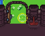
- We made some cool black hole shader for the summoning (that worked in the editor), but we couldn't finally use it due to the upscaling of the viewport when exporting (the shader was a vertex shader).
What did you learn?
Yes, LOWREZJAM is always an interesting challenge to attend.
Beside improving in our personnal main fields, I think we all got a better understanding of viewports and screen gestion through this game jam !
Leave a comment
Log in with itch.io to leave a comment.
Comments
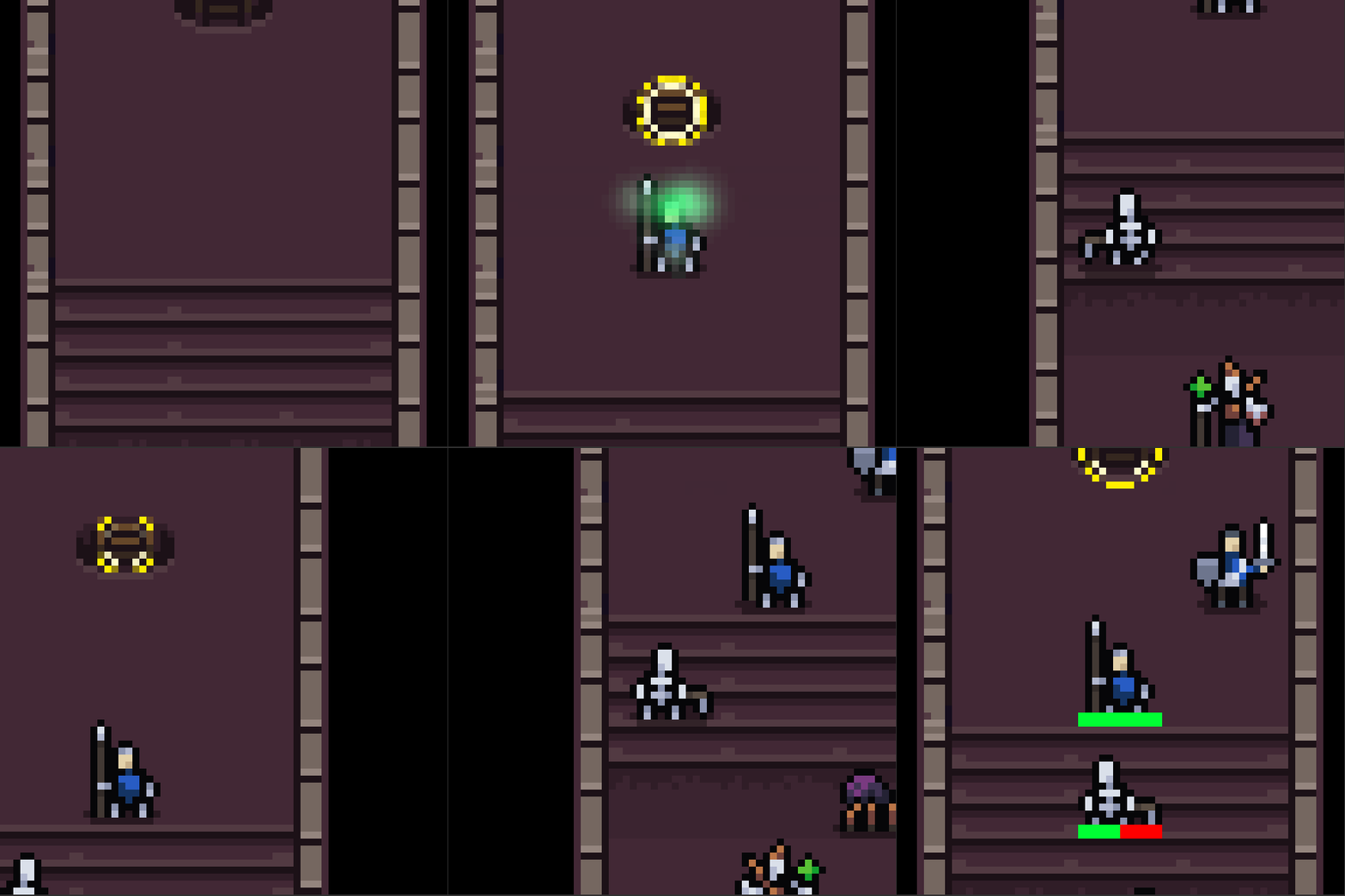
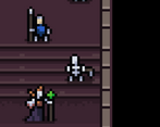
Sorry for being harsh but for me this game lacks gameplay. It is basically placing units and waiting till they die to drop them again.
The art and sfx are very cool, don't get me wrong but there is something missing, maybe adding different abilities to each creature, different interactions, etc. They're basically the same creep with different stats.
The game is also way too slow for me and it made me not want to play it all through. Also you should make the creatures go around corners in one turn and not 2, make the right diagonally would help making the AI more active because often they were or unable to hit or moving would take 4 turns to hit the creep 2 blocks away.
Anyway, I get that you only had 48 hours but I have to rate you as everyone, but can't wait till you update the game and add all the cool stuff. Great job for a 2 day game!
Hi, thanks for playing the game, and for taking the time to review.
The gameplay is indeed the main flaw here, and I'm really glad you put your criticism were it needs to.
We are willing to improve the game, and comments like yours really help.
There is indeed an hidden stats system, as well as a priority system (which helps the AI deciding when 2 different target are in range), but the lack of other interactions make the game quite repetitive.
About the slow-pace of the game, we are definitely reducing the time each IA turn takes in the new builds. And about the diagonal movement, its something we though about but I still need to discuss it with my team : it would change quite radically how the whole game is played.
Like you said, in 48 hours, we really had no time to fix the IA or to add more interactions.
We are currently working on a new IA and special abilities for differents minions and adventurers, as well as the ability to upgrade and evolve our minions.
Anyway, thanks a lot for being impartial as well.
After some major update, I would love some criticism from first version players, I hope to see you around when the time comes :) !
Yeah, thanks. That's what I expected from you and hope you'll expand because there is a lot of potential. Good luck!
Nice use of the resolution for corridors/little space battles. I like the shake cam, zoom, and effects too. Good mini-tactics game
Very cool concept, could be a really nice tactic game. At first I expected to be able to control my monsters, but it was funny to see them go fight. I just wish the movement of enemies and monsters were a bit smarter, because most of the time they ended up in a line waiting behind each other; but since the game was made in such a short time I won’t take it into account. Overall, very good graphics, audio and concept, good job !
this is a really neat concept for a game! I wish there was MOREEEEEEE.
I like the character art. Good detail in such tiny sprites.
Made in 48hrs? Nice work! :)
Thanks for your kind comment, really appreciated!
Yes, we made the game during the last week-end only, but we are quite experienced jammers and we were using some optimized-for-jam tools our main programmer Mahjoub is developing.
I also participated to the last LOWREZJAM, so I knew in advance how to initialize quite a few things needed for this jam.
This whole setup really helped us a lot in speeding the whole process.
This game has a lot of cool things going on. The art is really nice looking, and the audio is very fitting. I would like to see the AI cleaned up just a tiny bit as I found a lot of the time, my monsters would just stand behind the other monsters instead of moving around them to get to the enemies. Other than that, it played pretty well other than being a little slow pacing. Solid entry, especially for being done in 48 hours!
Really well polished game made incredibly fast! Lovely art style. My only gripe is that I found the camera a bit nausiating when it's swinging around a lot. Amazing work! :)
48hs? Wow, congrats, dude.
Very nice art, nice music. What is going on is a bit confusing at times, but great entry nevertheless.
it's a really great game (as mechanic AND gfx) - unbelievable if you did that in only 48h - congratulations :-)
I love the idea behind the game! great sound!
Great achievement for a 48 hours endeavour! Good graphics and sound! Since the summoned creatures tend to line up vertically, I sometimes would have liked the ability to pan the camera around.
Thanks for playing and reviewing our game, jujule!
We are pretty proud of how it turned out indeed :D !
Actually you can move your camera by selecting the button of an already summoned creature. It will move the camera to your selected minion. But yes, that's the only way to move the camera, and we may add more freedom to it in later versions!
This is a really great proof of concept!
My only criticism is that units don't try to take an alternate path if they're blocked.
Really impressive for 48 hours though! The camera animations were really nice.
This is great! I love the idea, the sprites, and the way the idle animations match up to the music, that's a great touch. Would of course love more levels, but what's here is a fun little taste.
Good job! 12 from 10
Great game !
Well I just say here what I said on the game's page.
Super fun to play, super nice visual theme with cool music. A few bugs here and there but none of them are wasting the game. Like with every good gamejam game, I would just want to have more levels.
Great work guys.
This was super impressive to make this in 48 hours only, wow.
Btw I can definitely relate; UI was a pain to get working pixel perfectly in Unity. I ended up making a pretty complicated solution to make it work with a moving camera. It went something like:
UI -> Render Texture -> Texture 2D -> Tex2D to PNG (stored in a variable of bytes) -> PNG to Tex2D -> Sprite -> Child to Camera
Aside from the mouse cursor jitter, and forgetting to add a Solid Color to the UI camera, moving the camera with the UI worked basically perfectly (with the right garbage collection).
There's a component called the "Aspect Ratio Fitter" that might do this faster. I got some frame clearing issues on the edges from this, but maybe check this out and tweak it a bit: https://itch.io/jam/lowrezjam-2019/topic/515184/unity-setup-guide
Thank you a lot for your comment, we are glad that you enjoyed it!
Great, thank you also for the tips ;)
Hello Jonathan, I'm really happy that you played our game.
Thanks a lot, your comment is really cool.
About the UI, I heard about a similar solution than yours, but it was way too late for me to program.
Also, I think we got this problem last year too with Periapsis, but our UI assets were already at a convenient resolution so we couldn't see it.
Your game looks really good, and I'll definetly play it this evening.
It looks like you too step-upped a lot in one year, and I can't wait to give you my thoughts on your game :) !
I think our text were just sprites, so we didn't need to worry about text rendering I think. I think our UI were just sprites too, which made it a (lot) more easier, since all we had to do was attach it to the camera. Plus, our camera was static too for the most part.