Play game
A Little Bird Told Me's itch.io pageResults
| Criteria | Rank | Score* | Raw Score |
| Theme interpretation | #153 | 3.286 | 3.286 |
| Innovation | #213 | 2.714 | 2.714 |
| Graphics | #221 | 3.000 | 3.000 |
| Audio | #241 | 2.714 | 2.714 |
| Overall | #293 | 2.619 | 2.619 |
| Gameplay | #296 | 2.429 | 2.429 |
Ranked from 21 ratings. Score is adjusted from raw score by the median number of ratings per game in the jam.
GitHub repository
https://github.com/ironhandmd/A-Little-Bird-.git
Leave a comment
Log in with itch.io to leave a comment.


Comments
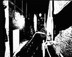
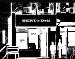
Really interesting graphic style :D, I had a some issues reading the text since it was badly positioned on the chat balloon, other than that it was pretty a smooth gameplay experience
Love the overall vibe of the game, the choice on the audio is spot on.
The graphic could use some work especially on interactable objects and scene transition, these things are pretty hard to spot the first time I played it so the use of highlight could be useful.
Other than that, pretty solid game !
Loved the noir feel. I imagine due to unexpected results from WebGL upload, you didn't mean for some of those issues to occur. If you get them fixed, I would love to play more! Definitely caught my interest. Keep up the good work!
As a tip to everyone developing in Unity - please, please test your game in WebGL before the deadline. A lot of things like the text positioning can seem fine in the editor but totally break upon exporting.
The game was pretty confusing to follow - there didn't seem to be much logic as to which screens led to which other screens. I feel like some arrows showing which sides of the screen you can exit from, and a map showing the layout of the city, would be helpful.
I was able to unlock the chest while holding a hot dog, which I guess counted as a win?
I love the black & white art style, and I loved the music!
love the art style and total Raymond Chandler vibe. nice gritty detective stuff. I did miss some text and clickable were working but I figure it might be my small monitor (?) idk, great work!
Nice concept and execution. As others stated, the art style is quite interesting and unique. I'm not sure if I played it correctly, though, since, at some point, the game simply said I had finished it (I think after getting a key somewhere). Good job anyway :)
Nice entry! Art style is very nice. I liked the tutorial of needing to get the coffee first to teach you how to play the game - that is smart!
As others have mentioned, the text was at times hard to read, though not that bad if I switched out of full screen. We actually had the same problem with our first WebGL build, and it was because we had our Canvas Scaler set to "Constant Pixel Size" rather than "Scale With Screen Size." Not sure if that would work for you, but figured I would pass that information along. Would love to see an updated version after the jam!
Good job!
Hallo,
Thank you for sharing your game. I’ve already saved its RATING;
1. verified: GAME due to read your review of our team’s GAME OFF 2022 entry
2. observed: in MAIN GAME, noticeable drawing technique to remind self of select comic books, e.g. LIONGOREN, AVID’s “Why I wake up late.” from Expeditions Comics, and BEATMANIA (GameBoyColor); adds: noticeable animation technique with the main character
3. observed: musical tune assists in creating world
4. notes: however, text dialogue to be NOT in the correct position to cause bottom text to be difficult to read; observed: noticeable spelling error via “find it stange…”, instead of “find it [strange]”
5. verified: GAMEPLAY to remind self of SIERRA classic adventure games, e.g. King’s Quest, Space Quest series; notes: correct sequence of actions necessary to cause movement in STORY, where: previously closed location is opened in created world; adds: correct action at times may be unclear
6. received: “Congratulations!” with “Finished” GAME status
Thank you. Health!
Good adventure. The idea is interesting although the interface lacks a bit of clarity, especially when the text overflows the dialog box. The art fits very nicely and mixed with the music it creates a nice noir ambient. Congrats and keep up the good work!
Lovely art style. Nice puzzle game
Art is nice, but the text is out of the speech bubble making parts of it impossible to read.
The black & white art style is a nice idea
I think the art style is top notch. When walking into the first room sometime the character will teleport to the other side of the screen
Really like the art style. The text sometimes fell off the speech bubble and was hard to read. I managed to get the bird seed but lost it when i tried to feed it to the bird.
Could have been interesting with the setting and so on, but you can't read the texts, and it is a little confusing exploring with this black and white
This looks a bit rushing. Texts aren't exactly in the speech bubble. The game somehow ends at some point where I don't exactly realize that.
Great work! Love the style and use of the theme.