


Play game
Incursion of the Night's itch.io pageResults
| Criteria | Rank | Score* | Raw Score |
| Completeness - Is it an unfinished tech-demo, prototype or a complete game? | #9 | 3.706 | 3.706 |
| Gameplay - How fun is it to play? | #11 | 3.176 | 3.176 |
| Overall | #13 | 3.188 | 3.188 |
| Audio - Does the game have nice sfx and music? | #14 | 3.176 | 3.176 |
| Originality - Does the game innovate or try something new? | #17 | 3.235 | 3.235 |
| Graphics - Is the game aesthetically pleasing? | #30 | 2.647 | 2.647 |
Ranked from 17 ratings. Score is adjusted from raw score by the median number of ratings per game in the jam.
Leave a comment
Log in with itch.io to leave a comment.
Comments
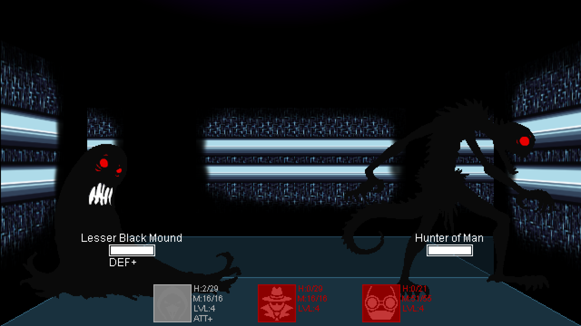
"Loser!" :D I was not expecting the taunt to do that! Nice touch! I really liked the art for the characters and the monsters. Well done!
Thanks!
I had a bit of a hard time seeing the world in front of me. I like how fast and snappy the movement and combat are though.
Thanks, fast and snappy movement and combat are one of the reasons why I enjoyed your game too.
Cool game. I like non-traditional rpgs, setting is very interesting. I like skill system (i always use similar system). One of those games want to play and beat the game. Great work.
Btw, will be there any automap or compass? Sometimes i'm very confused where am i.
Thanks,
We built the game without an automap in mind, especially there's not too much backtracking involved so when you find the next point of interest (the next map, typically) you should not have to get back and fourth too much, it's not too sprawling, while an automap or a compass might work a bit again dungeon mechanics (spinners ...) . With that said one specific late part might require a pencil and the corner of a piece of paper to manage to get out of it.
The enemy design and classes hint at a really interesting world. Good job here, I really think this is a strength of this game. I laughed out loud when I called the attacking tree a “Loser”.
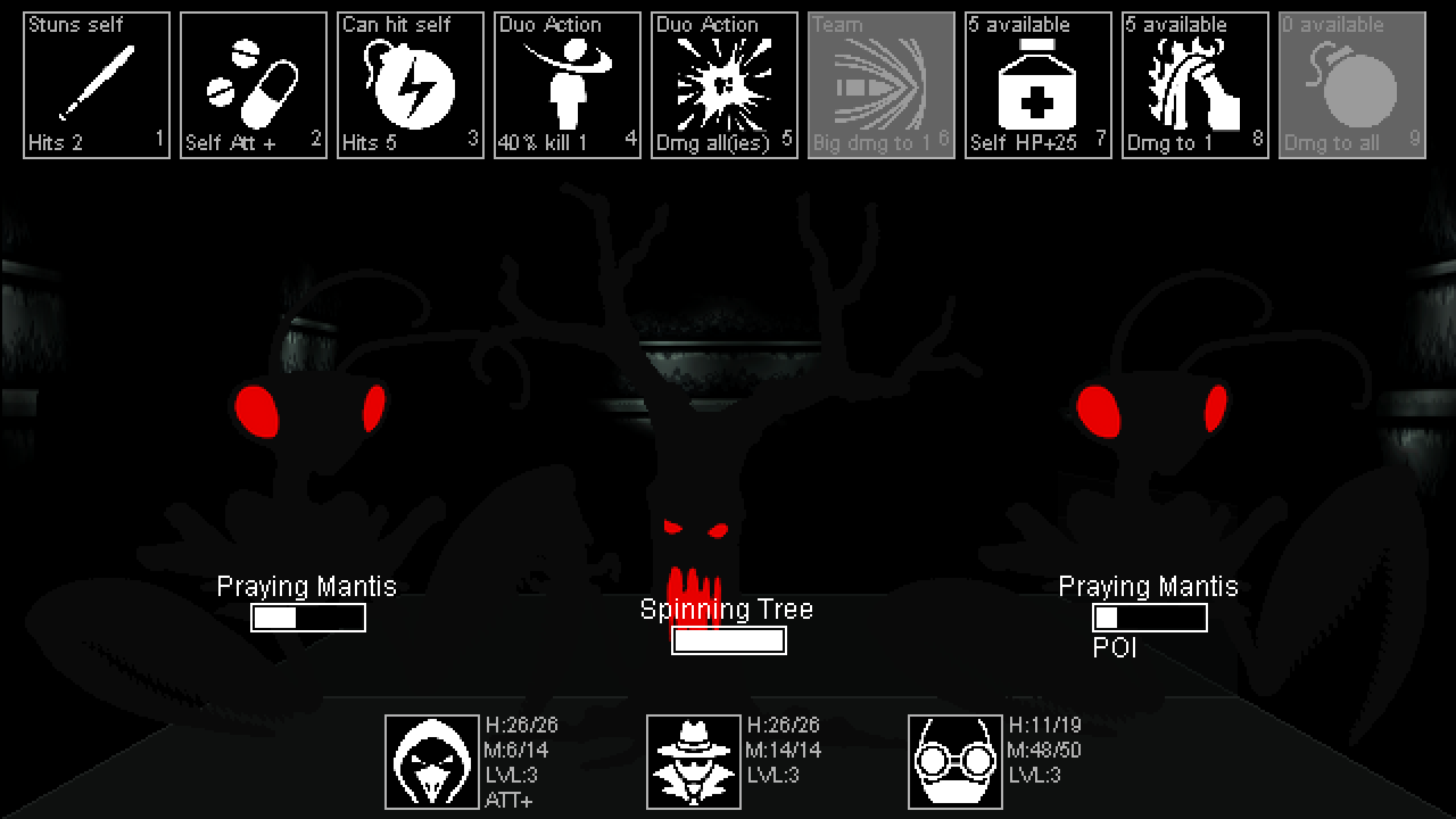
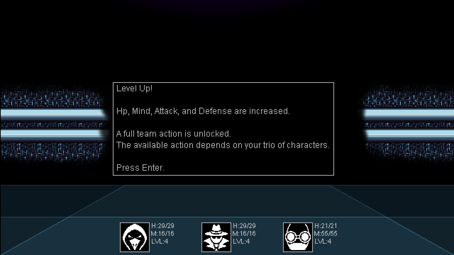
The combat system seems to have a lot of options and thought put in to it. I like the idea of duo abilities. But unfortunately it is hard to understand what the abilities do, so I felt like I was mostly just choosing which ability to use randomly, rather than having interesting tactical choices. Putting in text for each ability which explains the mechanics would help a lot here - I suspect there is a fun combat system under the hood, but it is hidden away from the player.
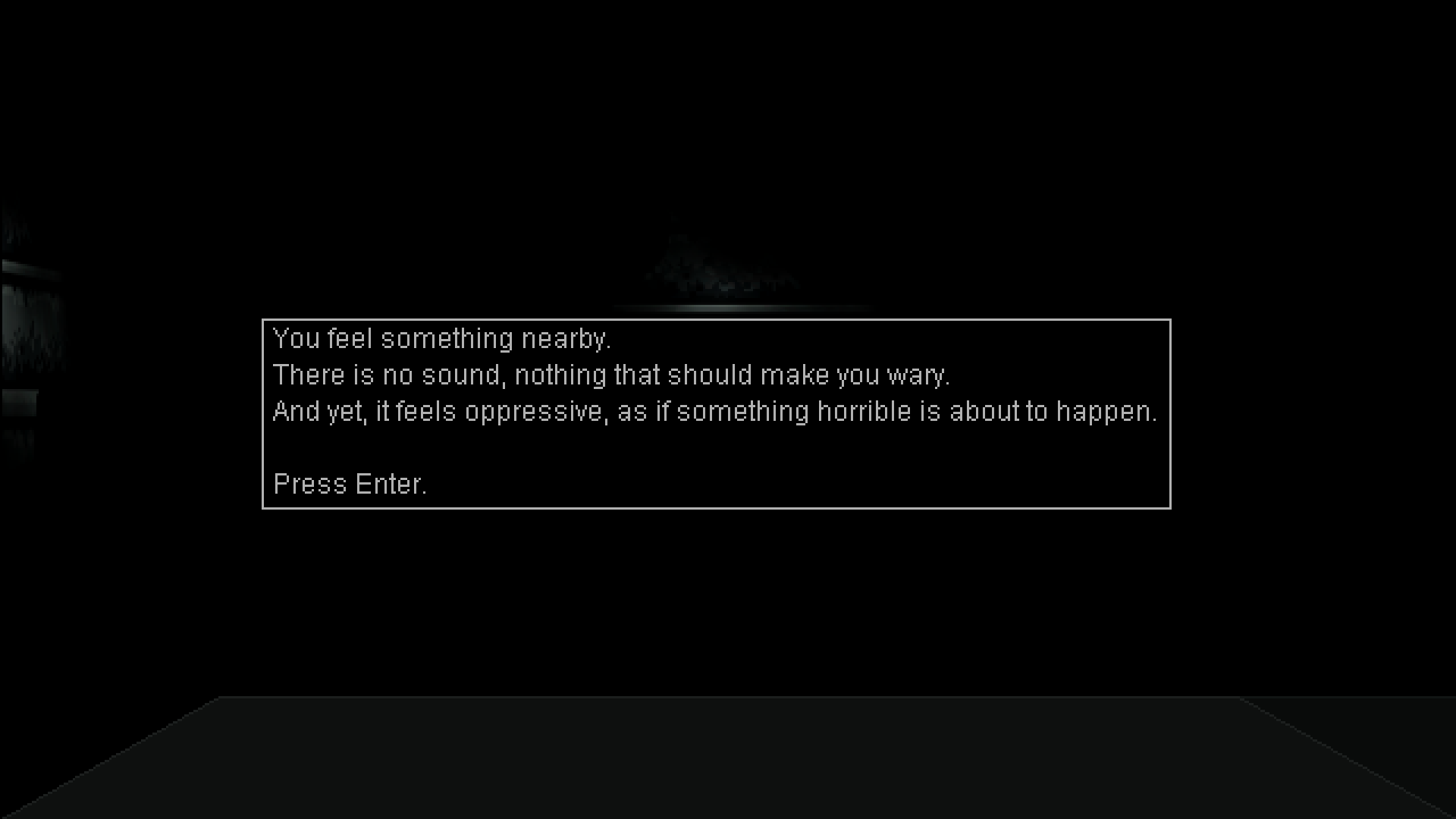
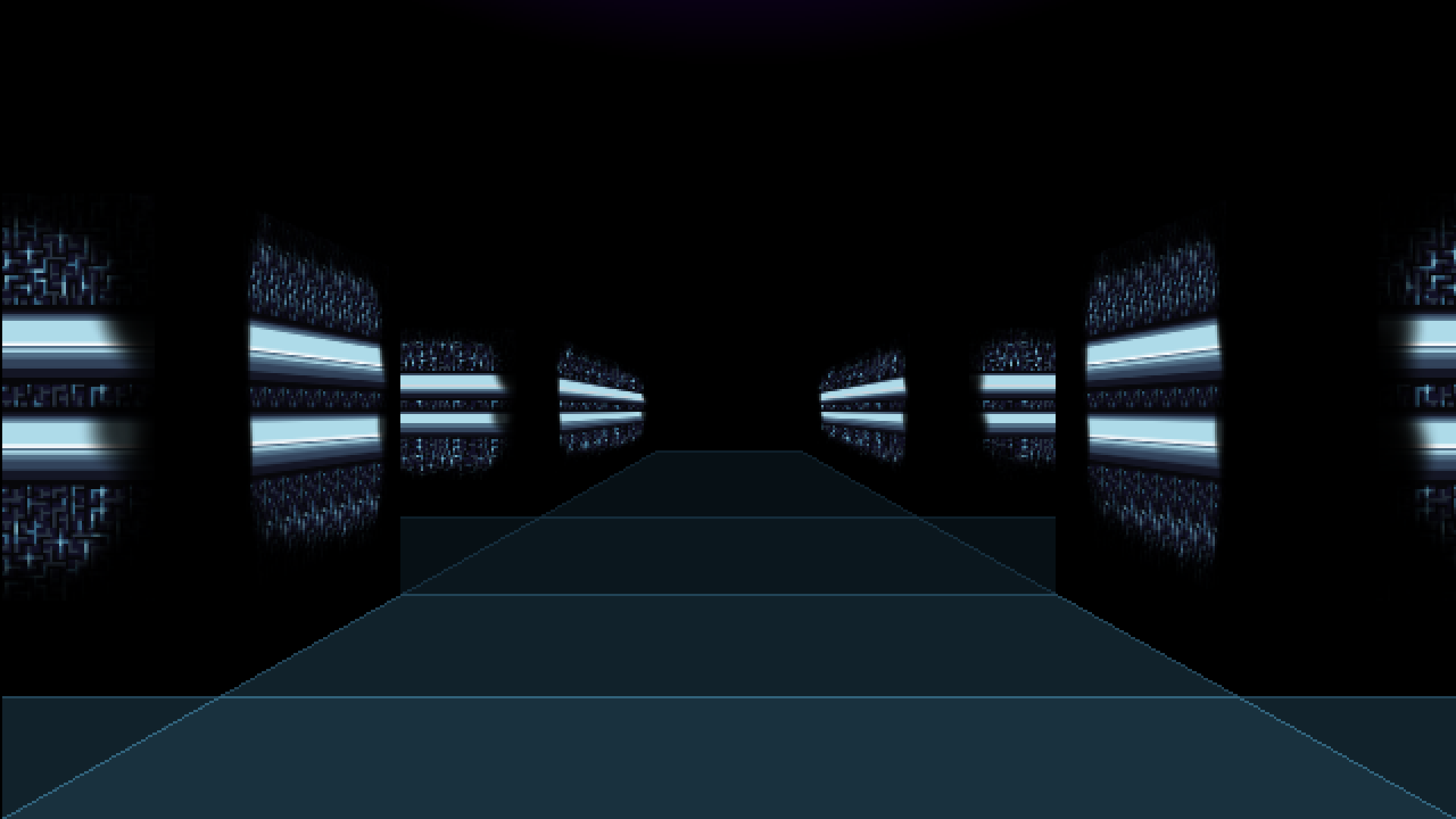
The game is certainly dark and moody, and I like that, but maybe it is too dark, visually speaking.
I would like to revisit the game after some improvements are made to make it more accessible (understandable) for the player!
Thanks for the extensive feedback,
I don't know if we'll work further on the game, what is plausible is that we reuse the same system in another game, in which case with more time we'd definitely add an alternative mouse control with tool-tips, and then we would retroactively implement it in this game too.
Not certain we will though', the thing is that for bigger games I prefer bigger parties, and what I liked here with picking 3 among 4 is that every single combination (of 2 and 3) can have its own unique action, if you get to pick 7 among 12 or whatever (with also the possibility to use the same class more than once) it becomes impossible to fit every possible combination with a totally unique action so the purpose is a bit lost, it's not as cool.
Oh, I wish there was more variety in the wall graphics. While the darkness helped the atmosphere it made the game a bit hard to navigate. The battle system was very cool and I loved, that I could taunt the enemies.
Thanks, judging by the different comments it seems incontestable that we took the confusing darkness too far one way or another.
Java was a brave move! Is it setup for AZERTY on the keys? We thought for while we could only turn anti-clockwise. The splash screen drew us in but it was really hard to see anything on screen. Even when were in combat we couldn't see anything. Combat was interesting though. Nice to be able to choose your party members and them have different abilities. Well done for completing your game!
Kinda, both WASD and ZQSD (azerty), and arrows too by the way, are setup, which means both A and Q turns you left while only D turns you right (E does nothing), hence the possible confusion.
Thanks for the feedback.
Great atmosphere and I certainly spend a lot of time lost. The combat system is good I do love combinations and how character combinations work.
Personal note nice to see a java game. Am a Java dev commercially and have published a game in Java years ago so it’s nice to see a fellow java dev working on games.
Thanks, I like Java and as long as all I'm doing is displaying a bunch of fixed 2D sprites on top of each other I don't feel like switching to something else.
Quick thoughts; Didn't play all the way through yet; The atmosphere is well crafted and the writing is excellent; got lost quickly and often. Class combos are fun and combat feels zippy while punishing complacency.
First try: Brawler, Kamikaze, Psyker. Let's go! The "darkness" was really hard to grasp at first, but once we started parsing the controls and presentation better it started to come together. We made it to the second floor, followed by a surprising third floor. Unsure whether to take it, we went in to the third floor and found uneasy success that snuck up on us as our Psyker went down. The next few combats went really rough, and we didn't track where the healing spot was. We were certainly doomed.
Second try, bring out the graph paper! It didn't take long to lose track of our position, and it felt difficult to get oriented. There isn't a stairway or interactable image, and it was difficult to get our bearings without being able to step back and gain heading. There were several times where mapping out an area did help with orientation, like with doorways and some grooves. We've clawed our way up to the second floor again, this time equipped with supplies and higher level. We saved the game at a point and stopped there for the moment.
The atmosphere is chilling and creepy, in a fun to observe way. The enemies encountered are abstract, fearsome night creatures that look great. It felt like we were powerful enough to run through most any of the encounters, and it wasn't clear to us how differentiated the enemies were. Some spookier names got MP used on them to make doublesure we weren't going to be overwhelmed. At this point of the second floor, our go-to super tool is a team attack that inflicts poison and stun, and a follow up attack against all poison targets. Handy!
Thanks!
As obssessive mappers it's cool to hear people bringing out graph paper (while people who don't can still at very least get a glimpse of the combat system). I like the attack which targets poisoned enemies but its label may be confusing so I'm also glad to hear you're using it.
This has one of the best combat systems of any of the games I've tried so far. It had a lot of depth, especially once the duo attacks were introduced but systems were well represented in the UI so I felt like I knew what was going on.
As others have said, it's very dark which makes it hard to navigate, but that being said I loved the theme/narrative of leaving the comfortable settlement to venture out and save it, kinda like looking for the GECK in fallout, and the dark oppressive nature of the map does help build that kind of atmosphere, just gotta get the right balance so it's not difficult to navigate or strains peoples eyes.
Audio was funny (Loser!) and I thought the monster designs were really well done in a kind of 2 tone minimalist spooky style.
My primary piece of feedback outside of making it a bit lighter would be some sort of landmarks in the more open spaces of the dark lands, just to act as references for your eyes when moving around.
Nice entry!
Glad you liked the game and thanks for the detailed feedback, finding the good balance between dark and playable indeed always gives me headaches.
Fallout is a reference one's happy to hear for sure.
I like the idea behind playing the game with your numpad.
It is really dark tho and the lack of smooth transitions hurts my zoomer brain, so it's really hard to figure out where you are going.
Thanks for the feedback.
I like the heavy use of game-icons.net icons.
It was.... very very dark. Like "too dark for the stream" dark.
But it was fun. I especially enjoyed the "loser" taunt.
Thanks!
Played this for a while just as soon as you posted it the other day. First game of the jam I played. Good atmosphere. I loved the character variety and their combo attacks, that was a very nice touch. And they were varied enough to keep things interesting.
I did get hopelessly lost in the station eventually. This is a game I'm afraid I won't be able to finish without mapping it myself, which I will probably do eventually. The power station levels look great, the game is easy to control and understand. Good stuff!
Thanks, reaching the end is definitely not easy (without mapping).