Play game
AC Units's itch.io pageResults
| Criteria | Rank | Score* | Raw Score |
| Graphics | #82 | 3.583 | 3.583 |
| Audio | #135 | 2.667 | 2.667 |
| Fun | #174 | 2.667 | 2.667 |
| Overall | #188 | 2.611 | 2.611 |
| Game Design | #203 | 2.500 | 2.500 |
| Innovation | #232 | 2.167 | 2.167 |
| Theme | #265 | 2.083 | 2.083 |
Ranked from 12 ratings. Score is adjusted from raw score by the median number of ratings per game in the jam.
Leave a comment
Log in with itch.io to leave a comment.


Comments
Extremely nice graphics and lovely models. It requires a few minutes until you have figures out the player controls but then it makes a lot of fun. Respectable game, good job.
Thanks for leaving this great review. Try the standalone version to play the full game. hope youenjoyed it :)
Nice game, I complete the Stage 1 with full health :D
Really enjoy the sci-fi background music, and I have a lot of fun in your game.
By the way, is there stage 2 in your game?
I press "next level", but it took me back to the menu though, weird.
Did I understand the plot? Nope. Did I enjoy moving a small blue cube around firing at stuff? Yes. The moment I saw the term "AC" I couldn't shake from my mind you didn't mean "Air-Conditioning Unit." That threw me a little. As a player it felt a little clunky, I was hoping for a few powerups to find to give me an edge. What I most enjoyed was the ai of the red fellows; it was quite nice having them following me around, up until I did the old horse-archer trick of kiting them in wide circles.
I played the browser version and I acknowledge that there are some missing elements in the web version.
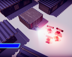
3D graphics are nice and polished, I found it fun that the camera was the actual display of your player in real time as when he speaks I could see some lasting shoot passing by me. Pleasant effect.
I find it frustrating that you can't push the dead robots, you could get stuck easily. It seems that the enemies aren't affected by that though as they can make their way even if a robot is dead.
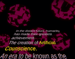
I liked the wink at star wars with the intro (even though I'm not a star wars fan) but the text that couldn't be skipped on second try was a pain. I know you know it but I still wanted to let you know my thoughts.
The music is a bit out of theme but it was dynamic at least.
The game plays nice but shooting wasn't too much precise. It doesn't aim where your mouse is, You have to be careful when shootings at enemies because you might miss them.
I don't think there is a "next level"? Upon finishing the first one I clicked next level but was brought back to the intro (I guess?)
Anyway well done for your entry :)
Thanks for the comment Corbak Games.
Glad you figured out that the camera dialogue is a real-time display XD.
Pushing dead enemy bodies I agree. The reason for this is that we were using unity character controller just so we could avoid other buggy movement behaviour from rigidbody. But the drawback is that one. Enemies passing is due the nav-mesh. Since the nav-mesh is static and it doesn't take into account the enemies itself because that would mean having a dynamic nav-mesh. Still something I can fix after rating.
I already have a version with dialogue skip and intro skip XD, but again after rating.
I did notice the cross-hair misalignment, but changing in unity the reticule offset didn't seem to have an effect. I have to figure out a bit more.
Next level is on the standalone version, but i checked and on the last level we didn't change the text so your argument is still valid.
Once again, thanks for the feedback Corbak Games.
Kind regards,
Villaroux
You know I am crazy the shoot game and your game is my faviorate one. I am always looking forward one exploration effect in your game as well. Special 3D game in this jam I like it. If you can add some audio inside your game would be better. Anyway it cannot deny you made one great game ~
Thank you for the feedback BeaverJoe.
Great, we will be adding some audio, like bullets hitting surfaces.
Kinda regards,
Villaroux
The graphics are pretty nice but the game lacks variety of enemies. They're too easy to beat by just moving in circles around them. The levels 2 and 3 are a bit big. I'm not sure if the enemies level 3 have faster fire rate and more health but something that would've make things more interesting would've been to change the enemy or projectile behavior. But other than that the concept is interesting.
Thanks for the feedback 43ther.
About the enemy variety, if we are talking about the shape of the enemies then that would be a little rough, since we barely got them done. They have a script where they predict where you will be going and shoot towards your position if you continue. On level 1, though this is not true, enemies shoot where you stand and not where you are going thus, like you pointed out, just strafe and its fine. Level 2/3 enemies have bosses, which we could have made them bigger but it would interfere with some gameplay aspects and we never really got around a solution for it with the available time. Also bosses, use indeed a faster fire rate, more health and due predict a little bit where the player is going.
Levels 2 and 3 are indeed too big. especially level 2 where we had such good modern looking buildings are they are barely shown.
Taking advantage of this conversation. On projectile behaviour, what if the harder enemies had a seeking projectile that the player had to shoot down in order to make it go away or run away ?
Kind regards,
Villaroux
Homing projectiles would be an alternative, there are also other options like projectiles that explode mid air and send shrapnel in multiple direction or melee enemies.
Thanks. After ratings I'll be sure to add those and some others.
Thank you for your feedback yet again.
The graphics are awesome and the controls felt fine, but I think you should've tried to use the mechanics to match the theme a bit better. It feels like you're just adding a backstory to fit a tanks game into the love theme.
(I played the browser version)
1. The graphics of the gameplay itself looks great (actually quite good for a jam) yet all the other graphics look pretty bad, especially the old-style-movie intro text
2. Why to make invisible map boundaries when you have containers?
3. Dialogs are too long
4. You have to reread the whole second part of the dialog if you get killed and there is no option to skip it
Check out my game (3D-horror) as well: https://nns2009.itch.io/love-full-house
Thanks for the feedback nns2009.
From my standpoint, I agree with what you said. If you could, I would like to clarify some aspects.
Did you play the browser version or standalone?
First level there are a few parts where we could have done a better job on filling those invisible wall.
If you play the standalone, on the second level there is just on invisible wall on purpose right where you start just to signify the direction the player came from.
Dialogues being long and non-skippable is indeed another fault. we just didn't have enough time to work the kinks. I can add easily that to the game but if I do it, it'll be after the rating of the brackeys game jam, Because that is not considered a bug and it just a feature lack.
Once again, thank you for the feedback nns2009. Let us know more about the game.
Kind regards,
Villaroux
-------
Side note:
I'm the one to blame for the attempt on a star wars like intro. I just really wanted to do one. And I can take full charge on that XD
The relation to the theme seems rather forced if any at all. The graphics is amazing though considering it's for a Jam. Perhaps it seems a little too much story-driven so as to be this short.
Hi MattFett
Thanks for the feedback.
Regarding the story did you play the browser or the standalone? I know this is a repeating question, but the game was taking a long time to load on WebGL, so we decided to cut levels and story just so the player can play in a reasonable loading time.
Either way, could you elaborate on how does the story seem forced? Since none of us are a writer, this is a chance for us to learn how not to make a story seem forced.
I did play the browser version... There was a connection to love but love is almost present everywhere and the "blind" part is seen nowhere (to my knowledge)
Ok has I previously said the browser version had to be cut off a bit since it was taking a longer time to load, hence story wise you don't the full story and how it ends.
As for the blind part, it comes from the expression itself. "Love is Blind" for us meant that whenever we are in love we are able to see past someones flaws (no matter how bad they are). With that said, as a popular end of world theory, robots are to replace us because when they look at us we are kinda flawed in many aspects. Except the player, which found his companion to be perfect. Dialogue through out the game is to personify the character and give us an idea of whats currently going through his thought process.
So to clarify, you think the blind part wasn't well explained then correct?
I did understand it but it was kind of an implied sub-theme and not in the spotlight for the player to see. I think it just wasn't the main theme of the game.