
Play game
JUNGLE of the JADE JAGUAR's itch.io pageResults
| Criteria | Rank | Score* | Raw Score |
| Theme: how well would the module have fit into the Appendix N? | #6 | 4.627 | 4.627 |
| Overall | #13 | 4.416 | 4.416 |
| Layout: how easy is it to find all the presented information? | #15 | 4.490 | 4.490 |
| Art: how well does the art support the other content? | #19 | 4.627 | 4.627 |
| Writing: how clear and/or interesting is the writing? | #25 | 4.314 | 4.314 |
| Playability: how easy would it be to run this module? | #38 | 4.020 | 4.020 |
Ranked from 51 ratings. Score is adjusted from raw score by the median number of ratings per game in the jam.
Leave a comment
Log in with itch.io to leave a comment.
Comments
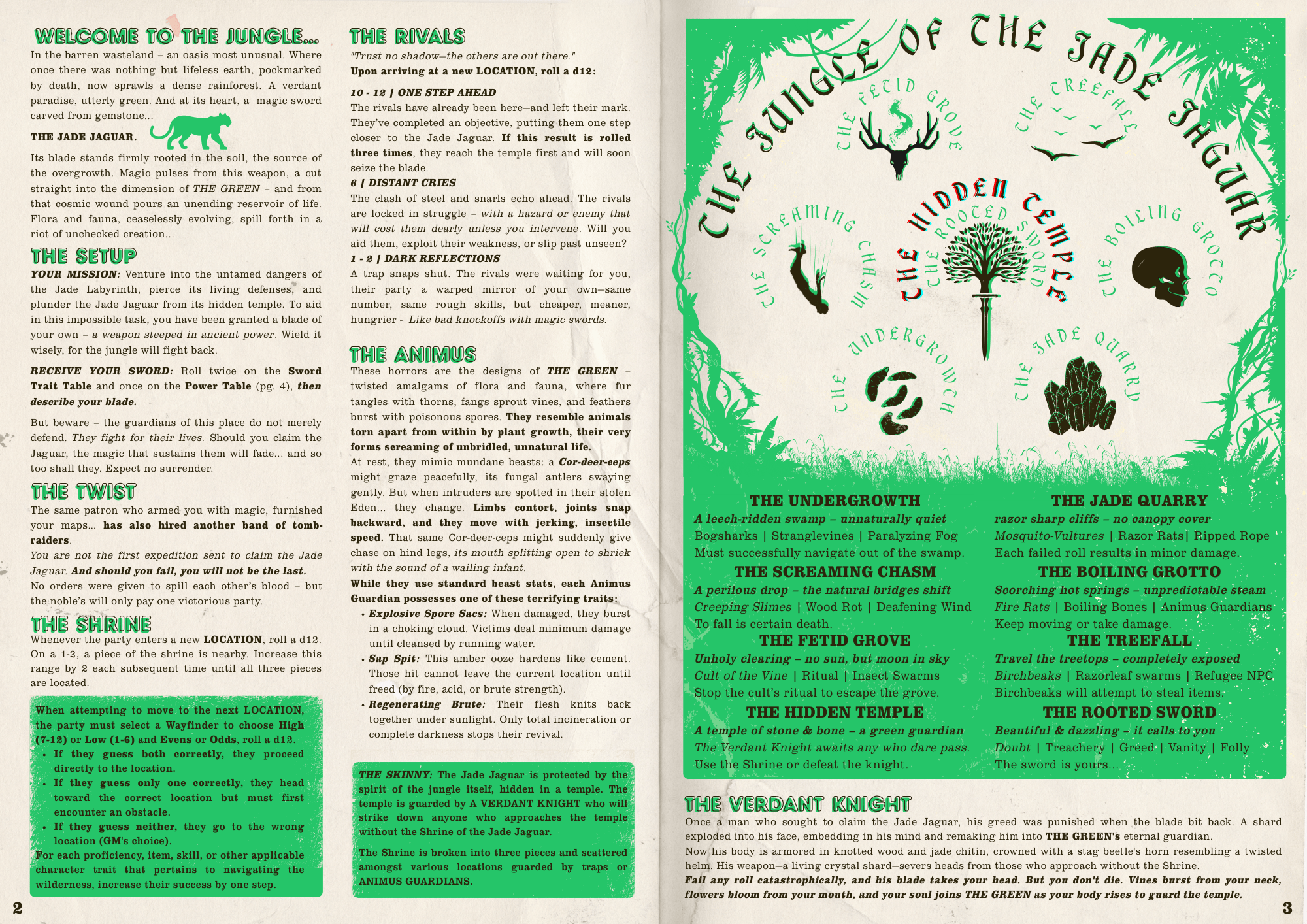
A cool setup, with evocative descriptions of the locations. While bare bones in this form, it feels easy to expand. The included system looks interesting too. The artwork complements the theme, and it fits the Appendix N aesthetic nicely.
Thank you!
Brilliant colors. Smart graphics. Clever adventure. Sharp system.
Thank you!
Lovely design (both game and visual)!
Thank You!
Love it! Art is spectacular. My only critique is the font for the locations graphic makes me dizzy. Something to do with the font color and shadow.
Thank you ! Very fair, probably need a simpler font or a boost to contrast
Knocking it out of the park as usual.
Thanks, buddy!
I have really liked the Swords system, will try to find an opportunity to run it.
The adventure is also very nicely written and laid out. Love the Verdant Knight and the critical effect of turning PCs into enemies.
And also thanks for providing BW print friendly version.
(A small ask, if you have time for this please also upload an BW version of RIVALS.)
One complaint is that the font size is very much on the edge of being readable for me(so I will have to print it at A4 page size to be actually usable at the table).
Thank you, once the jam is over I'll will be releasing a full version with all pages collected (as well as a printer friendly version). And you are not wrong about the font size (I definitely designed this for screens) and will probably do some tweaks on the post jam version.
Thanks again!
You made the greatest of works being able to squeeze so much adventure in so little space! it's a beautiful and inspiring module!
Thank you so much!
A cosmic fissure opened by a dimension-slicing sword? A race against another group or a lucky encounter in search of a table agenda? And even a green knight. Several elements remind me of Arthurian legends. Very interesting.
Thank you so much! I had a lot of fun making this!
This is so cool. I'm gonna be kinda pissed if you don't win, honestly.
Also tremendous flex to drop a one page system into a 4 page dungeon, and doubly so because it's so cool. Just really tremendous work!
Thank you! I had a blast making it and being involved, so I'm just happy to be here! Appreciate your kind words!
The visual design and colour pallet for this is top notch! Love the cover, fits so well with the adventure and I really like the heading font choice, just very cool. The standout for me of this adventure would have to be the Verdant knight which after such a build up feels like it would be a really exciting encounter, especially with the catastrophic failure roll description! Im sure that will get a reaction from players. Awesome adventure!
Thank you so much! The Verdant Knight is a reoccurring baddie i put in a lot of things, i really love em.
It's really cool that there's essentially a system and an adventure in this. I found it a little difficult to piece it all together but overall it's gorgeous and evocative. I'm excited to play it solo and hope everything clicks into place then. There's just A LOT happening here.
The way this is written does put more work on the GM to make it all work, but I was dead set on getting all the ingredients in this even if it killed me, lol. Thank you!
The old school video game vibes of the art and design complement the feel of combat as does the “do over” mechanic. Looks like a lot of fun.
Thank you!
I love reto style layout and design and this takes the cake. Layout is great and understandable to follow.
Thank you!
I am in love with the design of this module. The layout is so good and the Sword score mechanic is really fun.
Thank you!
As I was finishing my own, I saw an entry for the Appendix N Jam that was posted that basically did what the jam asked for in half of the pages, used one of them to just be the cover, and then had the audacity to have a whole system in the last page. I mean, how the hell do you surpass that? So yeah, fuck you dude for being so goddamned good. hahahaha
Sprouting and blooming of unnatural life, brought upon by the torn manifestation of life itself, growing, gnawing, and decaying, canceroursly multiplicating and inserting.
The concept and layout are amazing, leaving space open for interpretation but also guiding GMs and players through the course of the adventure.
This is exemplary work for which we should all strive, good job!
That's very kind! I really appreciate your kind words!
When I first saw your entry, I immediately thought: "okay, that's it, no need to participate anymore" :D Awesome look, great ideas, its own system (!) at one page - I struggled with the page limit and you presented us with this gem, making it look so easy to come up with an awesome jam entry. Hats off to you! Oh, and I absolutely have to try SWORDS!!
Thank you so much! That's very kind! I love your entry as well!
I like Cor-deer-ceps. I'm a big fan of puns.
lol, I'm so happy you caught that!