

Play game
Surgery Shopping Spree!!!'s itch.io pageResults
| Criteria | Rank | Score* | Raw Score |
| WRITING — How does this read? does it emanate with horror, humor, drama...? | #6 | 3.957 | 4.150 |
| UTILITY — Does complexity inspire game prep? Or Is it very "Pick-up-n-Play"? | #7 | 3.957 | 4.150 |
| GAME DESIGN — How good is the game balance or concepts there in? | #19 | 3.528 | 3.700 |
| ART — How good is the art/graphic design? | #27 | 3.575 | 3.750 |
| FAVORABILITY — how much do you personally like the submission? | #29 | 3.242 | 3.400 |
| Overall | #33 | 3.283 | 3.443 |
| LAYOUT — How well does the module get across information? | #35 | 3.194 | 3.350 |
| THEME — How well is the jam theme used? | #51 | 1.526 | 1.600 |
Ranked from 20 ratings. Score is adjusted from raw score by the median number of ratings per game in the jam.
Leave a comment
Log in with itch.io to leave a comment.
Comments
This is such fun, has great Utility, funny writing, and overall good vibes. Very much looking forward to the post Jam version!
a quick note on some of the layout, others have already pointed out a bunch of great stuff, But one thing i didn’t see mentioned is that you reference the Microbiota Empire A LOT before you actually get to what it IS. it can help a reader to see something like (See Panel 5) or (See interior Right Panel) so that they know the info is coming and can hop ahead if its bothering them to not know what (ME) is.
Also I agree with others the jam theme is severely lacking. I am a benevolent Jam Host, but in the future, both for TripTech as well as other jams, its important that you include the theme when it is required as this is one of the ways we know you didn’t take something you already had written and just submitted it for the jam. Here I get a very light “Dr. Frankenstein” vibe which i’m choosing to believe is a very soft tie in to the jam theme as an “Ancient” myth haha. Again you are fine this time, but please stick on theme next jam!
Thank you! I really botched the theme. When I first read the rules I conflated theme and focus and thought both were optional and then didn’t reread the rules until I was about to submit. I’ll be more careful next time.
No worries! I always assume that people are doing their best! just wanted to point it out for the future!
This is amazing! I am not really in need of more adventure modules, I already have more than I can possibly run. I am however always looking for good easy-to-use supplements to throw into other adventures to flesh out the setting. I do agree with some of the other comments that the layout could use a little work to really nail it. For example the font looks a little boring compared to the main header and art.
Thank you! Let me know how it goes if you use it!
1000% YES. THIS is how you do Mothership. Weird, dangerous, and extremely likely to get players killed, but they'll jump in feet first.
I agree with the other comments. This is going right on the top of my "ready for game night" pile and this franchise will exist in every backwater spaceport and grungy station.
Thank you so much! This made my day
Love this. Honestly I'm just taking this wholesale and sticking it into every shore leave and starting town. Very funny, very dark. I appreciate how even after your organs are stolen this guy is trying to not pay you, truly a great mundane horror scenario.
All of my droogs hate the Ludovico.
i didn’t reply to this before, but thank you! I really appreciate it!
Art, writing and layout all pretty good. Jam theme seems absent though. Not sure I could convince a crew to shop here once they work out what's going on.
The charm of this supplement definitely lives in the writing and presumably hand drawn art. For game design and content that aligns with more cyberpunk (and likely more Prospero's Dream for lovers of APoF) this is likely to be a welcome addition as I could see myself using this almost as almost diegetic. I think I might even consider a full edit to make it player facing to be a possible way to take a final version. One of many!
That aside the layout and presentation of the art and information leaves something to be desired and rather than feeling deliberate I feel these aspects would be best served by some polishing.
As it happens in regard to the theme of the jam I can find no relevance to "Ancient Myth" after reading things over a few times. This definitely does not diminish the project in and of itself but insofar as it is a participant of Triptech3 it's a noteworthy issue.
Well done overall with the concept!
Thank you! Appreciate the feedback, layout and design are definitely my biggest weaknesses.
This was my first time making a trifold and using Affinity and I definitely ran into a wall with what to do creatively (hence the blood splatter background). Perhaps I might be better served partnering with someone more experienced.
The art is hand drawn and lightly photoshopped, I’m glad you liked it! Making it was one of the most enjoyable parts of the process.
You did a fantastic job overall, really. I would encourage you to polish for post jam publication if that's something you want to do! A few minor tweaks are the difference really and I can appreciate all of the effort as is :)
Art: I like the robot. He has a lot of personality. Can't decide if the boy counts as paying homage to Vault Boy or just copying, though I'm sure the intent is the former. The rest of the design is a bit too much "basic Word doc" without any visual structure.
Writing: Excellent sense of humor throughout. Explaining that it's meant to be satire is probably unnecessary. One typo: "brief deep."
Game Design: Solid. I think a single encounter like this that can be dropped into a larger adventure is a great use for a trifold. You have good hooks at the start and end to make integrating it easy.
Theme: It's very Mothership, but the rating guideline is for use of the jam theme, and I'm not getting Ancient Mythology from this at all.
Layout: Visually, this is again very much just a Word doc and could use some color and graphic elements to organize the content. I think separating the content into a player side and a Warden's-eyes-only side is logical, but my only concern there is using the organ price list as a D20 table, as an attentive player is going to be like "wait, why are you going to be rolling on this?"
Utility: Full marks. I think it's very obvious how to drop this into a campaign and I would not have issues finding the information I need in realtime.
Favorability: I love the content and could see myself using it. I'm more lukewarm on the visual presentation and think some more work could be done on that front if you intend to sell it.
thank you for the feedback, I really appreciate it!
BTW, if you have any design suggestions I’d love to hear them! I’m trying to figure out what I can do to improve it.
It's hard to offer concise suggestions, but I would suggest as you review other modules to keep an eye out for whatever jumps out at you as "professional" and take note of what they're doing.
Graphic design is largely about organizing information visually, so think about what different types of content you have (price lists, game mechanics and stat blocks, narrative, Warden tips, etc.) and how you can visually distinguish them and let the reader know at a glance what goes together and what's something different.
RADSICK is a good example to look at.
I see what you mean, thanks for the advice
Some very basic things to note:
Visual Weight: Things that are bigger, bolder, or higher contrast are more important.
Alignment: Things that line up go together. Things that are offset are separate.
Color Coding: You know how this works.
Graphic Elements: Simple lines, boxes, dots, etc. can either connect or separate things, depending on how you place them.
I had some free time this morning and I attempted to make the first page look like a 1950s menu, if you have a minute, I'd love to know if you think it "works" for the adventure or is a step in the wrong direction. If you're too busy, no worries! No need for detail specific feedback.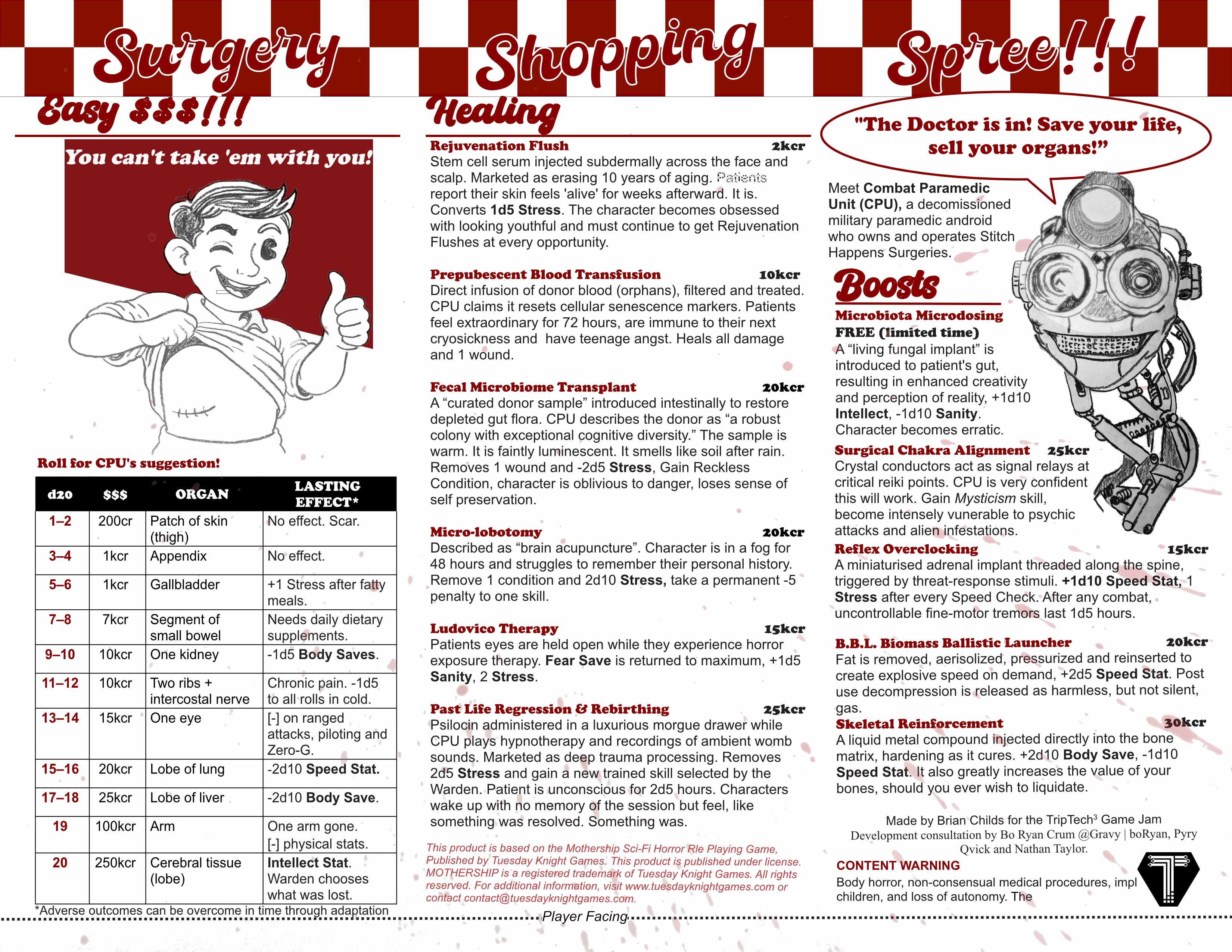
Yeah, that's a great call. Definitely the right direction, although things are getting cramped at the top and might something to give way a little so that "Easy $$$!!!" and "Healing" can breathe.
This is much less readable imo, I think it's great the way it is
Thank you for the feedback! Are you referring to the title at the top with the checker background or the the other changes to make it more like a menu? Here is the version with the original header but the other changes in place for reference.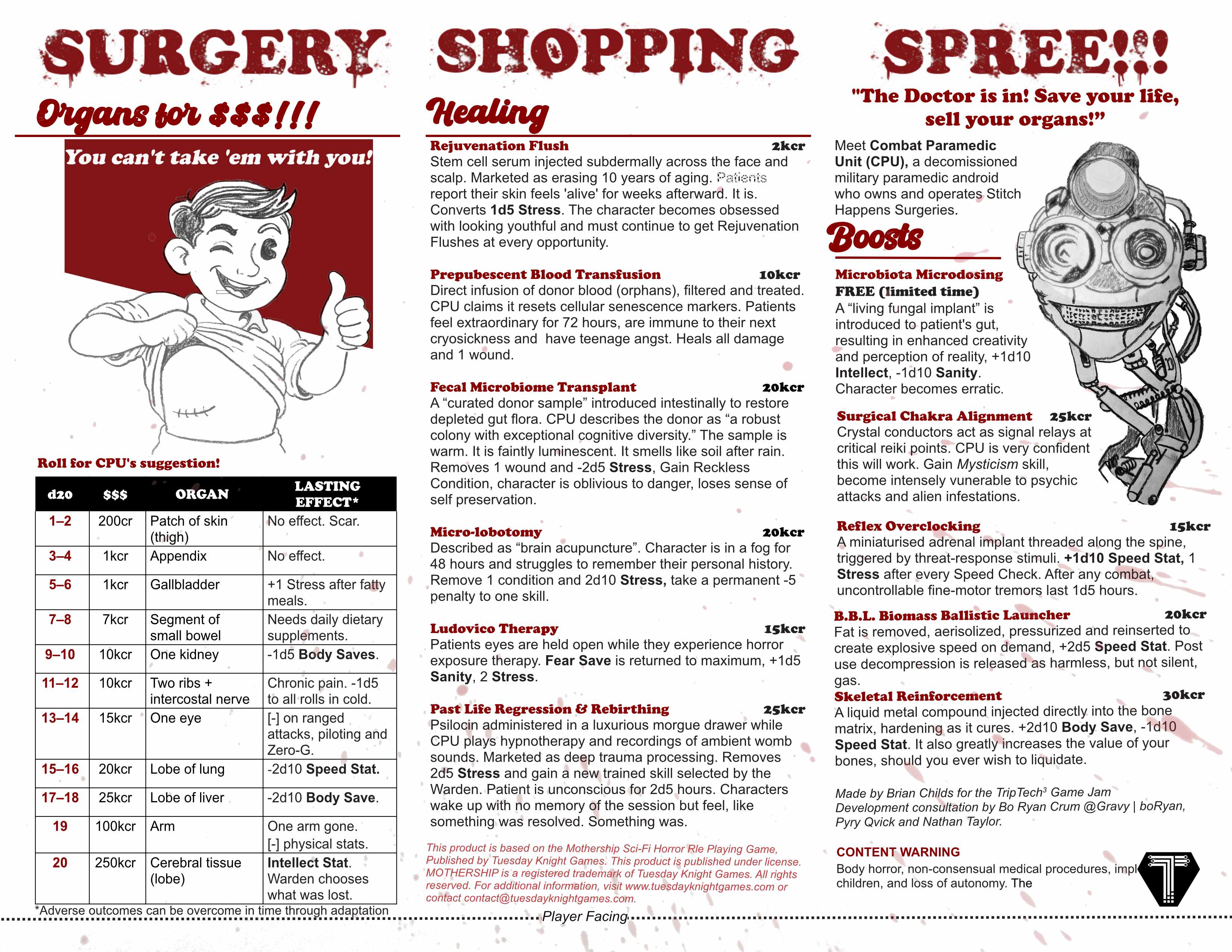
I meant that the top looked too hard to read, this is great though! I know the header fonts aren't necessarily "on theme"for a menu but they wouldn't look out of place on a diner menu, plus the bloody font enforces up front that this is horror game and the contrast with the other elements adds a lot of comedy.
Thanks! I really appreciate the feedback!
I like the checkers, maybe just increase the stroke around the text so that it pops out of the checkers a bit more?
Also maybe extend the Red block behind the “Bob’s Bigboy” / “Pipboy” so that it aligns with the edges of the table below!
Thank you! These are great suggestions!