

Thank you for the feedback! Are you referring to the title at the top with the checker background or the the other changes to make it more like a menu? Here is the version with the original header but the other changes in place for reference. 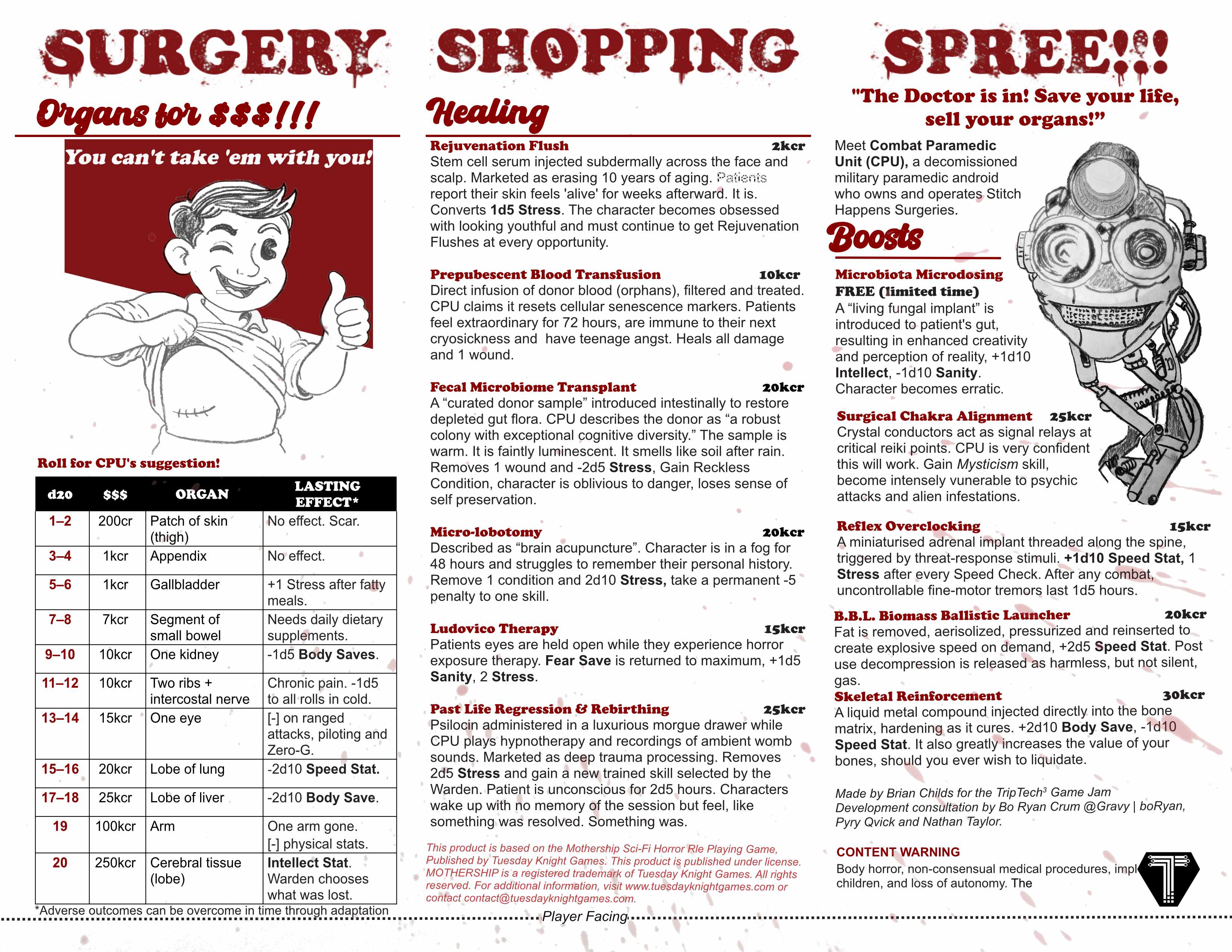
Viewing post in Surgery Shopping Spree!!! jam comments
I meant that the top looked too hard to read, this is great though! I know the header fonts aren't necessarily "on theme"for a menu but they wouldn't look out of place on a diner menu, plus the bloody font enforces up front that this is horror game and the contrast with the other elements adds a lot of comedy.