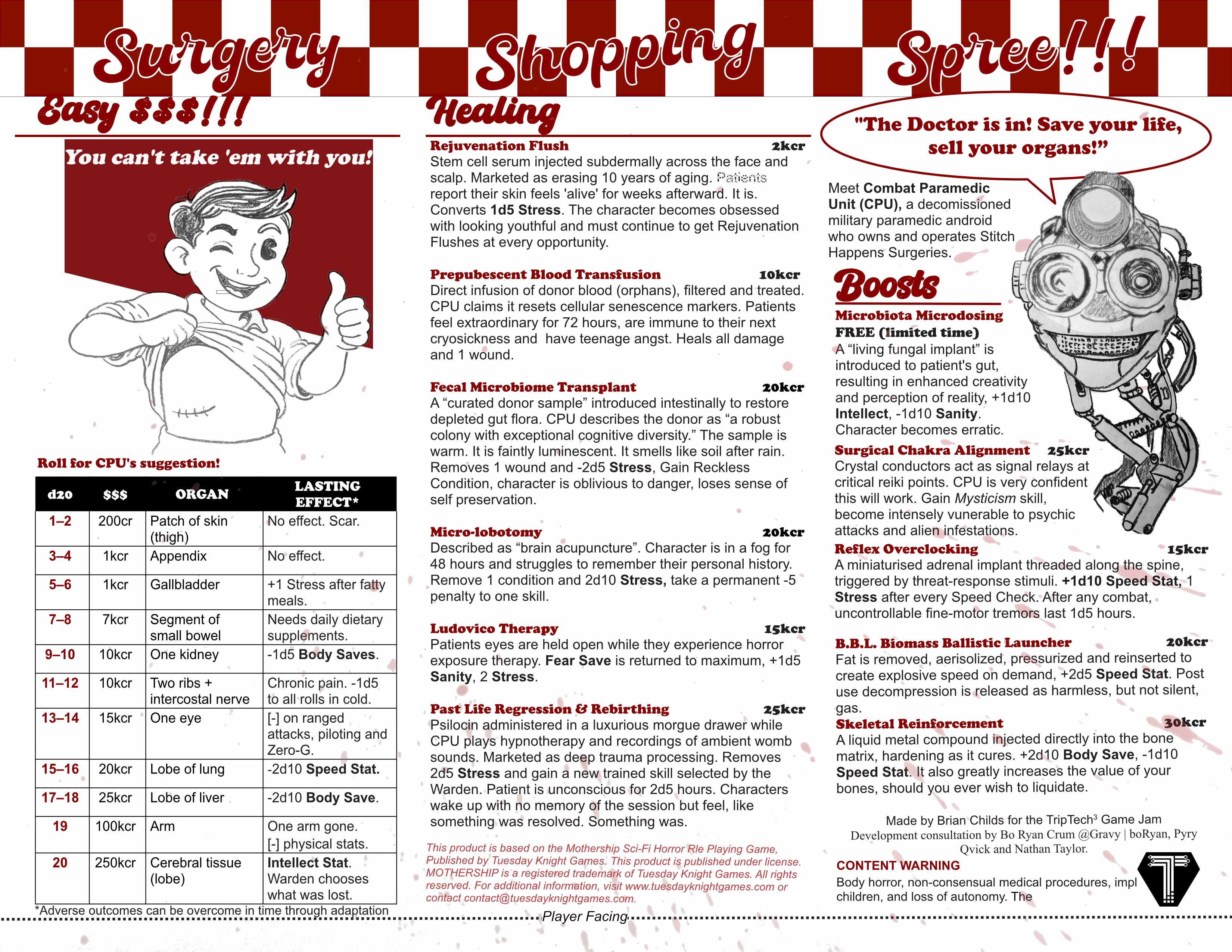
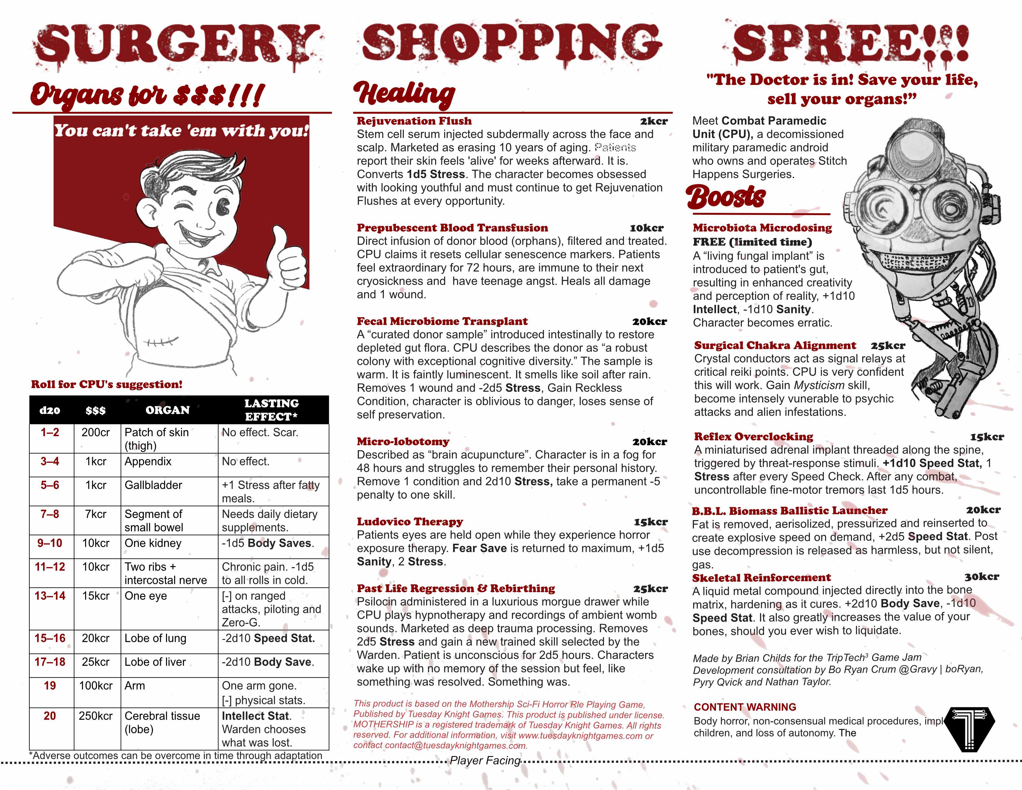
Art: I like the robot. He has a lot of personality. Can't decide if the boy counts as paying homage to Vault Boy or just copying, though I'm sure the intent is the former. The rest of the design is a bit too much "basic Word doc" without any visual structure.
Writing: Excellent sense of humor throughout. Explaining that it's meant to be satire is probably unnecessary. One typo: "brief deep."
Game Design: Solid. I think a single encounter like this that can be dropped into a larger adventure is a great use for a trifold. You have good hooks at the start and end to make integrating it easy.
Theme: It's very Mothership, but the rating guideline is for use of the jam theme, and I'm not getting Ancient Mythology from this at all.
Layout: Visually, this is again very much just a Word doc and could use some color and graphic elements to organize the content. I think separating the content into a player side and a Warden's-eyes-only side is logical, but my only concern there is using the organ price list as a D20 table, as an attentive player is going to be like "wait, why are you going to be rolling on this?"
Utility: Full marks. I think it's very obvious how to drop this into a campaign and I would not have issues finding the information I need in realtime.
Favorability: I love the content and could see myself using it. I'm more lukewarm on the visual presentation and think some more work could be done on that front if you intend to sell it.