


Play game
Singularity's itch.io pageResults
| Criteria | Rank | Score* | Raw Score |
| ART — How good is the art/graphic design? | #23 | 2.704 | 2.778 |
| UTILITY — Does complexity inspire game prep? Or Is it very "Pick-up-n-Play"? | #23 | 3.190 | 3.278 |
| THEME — How well is the jam theme used? | #23 | 2.541 | 2.611 |
| GAME DESIGN — How good is the game balance or concepts there in? | #25 | 3.028 | 3.111 |
| WRITING — How does this read? does it emanate with horror, humor, drama...? | #26 | 2.812 | 2.889 |
| Overall | #28 | 2.789 | 2.865 |
| LAYOUT — How well does the module get across information? | #29 | 2.812 | 2.889 |
| FAVORABILITY — how much do you personally like the submission? | #30 | 2.433 | 2.500 |
Ranked from 18 ratings. Score is adjusted from raw score by the median number of ratings per game in the jam.
Leave a comment
Log in with itch.io to leave a comment.
Comments
(+) Simple and easy to follow objective procedures
(+) Nice variety in threats that can seek the players out
(+) Good collection of locations for players to traverse through
Feels a bit too dungeon-crawly for my taste.
The rift portals could have been used in more creative ways than to spam encounter spawns. Some rooms could have more puzzle mechanisms to have a reason to linger longer.
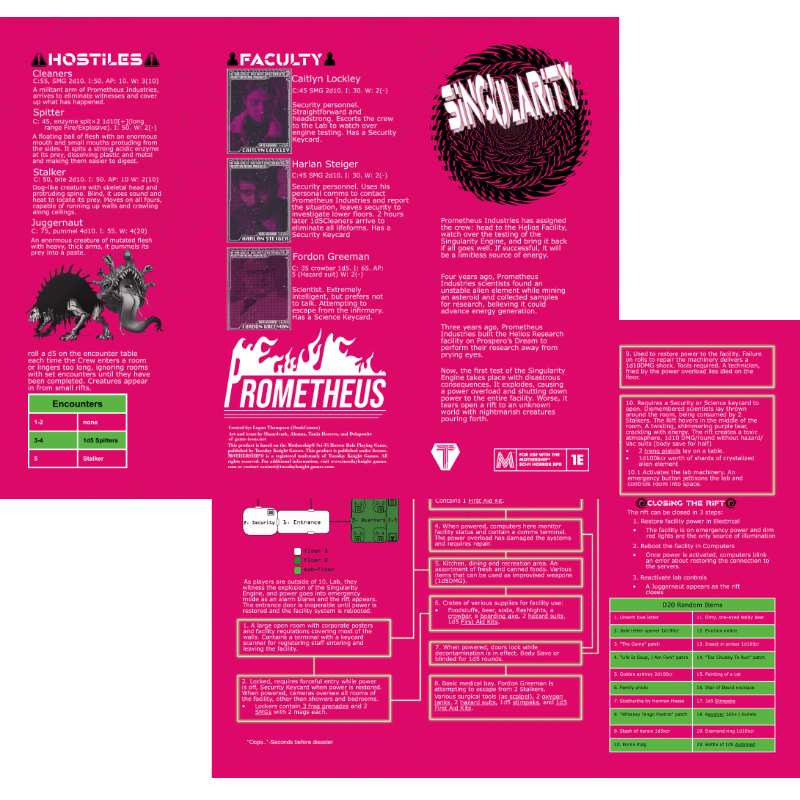
A half-life inspired module about a science facility with an experiment gone disastrously wrong. An explosion happens, all hell breaks loose, power must be restored and the rift closed.
A nice map provides a good overview of the facility, and the room information is well organised in textboxes, but the body font is not great for reading large amounts of text, an issue which is exacerbated by the white text on magenta background colour scheme. The module could have benefited from leaning even further into its source material and cribbing the minimalistic aesthetic of Half-Life.
The problem itself is nice, with a three-step process to close the dimensional rift, though there are minor inconsistencies, e.g. stating that the receptionist runs out as soon as the alarm goes off, but also that the door becomes inoperable at this time.
Thanks, I completely missed that about the receptionist! Will be fixed in the public version.
The only thing missing is the big Akira Elevator. I can't wait to run this! :D
Hmmm, I could add that as a way to the bottom floor in the public version maybe... But thank ya!
There’s a great variety in the hostiles. I think the stalker details are particularly evocative. I agree with what other folks have said about readability; I have some trouble distinguishing the two greens used in the map key, and it’s a little tough to discern individual letter forms. I think using a sans serif font with an emphasis on letter kerning would help with legibility.
(Also, I love Fordon Greeman and am mad I didn’t come up with the name.)
Thanks for the feedback! And yeah, I was trying to think of a rhyming name, but then decided to just flip the G and F haha.
Looking good, do we have a space station 13 aficionado in addition to the half life references?
I have no idea what Space Station 13 is haha.
Its an open source mmo computer game anout performing mundane tasks on a space station while it is literally falling apart around you. It historically used a singularity engine (artificial contained black hole) to keep the station powered. The singularity engine had a nasty habit of escaping and bringing down the whole station.
Oh cool, I'll have to give it a look!
Interesting, ready to go mission thanks to the nice level of detail on the descriptions and the different things to do for the players. For me personally that's the kind of thing I'm looking for in a small module like this.
Layout is good, content is in the right places, however some variation in typography (color coding, italics, underlines) would help the eye separate different kinds of information quickly.
Main text font is a bit tough for me to read. A more conventional choice would be more legible at a smaller font size, allowing for a bit more breathing room for the decorations (frames and map glyphs).
Okay, cool, thank you for the feedback!
Love a tidy little Half-Life homage (though Fordon Greeman is a little on the nose!), and this makes for a great little diversion that fits into a single session. I do wish it had a little bit more to say about the aftermath, if used in a campaign - is there any way to get paid, how does the employer react to the failed test, that sort of thing - but it works fine standalone. The floor 2 and sub-floor colors on the map are a too similar to be legible at a glance for me.
Fun stuff!
Thank ya! Yeah Fordon isn't exactly meant to be subtle lol, but I'll definitely make the colors of the floors more distinct before publishing and add in some extras, thank you!
Love a tidy little Half-Life homage (though Fordon Greeman is a little on the nose!), and this makes for a great little diversion that fits into a single session. I do wish it had a little bit more to say about the aftermath, if used in a campaign - is there any way to get paid, how does the employer react to the failed test, that sort of thing - but it works fine standalone. The floor 2 and sub-floor colors on the map are a too similar to be legible at a glance for me.
Fun stuff!