Play game
Gray Decay's itch.io pageResults
| Criteria | Rank | Score* | Raw Score |
| Concept | #3 | 4.237 | 4.237 |
| Overall | #13 | 3.908 | 3.908 |
| Use of the Limitation | #14 | 3.868 | 3.868 |
| Enjoyment | #16 | 3.658 | 3.658 |
| Presentation | #17 | 3.868 | 3.868 |
Ranked from 38 ratings. Score is adjusted from raw score by the median number of ratings per game in the jam.
Team members
PixelPax (Gabriel Kind) - Concept, Code, Character Design and Animation, Level Design and Art frodoTimBaku - Concept, Environment Art, Enemy Design and Animation, Title Screen Art Fidel Delgado - Music Composer, SFX, Playtester Lssndra - Playtester, Concept, Writing, Talk Bubble Art Yammmmmy - Playtester, Bug Finder
Software used
Unity w/ Corgi Engine
Use of the limitation
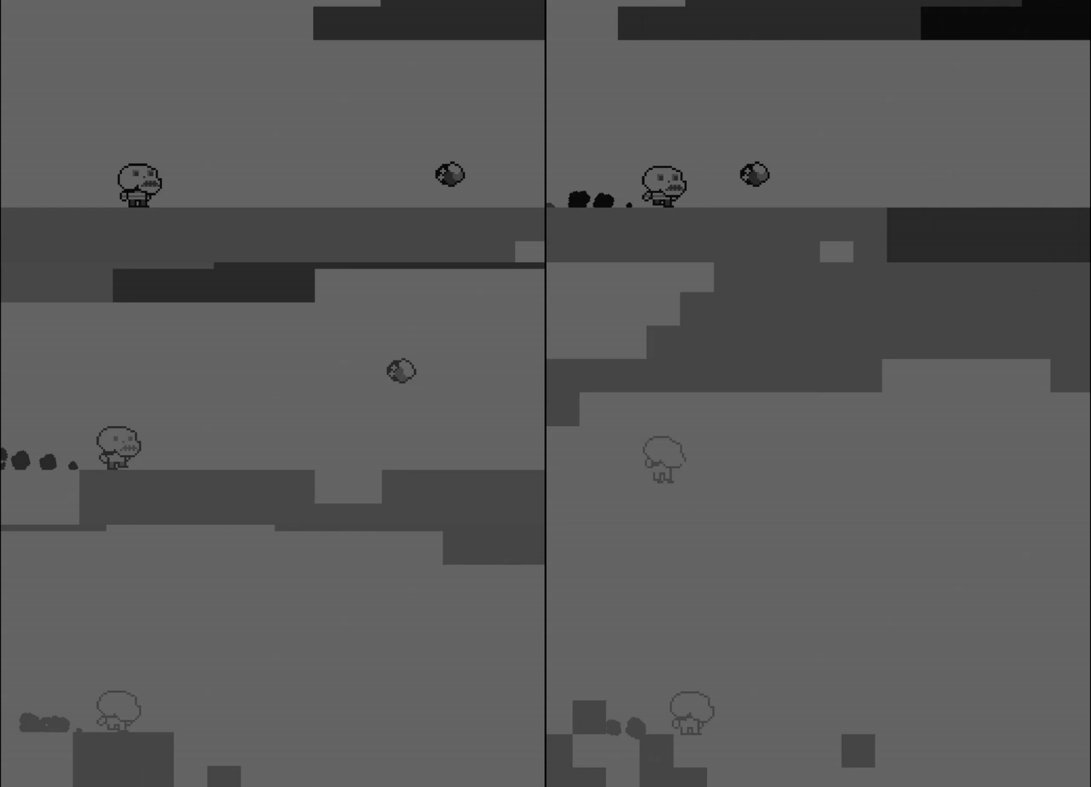
The protagonist in my game is hell bent on destroying the screen's contrast, eroding the details of the game, and making life hard for himself. In a metaphorical sense, he is self-destructively self-medicating, and harming himself and his ability to get on in the world.
Cookies eaten
I think one, I was really caffeinated and didn't have time for food so I pulled one out of an old tupperware. It was pretty stale, so I only ate the one.
Leave a comment
Log in with itch.io to leave a comment.


Comments
Great work! the slide on the wall mechanic was great! (among everything else already mentioned)
I really like the mechanics in this game. The art is cool and well implemented, the music is awesome and there are a lot of levels. Well done overall!
Very interesting and fun game, and different object dependent on color is very good idea, also sounds selection is also good event sliding from wall have its unique sound, well made :).
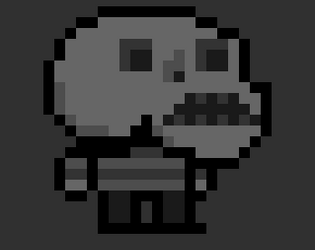
I like how the game works with different grays in the level and also in the players sprite. The concept is amazing and fit the limitation pretty well. I really enjoyed exploring and completing the levels :)
Amazing concept, solid platform design, great job overall!
Great game concept and interpritation of limitation! But I'd improve wall jump mechanic: how about shap character to the wall until player won't press jump button? It's pretty challenging when you press arrow button before the jump and fall into the pit because character doesn't slide on the wall anymore)
That's great feedback! I went ahead and fixed this to include your suggested change in the windows build-- if you were willing to re-evaluate w/ that change it would mean a lot to me :)
imho this is the most original so far, both narrative and mechanics!
great game! I downloaded the game since I cannot get it to play on the browser, Impressive controls and creative artwork and music, the gameplay is fun and the difficulty increases when the colors/hues disappear. This has good replay value! Overall , I enjoyed playing this one! congratulations! keep it up!
Great idea, I love it! (p.s: I didn't understand why nothing worked until I realized that I was looking at a banner)
wow. this ought to be 1st place in this jam!
Really nice idea, great style and impactful responsive movement.
the theme fits, the limitation is wonderfully implemented, and the music brings it all together!
love it!
Thank you for the incredibly kind words!
You really made my day MrMelonMonkey, it means so much to me that you enjoyed it :)
Innovative gameplay, good game!
This an absolutely amazing game! Concept is also very nice!
I loved the concept and the game very much! Challenging puzzles and the atmosphere is nice
Really enjoyed!! Very cool work!!
This was really nice! Accidentally pushing the black box on the platform then being able to see it later gave me a great "OOHH" moment.
Thank you! Hearing that made my whole day :)
very cool super tight controls and the puzzles were fun but challenging!!!
Very nice idea. Challenging puzzles. Congrats
Nice game, I love the art. And I like that you introduced a contrast calibration screen, I should have done the same!
I like how the maps are designed, so that you have to think which "orbs" pick up first. I love the art and the general aesthetic. Good Job!
Really well-done puzzler. The idea of the gradually decreasing contrast, which means you have to remember the location of certain blocks, is brilliant. You introduce it smoothly, and the puzzles implement it very well.
At times it does get a bit fiendish. I gave up near the end of level 5.
Also--the WebGL did not work for me, I had to download. Which version of Unity were you using?
Thank you so much for the kind words, it meant a lot to me that you noticed the effort I put into introducing the mechanic :)
I used 2020.17f1 and did some fanciness with custom postprocessed shadergraphs in URP to get the 'color removal' effect. I've heard that URP, 2020 and WebGL don't play well together, but I waited until too long into the jam to realistically downgrade or fix (I tried, but I could tell it was going to be a fruitless time-suck).
Lesson learned: build early and often.
So true.
I used Unity 2020.3.31f1 and I also had some last-minute build issues in connection with the URP. Fortunately I managed to resolve them, but it led to delays and I ended up submitting 75 seconds before the deadline. :)