Play game
444: 4 Colors, 4 Ninjas, 4 Sale's itch.io pageResults
| Criteria | Rank | Score* | Raw Score |
| Fun | #26 | 3.867 | 3.867 |
| Audio | #40 | 3.800 | 3.800 |
| Overall | #76 | 3.533 | 3.533 |
| Graphics | #133 | 3.200 | 3.200 |
| Gameboy-ness | #145 | 3.267 | 3.267 |
Ranked from 15 ratings. Score is adjusted from raw score by the median number of ratings per game in the jam.
Leave a comment
Log in with itch.io to leave a comment.


Comments
The characters and their different powers / abilities give good replayability, the nervous gameplay is great even though I feel like I'm not very good at, good fun overall and the music works well with the game!
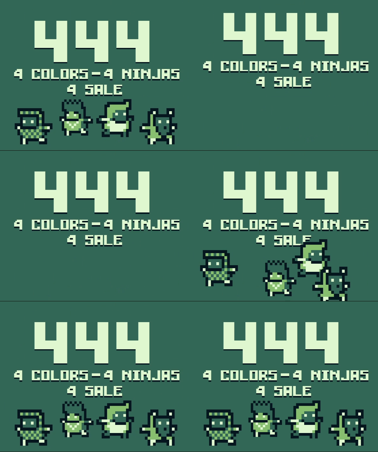
This is like a turbo, difficult jetpack joyride on steroids. I felt FAST playing this and died countless times, but I loved it. I'm so glad you ended up submitting this! Well done.
A very fun and fast pased game, with great graphics and audio. The only slight criticism is that when the game is running at higher scaled resolutions, it seems to actually be running at the higher resolution - by which i mean the game isnt just displaying each pixel of the original 160*144 size as multiple but instead is fully running at the higher resolutions, if that makes any sense). However, the game does have an option for 1x resolution, so I'm sure it's fine in terms of abiding by the rules. Definitely one of the more polished games ive seen so far, would love to see more games in this style by you!
Thanks a lot! Upscaling the game does not actually change the resolution of the game, at least not in the logic side, but sadly the camera system of GameMaker Studio 2 makes it very difficult to disable subpixel drawing, that's why I let an optional 1x resolution.
While this of course doesn't look very gameboy-ish, I was actually surprised to learn that the og GB did have subpixel calculation that obviously couldn't be displayed due to hardware limitations. Of course, that's no excuse, but a fun fact
Super fun speed running platformer. Really need to brush up some skills for this one!
I really liked the idea of the overall game, being able to select up to 4 different powers to use throughout the game was a pretty smart idea! I think this should be a bit more expanded on though. You don't get a clear idea what you should be doing right at the start "sorry I failed to read the directions" so selecting multiple guys at first wasn't the first thing that came to mind.
The idea that I could use a combination of boost throughout the level. Explaining that to the player when they first start will make someone who plays for the first time more willing to sit down and try different combos then just straight giving up 'because darksouls' Once I discovered that there was more then one combination to be explored, i had way more interest in trying to venture through and didn't mind the difficulty as much.
This brings us to a bit of balancing and maybe some things to consider when doing elements for the different characters. The triple double and two long jumps felt fine. The bullet time though, felt really off. And this could be to add to the challenge but didn't really live up to what i was hoping.
Its very difficult to time when to activate it due to the nature of its slowing down to "whatever speed" instead of instantly slowing down. I think if it instantly slowed down it would be more useful and a bit more predictable. Also ended up several times where when it sped back up, id instantly drop which was a bit of a problem if your slowdown stops in-between the pillars. you will die. And because you slow down slowly before being at slow, you cant predict when to start it so you don't die at the end......this was a bit...wordy but I hope you understand.
then the cleanup!
Everything else was super nice but I think there's a few QOL things that could be addressed.
Instead of your tutorial text popping out from your dude, have it be directly big in the center bold in your face. I actually had a bit of trouble reading the tutorial text while trying to avoid death. another way you could deal with this, is if you want to have text pop up, have your self go into the bullet time mode and keep it slow until the player pushes another key or for about 2-4 seconds. whatever feels good for a reading speed of someone who is 5.
The text boxes at the top representing which power i had was a bit confusing at first, I thought that was the key I had to push in order to activate the power. and this brings us to key placement.
It could just be me on my keyboard but having J and K as your A and B button is a bit odd. hand placement just feels tiny off and I keep finding my self to pushing K and L which i think are more commonly used for A B when using AWSD layout. So for me shifting one letter over would add just a huge hand comfort positioning improvement.
Lastly is a bit harder of something to accomplish. but this could have gone the extra ++ if it did not use any scale modification of the sprites. I feel like having him squish and sqash as you jump or dash really takes away from that GB feel you have going. I think you can accomplish the same thing with either another frame or having him flash a different color as he dose an action.
For the shadow that gets casted off him, i think that should just be a solid dark or light color that would best fit the background. It only needs to be a representation of your character, doesn't have to look like it. and doing this without any alpha blend techniques i think could really give it that extra push.
Hardest but last, If you could figure out how to rotate your character without rotation, i think it would look better. what I mean is, Instead of a full 360 degree range of movement, Lock it so it only faces 4 or 8 ways throughout the rotation. that will give it a much more retro feeling when you have objects rotate if you don't want to draw the rotation.
overall super fun and really well put together!
O' boi, I wasn't expect this kind of review! Thanks! I'll try to address point by point.
Yes, I've failed to communicate that you could buy multiple heroes. This could have been easily fixed with a 0/4 text that increased with each ninja bought. That was a clear case of "because I coded this I know it but I forgot to communicate other players".
Sadly, I did want to improve in character powers but didn't have time to do so. Bullet time ended up being useful only on the 2nd and 4th level, maybe a bit in the 3rd, but it was very situational. I have many ideas of improvements to do to these powers, but they have to wait until the ratings.
I originally wanted to have a dedicated tutorial level, but didn't have time to implement so I opted for the in game texts. I wanted the text to come out of the player because that would made more sense with the ending of the game, but I never thought about slowing time during the tutorial, which now that you say it it's a great idea that I'll definitively implement.
The letters at the top sadly were just placeholders that stayed in the long run because they weren't high priority.
The button placement never gave me any problem. That being said, I wanted to have remappeable controls as well as gamepad support. I'll be sure to add that.
And with the subpixel drawings like sprite stretching and full rotation, for the final version of the game I'll leave them, and I'll only stick with the 4 color scheme (probably adding alpha blending), but it's true that, for the GB Jam, these effects did detract from the retro feeling. The problem is as follows: GMS 2 camera system makes it very difficult to disable subpixel drawings, so I opted to have selectable scale. If you go to settings you can set scale 1, which will give you a window of 160x144. Of course, this makes it very hard to actually see what's going on, but then the rotations and the sprite scaling will be on grid with the resolution, thus making it more gameboy-ish.
Thanks a lot for the review! It gave me great points and I'll be sure to apply them in a future version of the game, as well as (I hope) my next jam!
This was pretty addicting! I also really like the way the dash ability felt! great work!
The games crashes a lot with me but maybe I spammed too much the button... but, it's a juicy arcade game on game boy ! The progression is pretty interessting with the system of ninja and power, cool !
Hey, I'm sorry to hear that! What button are you spamming for it to crash?
GMS 2.3 is having some weird bugs in room changes too
I just pressing A multiple time seem to crash the game when launching it (so, after selecting the character) and when exiting it (the menu appears but the crash log did too)
I can't reproduce it consistently, so it may vary from PC to PC, but I think it's related to room changes in GMS 2.3. I'll have to take a look into that :(
So cool, very fast and frantic! What a great entry this is!!
4 Comments, in 4 lines, at... 4am?
Very fast. Gameplay is more like in mobile games for me. Nice work.
Love the high-energy presentation and the funny messages! I have terrible twitch reflexes so I didn't get very far in, but the gameplay video was an entertaining watch.
This game is so Peppy!
i like how the Damn the death animation is.
I love the commitment to the theme! The use of colour and characters really added to the concept. Great work!
Great Game ! Addictive right out of the gate. It makes me think of Jetpack Joyride, played that game for hours. Very well done. Audio and visuals all come together really nicely and the multiple character approach is really boosting replay-ability.
The controls appear in game, but just in case
W and S = Jump up and down
A and D = Speed down and up
J = Dash
K = Power
Space = Switch characters