Well done, interesting concept I like it! Maybe control of the hole was a little bit too hard, maybe controlling with arrows would be better, but that's my opinion.
Play game
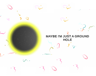
Maybe I'm Just A Ground Hole's itch.io pageResults
| Criteria | Rank | Score* | Raw Score |
| Theme | #109 | 3.739 | 3.739 |
| Graphics | #164 | 3.478 | 3.478 |
| Overall | #224 | 3.145 | 3.145 |
| Audio | #237 | 2.913 | 2.913 |
| Game Design | #253 | 3.130 | 3.130 |
| Innovation | #306 | 2.783 | 2.783 |
| Fun | #320 | 2.826 | 2.826 |
Ranked from 23 ratings. Score is adjusted from raw score by the median number of ratings per game in the jam.
Comments
First of all, I want to thank you for the option to clear particles on the screen, it savedd my potato computer! Great solid game all around! I did have a little trouble gauging where to go as the view is was slanted rather than top down, but then again I haven't seen a game like this before. What a great unique game, amazing work!
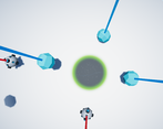
Simple gameplay that works! There didn't seem to be too many hiccups with the hole following the mouse. The offset between mouse and the hole took a little bit to get used to.
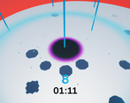
The shadows clearly show which object is falling. Sometimes the smallest-looking shadow wasn't the lowest one though.
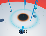
The "edge" of the play area was too unforgiving, making you lose when you were barely touching the edge. I'd recommend allowing the player to get at least a third, maybe even half of the hole outside before game over. You could also give it a short timer (0.3 - 0.5 seconds maybe) so the player doesn't "die" immediately - the suddenness of the game over felt weird.
Cool game! The mouse control is perfect for this kind of gameplay! Well done!
nice game !! great work :) game design and graphics both killed me they are more than epic well done ^^
btw i rated ur game can u do the same pls ?? and thx !!
Cool idea and nice, clean graphics. One thing is that it is hard to tell the order the objects are gonna fall, the shrinking of the shadows could be more dynamic or there could be another indication of which objects are closer to the ground. Nice work!
Pretty organized game, i like the tricks that you need to follow to catch, i thought at first that the bombs are unpredictable and thought of making a red shadow for the bombs when they are close the the ground! i know the trail of the bombs are red but it's not that obvious, also i would recommend speeding up the precess a little bit of falling :) nice work! rated.
here's my game if you wanna take a look:
Interesting concept. You do the graphics pretty well not to mention the UI design. The BGM is nice as well. The movement is fine, but if you could hide the cursor in game would be great.
Great concept, audio, and theme! The mechanic was great too, but if the camera was too far from the a shadow it would disappear because it was outside the viewing distance, which made it too challenging for me. I really did like the game, would love to build my experience by starting with easier levels!
Cool gameplay. It reminds me of my entry because of the whole moving with the mouse deal.
I agree with mariothedog that the red are is too sensitive. Also when near the bottom the red are makes the entire screen red as the camera goes outside of it. I though that something bad was going to happen until I noted why the screen suddenly went red.
Overall solid entry!




Leave a comment
Log in with itch.io to leave a comment.