Play game
On the edge of dismissal's itch.io pageResults
| Criteria | Rank | Score* | Raw Score |
| Fun/Design | #3 | 4.263 | 4.263 |
| Technical Implementation | #7 | 4.000 | 4.000 |
| Overall | #10 | 4.011 | 4.011 |
| Theme/Limitation | #13 | 3.947 | 3.947 |
| Music/Sound | #14 | 4.053 | 4.053 |
| Graphics/Animation | #66 | 3.789 | 3.789 |
Ranked from 19 ratings. Score is adjusted from raw score by the median number of ratings per game in the jam.
How does your game apply the limitation (and optionally, the theme)?
The game is about a designer "on the edge" of losing her job, and her "boss" gives her a last opportunity not to get fired. She has to create a game in 10 days (does it sound familiar?). The game story is about planning a "boss" fight, will the player be able to kill it with "the edge" of his blade? Oh, wait, that's a hammer!
Team Size
What main engine/tool/language did you use to construct the game?
Unity/C#
Which diversifiers did you use, if any?
Color Blind Friendly - Use options, modes, or a general design that accommodates color blindness (not using combinations of green and red should be good enough?) Doing Your Part - Contribute at least one asset from the game to https://opengameart.org/ (https://bit.ly/3lDxrbp) Educational - Players learn a real-world skill or concept (During the battle there are a couple of tips on how to design a good bossfight) Quick Run - A casual run of the game takes no more than 5 minutes (https://www.youtube.com/watch?v=n4wscXDQwTQ ok that's not very casual but we are pretty close on length :D )
Leave a comment
Log in with itch.io to leave a comment.



Comments
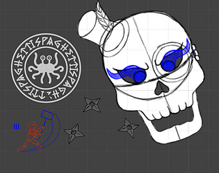
Daisy should definitely stay :D Loved the story, gameplay is also very fun, the music is awesome. The only thing I didn't like was that those little shurikens were kind of hard to spot being grey on a grey background.
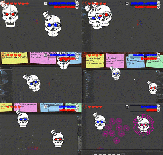
Great game Daisy! Hope you keep your job, or find a better one. Enjoyed the "Animator vs. Animation" meta vibes. Fighting two skulls at once was also interesting.
This is a fun and novel take on the theme, it's very meta. The dialog was funny, and the boss fight was actually good. Playing within Unity as a scribbled character was a clever and non-intrusive way to save yourself some work on the graphics. I realized after I beat it that I never used the dash move. I really liked how you used the shield phase to force the player to use the projectile reflection, it would've been good to have something like that for the dash. I realize now that the part where he shoots the wide projectiles with gaps in them was probably meant to be that, but I didn't have a lot of trouble doing it without the dash. :D Also, in the part at the end, where the second boss shows up, I accidentally skipped the dialog because I was mashing the attack key which is the same as the skip dialog button, which was a little unfortunate. Those are minor nitpicks though, overall, really fun game, great work you guys!
Awesome game! enjoyed playing this one! the controls are easy and smooth for gameplay, the graphics and sounds are superb! fighting the boss keeps the player on the edge ,the story is appropriate for the theme and limitation, and I really liked it! congratulations and keep up the great work!
One of the best entries i've had the chance to play so far, look good, sounds good, plays well, and nice little story.
Good job to your team that was really fun to play !
Awesome Game! You all did a great job developing this in the 10 days given. Music and sound was awesome, the theme was awesome, the gameplay was awesome! Very nice job! Even the storyline was good, and I liked the Spaget symbol that was thrown in there, you'd only notice if you payed attention to the intro.
Id say the only thing that got me a little was the buttons, just the fact that z and x were able to be used but it wasn't stated and instead of the narrative also being a button it was a switch to a mouse click. Honestly not a big deal to me just something i noticed. up to this point i've probably played 30-40+ games this afternoon and id have to say this was easily the best one yet.
Thank you for the great experience and i look forward to more of your games in the future. If you get a minute please check out my game https://itch.io/jam/vimjam2/rate/1200495
Thank you for your kind feedback, I'll surely play your game as soon as I'm connected from a PC!
You talked about Z and X keys but honestly... I'm learning from you that they do something 🤣 (I guess that's Some unity default setting or something I wasn't informed of😅)
I really wanted to thank you for spending your time writing a long and detailed comment, I followed you back 😊
the symbol was 100% an intentional easter egg and totally not programmer art that we couldn't improve before the deadline ;)
lol Loved it
Enjoyed it, looks, feels and sounds good! I got confused on the first shuriken waves until I realised I could dash past and not get hurt. Had fun overall!
Kept my interest through the whole thing. Attacks felt good, music was great, story was funny. Don't really have anything negative to say about this. Well played! Daisy gets to keep her job
Thank you for your lovely feedback, you are the only one who cared about Daisy's future 🤣🤣
Very FUN & enjoyable level design - good narrative and fun gameplay - I would have like the boss to be harder beacuse dashing around was fun & intuitive.
That was quite a blast. The attacks felt good, and the boss(es) had well varied attacks and phases. I would say that the blade attacks could be better signaled, as quite often I was hit by them before I could even see that the attack happened. For me it was confusing that the dash didn't give any form of immunity, but that might just be me.
I also do think the story is too on the nose, bordering on cliché. I think it was also too long, as I was afraid I was getting into a visual novel. (Maybe adding a descriptor to the game page could alleviate that.)
Spot on analysis. We are aware of most of those things but coudn't fix it in time.
thank you for the feedback. It's the first time we try to write some dialogue most of us are "skip everything and go to the battle" players, we can understand :D
thank you for playing
Thanks for your feedback, we wanted to give to the game some "visual novel components", I'm sorry you didn't like them!
We know there are many things that could have been implemented in a better way (we also noticed too late that the shuriken colour was not so visible on that background, our first background was white 🤣)
The dash giving some kind of immunity is a thing I usually don't like in games (If you move faster in theory you should get more damage hitting something, don' you?)
Thank you again and have a nice day!
AAAAAAAAAA WE DO NOT AGREE I REPEAT WE DO NOT AGREE :D
i love dash / roll inv frames, but they are hard to teach to a new player. They are good for games that you can play for much longer, you learn those timings and then you feel GREAT abusing them
Thank you for the feedback!
I'm personally a fan of visual novels and I like when they mix with other genres, but probably we could have made the dialogs a bit shorter.
I didn't want to imply anything bad about visual novels (I love the Zero Escape series), but I do think they require time to be enjoyed, which is difficult for after a Jam where you want to play many games. Especially since your submission was the first one I played.
You are totally right, we were afraid of this and were planning on trying to make the dialogs shorter while keeping our meta-narrative, but we didn't have time in the end.