Play game
Low-Budget Quantum Tunneling's itch.io pageResults
| Criteria | Rank | Score* | Raw Score |
| Graphics | #10 | 3.619 | 3.619 |
| Overall Bad | #11 | 3.571 | 3.571 |
| Sound | #14 | 3.381 | 3.381 |
| Gameplay | #15 | 3.095 | 3.095 |
| Overall Good | #16 | 3.048 | 3.048 |
| Overall | #19 | 3.048 | 3.048 |
| Modifier | #40 | 1.571 | 1.571 |
Ranked from 21 ratings. Score is adjusted from raw score by the median number of ratings per game in the jam.
Any additional information for voters?
Use either mouse button to cast Quantum Tunneling Panels where accepted. Press the E key to pick up and use certain objects
Leave a comment
Log in with itch.io to leave a comment.


Comments
My laptop could barely run this game and I was practically spinning around as I walked around, but regardless during the short 5 minutes where I wasn't worried of my laptop having a mental breakdown, it was very fun
A brilliant idea executed well. I loved it.
I like the concept and humor though I found placing the portals to be a bit frustrating. This did not stop me however from meeting the love of my life at the end and we are very happy together now living in the house I built for us
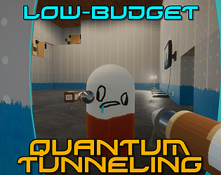
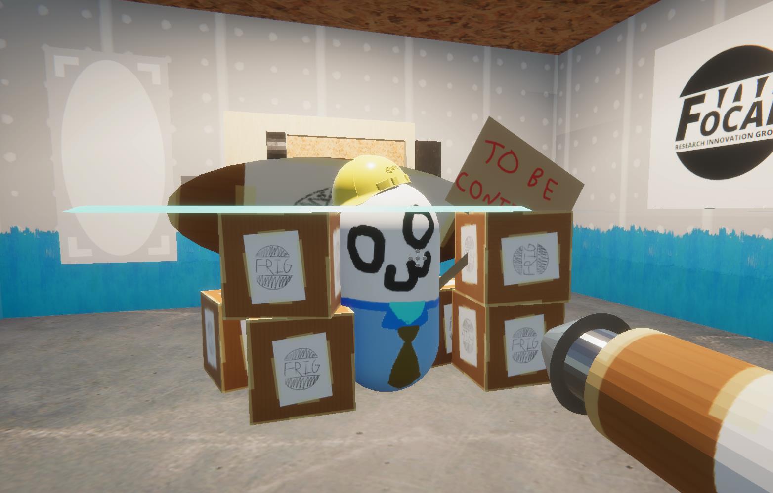
I absolutely love the concept and aesthetic of this game. It's a Portal demake... but it's also a Portal demake in-universe. The level design, or what I saw of it, was superb, with lots of interesting little details. What did you use to build the environments?
The portals didn't seem to work like I'd expect, or really work at all. I figured out I could move them, but I was only able to actually traverse them once and I'm not sure how I did it. Then I knocked one over and couldn't get it back up again.
With the motion blur and fancy HDRP lighting it looked almost like an Unreal Engine game. Unfortunately, it also ran like an Unreal Engine game on my laptop. It's not the strongest laptop, but it's not the weakest, either, and I was down to single-digit FPS.
Unfortunately between the janky portals (and possibly softlocking myself) and my laptop threatening to take off from the table I didn't get very far. If I have time, though, I'll revisit this on my gaming PC, because it's one of the more interesting entries I've seen thus far.
The portals weren't supposed to work - You use them as movable platforms
As for the performance, that's getting ironed out and should hopefully be fixed soon ^w^
I really liked the creativity in using portal mechanics in broken ways. It was actually fun to figure out impromptu ways to be the game. Hated being softlocked in a door, though :(.
Brilliant! Portal on a budget! I was a tad confused about the portal properties but knowing that they work more as platforms is quite clever!
I was already intrigued by the game page itself but after I saw it on the stream I had to check this out myself. As someone who has tried to make puzzles out of physics interaction in unity I'm really impressed by what you managed to get done in only a week! My games interaction still feels really clunky and I've been working almost 6 months on it.
I really love the low budget feel of the environment, really fits the theme of an Aperture knockoff. The environmental details are great and you really managed to make effective use of the example assets!
Luckily I didn't get stuck for too long at any part, though I admit the low FPS and motion blur didn't exactly help. I've worked with HDRP before so I know poor performance comes with the territory, but I think maybe an update to allow some of the effects to be turned off, or even just a separate download of the effects or quality turned down, would be a nice touch. If it wasn't for the shoddy performance I'd say the motion blur on the UI is perfectly fitting for a so bad its good game.
Overall though the concept was great and I think well executed I did miss some of the dialogue at the beginning unfortunately, not the games fault but my stupid anti-virus decided to open multiple instances of the game :/.
Well done!
Very enjoyable! I'm surprised that a game of this quality was produced in such a short period for this jam!
As others users pointed out, the performance issues and excessive motion blur did make the game somewhat difficult to play. Still a great experience though!
I enjoyed it, but the motion blur made it kinda unplayable for me.
Sorry to hear. Blame Clarence; I had no part in that lmao
-- Epsilon
I knew I’d be coming into a Portal parody, but I didn’t think it’ll actually tie into the actual game. The concept of a DIY Aperture Science is not only a thematic joke but actually used with the portals themselves, which is pretty brilliant.
I will say though, the portal view isn’t optimized at all, to the point that the game ran at sub-20 FPS at most times on my machine. Render Textures be heavy, y’all. Still, from what I played, it’s a superb take on the theme despite its performance problems.
Some performance aspects were definitely handwaved in favor of meeting the deadline. 😅
As it stands frustum culling is completely unimplemented ad there's three render textures always running... But that will definitely be fixed in upcoming releases down the line.
--Clarence
First game I tried so far, and colour me impressed! This is really one of the best SBIGJam games I've tried in a while. I love the whole concept, and it's pretty well executed.
The environmental details really add to the idea, and once I got the hang of it I really enjoyed it! There's not a whole lot else to say, but it was a really well-rounded entry. Well done!