Indie game storeFree gamesFun gamesHorror games
Game developmentAssetsComics
SalesBundles
Jobs
TagsGame Engines
A jam submission

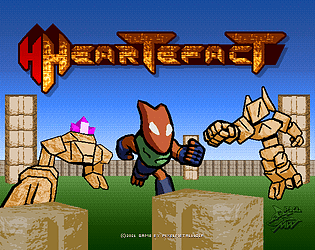
HeartefactView game page

An exploration mini adventure for WildJam30
Submitted by PixelMetalWolf — 9 hours, 30 minutes before the deadline
Add to collection

Play game

Heartefact's itch.io page

Results

CriteriaRankScore*Raw Score
Audio#283.4003.400
Graphics#323.6503.650
Controls#353.5003.500
Overall#433.3173.317
Theme#513.1503.150
Originality#533.3503.350
Fun#592.8502.850

Ranked from 20 ratings. Score is adjusted from raw score by the median number of ratings per game in the jam.

Godot Version
3.2.2

Wildcards Used
N/A

Game Description
You got your fists, your compass and your instinct goes beep beep

Source
No sorry

Discord Username
N/A

Leave a comment

Log in with itch.io to leave a comment.

Comments

Submitted (1 edit) (+1)

I really enjoyed this game, although unfortunately didn't have the time to play through to the end. The ominous stomping of the enemies chasing the player was really good and very intimidating for a new player - which is a good thing! I was actually a little creeped out by the enemies haha.

The artwork was lovely and well done and as others have said is reminiscent of a previous era of gaming, very nice. I enjoyed the treasure-hunting-follow-the-heartbeat mechanic quite fun, figuring out where to go.

Do I think the game could use a little polish in places? Sure

Do I think that the game is pretty damn sweet anyway? Definitely!

Good work, love it :)

Developer

Thanks glad you liked it :D !

Haha I didn't mean to make the ennemies THAT ominous though so i'm sorry if they creeped you out XD i just wanted to experiment a bit with having footsteps cause i wanted it to convey that they were heavy cause made of stone.

Yeah the heartbeat sensor mechanic was quite difficult to make work and cause me some trouble fixing so i'm happy that it's well recieved though not without its flaws as i noted from all the feedback.

Like i said i may have gone a bit overboard with the map's size and thus gamelength so i don't blame anybody for not having played it till the end if they couldn't, as long as you had fun that's what counts, especially considering the game's issues :p

Thanks again for trying it out and your feedback :)

Submitted(+1)

There's no winning against those golem things. I think the two parts of this game - the warmer/colder game and the combat - are a bit at odds with each other. I really liked the Mega Drive-esque music, though.

Developer

Yeah combat may need some tweaking, however it is still possible but some ennemies are harder without the upgrades, although i agree maybe a bit too hard :/

Hope you still enjoyed despite the flaws, and glad you liked the music, i can't resist having some megadrive - ey - sound whenever i can :p

Submitted(+1)

I was pretty happy with this game once I got to the end of it. I think a lot of the exploration and some of the combat systems ended up working pretty well.

I think it is worthwhile to describe a couple of the things I liked, and the things I didn't like.

I like the gamepad controls, they're what I used for the most part. I was sad that the joystick didn't work.

I never really understood what caused the hearts to spawn. It seemed like I would just have to wander in the yellow area for a while before the game decided to spawn the heart. This became especially confusing when I couldn't figure out what I needed to do to get past the beige walls. I think making the hearts visible at all times would be a better idea--I don't think it would hurt the gameplay, as the map is large enough that even very easy-to-spot things can be difficult to find.

I think the game is too long for it to erase all your progress when you lose. At one point I had to leave for a bit after playing for about half an hour; thankfully I wasn't killed, but had I died at that point, I don't think I would want to re-do the last half hour of gameplay. So the game should really keep all the upgrades, hearts, and levers that you've found after you die.

On that note, the game ended up taking me about an hour. I don't think this is really too long, as at least half of that I was having a good time. However, at times the sheer size of the map seemed a little much--in particular when looking for the third lever behind the fire blocks behind the beige wall. I think a little bit of tedium in exploration is good, but there might be just a little too much wandering around.

As other people have suggested, the other solution to this would be to make a minimap. One interesting idea could be to have everything but the hearts displayed on the minimap.

At first, I thought that the combat system seemed to fall flat because combat was very difficult--death was essentially guaranteed. However, I ended up thinking the combat system is very good. Before you get the fire upgrade, the combat is more or less impossible without dying, in my opinion, meaning that avoiding enemies is the way to play. However, combat becomes viable after you get the fire upgrade, and so the player's relationship to the enemy changes significantly even though the enemies haven't changed in behavior at all. I think this is pretty neat.

I also liked the variety of things that the player needed to find. Having to activate levers and find the fire upgrade--they were both very welcome variations in what I was looking for. I think maybe having a starting area with a lever that you have to find would help put me in this mindset earlier. That is, at first I wasn't aware that the game consisted of more than avoiding enemies and following the radar--the game started to feel much more alive once I was aware that there were more things in the world than just enemies and hearts.

I find the graphics to be pretty nice. I would have liked a better indication of how many levers each beige door took--the first lever I flipped seemed like it didn't do anything because the two doors I had seen thus far had not moved.

The tiles graphics give me this sort of Diablo vibe, maybe? I think they're pretty good.

I also like the repeated use of the gradient orb idea. It kind of reminds me of retro games that would have repeated use of palette-swapped sprites.

The end screen is very charming as well.

Overall I had a good time playing this game. I hope that some of my feedback is helpful somehow! 😅

Developer(+1)

No problem, your detailed feedback is welcome and sure to be helpful ^^

well the map size is a bit large indeed, like i already joked *George Lucas voice* "I may have gone too far in a few places" i tried my best at putting some landmarks and having the compas pop up so that people could have an easier time navigating by finding the center, but i realize i clearly didn't mark well enough the use of doors and levers and even the fact that they're here at all, which was especially dumb on my part cause when the doors open they hava an animation and well they're so far from the lever that it's not even visible  XD to clarify about said levers, the thing is that there's no complicated combination or anything with them, there's 3 in the map and each open a specific door, then the level design is one of the main reason that probably doesn't help with finding that out.

Still on some of the design flaws, here's how the hearts "spawn", they become visible when you are in a certain circular range from them, the main issue being that i made said range so small that you usually stay in the yellow far too long before it poping up, but then i agree i should probably change this to have them visible permanently, i initially made it like this cause i thought it might be too easy to find em lying around like that. Then the combat i mainly wanted to have the more powerful ranged enemies be a bigger threat to entice players to search for the upgrades, the other enemy may still need some tweaking but i tried to have it possible to beat without upgrades while still have them challenging enough to have a different feel while having the upgrades. And finally the lack of any kept progress upon death is just a simple oversight on my part because of the deadline, but i feel this is one of the main change i should have to ease player frustration, a main fault i'll also admit is that since i didn't anticipate well enough some of the other issues, the playtime ended up being longer than i thought to complete the game. I'll try to experiment with the fixes, minimap or otherwise but i'm taking note of everybody's feedback so far ^^

On another note, glad you still enjoyed the game despite all these issues :p 

I've played my share of Diablo back in the day and i'm humble to be compared to it graphically even though i'm nowhere near the level of blizzard artists XD The repeat use of some elements is also kinda out of necessity to save time cause of the deadline but i always try to see if it looks alright before keeping it that way everytime i do something like this, and hopefully in that case it did :p and while i really love games that immerse the player in it's world, i also have a soft spot for games that have clearly "video gamey" type of items on display.

Thanks for taking time to try out my game to the end, and giving this detailed insight !

Cheers :)

Submitted(+1)

I really enjoyed this one. The balance between the enemies agression and your ability to escape them is really spot on imo. That and the heart beat radar is what really makes this shine for me. Sprites are great as well. I found combat a bit hard, but I'm not very good.

Developer

Thanks glad you seem to like it sprites and all!

Yep combat can use a bit of balance more my fault than the player's tbh, although what i intended in a way was that some enemies are meant to be too powerful to face without upgrades so that you can't just empty the map before going for the heart pieces.

Thanks again for giving the game a spin and sharing your thoughts :)

Submitted(+1)

This is a nice exploration game, but it's easy to forget lost and not know where to go. Some of the hearts are blocked behind doors that I haven't opened, and it took me a long time to find that there are levers that you need to use to open them.


What could help is either a map to help show where you have already been or distinct landmarks that people can use to say "I am here".

Developer

Yeah i feel like i didn't properly indicate that the doors are opened remotely from the levers and it's not helped by the size of the map :/

I tried to have some landmarks but i feel like i didn't do some distinct enough  to help navigating, but lesson learned i'll se how i could improve this.

Thanks for the feedback and i hope you liked the game despite the flaws :)

Submitted(+1)

I always die after about 3 hearts found.

Its a really good idea and fun too play. Unfortunatly i'm too bad to get very far. xD

A minimap would be very great!

Developer(+1)

Well i feel like i didn't properly balanced the difficulty, considering feedback so far so more on me than on player's skill i'd say :p

Yeah a minimap could be a good improvement, but i still have to learn how to do that XD

Hope you didn't had too bad of an experience with the game anyway, Thanks for trying it out :)

Submitted (1 edit) (+1)

Oh, it wasn't bad at all!

Running away while still trying to find the hearts was pretty intense and fun!


EDIT:

The minimap is a good point... haven't done this either. A nice goal for the next jam :P

Submitted(+1)

I really enjoyed it, took me back to the Knuckles levels in Sonic Adventure 2 Battle on the GameCube, which I think was your inspiration for the main mechanic here? I did a certain number of loops around the map, found some hearts but never found the fire punch, and felt very weak without it (died multiple times trying to take on enemies one by one). I'm always amazed by the quality of games you make as a solo developer! If you have a tutorial on how you did your asset workflow from Blender to pixels I'd be very interested in that :)

Developer

Thanks willow :) 

Yep that was the inspiration for the mechanics i tried to see if it could fit for 2d gameplay and tried from what i know with the engine to make something similar.

Yeah i think i have the view a bit too zoomed in so it's kinda hard to see the powerups and other stuff which i tried labeling as best i could, but if you ever want to give it another go to see the ending, there's a small hint in the pages screenshots, that could help you find it, and you do have to open a switch operated door to access it :) i admit i might have made the player a bit too weak without upgrades though.

I'm humbled ^^ coming from someone that has such polished projects as you did in the past with your team last jam i saw ! 

Well i'm not sure i'd be good with tutorials but maybe if i find the time i could try finding a way to make some someday, 

if this helps most of the blender side of things comes from tutorials on shaders on youtube like Defaultcube's or Cg Cookie, they mainly focus on ultra high def stuff that personally would set my computer on fire if i tried to render them but the knowledge from some of their stuff can apply to make some more retro effects, and the rest i usually manually finnish up in gimp, takes some time but a whole lot less than animating by hand :p

Anyways thanks again for trying the game out :D

Submitted(+1)

Cool game! I had a bit of a hard time navigating and I was struggling to fight the monster that shoots the purple stuff but still had fun. The world is pretty interesting to explore and I really liked the music. The punching is pretty satisfying as well. 

Developer

Thanks :)

Yeah the shooting monster is a bit hard to fight, while not impossible even when i playtested i couldn't beat one with just the punch and default hp, the idea with it in terms of balance is that you can avoid it and if you're upgraded you have a better fighting chance against it ^^

Submitted (1 edit) (+1)

Once I got into the swing of things and figured out what I needed to do, it was fun! Good game :)

I really enjoyed the art style you created, super charming. Also great name!

Developer(+1)

Thanks for trying my game out ^^ glad to hear you had a good time, liked the artstyle and name :p

Did the best i could :) 

Submitted(+1)

The sprites and designs looks great! The music is also nice, but it got progressively more annoying as I explored the world. I think something more ambient and calm would be a better fit for this kind of game. I really liked finding the fire punch upgrade, felt very rewarding!

Developer(+1)

Thanks Gemini :) 

Yeah the music could be better, i made it a bit late into the project so  i made a way too short loop without much variation :( i had a more chill idea in mind, i wanted to have something in the vein of Shadow of the Beast's first level but didn't manage to find the right sound for it in LMMS so i moved to Bosca and made a simple tune and  i didn't wanted the game to have none.

Glad you liked the firepunch ^^

Submitted(+1)

Yeah, I know the time limit can get pretty tight to do art, music and programming, specially if you're going solo. So good work on managing to deliver a complete package in the end! 

On another note, not sure if you synth your own instruments on lmms, but there's this great synth called Vital, and it's completely free. Maybe it'll help finding the 'right sounds' in future projects! It certaintly helped me.

Developer(+1)

Since i started Lmms i mostly made due with some of the presets and packed in plug ins, i actually installed a genesis vst ( Genny ) which sounds pretty dope, but i'm not sure how this goes copyright wise cause this vst is free but has some of its samples like the "Go" from sonic 3's launch base and such so i've been hesitant to use it.

Thanks for the recommendation, i'll look into that :)

Submitted(+1)

At first I thought the game is broken, I was going to leave the comment that I can't start it when I press the mouse on the "START" button, but pressing space worked. Not sure if you intended it that way, but if not it's probably some UI element blocking mouse events.

Game itself is nice. Art and music are great. I was getting lost in the big open world :) Perhaps changing top indicator flash frequency as you get closer would help - but that would take longer to implement of course.

Ranged enemy got me, I couldn't get past it :D

Developer(+1)

Yeah that's a bit of a design flaw on my end, the thing is this jam i spent quite some time stuck on some bugs in the project, so i didn't make any kind of menu system, so i just embeded a "START" prompt on the titlescreen not thinking ahead that it would be confused for an actual button :p i should have added a "press space to" to make it clearer, so thanks for your patience and trying the game anyway ^^ not sure if this could be considered a bug so i may not be able to patch it while the jam is still going.

Glad you liked the game itself still, i wasn't sure i'd be able to make many levels with a good enough quality and no proper end, so i prefered focusing on a single map and make it the best possible and i made it quite big (*george lucas voice* "i may have gone too far in a few places") to not have the game be too short (even though it kinda is XD) and the game is finishable this time.

And yeah the indicator how it is now is the best i could do given my knowlege, the jam's deadline and the fact that it had a lot of bugs to fix before release XD

Ranged enemy is kinda hard, but while technically possible to beat with your fists, i made it so that you have a better chance against it with the fire and hp upgrade :)

Submitted(+1)

Lovely 3D-ish art! I liked how you made all the characters (as well as the Cover Screen) look so unique!

As @Ruben Gardiner mentioned the music is fantastic! Well done!

Developer(+1)

Thanks glad you liked it !

i tried to have everything be as cohesive as possible , and it's always nice to see that people seem to like the effort ^^

Thanks for giving my game a shot  :)

Developer

Thanks glad you enjoyed it !

Did my best to have the most polished game i could with all i learned so far and managing having only a week to do everything except the font for the start menu end end text.

I went a bit experimental with this mechanic so i agree that the detector mechanic lacks a bit of precision :/ 

Thanks again for trying it out, and happy that you liked the game (and usernam XD) cheers :)

(1 edit) (+1)

Enjoyed it a lot. Love the character sprite very cool design and all the ancient guardian characters. The music could have easily been in a snes game especially with those punchy bass samples. Its a little tricky at first trying to read exactly where the heart is telling me where to go, but i eventually managed to collect a couple of hearts.  Well done Pixel metal wolf (great name btw!) especially for a one person team.