Play game
IsoGen's itch.io pageResults
| Criteria | Rank | Score* | Raw Score |
| Completeness - Is it an unfinished tech-demo, prototype or a complete game? | #27 | 3.957 | 3.957 |
| Overall | #41 | 3.557 | 3.557 |
| Gameplay - How fun is it to play? | #47 | 3.478 | 3.478 |
| Theme - How well does it incorporate the theme? | #52 | 3.304 | 3.304 |
| Audio - Does the game have nice sfx and music? | #63 | 3.435 | 3.435 |
| Graphics - Is the game aesthetically pleasing? | #77 | 3.609 | 3.609 |
Ranked from 23 ratings. Score is adjusted from raw score by the median number of ratings per game in the jam.
Leave a comment
Log in with itch.io to leave a comment.



Comments
Confusing at first but once you get the hang of it, this game can be fun with the resource management aspect.
It is fun and I enjoyed playing it.
Nice game, it's fun, congratulations !
Thank you!
Good control and movement feel, some resource management and illusionary walls, this was fun.
Thank you!
At first i found the fov a bit disorienting but honestly i think it worked super well with the feel of the game! the concept was really well done and it was pretty gut wrenching at times! somehow this game manages to pull off evoking emotion really effortlessly! the art style was pretty good and so was the sound design; this is the one game in the jam where i didnt find myself skipping through text and really reading through the story! well done! although, if you plan to release a post jam version, could you add an option to make q and e rotate and a and d strafe instead?
Thank you! It's really great to hear that!
I suspect I won't make any updates post-jam to the movement, mostly because the engine I'm using defaults to the configuration I've used. But I can see from playing some of the other games that a and d for strafe is a lot more common! so I will keep that in mind for future projects.
The graphical style in this entry is chef’s kiss.
I absolutely adored this game and my only complaint is… when can I play more?
seriously, do you plan to make more? I need it in my life!
Great job!
Thank you very much (though I have Kenney to thank really for his amazing art packs).
I'm still considering if I'm going to continue the game, on one hand, it was really fun to make, and I do have a more fleshed-out story that I originally wanted to add to the game but I'm also pretty happy with how it turned out and thinking about what my next project could be.
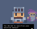
Victory comes at a really high cost! I love the simple graphics, it works really well. I have a single complain, when choosing a memory to sacrifice, I often advanced the text too fast and pressed "yes" without meaning too. For instance, I sacrificed a memory worth 7 points for a 3 points fight. It happened to me a lot.
I love how the controls are seamlessly explained at the beginning of the game, that's a very nice touch. Great job!
Thank you, I was really happy with myself for the tutorial :D
Good point on the sacrifice selection, that should be straight forward for me to resolve.
Nicely done. I love all the good feels, and sense of regret. Movement was fluid. Atmosphere was nice. mementoes were interesting.
Thank you :)
Really nice little quest!
I liked the pixel art, the original 'battle' system and the effort you bring in telling the story and the tutorial.
About the possible improvements, I think you should add a compass (plus it seems that when we come back from a battle, the orientation can change). The main path is marked by some banners, but it lack of some reward for those who explore other areas (I had a game over for exploring too much). I was gaining positivity but it didn't help much since I spent all my memories while exploring. Is there any use of the positivity stat, I did not understand that part?
It could be nice to access memories and knowing positivity when we are not in battle. The 'puzzle' room should probably be smaller (and maybe add some mechanics more like a puzzle, like not being able to walk twice on the same tile) :D
Great work!
Thank you for the feedback!
I was aware of the orientation bug, and it's only just now I've realised how I could have fixed that! (Typical right!)
I agree with the puzzle room being a bit too large, I really should have shrunk it, I don't really have an excuse for that one :D
And thank you for the other ideas that I could incorporate as well.
Nice! The movement feels great and the aesthetics are simple but effective. I wish monsters would look a bit more colorful to see them better in the fog and dungeon. The bridge scene was great and having people cheering you up and believing in you is cute. Sacrificing memories must feel terrible!
Thank you very much! I made a deliberate choice to keep the monsters grey scale, but I agree I think it would have been clearer if I hadn't.
What shall I say about this game.
I found it charming.
I found it interesting that being valued for what and who I truly am was more important than the memory of my first love.
So it was delightful.
Volume controls would have been nice.
Thank you for your kind words. I had really hoped to get volume controls in, but unfortunately didn't have time.