Play game
VaporRunner's itch.io pageResults
| Criteria | Rank | Score* | Raw Score |
| Audio | #176 | 3.607 | 3.607 |
| Fun | #213 | 3.607 | 3.607 |
| Overall | #335 | 3.470 | 3.470 |
| Graphics | #367 | 3.679 | 3.679 |
| Game Design | #399 | 3.429 | 3.429 |
| Theme | #547 | 3.357 | 3.357 |
| Innovation | #560 | 3.143 | 3.143 |
Ranked from 28 ratings. Score is adjusted from raw score by the median number of ratings per game in the jam.
In what way does your game fit the theme?
Rewind mechanic on left click and retro/vapor/synth aestethic.
Did you write most of the code yourself and made all the assets from scratch?
Most of the code is written by us. The only asset used is a Royalty free song under CC attribution.
Leave a comment
Log in with itch.io to leave a comment.


Comments
This game is so cool. I really like the movement and the rewind mechanic. It is very fun to play!
A fun game that fits the concept quite well :) Feels great to sort of parkour with having the ability to rewind obstacles! I liked the glowy style of the game, and the audio is quite ok although could be better.
Overall nice concept & visuals, great work :)
Would appreciate if you could try & rate our game too: https://hadilepanda.itch.io/corewind
I realized at the end of writing this that I MIGHT have written more than I needed to write, but I'm hoping this long critique helps your game in the future.
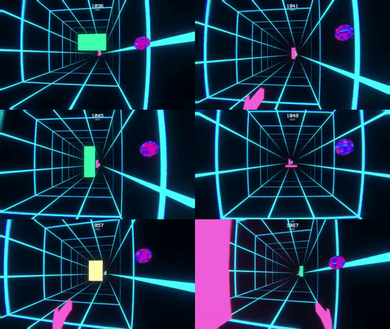
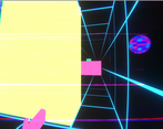
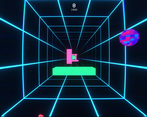
I really like the visuals that this game has. The game almost has some TRON-like aesthetics with a twist since it's using a hot neon palette, rather than the regular neon palette that TRON has.
I also enjoy the hand animations that play out throughout the game; it's small details like this that make you feel like you're playing a human-character. Perhaps in a future update, you could add more hand animations for the jumping and sliding to give it some variety.
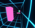
One of the notable hazards I liked was the thin wall that moves either to the left or the right. The reason being that it stops the player from just constantly spamming the rewind button in order to win since they could potentially rewind the wall right into their face. I find this to be a great design choice.
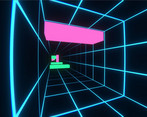
I'm not sure if I'm a fan of the walls and ceiling having the same grid, it's giving me a bit of tunnel-vision looking down the path with all the squares surrounding me. I personally think the walls and ceiling could be either darker colored, or not colored at all while keeping the grid on the floor. This is so the hazards can pop out more easily, and so players don't get sick looking down the end of the hall with a repeating texture.
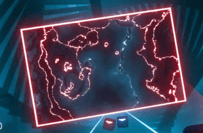
There also seems to be a few moments where it's hard to tell how far away the hazard are. Perhaps if there were some small dust particles floating around that glow near the obstacles, it would reinforce the 3D space of where the obstacles are placed. It would also be helpful if the hazards had some sort of texture on them, it's hard to tell how far away the hazards are from my face if they remain as one static color the whole time. I would suggest having some sort of wavy static effect as a texture for the walls, similar to the walls used in Beat Saber:
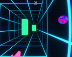
The floating orb really doesn't seem fit with the square-styled look of the game. Everything in the game seems to have a rectangular shape style to it, and the roundness of the orb seems to stick out like a sore thumb. It's also kind of distracting having a random spot sticking out within a game that involves a lot of visual reactions. One suggestion I have for is to remove the orb, and instead have rewind action involve the player's hands doing a quick clenching animation (or any kind of magical hand gesture) to show that the running character is using their powers.
It would also helpful if there was a visual representation on what section of the grid the player is standing on. It would be helpful if the section of the grid that the player is standing on changes to a different color so the player can visualize if the oncoming hazards are going to hit them or not.
The vibe is pretty awesome. It feels pretty epic to run passed a few walls but that's just about as far as I can get, it's pretty difficult. I wish crouch was a more natural button like left shift or S, I feel like that would help with the difficulty in my case. I can Imagine it being a lot of fun if I was good at it.
Thanks for the feedback! No worries, we're already working on both the difficulty and controls.
Good to hear!
Foarte polished jocul ! Arata super bine si sonorul e excelent! Singura problema pe care am intampinat-o e ca obstacolele sunt prea apropiate unele de altele si e foarte greu jocul din cauza asta.
Buna treaba in rest!
Buna! Imi place sa vad romani pe aici! Ma bucur ca iti place jocul si legat de dificultatea jocului, fii fara grija! Vrem sa schimbam asta in viitor. Apreciem feedback-ul, ca de-obicei! :)
Graphics are amazing although it gets boring after like 5 minutes
Thank you for the feedback! We are sorry you feel this way, though! We tried making it making it a challenging for every person, we obviously made the game too hard and we're gonna tweak it. If you have any suggestions, we're open!
The aesthetic and music complement themselves in a super neat way, it runs very smoothly even on Ultra Graphics on my pc (My pc it's not very powerful lol) and it looks really nice, the speed and the rest of the design also complements themselves with the rest of the game. Really cool!
Appreciate it! My friend, cristianrosiu, told me your game was also pretty cool and rated it.
This game is really cool and definitely has potential. I think the main thing to be improved upon is the learning curve which is very steep. Maybe the game should start a bit slower and then speed up. Otherwise, great work!
Appreciate it! Especially coming from someone that made that game honestly. It was really good
Tough as nails and would really benefit from some carnage when you hit something, so as to minimise the frustration of failure.
Thank you for the feedback! We actually thought about that.. You're saying we should let the player "hit" a little more of the obstacle or something, right? To make it more forgiving. That's what I understand. As for it being "tough as nails", we agreed we should tweak the difficulty. It's a bit frustrating that you get used to your own game and aren't as objective, the more you test it haha.
Really cool idea, though movement feels quite stiff, you should be able to move while in air, or atleast make it possible to do immditlly after landing, also i would recommend you to work on your UI, you could add scaling to canvas, just click on canvas, and in inspector in canvas scaler component set it to scale with screen size, other than that, game was pretty cool
Hello! Thanks for the feedback! I just tested and you can switch lanes while mid-air, there's no restriction to that? Maybe it's a problem with the build, I'll look into it. And as far as I know, my friend made canvas responsive. Does the canvas not scale correctly on your screen? We'll look into this anyways, thanks for bringing it to our attention. It really helps!
well maybe you guys just uploaded wrong build, UI was pretty small on my 2k screen, and when i changed to Full HD it got a lot bigger, so that's why i thought there's no scalling
I think you're right! Thanks !!
Great game! It it very hard to maneuver but it is a great game
Thanks for the review, all the love !
Visually awesome looking game, but it's missing some juice... Maybe more SFX when rewinding an object, some particles, footsteps sound.
Thank you! It definitely needs some juice in there. We tried to keep it simple and not overdo things as it was our 2nd game jam. This is still something that is on our "to do" list after this phase is over.
Extremely difficult while incredibly fun at the same time ;) Also loved the vaporwave aesthetic to it.
Our intention wasn't to create an "extremely difficult" game, so we will definitely look into the "difficulty" aspect. The main idea was to incrementally increase the difficulty as the player reaches longer distances.
On the flip side, really glad that you like how the game turned out in the end. We really think that, with some improvements and adjustments, we can make this game playable for almost any skill level.
Cool vibes. Super hard, but instant restart & back-in-the-game flow makes it easy to keep trying over & over! My small bit of feedback-criticism maybe kind of clashes with others, but I would actually reduce the time it takes to reach the first obstacles (move the player closer at the start) because those precious… 3? seconds can feel long if you try a lot (and fail a lot, like me, hah) - perhaps not for the very first time you play though, if you wanna get fancy with it :)
I had the most trouble with the jumps, always find it hard to do first-person platforming in games.
Good job!
Thank you for the feedback!
Holy shit, this game is hard, but also addicting. I reached depth 150 (don't know if this is good or bad). I also think that would be good to use W,A,S,D , or at least ctrl for S. Good job, I had a good time playing this.
Love to hear that. Our ASAP priority: changing the difficulty of the game. We really got used to play testing it ooops haha. Also, going to add WASD as primary keys next update, don't worry :)
The vaporwave style is awesome and the game is pretty intense from the start(which i personally like), so i had fun playing this. Great job!
Love to hear that! We'll rethink the speed start and progressive growth in order to let everyone play and enjoy the experience. Thanks for the feedback! :)
Simple and fun, I love the vaporwave aesthetic!
Maybe make it slower at the beginning or at least fewer obstacles since it's kinda hard to get used to the mechanics straight away, otherwise, excellent game :)
Thank you! Noted! Will make a patch after the voting period. :)
That's a nicely done game. I'm a vaporwave connoisseur myself *tip neon wine glass and raise my rave wire hat*
But it's quite challenging. It could be better to make the obstacles less dense at the start. Seeing it's random anyway I don't think it would be that hard to implement if you wish to continue developing it.
Also maybe it would have been easier for the player to only use W,A,S,D for movement because it's disorienting having to use ctrl and space. Maybe space is more ok than ctrl, but I think wasd would be a better choice.
But don't get me wrong, I enjoyed the game. You getting point for rewinding the platforms is a nice touch
Thank you for the review! I think I get what you're saying with changing 'CTRL' for 'S' and 'SPACE' for 'W'. Maybe we can come somewhere in the middle and do both :) (We already want to add lots of settings as we had no time left in the jam for that sadly). And we'll make the game start easier, or at least give different difficulties.
Great job! i really like this game! I have fun playing this game.
Thank you! :)
First of all, it's fun. There are some details that I didn't like. On my first game my character was looking at his side and it took me some time to understand what to do xD. Also I'd have liked more clarity in the rewind mechanic, because, although it was explained in the instructions, someone could want to get into the game without reading them (like I did). Finally, the game could be a little more forgiving to the player, for example having more space between the obstacles and making jumps last longer, but that's just personal preference.
I still enjoyed it though, it was very well made. The atmosphere was really cool
Thank you so much for the comment! I would definitely look into the camera, as I think I know what you're talking about, sometimes it feels like the camera is not necessarily looking straight ahead at spawn. (It's because you load when you press play and move it around before you actually see what happens). We will look into making instructions more visible and as of the game being a little to unforgiving, I could make it ramp slower, but the jumping lasting longer could hurt the game as the forward speed increases in time and you could hit a wall before you jump again.