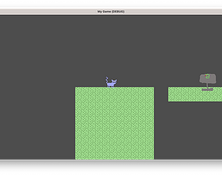
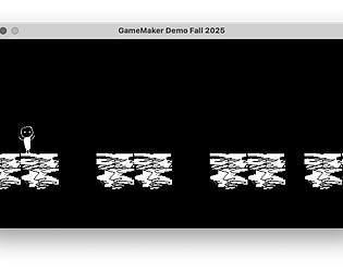
Looks good, I like the simple graphics. I think the player feels a bit slow, it might be interesting to increase the speed a bit. The UI is covered by the coins sometime, so its hard to see. I like the last level with THE END as platforms.
owenbmcc
Creator of
Recent community posts
Nice work, I really like the graphics in this game, the mix of more pixelated and more detailed graphics is interesting. The game play is good overall, but its not clear to me what some of the items are, like the sleeping dog and the item that looks like a steak. Are those scenery or collectibles? Also the lives count is missing an icon, so its unclear what the number is referring to.
Nice work, the character design is cute and I like how you have a series of levels with increasing difficulty. It looks like the character gets stuck on the platforms. Double check to make sure your platforms are not overlapping and the character is centered on the origin point, or set to use one collider from the default sprite. I would also add a reset for when the player falls below the game window.
Nice work, I like the graphics and how each level has a unique design.
I would add a reset when you fall off the platform, otherwise you have to restart the browser window.
I think I would also swap the walk animation for the jump animation, the little spaceship is cool and it seems like I spend most of my time jumping, so I would be interested to see that more.
It also seems to end abruptly, I would have it go back to the beginning.
Nice work, this looks great, and the physics are fun to play with, I like that the jump increases power when you hold the jump key. The parallax background and snow particles are really nice for the ambiance and the platform graphics look great.
It gets pretty hard pretty quickly, I would add a bit more just movement and easy jumps to the game to get the user used to the controls before you die a bunch.
There's a little ledge next to the first cliff for the first jump, I'm not sure why it's there because if you go down there, the only way to go is back up to the right.
My impression is that the best way to stay on the moving ice platforms it by doing a bunch of little jumps, I'm not sure if that's intended.
The second level is really hard, it seems like the challenge goes from 0 to 60 all of a sudden. I could only make it to the ice platform a few times after trying a bunch, and then I kept running into the block platform with the cherry and dying.
I think the fun of a game with this kind of physics is going fast and jumping high and timing jumps, but it feels a little to difficult in this version, I would add some more easy jump to get the player going and be able to string together a few jumps in a row.
Nice work. The graphics look good, and the progression of levels so far works. I would make the game window in itch.io match the size of the viewport so that the game is full visible, or set the game to open in full screen. There are some issues with the platforms as we've discussed, but it's not so bad that you can't finish the game. The jump goes very high, which makes sense for the space theme, I think it might be interesting to play with the placement of platforms so that you can jump up or down and discover new platforms, maybe make the gravity lower too. I would space out the UI a bit too so you can more clearly see the sprites and numbers being displayed.
Nice work, I like the minimalist graphics and the pace of play. The gameplay in the second level is much harder in the first because the viewport doesn't move until the player get to the very edge of the window, so you can't see the eight balls until they're about to hit you, so you can increase the horizontal edge of the viewport to fix that. I would also add in a reset for when the player falls below a certain y value so you can reset play and don't have to reload the game. It could be interesting to vary the speed and direction of the eight balls so there's a little variety to the challenges.
Nice work, this is fun to play so far. I like the sphere animations, they are well timed with the movement so it feels natural. The mix of pixel art and cartoon drawings is nice. The art on the first level seems to be clearer than the second level, maybe an issue with scaling or the viewport setup. It took me a while to figure out how to get past the area with two spaceships bouncing of each other, it was a good challenge, but I feel like one slightly easier challenge could come first. I like how once you get past that challenge you can go back to get the crystal that you can see at the beginning of the level, this is good foreshadowing. I like the "To be continued" level as the ending.
Nice work, I like the artwork and story a lot. The gameplay is very simple, but that's okay since the focus seems to be more on the artwork, environment design and storytelling. One improvement could be to make walls from some of the tiles that appear to be separating the game space, there seems to be a sky area and ground area, but the player can move between them, so this encourages the player to explore the space, but there isn't anything to interact with, so it isn't really necessary, it's better to just appreciate the artwork and scenery.
Nice work, I like how you started to vary the scenery in later rooms, I would also vary the scenery in the second room because its more or less the same as the first room. The treats don't get used for anything, so after getting through the first room I stopped collecting them, there's no real reason to collect them. You could add a character that will exchange a key for treats, or add more variety to the dialog when collecting a treat to create more interest around the treat component.
Nice work, I'm glad you fixed the doors because it was fun to play this game and explore the world you built. I think working with the Fallout theme is a good way to create familiarity for players and do your own take on the world. The graphics are really well done, it's easy to navigate the world, and the world items invite the user to explore the space and see what everything is. There's a lot of dialog as well that's fun to read.
Nice work, this has a nice variety of different layouts so the rooms have a sense of uniqueness. This is kind of an interesting case where the crystals are framed as a reward but end up acting as an obstacle due in part to the limitations of the game engine. Once you pick up on the fact that collecting crystals doesn't really do anything to help you progress in the game, it actually becomes better to avoid the crystals because each one opens the same dialog box, requiring more keypresses just to move across the level. You could have some ways of fixing that, like requiring a certain number of crystals to get to the next room or randomizing or updating the dialog that you get with each crystal so there's more incentive to collect them.
Nice work, this is a nice concept for this project. I think it would be a bit more challenging if some of the tiles were walls, it looks like there are blocks of trees and maze walls but since you can walk over them, you can walk directly to the bones and collect them all without any obstacle, so after a few rooms of running around collecting the bones it feels a bit repetitive. I would think about using walls, or other ways to vary the experience between rooms.
Nice work, I enjoyed this a lot, the color scheme and graphics work well together, the scenery is interesting and abstract and encourages exploration and discovery. I like how the second room resets itself with a vertical swipe transition, it creates a surreal sense of deja vu, which is interesting in a video game context. Each room seems to play with the aesthetic theme in unexpected ways. And I like how it loops back to the first room at the end, that creates an interesting loop that echoes the second room.
This is a really interesting and cool premise for this type of game, I like how it starts really simple and each level gets more busy and chaotic. At first it was confusing to find the room exits but once you establish that they are hidden its fun to try to find the right place to exit and it makes sense with the castle theme. There's a nice variety of items that imply good and bad outcomes as you progress through the game. I like the simple line graphics as well, they're a nice touch. And the music fits the theme well.
Nice work, the graphics are well done, the bread item is really funny and the fish animation is nice. This has a good structure, there's a simple gating setup with the maze and a clear ending to the game, which makes a satisfying play through. Each room has a unique design which encourages exploration as well.
Nice work, this is a good premise for the game, the player will be highly motivated to find and collect all of the money. One simple improvement would be to change the dialog with the uncle when you get back with all of the money, since the last room has no other exit, it seems like you should go back to the beginning to talk to the uncle. You could also add an exit so the player can go out to buy their game. It's funny that this presumably all takes place in one house but each room has a different color scheme, that would be a crazy house!
Nice work, I like the details of this project. The room with the large tree is an interesting surprise, and it's funny that the room is linked to itself so if you leave one side you return on the other, this makes the game feel surreal. The final hidden room is an interesting ending, but it's a little unclear that it is the ending, it would be good to add some dialog or a restart so it's clear that that's the end of the game. I also like how you added multiple doors between rooms so you can walk up to any edge and go to the next room.
This is a funny take on this project, it's interesting to build a game out of the default example assets built into the game engine, but I think there's ways to make it more engaging. If you want to stick with only using the default assets, I think spending more time on the levels to make them a bit more maze-like so it takes more time to move through them, or more visually different, currently each level looks very similar and is very easy to complete. Another direction would be to make your own sprites and develop the game a bit more after a few default tea levels, that would add some original and unique levels and be one way to play with the expectations established by the tea level.
Nice work, I like the concept for this project, since people are familiar with Fallout, this is an interesting way of engaging with the existing content, the pixel version of the items from the game encourage the player to explore and understand more about how the game world has been represented. Although the door issue is preventing me from exploring the game now, I did see you have lots of rooms and content, so I'm excited to explore more once the doors are setup correctly.
Nice work, the narrative and writing for this area really great, it builds up tension as you learn more about the world and I started to actually get worried that I was going to die when I went into a room or investigated one of the creatures. I can see why you were asking about the ending, it does seem like it's building towards an ending but that never seems to arrive, unless I missed something. I think it might make sense to have a room where you either encounter a final creature or have some sense of completing the exploration, I felt like once I got the mask something else might happen, so I wasn't quite sure if I had found everything. Another small suggestion, the doors are mostly centered between three tiles in most of the rooms, but there are couple of doors that are in between 4 tiles so they are off-center, it's a small difference but it made me unsure about where to find some doors as I was exploring. I think you could make sure all of the openings are three tiles wide, or you could just add more doors so it's easier to hit the door when you read the end of the hallway. But overall this is well constructed and really encourages the player to explore and learn about the fictional world, there's some nice moments of humor and lots of intrigue about what's happening in the lab.
This is great, there's a lot to talk about because there are so many nice details, I'll try to mention a few. I like the visual language that gets established after you start moving around, there are some shapes, the lines with different sizes, that block the player, and others that are just scenery, and it quickly becomes apparent, which works really well. There is a really nice variety of scenery, some of it is really simple, some more complex, and it gives the whole game a very natural environment and every room is engaging to look at. The dialog is very well done, there's a lot of attention to detail, its nice how the sprites have initial dialog and then dialog options for multiple visits, it encourages exploration, and its good to have the doors locked to force the player to interact. I really like the rooms where you have a small path to go through and there's a lot of scenery that's inaccessible, it makes the world feel large and detailed. There's also a nice balance of humor and narrative in the dialog. It did take me a bit of exploration to figure out how to leave the first room, but once I realized there was a pathway, it was easy to recognize in subsequent rooms, but I might add a couple more tiles to the path in the first room to make it stand out more.
Nice work, this really tests the patience of the player! I eventually realized that I didn't need to go through every possible square in most of the puzzle levels to get to the end and so it didn't take as long as it probably could to get through the game, but when I thought I might have to collect every single key I was definitely feeling a bit annoyed! But I like how you're playing with the constraints of the medium, skipping through text, hiding keys within keys and the narrative commentary adds a good satirical voice to the project that fits with the theme. I think the pacing is really well done, the levels get more and more complex, each building on the expectations of previous levels, it does a good job of bringing the player through the challenges, there's a reasonable transition from each level to the next.
Nice work, I like how you used images to illustrate the choices at each stage. It seems like there are two endings, and you go through most of the same choices regardless of what you choose along the way. I would consider adding another thread that maybe deviates a bit more from the main series of choices to add some more variety.
Nice work, the structure of this project is good, there are different paths that converge and a good variety of choices.
I think this is a typo: "This guy presents himself as the an spirit" it should just be the or an
It looks like there is a missing image link on the page that begins: "You ran into the police station and you found two officers that are old friends of you on the station". It seems like it should link to an image from the article at the source URL, but that doesn't appear to be a Creative Commons or Public Domain image, so I would find a new image with an appropriate license.
It looks like most of the images used are not appropriately licensed.
The first ending I got was "You died several times but you still made it. Take care, buddy." This is a good joke with this medium, you can die on different paths and start over.
Nice work, this is a good premise and has a good voice, and clear choices. It seems like one path ends here: "You get up off the bed that apparently belongs to the girl in front of you and try to orient yourself," which feels like there should be more, maybe that is coming. I like the twist in the path where you are not in your own room and the options are "What?" and "What?!", thats a funny play on the medium.
Nice start, I like the concept of choosing the sneakers leading to unforeseen events. Both directions seem to end abruptly, the link "only remember the last 5 mins of his last routine" goes to a blank page. The other direction goes to "he has no sense of how he smells to other people" which is an interesting direction but seems unfinished, if that's the end it should be a bit more clear, but it seems like it should lead to further events.
Nice work, this story uses images really well and has a great mood. There are a few paths that could be improved. There's a path that ends with this sentence: "You wake up extremly scared than what you should've which leads to you passing." I'm a bit confused by this, what is meant by "passing"? I think that sentence could be structured more clearly.
The passage "You shake and tremble in fear but you just go to bed instead" seems to loop back on itself, I'm not sure if this is intentional.
I like this idea, but I'm confused by this link: "Your 10 years before", I think it might make more sense as "you're 10 years before" or you are? But I think it might need another word, like you travel ten years in the past, or you realize its 10 years before, maybe?
It looks like there's a syntax error in the code on the "Eat breakfast" passage, it looks like it may need to be inside a macro with (). We can troubleshoot in office hours if you are available.
This is a good concept, I like how it highlights the consequences of the player's decisions. I think it would be more effective to simply create paths that end in the player either failing or passing the test based on previous decisions. Right now, the choice is presented to the player to choose whether they studied or not at the end, but you could us a variable to save that condition, or just use different pathways based on the player choices.
Nice work, this story has a lot of twists and turns! There are a number of interesting dilemmas and a clear goal that drives the player. There are some code and formatting issues that should be relatively easy to fix and make the project look much cleaner.
There is an image that is too large on the page with the text: "You're on the road and have to stop for a an elderly woman."
You could resize the image in an image editing program, or you can use a width of height attribute in the img tag in the passage to fix that, ie <img height="400" src="...">
It looks like there is a syntax error in the passage that starts "Let the ducks pass by as you wait for them to cross by safely"
I'm guessing there is a missing ( at the beginning of the line of code. I think that is causing some of the other errors as well, because it means that the variable is not being set properly.
Nice work, this story has a lot of good details, the story world is well fleshed out and easy to understand. I like the pacing of how information is related, and links are connected to specific places, people or events, and then some choices are presented. There are some typos, I would copy and paste the text into a text editor with spell check just to double check where there are typos. I would also switch the embed setting to launch in full screen because some of the content gets cut off. I like that you used images at the beginning and it would be good to use images consistently throughout the project, not necessarily on every page, but where it's appropriate for specific scenes. I'm looking forward to reading more!
Nice work, this is really structurally sound, there are clear good, bad and neutral endings, which is helpful for exploration, and different paths that lead to the endings. There is a really nice sense of tension that helps add significance to the choices being made by the user. I'm a little confused by the beginning, it starts using first person, "I wake up gasping" but then seems to switch to second person, "He turns his gaze toward you, eyes wide, trembling." And it also refers to Jimmy in third person. It seems like it would make sense for the whole thing to be in second person, "you" rather than starting with "I".


