
Woo ! guides ! 🙌
(I don’t use this translation pathway still hyped for all the people who do/will) ❤️
A member registered Nov 21, 2024
Recent community posts
Testing 0.4.7
I can happily confirm that the original test case has been successfully achieved with flying colours. 🎉
0.4.7 : Algorithm 1 = PASS ✅
0.4.7 : Algorithm 2 = PASS ✅
 (All pictures were taken with “High Contrast” mode enabled)
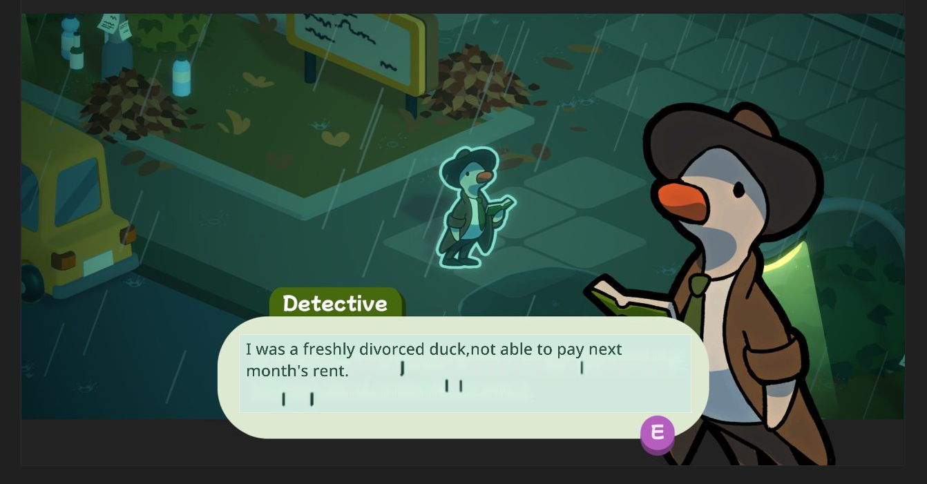
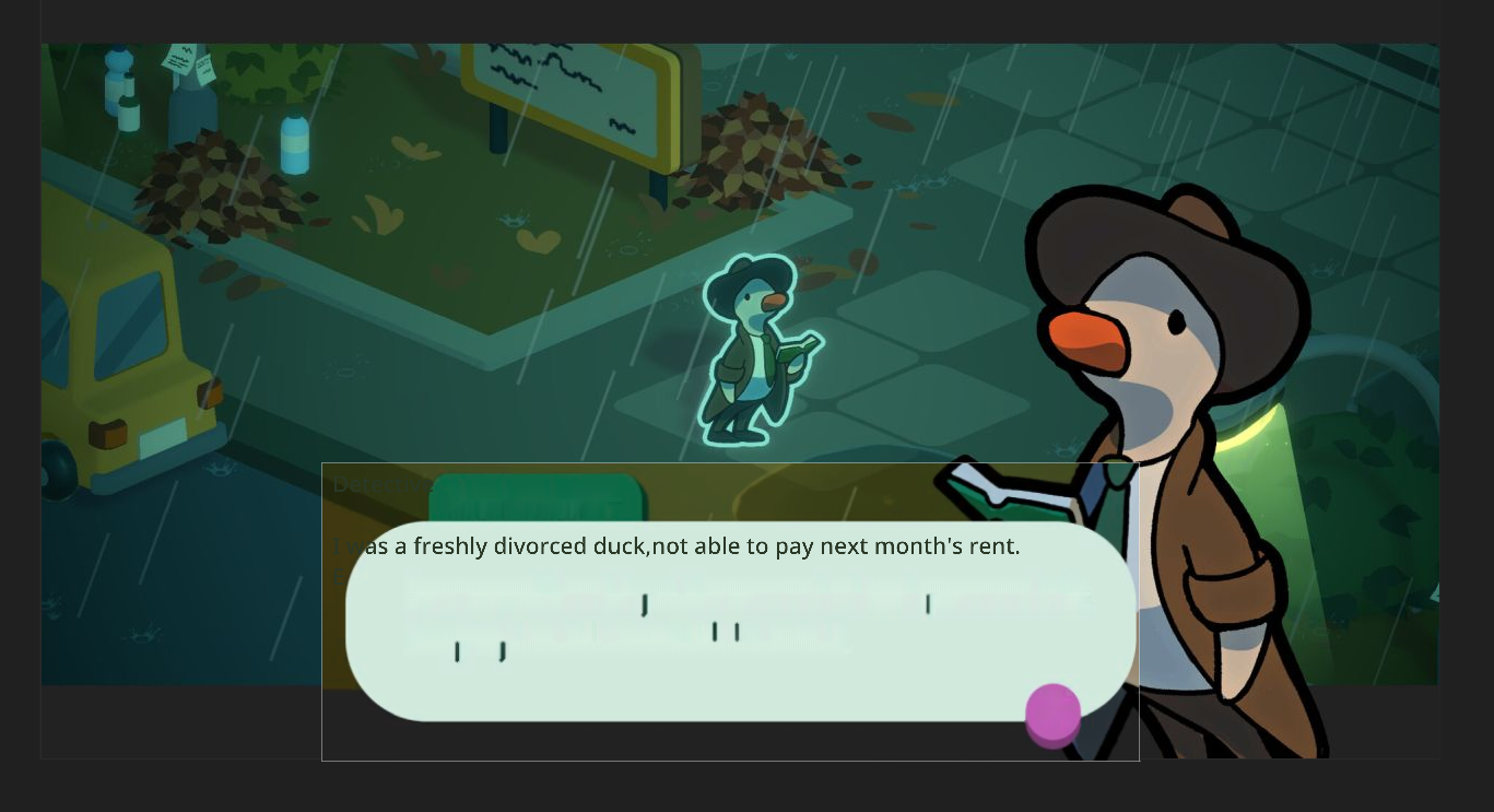
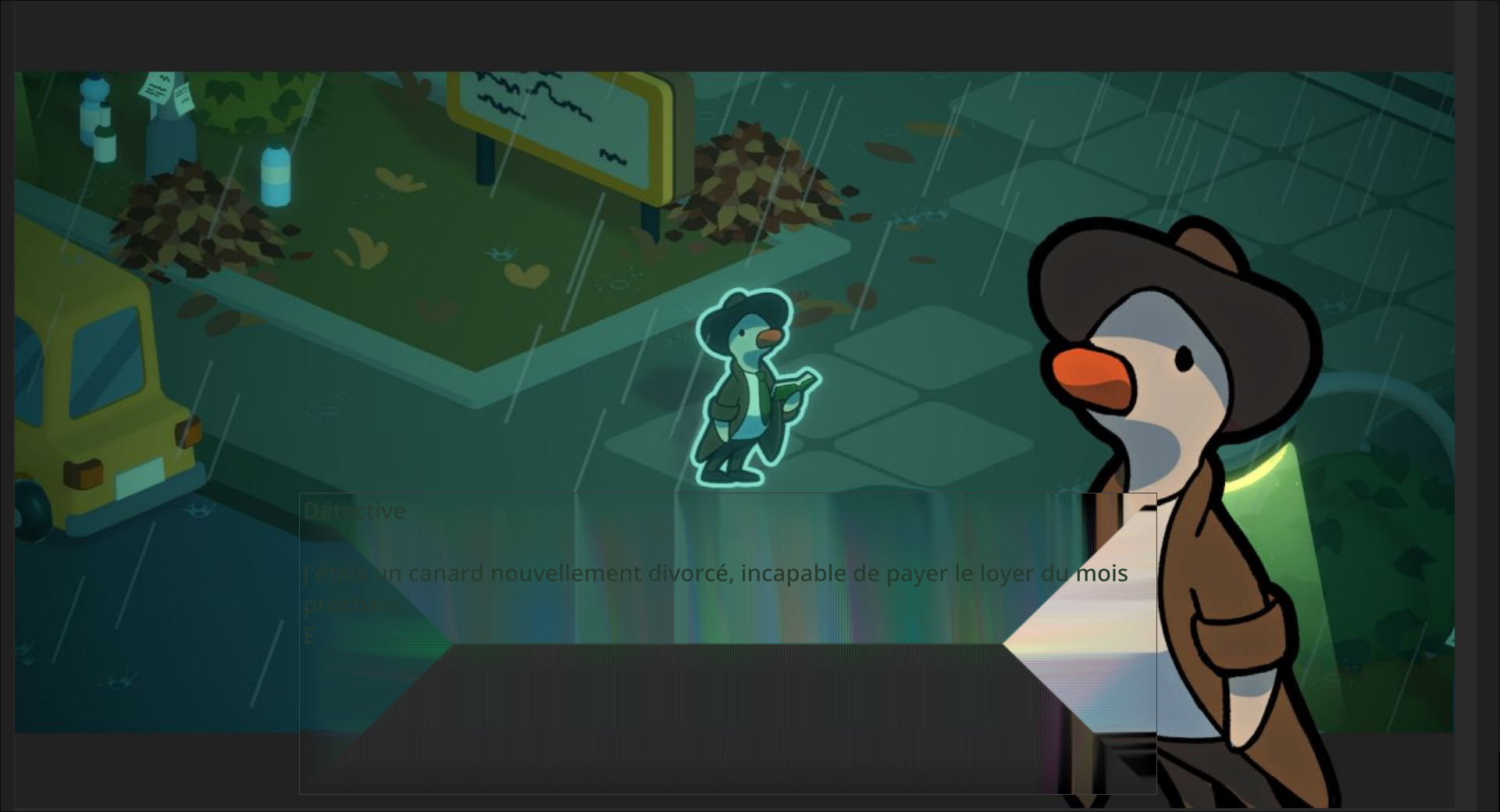
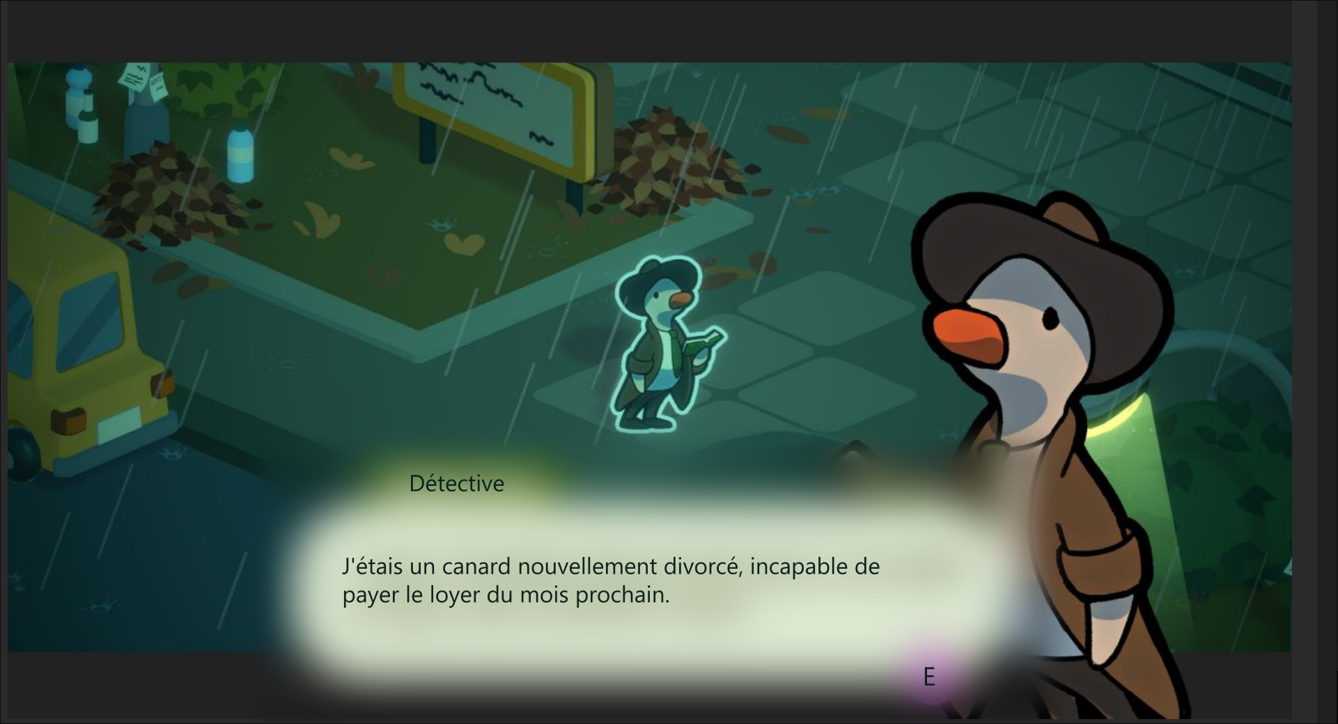
As we can see here, in 0.4.7, both are now satisfactorily passing the original test.
NOTE: There is some minor artifacting with the “E” for example. As the on screen UI is round and GameTranslate applies it’s background removal in a rectangle, but nothing distracting from the translation experience. I suppose this will eventually be ironed out with further improvements to the algorithm.
NOTE 2: The only difference I can see with the 2nd algorithm is that it close, it matches the original text font closelier. 🤷
Godnoken said: […] It is much less destructive & works really really well in all cases apart from extremely thick & large custom fonts
And to this I must concur. I have tried 0.4.7 on another test case and the results were indeed as described..
❌ 0.4.7 with thick and large fonts
Interestingly, it seems to have issues with the letter T more than others. 🤔
Solid progress nonetheless! We went from a distracting user experience to minor visual glitches. This certainly feels more polished. 👍
GameTranslate community · Posted in [✅ Implemented in 0.4.6] Font Size Scaling Issue in Regular Capture Mode with automatic font sizes
Further 0.4.6 testing
❌ Without High Contrast Mode
✅ With High Contrast Mode
And now we are back to the last, arguably the toughest, piece of the puzzle : the background removal algorithm itself.
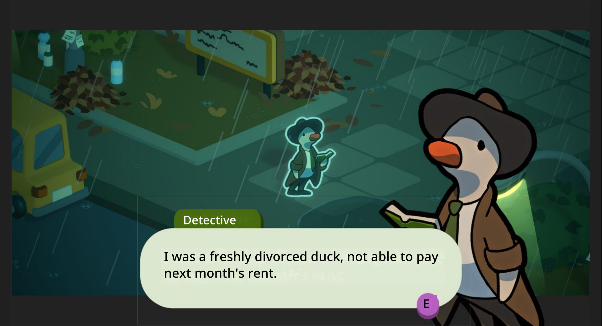
As we can see in this example, high contrast mode does not address the underlying issue in this scenario (the background removal algorithm grabbing pixels from nearby UI elements, already mentionned in above discussion).
We can even see the High Contrast mode being led into error because the background removal algorithm is rendering a lighter than reality background for the translation of the “E” button prompt.
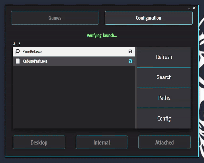
Issue Description
What:
When a game is launched unsuccessfully GameTranslate enters a persistent “Verifying launch…” state. In this state, the app appears stuck and non-functional, with no error messaging or exit path for the user.
When:
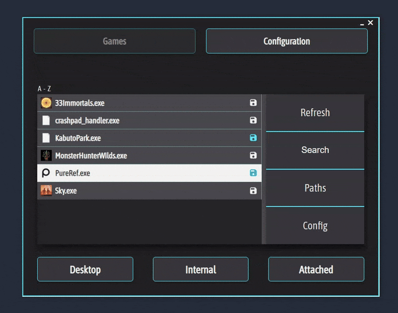
This typically happens when a user attempts to start a game that fails to initialize properly. Here, I had already launched PureRef and after that clicked on “Internal” for that same application.
🔎 Issue Demonstration
✅ Ideal Solution
Ideally, GameTranslate would:
- Include a launch verification timeout (e.g., 15–30 seconds).
- Display a clear and friendly message such as:
“We weren’t able to detect the game launch. Please [insert the most likely fix] (eg. consulting known compatibility issues, or launching attached rather that internal) - Offer a retry or abort option without requiring a force-quit.
📌 Why This Matters
- User Experience: Being stuck in a dead-end flow with no way out undermines user confidence and feels frustrating.
- Clarity: Clear messaging gives people a sense of control and helps them understand what went wrong. You already improved upon this in 0.4.6 with the more verbose logging.
- Professional Polish: Resilient failure handling signals attention to edge cases—crucial for trust in a tool designed to run alongside other apps.
- Troubleshooting Ease: A graceful exit path helps users test and diagnose issues without resorting to force-quitting and prevents the overhead caused by forum posts of easily fixed issues.
- Retention: First-time users encountering this issue may assume the app is broken or unstable and may not try again.
Thank you for your consideration 🙏
🙌 Yippee !
Test with 0.4.6
❌ Without High Contrast Mode
As we can see here, the issue was that the text color sometimes is incorrectly chosen, making it difficult to read.
✅ With High Contrast Mode
And now, High Contrast mode, completely fixes this use case!
I still need to do some more in-depth testing that will require more time, but as of now, this is amazing.
Congratulations Godnoken ! 🎉
GameTranslate community · Created a new topic [✅ Implemented in 0.4.6] Font Size Scaling Issue in Regular Capture Mode with automatic font sizes
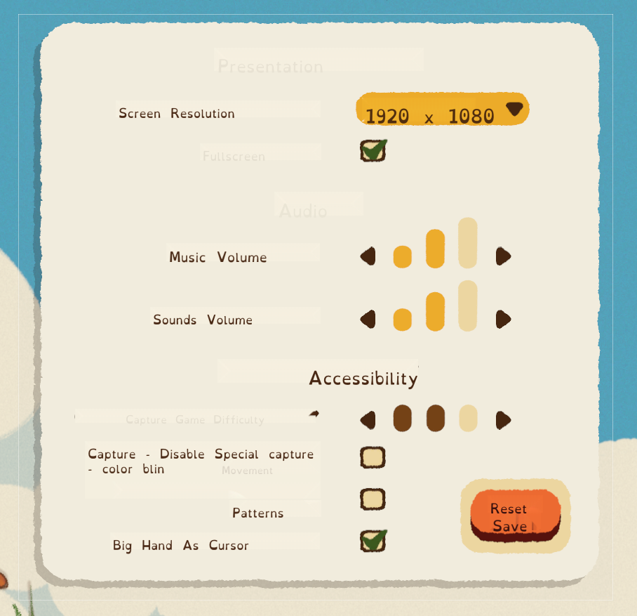
Issue Description
What : In Regular Capture Mode, when “Automatic Font Size” is enabled, the size of the first captured text element sets the font size baseline for the entire translation output.
When : This becomes a problem when the first detected element is a large-format title, as it causes all subsequent translations —regardless of actual size in the source— to appear disproportionately large.
Issue Demonstration
1️⃣ Capturing begins with a title element.
Result: all translated text is rendered in the oversized title font.
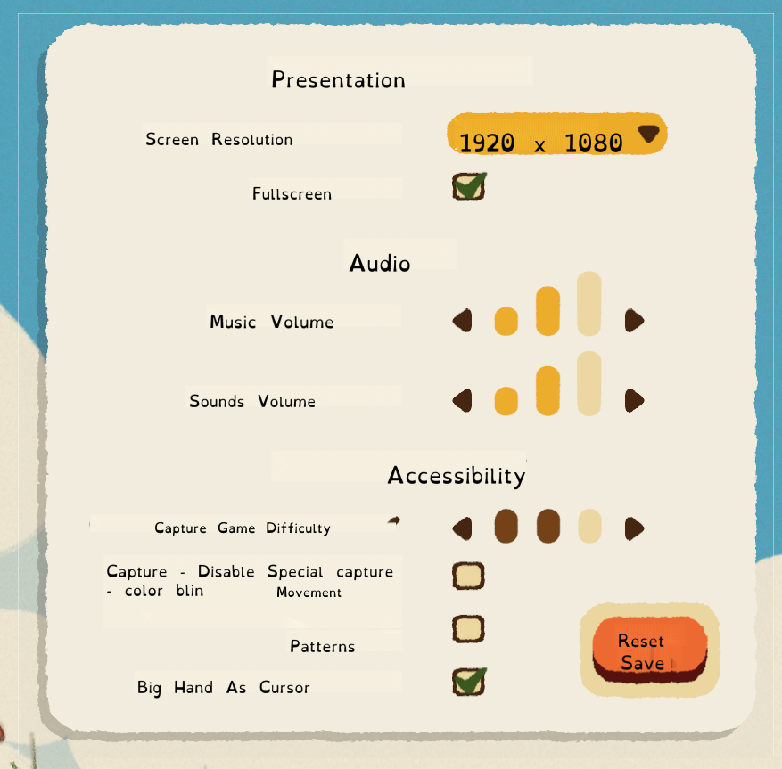
2️⃣ Capturing starts after the title.
Result: translation font sizes appear truer to context. Though still not perfect as in this example, the game uses very large fonts. The red outline indicating where the previous demonstration ended.
Ideal Solution
Ideally, the translation font sizes should reflect the relative size and hierarchy of the original elements, not just the first one encountered. I do not believe the aim of Regular Capture is to replicate the Automatic Capture mode’s accurate text positioning, but at least having relative sizes would help a lot.
Why this matters
- Enhances usability: by preventing large capture areas from going off screen.
- Helps readability: by preserving a semblance of UI integrity across translated content.
Thank you for your consideration.
🙏
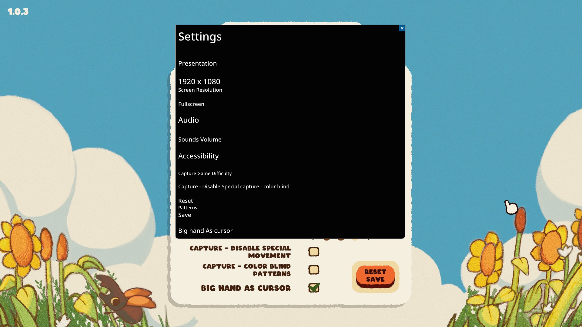
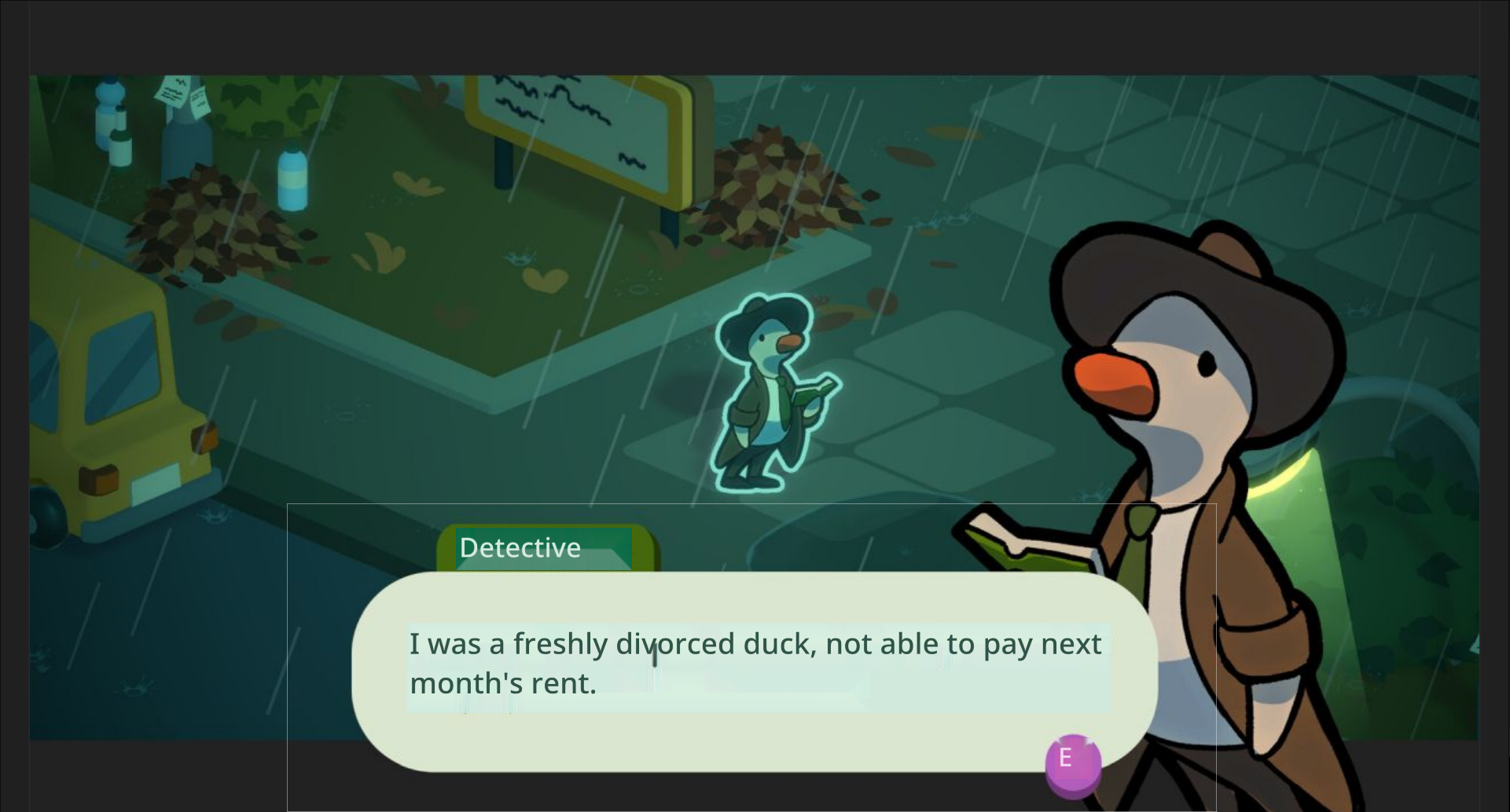
GameTranslate community · Posted in [Feature Proposal] Add Support for OpenDyslexic / User-Provided Custom Fonts
I tried out loading a font into the font folder and indeed it was very easy. (Just need to close GameTranslate before and open GameTranslate after.)
And here is the result :
From your description, I really was expecting far worse!
I feel that one part of the issue is a font size problem as OpenDyslexic tends to be pretty large.
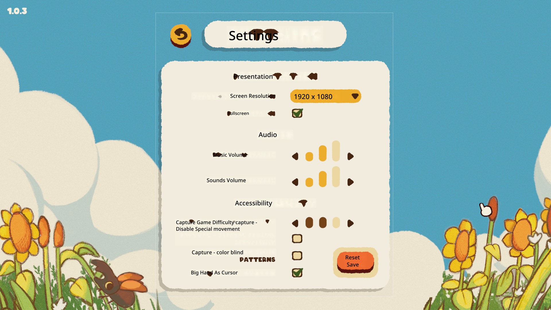
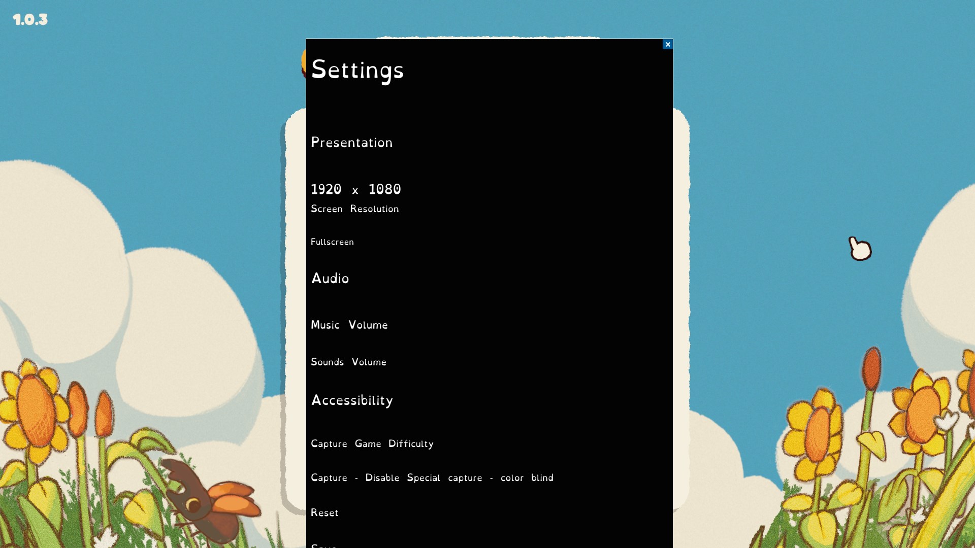
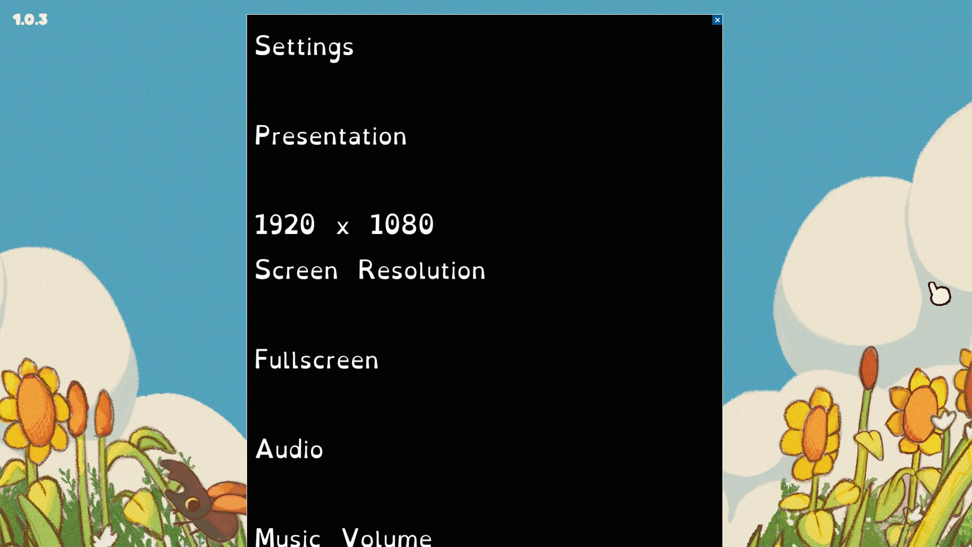
When I see the
“ 1920 x
1080 “
I feel it’s trying to fit the text into the frame and has run out of horizontal space.
GameTranslate community · Created a new topic [Feature Proposal] Add Support for OpenDyslexic / User-Provided Custom Fonts
Issue Description
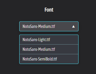
Currently, the app only supports a narrow range of font options (NotoSans in Light, Medium, and SemiBold weights). While clean and readable for many, this limitation presents accessibility challenges for some users and restricts the UI’s adaptability across varied content formats.
A user with dyslexia may struggle with the default font choices, especially when reading translated text over fast-moving visual media like live game UI, video/cinematics. The lack of font flexibility also prevents users from tailoring the reading experience to their visual preferences.
Proposed Solution
Add support for :
- OpenDyslexic as an included font option to improve baseline accessibility.
- User-provided custom fonts, allowing users to import and use their preferred fonts.
How :
- OpenDyslexic could be implemented as an available font in the default Font Selection window.
- The custom font could be imported through a “Browse” button so that the user can locate & load the font file.
Why this matters
- Accessibility : OpenDyslexic is specifically designed to support readers with dyslexia, offering better character distinction and reducing eye strain. Including it as a built-in option improves default accessibility out-of-the-box.
- User Empowerment : By enabling custom fonts, users can select the exact font that suits their needs—whether for dyslexia, visual comfort, aesthetic preference.
- Licensing Simplicity : Since fonts are user-provided, licensing concerns are offloaded to the user. This avoids the need to bundle and license additional typefaces.
- Professional Appeal : Font flexibility is increasingly a standard in UI-heavy applications. It demonstrates polish and a thoughtful approach to diverse user needs, which could be an addtional feature to market with.
Related Resources
💾 OpenDyslexic Font (itch.io)
📚 Designing for Dyslexia (uxcel)
Thank you for your consideration.
🙏
Tested 0.4.4 and here are the results
The new addition of only having the background replaced where new text is placed is genius.
Now, one issue is that the function that decides which background colour to pick sometimes makes.. odd choices.
As we can see here, the UI background element is “Tan” (RGB 241, 236, 220), but it decides that the translation background should be “Light Blue”? (RGB 223, 238, 244).
Proposed Workaround : High Contrast mode
While in an ideal scenario, the logic would always pick the most appropriate background color, to improve readability in edge cases without compromising the dynamic system, I suggest adding a toggle in the settings for an optional High Contrast Mode.
Why this matters
- Does not rely on complex background color detection logic, keeps the overlay readable even when the background detection fails.
- Provides a safety net for users who prioritize clarity over aesthetic subtlety.
- A similar solution already exists in the default capture window. This builds upon it with a simple binary threshold and two static styles.
- Improves accessibility of the app.
Suggested Implementation
- IF [Detected Background Luminance] is < 50% gray → Overlay shows white text on a black background
- IF [Detected Background Luminance] is ≥ 50% gray → Overlay shows black text on a white background
To prevent too high of a contrast :
White is RGB 222, 222, 222
Black is RGB 18, 18, 18
This would be a practical compromise between automation and user control, and it gives end-users a way to ensure legibility in any scenario.
Let me know what you think!
🙏
Fortunately, or unfortunately, the slowdown isn’t OCR (which is already impressively fast); it’s the DeepL translation that’s killing responsiveness. I know you’re focused on OCR perf, but from my end, that’s not the bottleneck.
Examples (0.4.4)

⬆️ The translation Online with DeepL

⬆️ The translation Offline with Internal Engine
This is one of the many reasons why an internal model is the preferred solution in my use case.
GameTranslate community · Created a new topic [🧱 Blocked by: Better Capital Letters Recognition] Preserve case
Issue Description
Game Translate’s OCR currently converts all recognized text to title case, which negatively affects the readability and accuracy of acronyms and all-caps text. For example:
• CUDA → Cuda
• OCR → Ocr
This behavior introduces two key issues:
-
Reduced Readability: Acronyms become less recognizable when not in uppercase, which can confuse users (e.g., “Cuda” vs “CUDA”).
-
Loss of Visual Hierarchy: Many games use all caps to differentiate titles or UI elements from body text. Changing the case undermines this formatting.
Examples
Original Image:
Note how the all-caps formatting indicates a title.
Current OCR Output:
Game Translate correctly identifies the text content but converts it to title case.
Proposed solution
Please preserve the original case of recognized text, especially for:
• Acronyms (e.g., keep CUDA, not Cuda)
• Fully capitalized words (used for emphasis or formatting)
This change would maintain the integrity and readability of the translated content.
Thank you! 🙏
Okay ! Haha, way better already ! Here is the same picture but with v0.4.3
 Small box area to cover just the text. Does nicely though has some issues
 And now with the same large encompassing box. This is where your new technique shines. It’s miles better compared to 0.4.2! It cleanly removes the title and the message box is cleanly preseved
Proposed Next Step
Implement coordinated text placement.
In Dynamic OCR Mode, store the starting position of each paragraph block. This information should be retained and applied during translation output.
Why this matters:
- Many UI elements (menus, item descriptions, system messages) rely on precise text placement to make sense visually.
- Translated text may differ in length, but starting position is often consistent and sufficient to maintain structure.
- Proper alignment avoids overlapping or misaligned text that can make UIs confusing or unreadable.
Suggested Implementation:
- During Dynamic OCR, record the XY-position of each detected line or block.
- When rendering the translation, align output based on these stored positions.
- Optionally allow slight dynamic adjustments if translated text blocks risk overlapping.
This would bring translated UI elements much closer to the original layout and greatly enhance the clarity and usability of real-time game translations. Thank you again for the amazing progress in 0.4.3 🙏
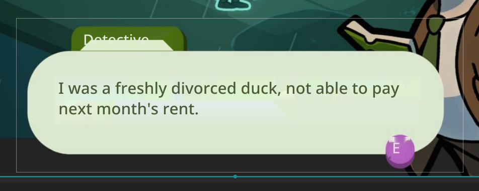
Issue Description
What : The background removal algorithm that the Auto-Translate window tries to apply is too destructive. I believe it tries to repeat edge pixels.
When : This method breaks when the window is not perfectly aligned with the background or if the captured area is too large.
 As we can see here, the background removal is so aggressive that it removes the UI on which the text is supposed to rest, making it difficult to read.
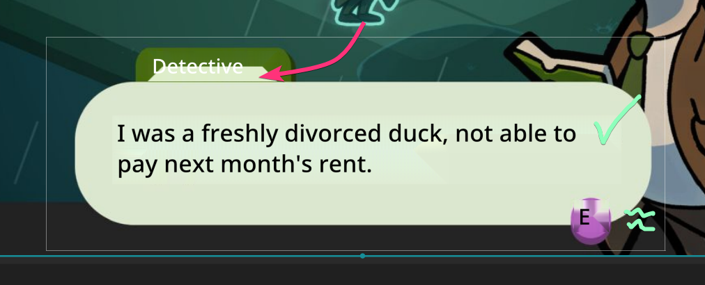
Proposed Solution
In an ideal world, we could do live AI processing for text removal. This being a little heavy for now, we will have to concede to a workaround. Implementation of a Gaussian/Box Blur + Feather Selection would be more robust while still being lightweight.
 Here it is with an improved detection of text placement. It does not attempt to remove the background and blurs enough (100px radius) so that the source text is not readable while saving both the UI elements and the general feel of the game.
Thank you for your consideration. 🙏