
Tested 0.4.4 and here are the results
The new addition of only having the background replaced where new text is placed is genius.
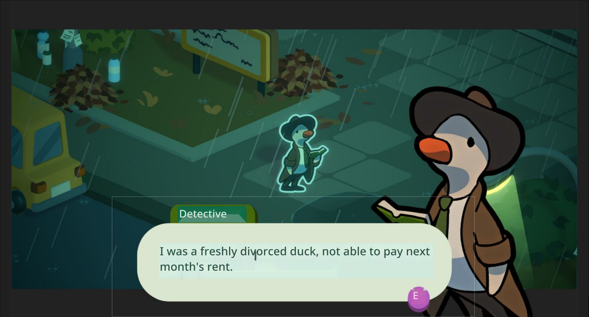
Now, one issue is that the function that decides which background colour to pick sometimes makes.. odd choices.
As we can see here, the UI background element is “Tan” (RGB 241, 236, 220), but it decides that the translation background should be “Light Blue”? (RGB 223, 238, 244).
Proposed Workaround : High Contrast mode
While in an ideal scenario, the logic would always pick the most appropriate background color, to improve readability in edge cases without compromising the dynamic system, I suggest adding a toggle in the settings for an optional High Contrast Mode.
Why this matters
- Does not rely on complex background color detection logic, keeps the overlay readable even when the background detection fails.
- Provides a safety net for users who prioritize clarity over aesthetic subtlety.
- A similar solution already exists in the default capture window. This builds upon it with a simple binary threshold and two static styles.
- Improves accessibility of the app.
Suggested Implementation
- IF [Detected Background Luminance] is < 50% gray → Overlay shows white text on a black background
- IF [Detected Background Luminance] is ≥ 50% gray → Overlay shows black text on a white background
To prevent too high of a contrast :
White is RGB 222, 222, 222
Black is RGB 18, 18, 18
This would be a practical compromise between automation and user control, and it gives end-users a way to ensure legibility in any scenario.
Let me know what you think!
🙏