Issue Description
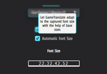
What : In Regular Capture Mode, when “Automatic Font Size” is enabled, the size of the first captured text element sets the font size baseline for the entire translation output.
When : This becomes a problem when the first detected element is a large-format title, as it causes all subsequent translations —regardless of actual size in the source— to appear disproportionately large.
Issue Demonstration
1️⃣ Capturing begins with a title element.
Result: all translated text is rendered in the oversized title font.
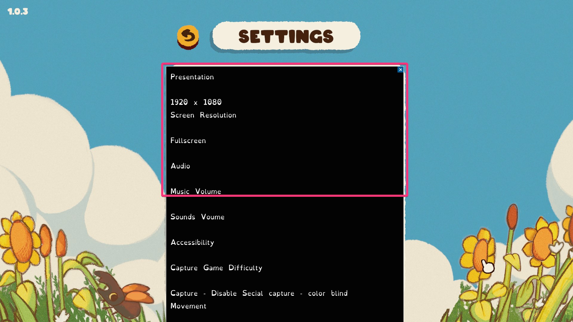
2️⃣ Capturing starts after the title.
Result: translation font sizes appear truer to context. Though still not perfect as in this example, the game uses very large fonts. The red outline indicating where the previous demonstration ended.
Ideal Solution
Ideally, the translation font sizes should reflect the relative size and hierarchy of the original elements, not just the first one encountered. I do not believe the aim of Regular Capture is to replicate the Automatic Capture mode’s accurate text positioning, but at least having relative sizes would help a lot.
Why this matters
- Enhances usability: by preventing large capture areas from going off screen.
- Helps readability: by preserving a semblance of UI integrity across translated content.
Thank you for your consideration.
🙏