


Play game
Where the Sands Whisper Madness's itch.io pageResults
| Criteria | Rank | Score* | Raw Score |
| Overall fun and playability | #45 | 3.211 | 3.211 |
Ranked from 38 ratings. Score is adjusted from raw score by the median number of ratings per game in the jam.
Theme incorporation
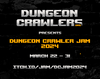
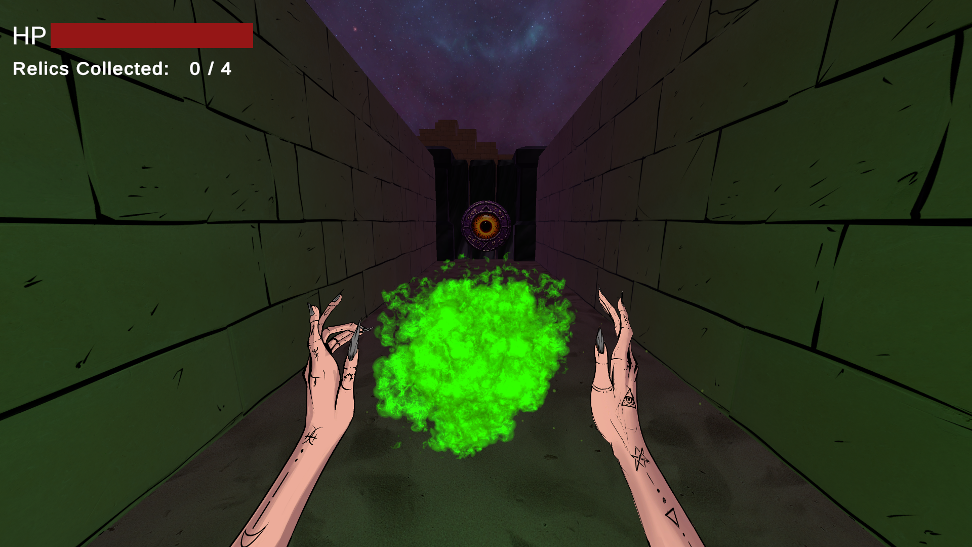
I went with the theme "Cosmic Horror" the game's art, story, and atmosphere where heavily influenced by the theme.
Leave a comment
Log in with itch.io to leave a comment.
Comments
I wouldn't place this in the top 5, but maybe in the top 10 somewhere
very good/5
Not a bad game, but I struggle a bit with the very prominent energy cloud, it takes a lot of sight and doesn't match the visual style of the game. Further, I'm not totally happy with the movement. Nevertheless, the game is fun and that is the most important thing.
I completed the game.
The game was fun. It looks good, especially the boss parts, and sounds good too. It controls very well and the combat part is fun, I really like that the enemies don't shoot only in straight line as they can't move. I like the open structure with 4 parts you can do in any order, the overall difficulty is appropriate and the boss fight is a satisfying conclusion to the game.
This is a cool entry, thanks for sharing.
Nice graphics - particularly the opening and backgrounds.
I wasn't a fan of the AI text narration.
A pity the arrow key couldn't be used too.
I found the combat the most annoying as you didn't get time to work out what to do, what to click before the monster had moved and alrady hit you.
But a nice job :)
Great work on the enemy placement.
I enjoyed the cover based combat.
And the last Boss was pretty great too.
Thank you, I really appreciate the gameplay video, its so helpful!
Super cool art, I love your style! Game seems quite polished, although too short :)
I’m not a fan of camera movement when moving, felt a bit strange, unnatural. Stationary enemies were super easy to defeat and were not posing any real challenge. Even when there were 2-3 of them in a row were just a matter of dodging all attacks at once and that’s it.
But other than that it’s a cool and enjoyable game with super great art :)
Nicely done! This was solid all-around!
One thing that I did notice right away, it felt very fast-paced, the effects were good, and the controls were good enough. However, having the projectile held in the center of the screen and obstructing the point of view where the eyes naturally want to come to rest in this kind of game was awkward. I would definitely recommend dropping the hands to the corners or the bottom third of the screen to make them and then particle effect less intrusive, I believe the whole thing would feel better.
Other than that, there really isn't much to offer constructive criticism on within a game jam timeframe. You did an excellent job of reusing code, assets, and mechanics to make a boss that felt different enough. I am also sure you know that everything could have used more polish and a little more depth, which is sort of expected within this kind of time constraint. Great submission, keep up the good work!
Cool aesthetic here, love the hands and the magic particle thing (Though it's a touch to big, takes up a lot of the screen). Gameplay is fun, dodging projectiles and blasting eyeballs mechanically feels satisfying.
Boss battle was well done I think, apart from not actually being able to shoot the eye after killing the hearts, the fact that you setup a multi-phase boss battle is pretty rad for a jam game. The art on that guy was sick too.
I really appreciate the effort you put into your itch page as well, it looks fantastic, and the fact that this is your first game is very impressive.
Well done on a great entry!
Sick tats. I like how sharp everything looks. I personally loved the 2d and 3d mixed together. I would have liked an ambient soundtrack or something. But this is my composer bias speaking. Only wish there was a bit more. Wanted to shoot at the eye in the center, but as I went around shooting the other parts and doing the math, I realized that wasn't going to happen. Very good otherwise! I experienced 0 bugs.
I really like the graphics, the creepy temple with octo-baddies and whispers. The little plumes of dust on the ground was a nice touch. The combat and movement are simple enough, but still had to dodge around things and pay attention to the enemy placement or you get attack from all sides! So it added a sense of danger around each corner. I especially loved the 'bullet hell' style boss (I did something similar in my entry, you should check it out) at the end.
Not too much to complain about and after reading this is your first game and first jam, I'm impressed! Great job!
Simple mechanics but they get you!
I really liked the cartoon aesthetic mixed with the 3D.
Nice clean graphics. Clear scope and objectives. Would like a more fluent movement, especially when facing the boss. When you try to put in inputs fast it does not respond correctly.
Overall Good game I liked it a lot!
I really liked the approach to art here, and especially the whole "hands holding a spell in front of you" conceit. I did not like that the enemies could shoot me at an angle no matter where I was :(
Lessons Learned & Postmortem of My First Game (WARNING TEXT DUMP!)
Hey everyone, Im writing this post for though who might care to read, and to analyzes the design choices of my game and the insights Ive gained from feedback so far.
-----
Combat:
My goal was to encourage cautious exploration, with players strategically peeking corners and managing enemy projectiles. I think this approach resonated with players who where already familiar with this style of gamplay. However, for newcomers, it might have felt frustrating due to:
Unclear Tutorials: The core gameplay loop of cautious exploration wasn't properly introduced, leaving some players confused.
Difficulty: The punishing death penalty (complete restart) and the lack of checkpoints. I think this game would of benifitted from checkpoints after every relic.
Missing Feedback: Lack of visual cues for off-screen attacks made the experience more unreactive than reactive/ strategic.
-
In Hindsight:
Improved Tutorials: Prioritizing clear communication of the intended playstyle from the beginning.
Fair Challenge: Implementing checkpoints and difficulty options to cater to a broader audience.
Visual Feedback: Visual indicators for off-screen attacks would of improved player awareness and decision-making.
-----
Movement:
This seems to be a controversial topic and a dealbreaker for many. Player preferences regarding movement controls (A/D for strafing vs. turning) seem divided. There's no single "right" or "wrong" approach, but offering options would have improved accessibility.
-
In Hindsight:
Control Customization: Including options for different control layouts, or letting players set there own keybindings, to personalize their own prefered experience.
-----
Level Design:
The intention was to guide players visually towards the central pyramid, with each relic retrieval leading players back to a familiar location. While I still think the concept was sound, the execution needed refinement:
Limited Visual Cues: The environment lacked strong visual distinctions, making it difficult for players to recognize the pyramid as a central point and easily navigate back to it. Repetitive textures and unclear pathways between relics detracted from the intended visual flow.
Underdeveloped Theming: Enemy placement could have benefited from stronger thematic ties to each zone (maze-like, projectile counting/timing , ambush potential).
-
In Hindsight:
Enhanced Landmark: Emphasize the pyramid's visual dominance to make it a clear landmark. This could involve using diffrent colors, unique textures, or changing its size.
Clearer Paths: Implement stronger visual cues, like diffrent textures for pathways leading to and from the pyramid to aid player navigation.
Enemy Encounters: Fleshing out more diverse enemy placement 'puzzles', aligned with zone themes (puzzles, timing challenges, surprises).
-----
Other Learnings:
The intro was too long. It should of been condensed down, and honestly could of been 'shown' not 'told'. Text to speech AI was not for everyone (fair enough). I had added it fairly last minite for though who might not want to read, but i think there where better ways to do/solve this.
Enviroment was too static. I think adding more dynamic details like animations that make enemies and health orbs float up and down could of helped make the game feel more dynamic (just as an exampe). And the lack of variery in wall textures, enemies, ect.
In Conclusion:
These are some key takeaways from my development, and while there is more i could talk about (like boss design) ill skip past it for lack of time. I appreciate all the feedback received so far, and welcome further discussions. (ps if you acually read all of this thanks!)
It's a nice game and it looks and feels very polished.
The only thing I did not like was having to start over after almost getting the boss. A save checkpoint would have been great!
PROS: Love the art, combat is readable and feels natural
CONS: 2D art contrasted heavily with 3d animation and models. Enemy placement felt too clustered or too open at times. Loss of progress at death or difficulty finding relics made progression feel slow.
I really liked it. I died at the boss fight because my movement felt stuck, which was frustrating. I could see myself playing this sort of game, the combat was tuned well, it just felt good and flowed. I really liked the cooldown was represented with a fireball recharge animation. Nice art too.
Cool art style.
The boss fight is very cool, the monster's combat is a bit redundant tho. The fireball is a bit too huge for the screen, it is too much bulky. Overall a nice game, good job!
Loved the graphics and style, its true that the combat is really repetitive, I could see this game becoming not a dungeon crawler but maybe a boomer shooter if you add a few new enemies. Nice work!
The combat felt very simple and repetitive, but I liked that the game was focused on ranged combat. That said, most encounters felt like hiding behind cover, waiting until the enemy was done shooting, then popping out to take a shot, but there were a few moments where enemy placement felt like a puzzle I had to figure out to avoid taking damage, and I wish there would be more of that.
Also, I think having VO in the intro dragged it for too long -- it would be much faster to read it and start playing.