
The sliced up arms are so weirdly satisfying. Cool stuff!
A member registered Mar 16, 2024 · View creator page →
Creator of

Play in browser
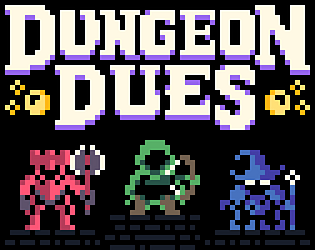
Survive the unknown, make every choice count – stranded on a hostile alien world.
Survival
Play in browser
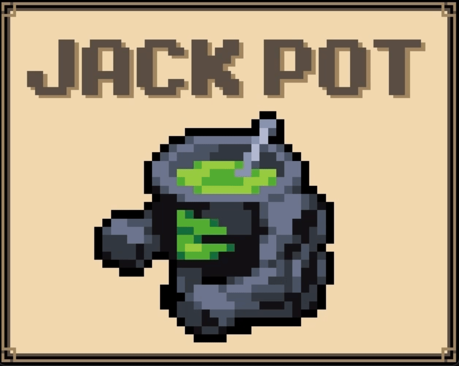
Mix, match, and master powerful potions while defending against the encroaching shadow!
Strategy
Play in browser

Green fire flickers against the cosmic void. Will it be enough?
Play in browser